Posts filed under Van Dieman's

Van Dieman's Tasmanian Robin Pink Fountain Pen Ink Review

Van Dieman's Tasmanian Robin Pink

(Jeff Abbott is a regular contributor at The Pen Addict. You can find more from Jeff online at Draft Evolution and Twitter.)

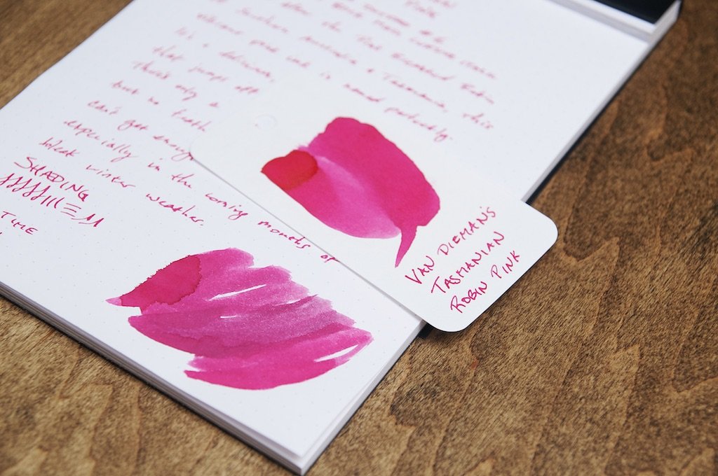
Even though there are plenty of cold, dreary weeks ahead of us, this ink from Van Dieman's will definitely brighten your day. Tasmanian Robin Pink is a vibrant, cheery pink that takes its name from the beautiful Pink Breasted Robin from southern Australia and Tasmania. It's hard to look at this ink and not smile.

I have exactly zero other pink inks in my collection, so I don't have anything to compare it against. As a side-note, I'm determined to expand my pink ink experience. Despite not having any direct comparisons, I'm convinced that this going to be a hard color to beat. It's so bright and crisp that it seems almost fluorescent — like it would glow in the dark if the lights went out. It doesn't glow in the dark, but it definitely jumps off the page with excitement.

Van Dieman's Tasmanian Robin Pink

The pink color is pretty steady and doesn't offer much shading. The little bit of shading I was able to see was nice, but it doesn't appear easily. And, it's also minimal in terms of the different shades of pink. This is a fairly one-dimensional color in that sense.

While writing, the ink is really well-lubricated and glides effortlessly across the paper. It doesn't have any trouble starting or keeping up with a fast pace of writing. I haven't noticed any delay when uncapping and writing with this pen. The ink is ready to go with zero sputters or gaps as soon as the nib hits the paper. I haven't noticed any feathering or bleeding on my usual notebooks, but it does tend to soak through cheaper paper rather quickly. Given the light color, seeing the ink on the back side of the page isn't an issue unless you're writing with a really large or wet nib.

Van Dieman's Tasmanian Robin Pink

The dry time of this ink has been really surprising. It's normally dry to the touch in about 10 seconds, and even after 5 seconds it's pretty resistant to smudging. Not bad!

All of the inks I've tried from Van Dieman's have been well-behaved and easy to clean, but this one cleans out of pens even faster than the others. Maybe it's due to the lighter color? At any rate, it's a cinch to clean out.

You can pick up a 30ml bottle of Tasmanian Robin Pink for just $12.95 at Vanness. This color is just so much fun that I think everyone should have a bottle to play with. If you're in need of cheering up, this ink will at least put a smile on your face. It's just so happy and friendly!

(Vanness Pens provided this product at no charge to The Pen Addict for review purposes.)


Enjoy reading The Pen Addict? Then consider becoming a member to receive additional weekly content, giveaways, and discounts in The Pen Addict shop. Plus, you support me and the site directly, for which I am very grateful.

Membership starts at just $5/month, with a discounted annual option available. To find out more about membership click here and join us!

Van Dieman's Tasmanian Robin Pink
Posted on December 29, 2021 and filed under Van Dieman's.

Van Dieman's Tassie Season Sweet Fig Fountain Pen Ink Review

(Jeff Abbott is a regular contributor at The Pen Addict. You can find more from Jeff online at Draft Evolution and Twitter.)

It's really difficult for me to believe, but winter is just a few days away (the official date anyway). I live in an area that rarely experiences the spring and fall seasons, so I'm more than happy to enjoy some of those seasons through ink colors and baked treats. In this case, I'm using Van Dieman's Tassie Season Sweet Fig — a luscious dark red ink that you could easily mistake for a blank ink in certain light. It makes me think of autumn weather and changing leaves, and I really appreciate it for that.

I generally need to be in the right mood to enjoy a dark ink, but Sweet Fig is just light enough in the thinner areas to really tickle my fancy. On first writing with this ink, I was a little disappointed with how dark the ink was. After using it a little more, I noticed all the little nuances that this ink has to offer. It's dark, but it also has depth.

The dark red tone is the most prominent, but I love the small hints of purple that come through from behind. This mixture of deep red and dark purple are just fabulous, and they complement each other perfectly. The shading of this ink from deep red and purple is really fantastic.

Along with the interesting shades and layers of colors, there's also an interesting sheen effect that you can notice in certain light. I've never used an ink with a black sheen before, but I'm somewhat blown away by how it behaves now that I've seen it with my own eyes. In the right light, this ink looks black — but it changes back and forth from black to deep red/purple like someone switching a light on and off. It's so cool.

The dry time for this ink is fairly average at around 10 to 15 seconds. I was using a large nib for the sample here, and I'd say the dry time is closer to 10 on smaller nibs. Not an incredibly fast-drying ink, but pretty good nonetheless.

Like all Van Dieman's inks I've tried before, this one behaves elegantly. It's well lubricated, starts easily, doesn't bleed or feather, and cleans out quickly. The more of these inks I try, the more they teeter into my favorite brand of inks.

A 30ml bottle of Sweet Fig is available from Vanness for $12.95, which is an excellent deal. If you'd rather try a small sample instead, you have that option. But if you like dark inks that have a few secrets to share, this ink is well-worth the small investment. While you're at it, browse the other inks that Van Dieman's offer and see what else tickles your fancy.

(Vanness Pens provided this product at no charge to The Pen Addict for review purposes.)


Enjoy reading The Pen Addict? Then consider becoming a member to receive additional weekly content, giveaways, and discounts in The Pen Addict shop. Plus, you support me and the site directly, for which I am very grateful.

Membership starts at just $5/month, with a discounted annual option available. To find out more about membership click here and join us!

Posted on December 15, 2021 and filed under Van Dieman's, Ink Reviews.

Van Dieman's Devil's Kitchen Fountain Pen Ink Review

Is “blue” the broadest fountain pen ink category? It has to be, right? Royal Blue, Navy Blue, Blue Black, Turquoise, Sky, insert Ocean or Lake descriptor here. The list goes on and on.

Why are they so popular? Because they are not black, and are mostly appropriate in an office setting. They give your writing character, and co-workers won’t give you the side-eye that green, purple, or orange might bring.

Fountain pen users have no shortage of blue inks at their fingertips, and a wide range of favorites. And you know what else? There is always room for one more. That’s where Van Dieman’s Devil’s Kitchen comes in.

You may have seen Jeff recently review this ink right here in these pages. I’m always open to reviewing the same writing instrument as other reviewers - we all have unique use cases and experiences for pens and pencils. But inks? They are a more static product, and usually one review is enough.

So, why was I compelled to review Devil’s Kitchen a second time? Because the color of ink in my bottle looks completely different than Jeff’s, and different than most retail samples you see online.

The color of ink in Jeff’s review perfectly matches the most common sample shown online, such as the swab from Vanness Pens, where I purchased my bottle from, and where Jeff’s sample vial was from. It’s a beautiful deep teal green, and a color I would highly recommend if you are looking for that shade.

That’s not what I see from my bottle, though. What I see is represented on Van Dieman’s product page, a rich, complex deep ocean blue. Their image even has more character than I’ve personally seen so far, but that hasn’t kept me from enjoying this ink immensely.

That I use it and enjoy it so much is what got me looking at the color variations online. I think the shade I have is perfect, and one of the best blues I have used in some time. The teal green is good, too, but this blue pops. I’ve used it as part of my #NaNoCoMo project (inked in the recently reviewed Edison x Goldspot Pens Newark Orion Nebula,) and I plan on keeping it on the front of the ink shelf for frequent use in other pens.

But it is blue. And it is different than Jeff’s sample, and other samples online. Right?

It looks like I have some emails to send to sort out the true color. Either that, or have my eyes checked.

(I purchased this ink from Vanness Pens at a discount for review purposes.)


Enjoy reading The Pen Addict? Then consider becoming a member to receive additional weekly content, giveaways, and discounts in The Pen Addict shop. Plus, you support me and the site directly, for which I am very grateful.

Membership starts at just $5/month, with a discounted annual option available. To find out more about membership click here and join us!

Posted on November 22, 2021 and filed under Van Dieman's, Ink Review.