Posts filed under Ink Samples

February Inks

(Kimberly (she/her) took the express train down the fountain pen/stationery rabbit hole and doesn't want to be rescued. She can be found on Instagram @allthehobbies because there really are many, many hobbies!.)

What started out as an innocent “How many pens do you have inked” question in a group chat, ended up with me suggesting that someone ink up 14 pens with red/pink inks for Valentine’s Day since they were going to be out of town for the first 14 days of February. Of course, it took minimal encouragement for me to consider doing this myself, so here we are!

First, I had to pick the pens. Thankfully, I already had some inked up! Yes, I’ll admit it’s sorta cheating, lol.

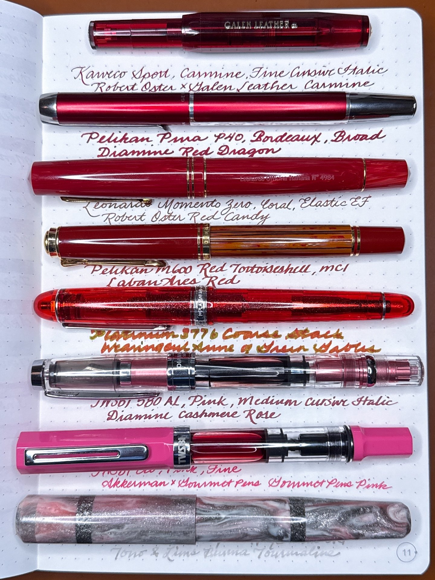
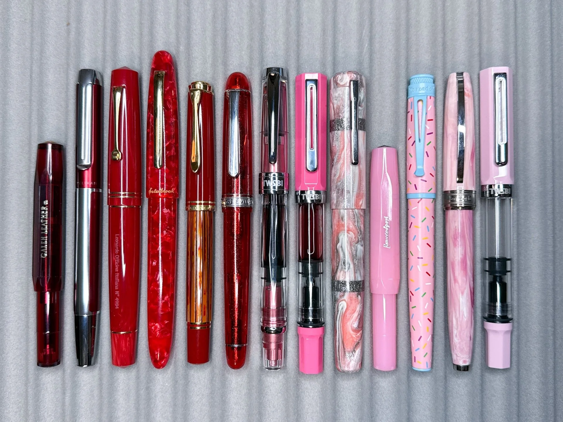
Left to right: Kaweco Sport Carmine; Pelikan Pura P40 Bordeaux; Leonardo Momento Zero Coral; Esterbrook Estie Maraschino; Pelikan M600 Red Tortoiseshell; Platinum 3776 Carnelian; TWSBI 580 AL Pink; TWSBI Eco Pink; Franklin-Christoph 19 Pink/Silver/White proto; Kaweco Sport Blush Pitaya; Retro 51 Sprinkle Ops; Visconti Van Gogh Souvenir de Mauve; TWSBI Eco Pastel Pink.

I used my trusty steel Kakimori dip nib for the swatches and writing samples in the A5 Odyssey Tomoe River notebook.

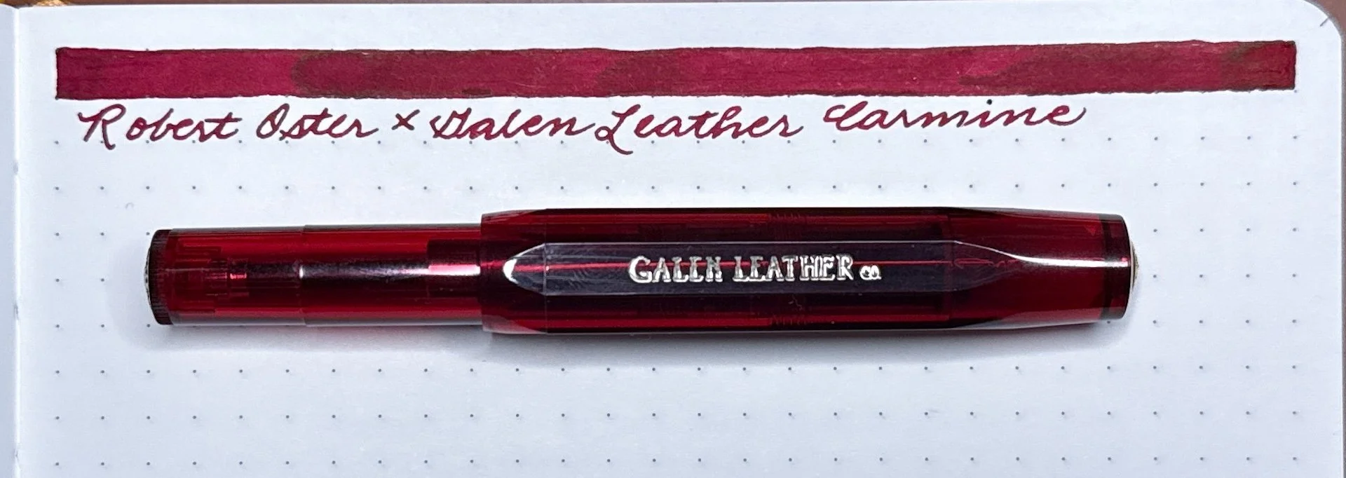
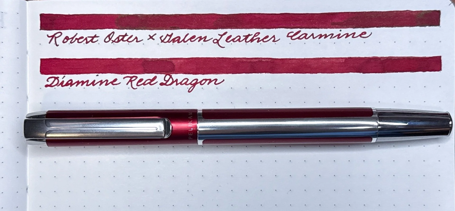
This Galen Leather exclusive Kaweco Sport Carmine will probably never see another ink besides its namesake, made by Robert Oster.

I’ve had this Pelikan Pura Bordeaux inked up since last year’s Pelikan Hub. It’s inked up with an oldie, but goodie, Diamine Red Dragon.

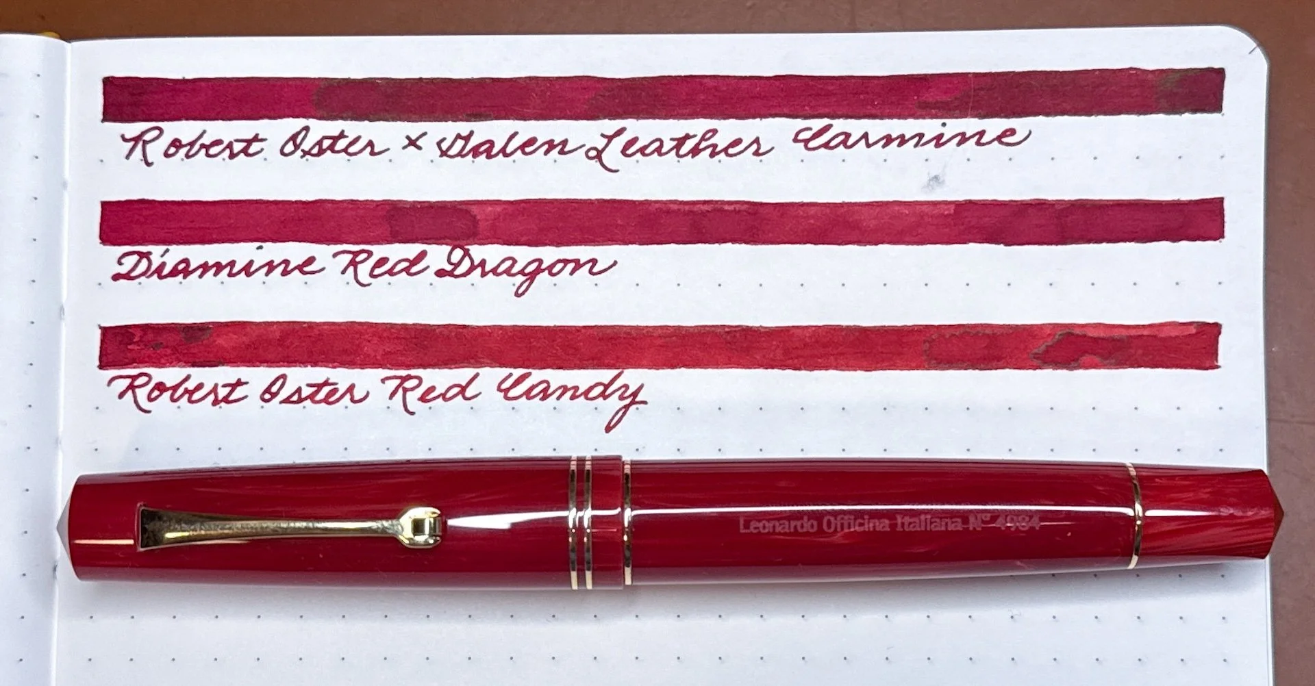
Leonardo Momento Zero Coral, which is definitely red and not remotely coral, with Robert Oster Red Candy, which is a little lighter in the swatch than irl.

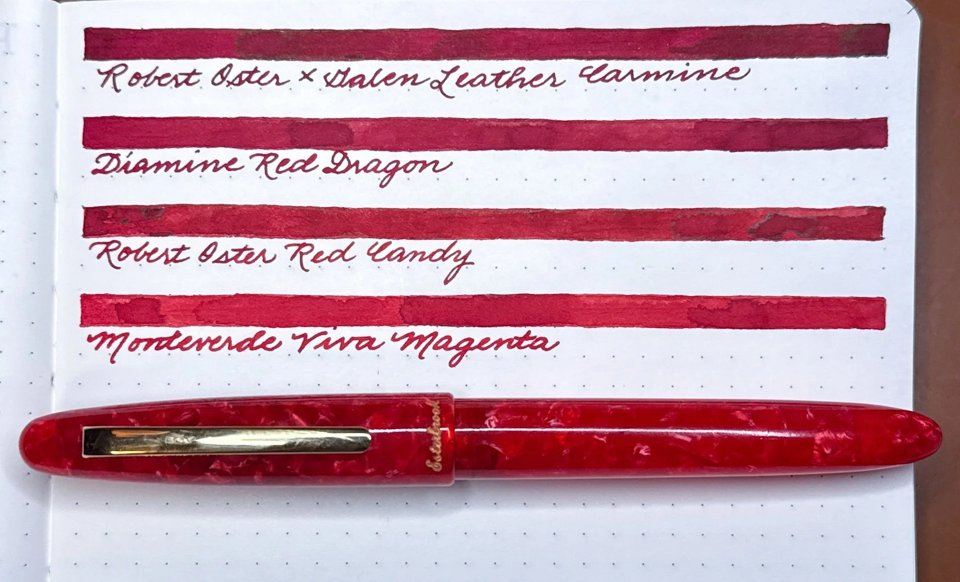
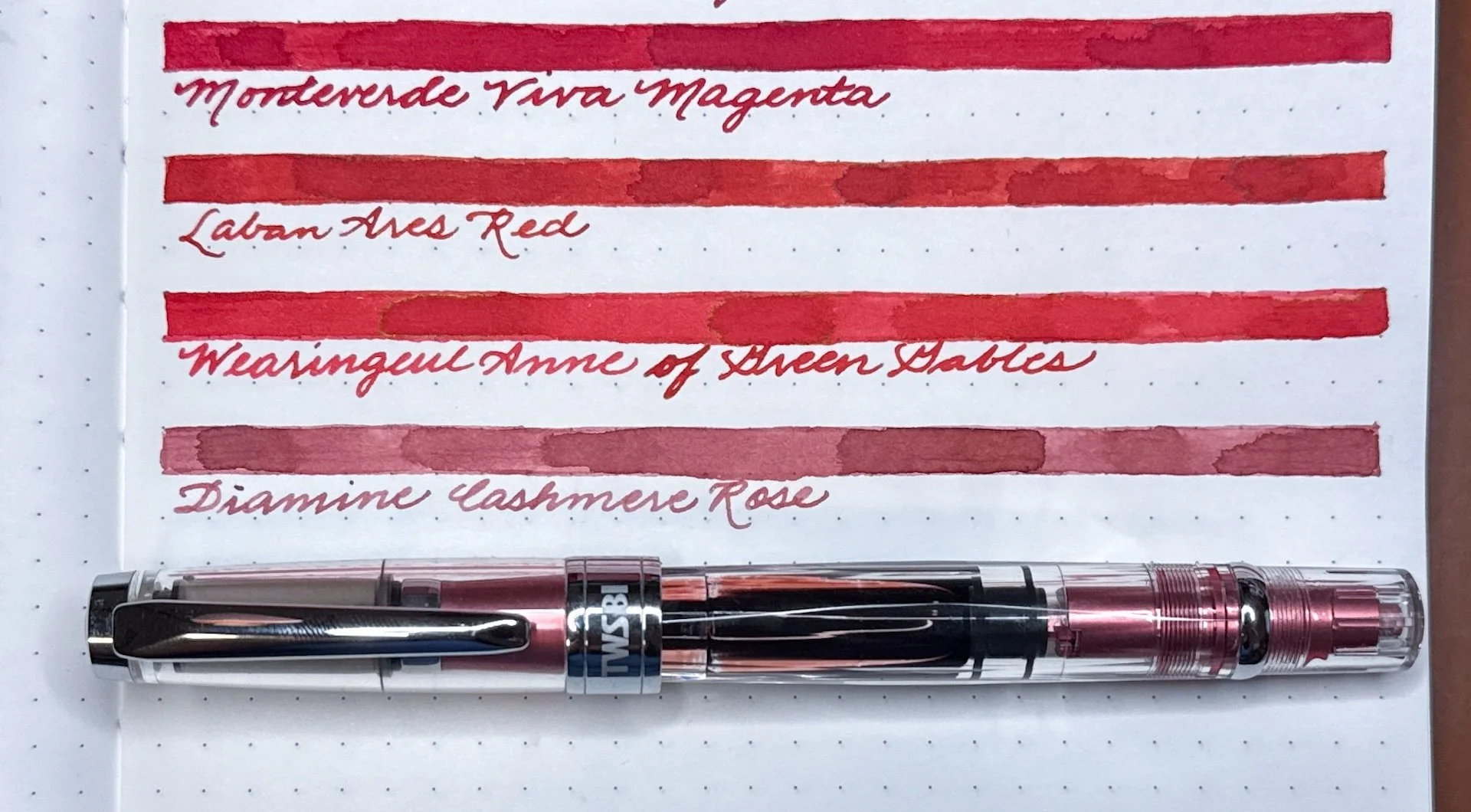
Esterbrook Estie Maraschino looks really good with Monteverde Viva Magenta, which is a bright red and definitely not magenta.

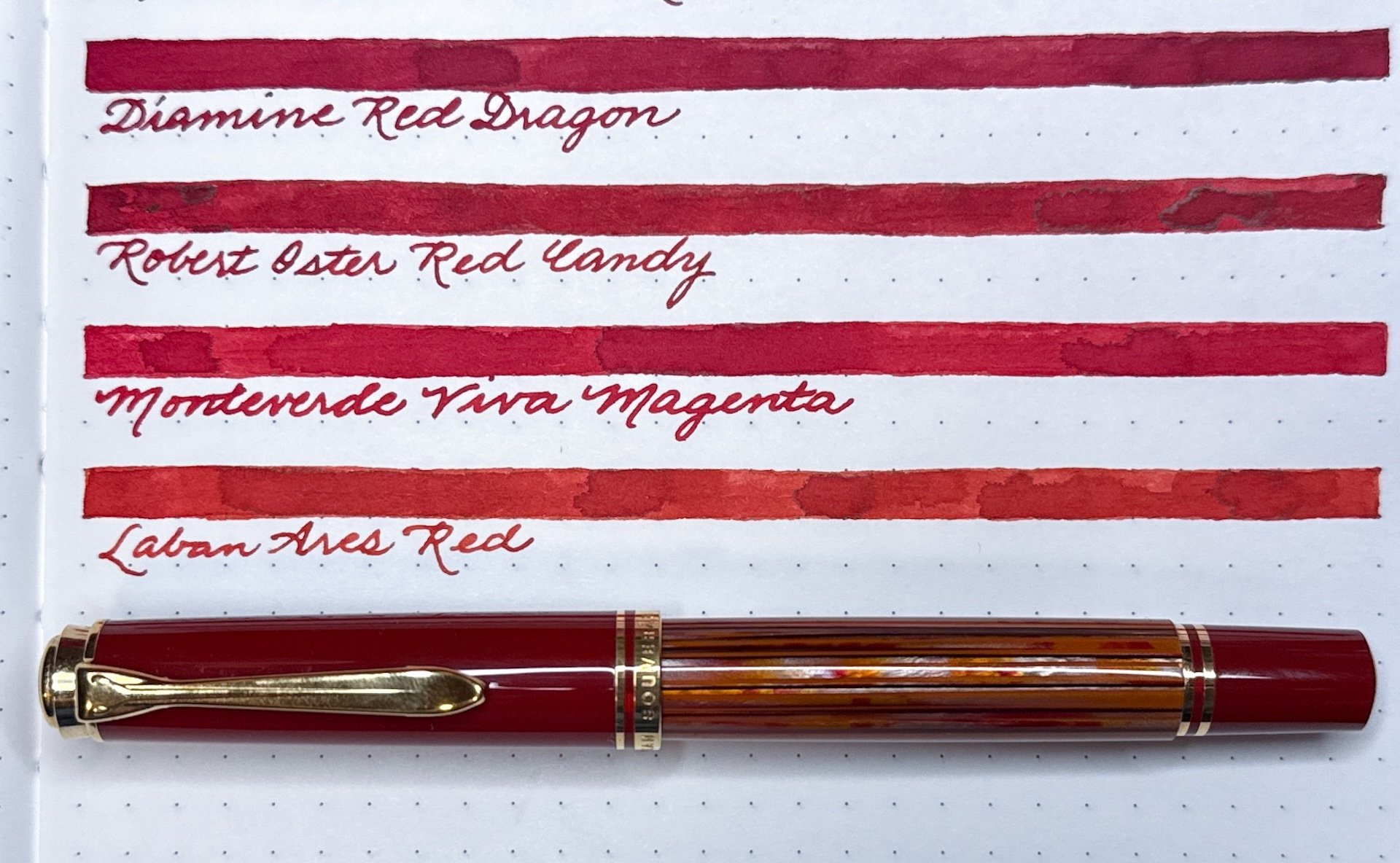
Another one from the Pelikan Hub, the M600 Red Tortoiseshell’s orange/black/red barrel needs a slightly orange leaning red, like Laban Ares Red.

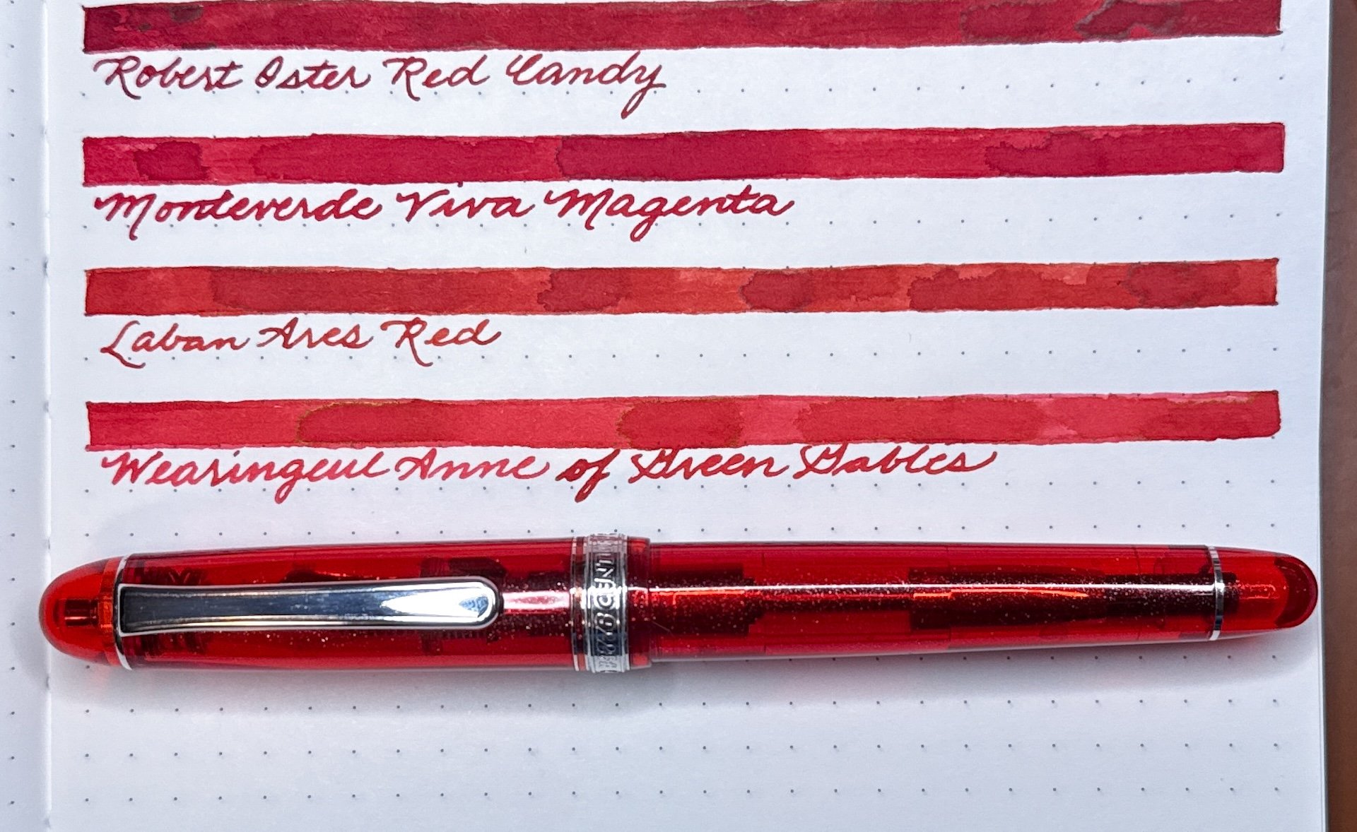
This Platinum 3776 Carnelian looks great with Wearingeul’s Anne of Green Gables, which has a greenish gold sheen with wetter pens.

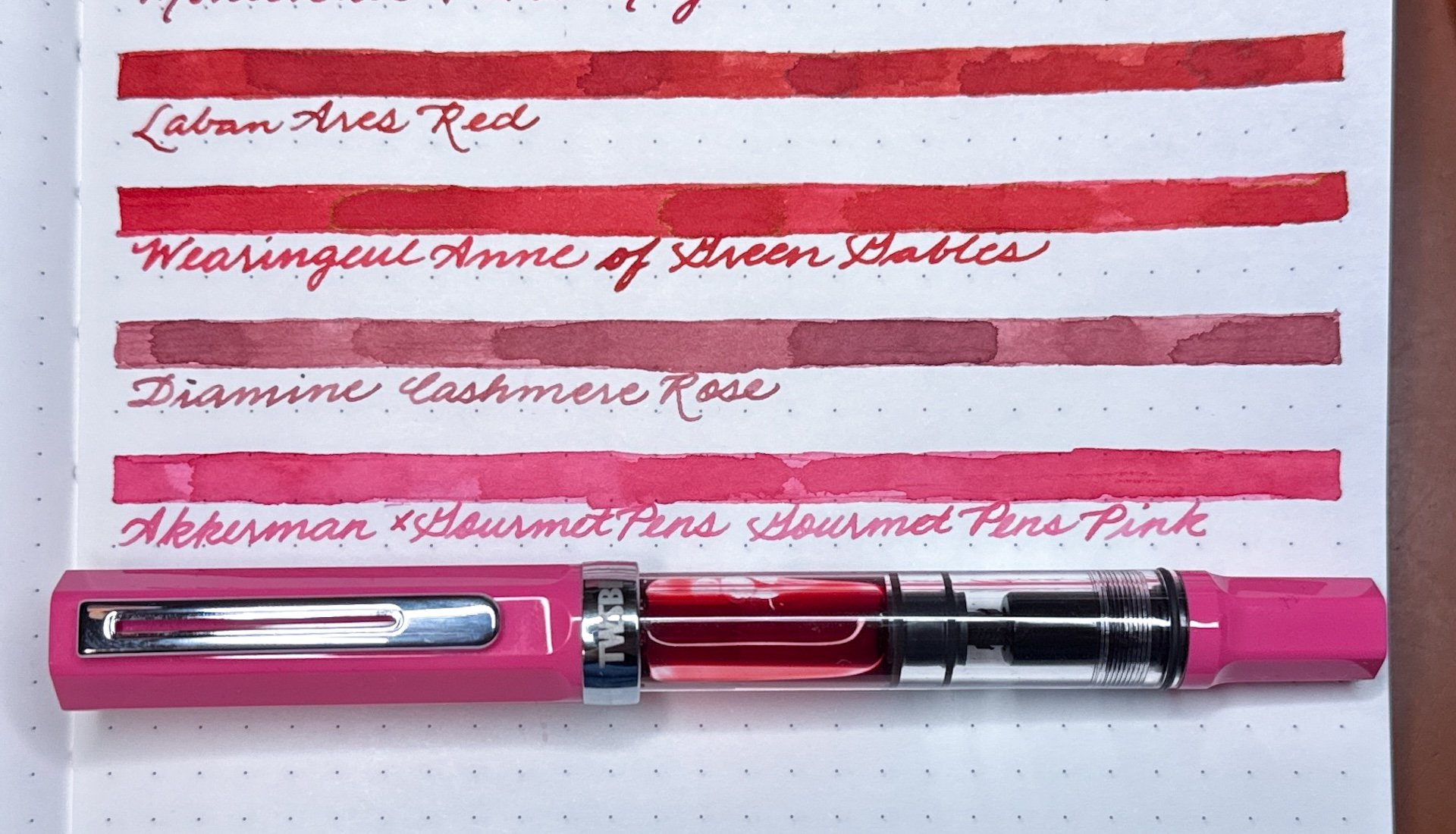
I haven’t busted this one out in a long time - the TWSBI 580 AL Pink (not to be confused with the ALR Punch Pink). It’s more red than pink, but definitely more pink than red. And that describes both the 580 and the Diamine Cashmere Rose ink.

TWSBI Eco Pink, which is a bright, almost neon, pink - perfect for a bright pink like Akkerman x GourmetPens’ GourmetPens Pink.

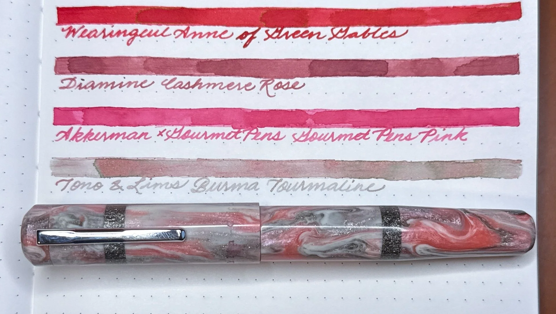
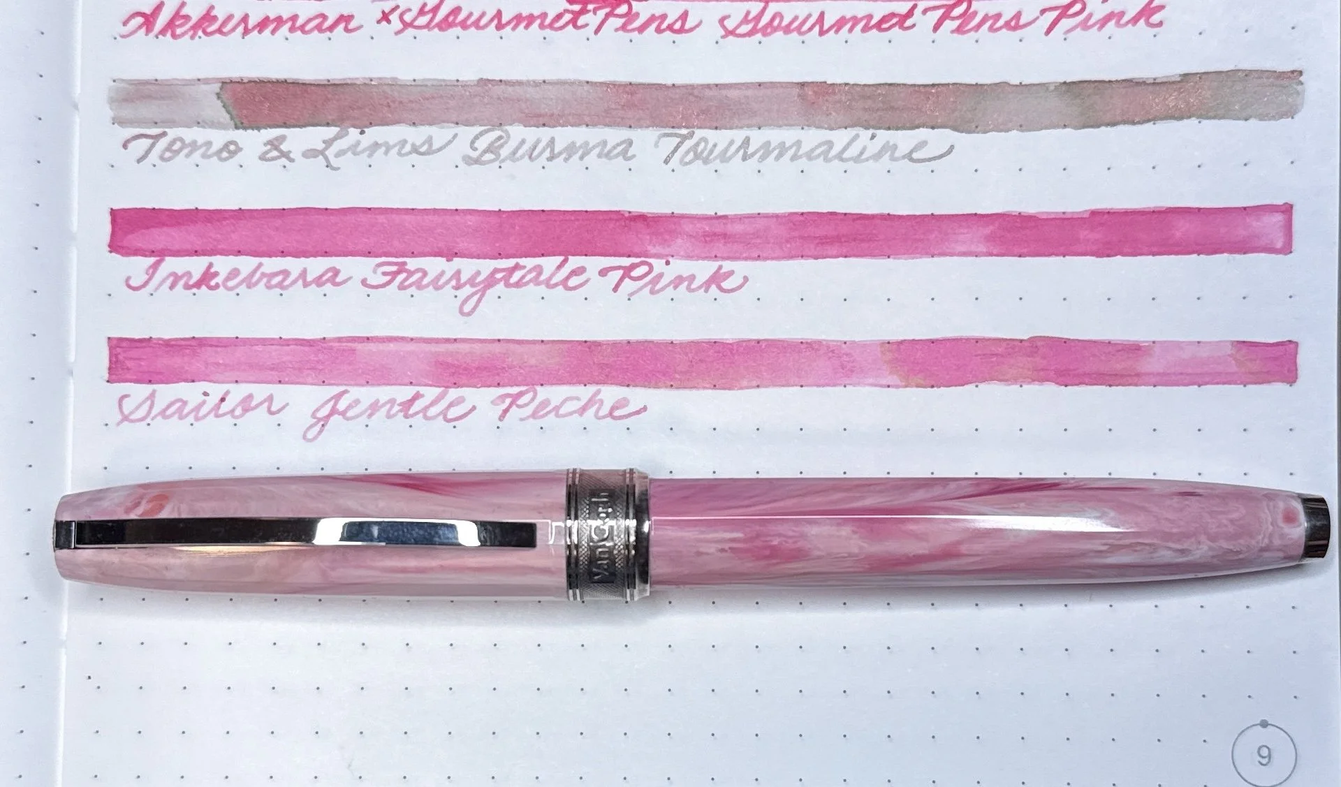
One of the weirder inks I own, the Tono & Lims Burma Tourmaline goes down grey, almost green, but it dries in shades of pink and grey.. It goes surprisingly well with the Franklin-Christoph 19 in a pink/white/silver prototype material.

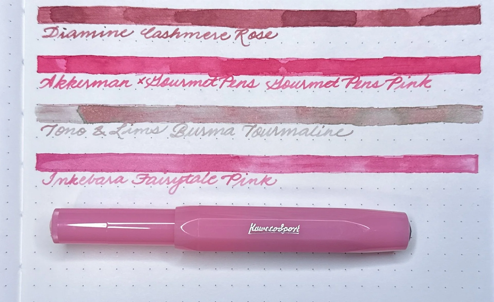
This bubblegum pink Kaweco Sport Blush Pitaya looks great with Inkebara Fairytale Pink.

The Visconti Van Gogh Souvenir du Mauve is pink, not mauve (which has more purple/grey undertones), and its namesake ink is more of a magenta, but Sailor Jentle Peche works well with the darker pink swirls in the material.

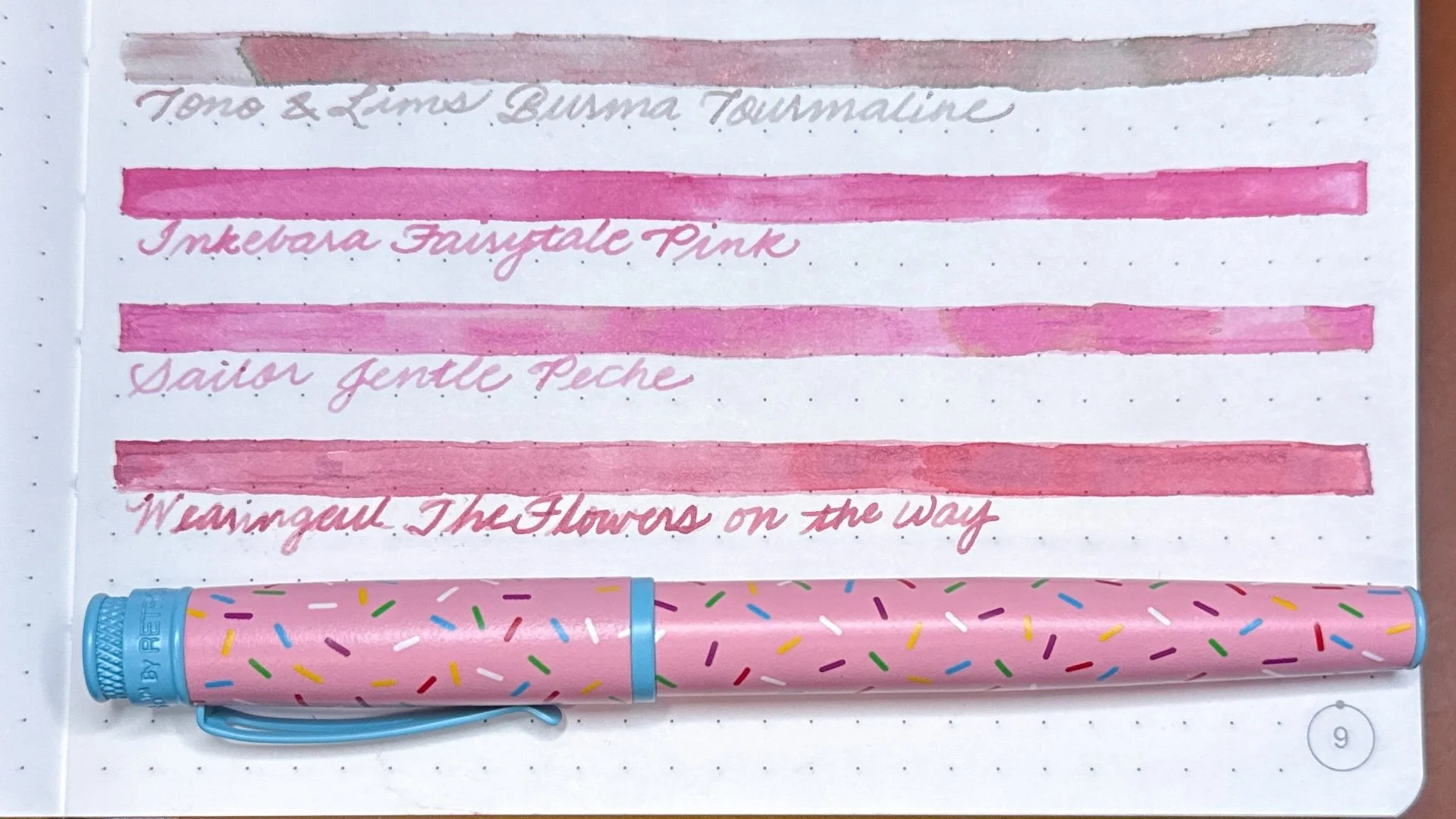
The last time I inked up this Retro 51 Sprinkle Ops pen, I put the above Inkebara Fairytale Pink ink in it, but I think it would look good with Wearingeul The Flowers on the Way even if it’s not the best match. It’s also showing up a bit more red in the picture.

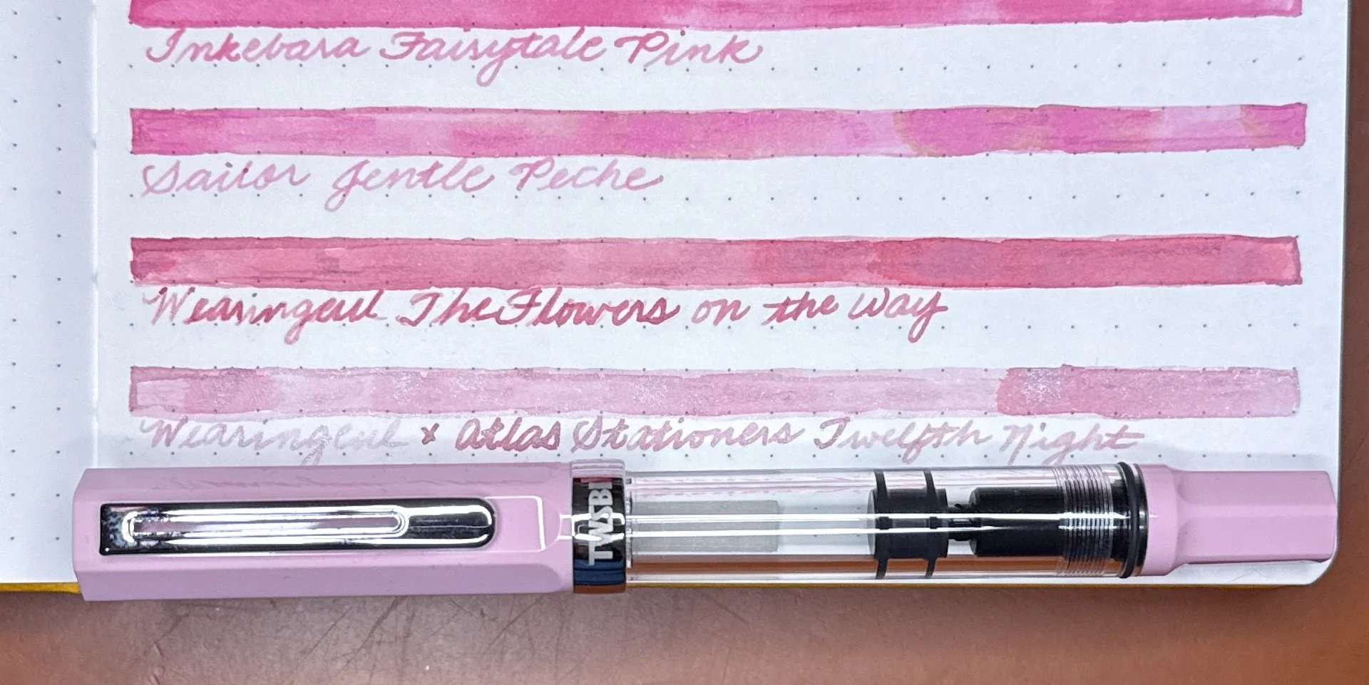
Wearingeul x Atlas Stationers Twelfth Night is a great match for the TWSBI Eco Pastel Pink.

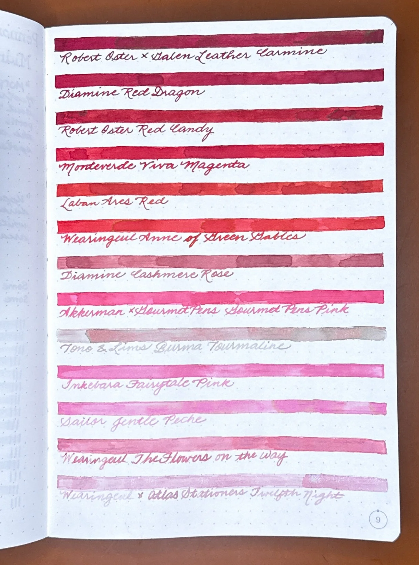
All the inks in the lineup (and wishing I put the Burma Tourmaline at the bottom).

After going through the exercise of picking the pens and matching inks, I definitely did NOT ink up everything. I’m nuts, but not that nuts! The Pura, Leonardo, Pelikan, and Platinum were already inked, but I just couldn’t refuse inking up a few more! It’s not inking up 14 red/pink pens, but it’ll have to do!

The final list: Kaweco Sport with Robert Oster Carmine, Pelikan Pura with Diamine Red Dragon, Leonardo Momento Zero with Robert Oster Red Candy, Pelikan M600 Red Tortoishell with Laban Ares Red, Platinum 3776 Carnelian with Wearingeul Anne of Green Gables, TWSBI 580 AL Pink with Diamine Cashmere Rose, TWSBI Eco Pink with Akkerman GourmetPens Pink, and Franklin-Christoph 19 pink/silver/white with Tono & Lims Burma Tourmaline.

Whether you celebrate Valentine’s, Galentine’s, Pal-entine’s, Lunar New Year, or you just wanted to see some red and pink inks, I hope you have a great February (and beyond)!


Enjoy reading The Pen Addict? Then consider becoming a member to receive additional weekly content, giveaways, and discounts in The Pen Addict shop. Plus, you support me and the site directly, for which I am very grateful.

Membership starts at just $5/month, with a discounted annual option available. To find out more about membership click here and join us!

Posted on February 6, 2026 and filed under Fountain Pens, Ink Samples.

Inks for the TWSBI ECO Plum with Onyx Fountain Pen

(Kimberly (she/her) took the express train down the fountain pen/stationery rabbit hole and doesn't want to be rescued. She can be found on Instagram @allthehobbies because there really are many, many hobbies!.)

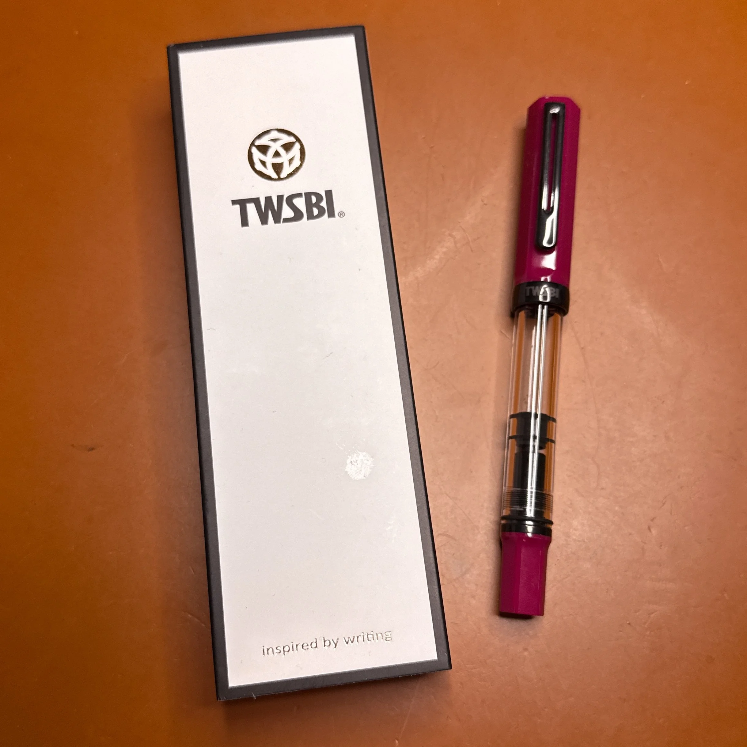
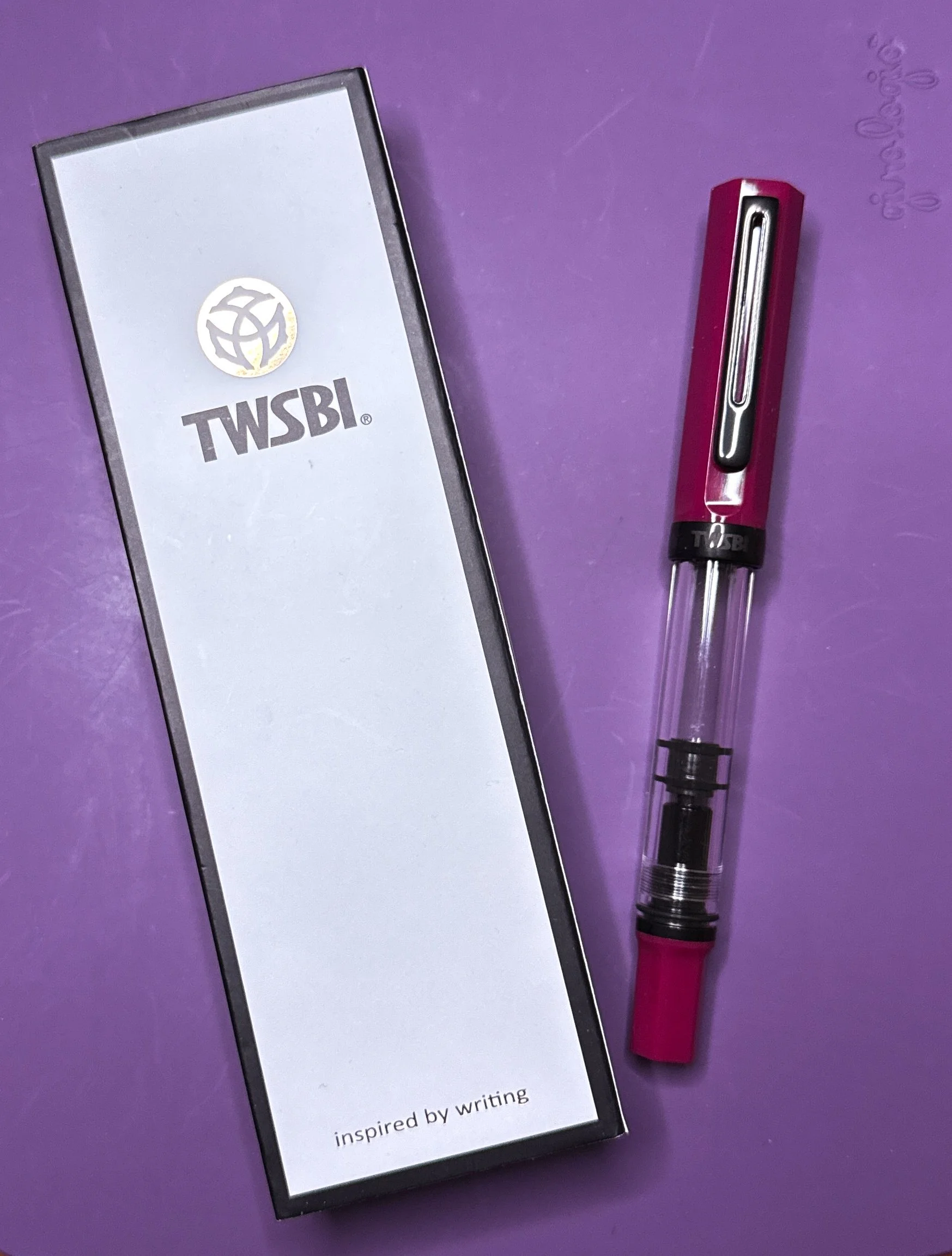
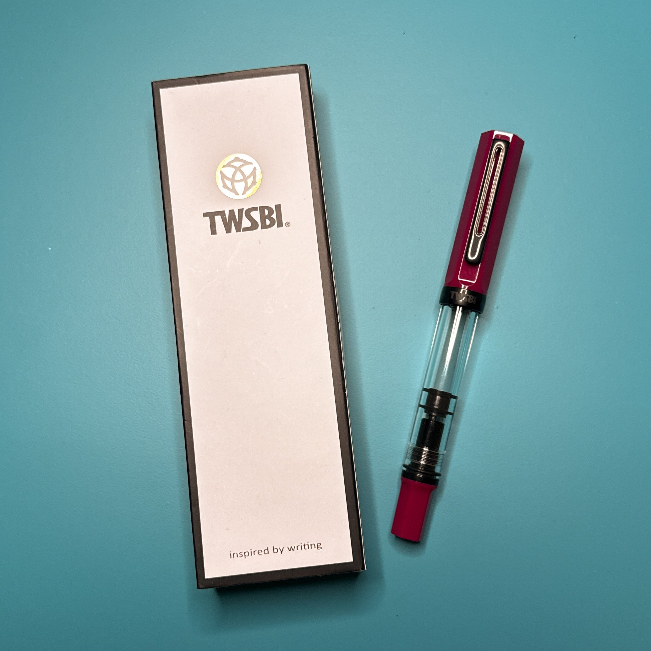
To no one’s surprise, I had to get the latest TWSBI Eco, the Plum with Onyx. It was difficult to tell what the color of the pen would be, since there were Eco photos with different tones of red, pink, purple, and magenta. So I thought it would be fun to walk you through my ink selection process so you can get a sense of the real color (no, I don’t do this for every pen, just some of them). Also spoiler: this pen really is difficult to photograph!

TWSBI Eco Plum with Onyx on Cognac Girologio writing mat.

Purple writing mat.

Grey writing mat.

Turquoise writing mat.

The best I can describe the color of the Eco Plum is that it is a magenta-ish color with a bit of pink and purple. The solo pictures make the Eco look more red than it is in real life, regardless of background (and yes, this is with some post-processing already - definitely not my strong suit). And despite using custom white balance with a grey card, the writing mat colors aren’t truly accurate either. This is one reason why ink and pen color photography can be difficult for us amateurs. Of the four photos, I think the closest is the one on the purple mat.

Next, I pulled a bunch of Col-O-Ring swatch cards from my collection and rather than compare the pen to the swatch card, I opted to swatch the inks in a 68 gsm Tomoe River notebook by Odyssey Notebooks. This way I could make sure the ink looks like it would on paper that I use quite often. As with my ink reviews, the swatches were made with a stainless steel Kakimori dip nib in a Kaweco clutch pencil holder.

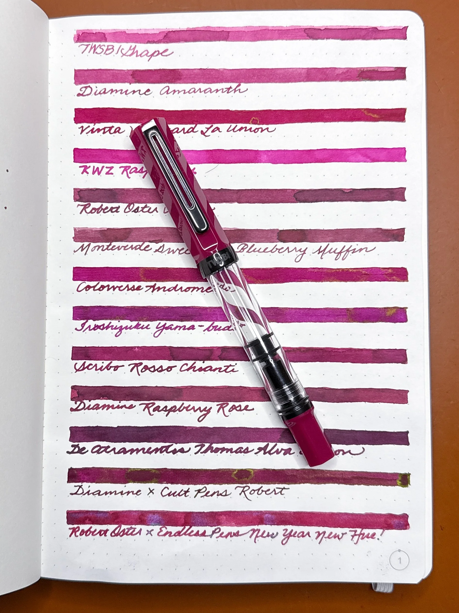
Inks from the top: TWSBI Grape, Diamine Amaranth, Vinta Vineyard La Union, KWZ Raspberry, Robert Oster Napa, Monteverde Sweet Life Blueberry Muffin, Colorverse Andromeda, Pilot Iroshizuku Yama-budo, Scribo Rosso Chianti, Diamine Raspberry Rose, De Atramentis Thomas Alva Edison (Black Red), Diamine x Cult Pens Robert, Robert Oster x EndlessPens New Year New Hue!

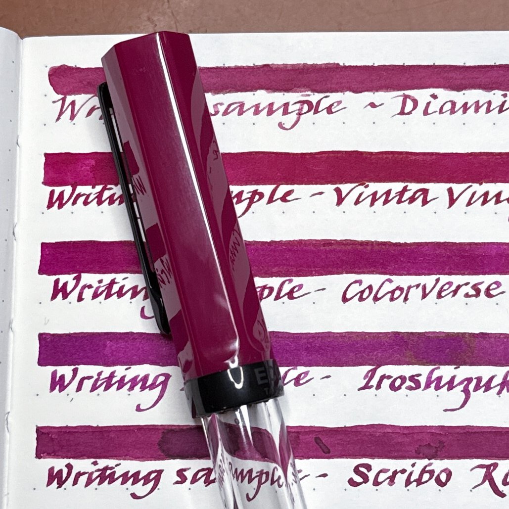
After I swatched all the inks and set the pen on top, it was pretty easy to see which ones were close but not close enough. Keep in mind that the closeup photos make the pen cap look darker than it does in real life.

TWSBI Grape, Diamine Amaranth, Vinta Vineyard La Union, KWZ Raspberry, Robert Oster Napa, Monteverde Sweet Life Blueberry Muffin, Colorverse Andromeda.

As much as I would’ve liked TWSBI Grape to be a match, it was too light and a bit too pink. KWZ Raspberry was more of a hot pink, while Robert Oster Napa and Monteverde Blueberry Muffin had some brown tones that didn’t work with the pen. The other three were possibilities.

Iroshizuku Yama-budo, Scribo Rosso Chianti, De Atramentis Thomas Alva Edison, Diamine x Cult Pens Robert, Robert Oster x EndlessPens New Year New Hue!

The Yama-budo was a touch too purple (thank goodness since I already have a pen inked with it), Raspberry Rose a wee bit too brown, De Atramentis was too dark and too purple (reminder that DA’s inks have a “line/theme name” like “Thomas Alva Edison” and a“base ink name” like Black Red). I liked the sheen of Robert and also the shimmer of New Year New Hue! How’s a girl to choose?! Reswatch for the next round!

Since I picked the 1.1 nib for the Eco Plum, I decided to use the Sailor Hocoro 1.0 stub dip nib to see if the ink looks better/different from a stub.

Diamine Amaranth, Vinta Vineyard La Union, Colorverse Andromeda, Iroshizuku Yama-budo, Scribo Rosso Chianti.

I already said Yama-budo was too purple but I must have really wanted to give it a second chance and yes, it’s still too purple for me. Diamine Amaranth was nice but it felt dry from both the Kakimori and Sailor Hocoro dip nibs. I really liked the Vinta, Colorverse, and Scribo from this batch.

Another look at Iroshizuku Yama-budo and Scribo Rosso Chianti, as well as Diamine x Cult Pens Robert, and Robert Oster x EndlessPens New Year New Hue!

The Diamine Robert was a really good match, but just a bit darker. The green sheen would’ve been fun though! The shimmer in the Robert Oster New Year New Hue! Was also really tempting but the base ink was a bit too light and too pink.

It was tough but I whittled it down to these two inks - Colorverse Andromeda and Scribo Rosso Chianti.

I could have gone either way with these two inks, but in the end, the Scribo Rosso Chianti won out because it was the right color and tone, and the Andromeda was just a teensy bit brighter. It also helps that I have a 90ml bottle of the Rosso Chianti and only a sample of the Andromeda.

Really happy with this combo - TWSBI Eco Plum with Onyx and Scribo Rosso Chianti!

(Disclaimer: I purchased the TWSBI at Flax Pen to Paper during Fountain Pen Day, all inks are my own, as well as the dip pens. The Odyssey Notebook was bought by the Bossman at a past pen show at regular price.)


Enjoy reading The Pen Addict? Then consider becoming a member to receive additional weekly content, giveaways, and discounts in The Pen Addict shop. Plus, you support me and the site directly, for which I am very grateful.

Membership starts at just $5/month, with a discounted annual option available. To find out more about membership click here and join us!
Posted on November 21, 2025 and filed under TWSBI, Fountain Pens, Ink Samples.

Do Less, Swatch More, Use More, Repeat

(Kimberly (she/her) took the express train down the fountain pen/stationery rabbit hole and doesn't want to be rescued. She can be found on Instagram @allthehobbies because there really are many, many hobbies!.)

I’ve been in a bit of a slump and it’s about all these inks I have around me. You see, I’m not only a Pen Addict, I’m an Ink Addict too. I absolutely love inks and matching them to pens is one of my favorite parts of this hobby. And while cutting back on ink purchases is probably never going to happen, I did tell myself that I needed to swatch more than I get. And so far, for 2024, I have failed miserably.

Why is this a problem? Because I don’t use what I don’t swatch. If an ink isn’t swatched, I don’t know what color it really is, and therefore, never ink it up because it’s not in my Col-O-Ring when I’m trying to match it to a pen. Not to mention, without the ink swatch, I sometimes forget I even have it, eek! I can hear my friend Judy, aka Tokubetsumemori yelling at me to “use your stuff!” (except she doesn’t say “stuff”, lol). I have added another 42 inks to my stash since January but I’ve only swatched 7 inks. Oof, going in the wrong direction here! To be fair, some of those inks were added for review (I put them in my Fountain Pen Companion account so I don’t accidentally buy inks that are in the review queue), and some of those inks were samples and not bottles, but still! I probably swatched about 200 inks in 2023 (and I’m nowhere near done), so 7 in the first 5 months of the year is not good progress.

This is just one of several overflowing bins of inks waiting to be swatched.

Now, this isn’t meant to be a “wah, woe is me, I have so many inks” article. I am VERY fortunate to be able to surround myself with all these fun inks. But, I have had zero desire to swatch the very thing that I really enjoy. I asked myself why not? What is holding me back and where did the motivation go? I’d feel much less guilty about getting more inks if I swatched more inks, because swatching leads to using and using leads to writing and pen play! I wanted to get back to swatching cuz let’s face it, there are some gorgeous inks being released (a bit too often, if you ask me and my wallet) and I’m not getting them because of my huge backlog! Note that this feeling doesn’t apply to doing swatches for reviews, by the way, since I have a plan for those and it’s usually limited to one or two inks (except when I’m being crazy and do 8 for a review, lol).

So I took a step back and looked at my process and omg, no wonder I don’t want to do this any more. You can read about it in more detail in my 2021 article about swatching, but here’s a quick summary with one addition:

  1. Swatches on 2 Col-O-Rings (one is for sorting by brand, the other by color)
  2. Little swatch and writing sample on 52 gsm Tomoe River insert
  3. Little swatch and writing sample on 75 gsm Cosmo Air Light
  4. Longer swatch and writing sample on 68 gsm Tomoe River notebook
  5. Circle swabs in a blank 52 gsm TR notebook, organized semi-randomly by brand, color, ink properties

Uh, that’s a lot.

Yeah, a 5 step process for swatching 1 ink (6, if you count the 2 Col-O-Rings separately). No wonder I didn’t want to do this any more! It takes a lot of time, and if I’m being honest, I rarely, if ever, use any of the inserts/notebooks as reference points. So why am I doing it? Honestly? I have no idea.

And since no one is the boss of me (except maybe the Bossman, but he doesn’t boss my swatching, lol), I’ve made the executive decision to cut back on all these steps. I’m going to just make the 2 swatches on my Col-O-Rings, with some occasional swatching on Wearingeul cards (I am thinking of swatching all my Wearingeul inks on their swatch cards). Sounds easy enough, but the hard part is telling myself that it’s ok that I spent all that time doing them all these years (I used to enjoy doing this). It will also be a little tough not regretting the decision to stop doing the extra steps. I know that it might feel weird at first, but I know that I will feel so much better when I make faster progress. And down the road, if I change my mind, I can always resume those added steps for inks moving forward, cuz I sure as heck am not going to go back and re-swatch inks I’ve already done.

The journey of a thousand swatches begins with a single swatch (well, technically two, lol.)

Heck yeah! One down, next!!

Wow, Kimberly, all those words just to reach the conclusion that (1) you’ve been kinda nuts doing all this and (2) that you don’t have to do all those things anymore? Yeah. Because change is hard, especially if it was something we once found enjoyable. Because second guessing ourselves is easier. Because it’s much easier to avoid making a decision to get back on track. Because procrastination, denial (especially of an ever-growing backlog and shopping cart) and inertia are real. And because we aren’t always kind to ourselves when “current us” isn’t loving the decisions that “past us” made.

So, to anyone (including me) who needs to hear that it’s ok to change your mind, change direction, change steps, take a deep breath and regroup, etc., I’m telling you that “it’s ok” (or you can imagine Judy telling you to “use your stuff”) - whatever helps you make this hobby enjoyable again. Now, let’s get swatching!

(Disclaimer: All items were purchased by me from various vendors.)


Enjoy reading The Pen Addict? Then consider becoming a member to receive additional weekly content, giveaways, and discounts in The Pen Addict shop. Plus, you support me and the site directly, for which I am very grateful.

Membership starts at just $5/month, with a discounted annual option available. To find out more about membership click here and join us!
Posted on May 17, 2024 and filed under Ink Reviews, Ink Samples.