When I first heard of Kakimori, I couldn’t imagine a place more magical. You’re telling me there is a shop in Japan where you can build your own notebook from dozens, if not hundreds of options? And you can mix your own ink color from a rainbow of liquid gold? This is a fantasy land right?
No. It’s Kakimori.
Kakimori has held a special place in my heart since that time, but I wasn’t sure I’d ever have the opportunity to try their products. That changed several years ago when they made their Dip Pen Nibs available around the world. The popularity of these nibs has not slowed since, and I believe that success allowed Kakimori to branch out even more with inks, pens, and accessories.
One of the features that remains core to the Kakimori in-store experience is the ability to build your own notebook. My friend Sam took A Stationery Trip to Japan last year, and was kind enough to make me a notebook. He goes through the details in the linked post, and while a proper review of a hand-picked, one-of-one, notebook may not be necessary, I did want to share a few notes about the end result.

Kakimori Japan. (Image via Sam Alpert.)
For starters, Sam detailed the process in an email to me, which didn’t make it into the final article. I thought I would share this bit for those of you who may be lucky enough to make the journey in the future:
- get a small tray almost like a lunch tray
- there's a paper testing station with small squares of the various papers to help you see what you'd like.
- then go to the wall of papers and pick up to 4 kinds (I think packets are 20 pages ea.)
- go to the wall of covers (there's all kinds including leather, and the custom art ones by local artists like the one I got you)
- pick binding method (string and puck or snap)
- pick colors of materials for binding method (like I literally got to pick the string color)
- pick binding type (full spiral, partial like yours) including color of metal
- pick corner hardware if desired (including color of metal)
- pick any additional inserts (like the envelope in the back of yours)
- wait for them to bind it!
I don’t know about y’all, but I’m ready to book a trip now!
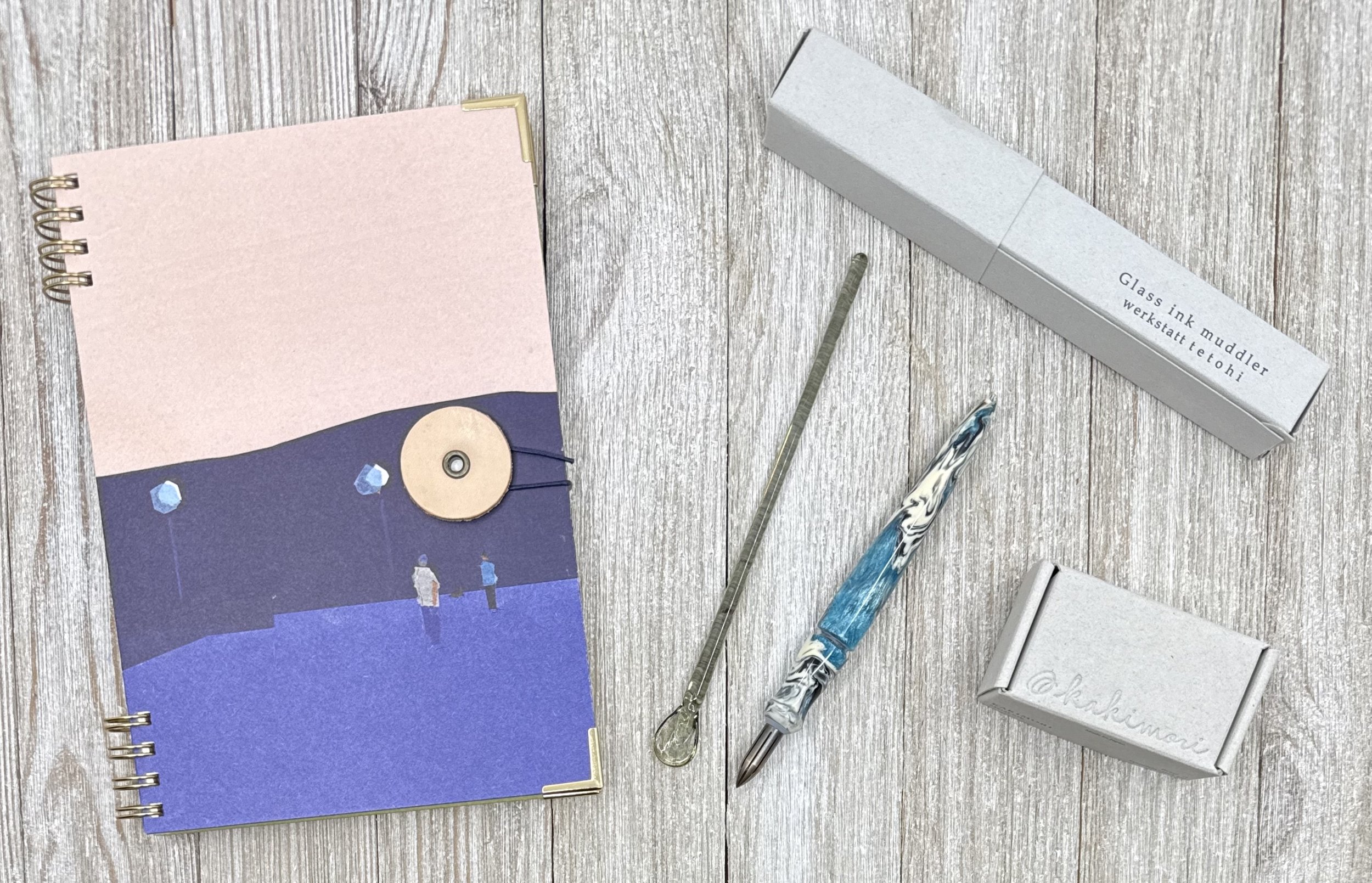
My B6 notebook features cover art by Taku Bannai, and two different paper sections using Conqueror Laid in the front half and Neue Grey in the back. The orange envelope inside the back cover is awesome, and I adore the string tie enclosure on the front. I’ll admit to being a little too precious in using it, but now that I have “review closure,” I feel like I’m ready to give it a proper go.
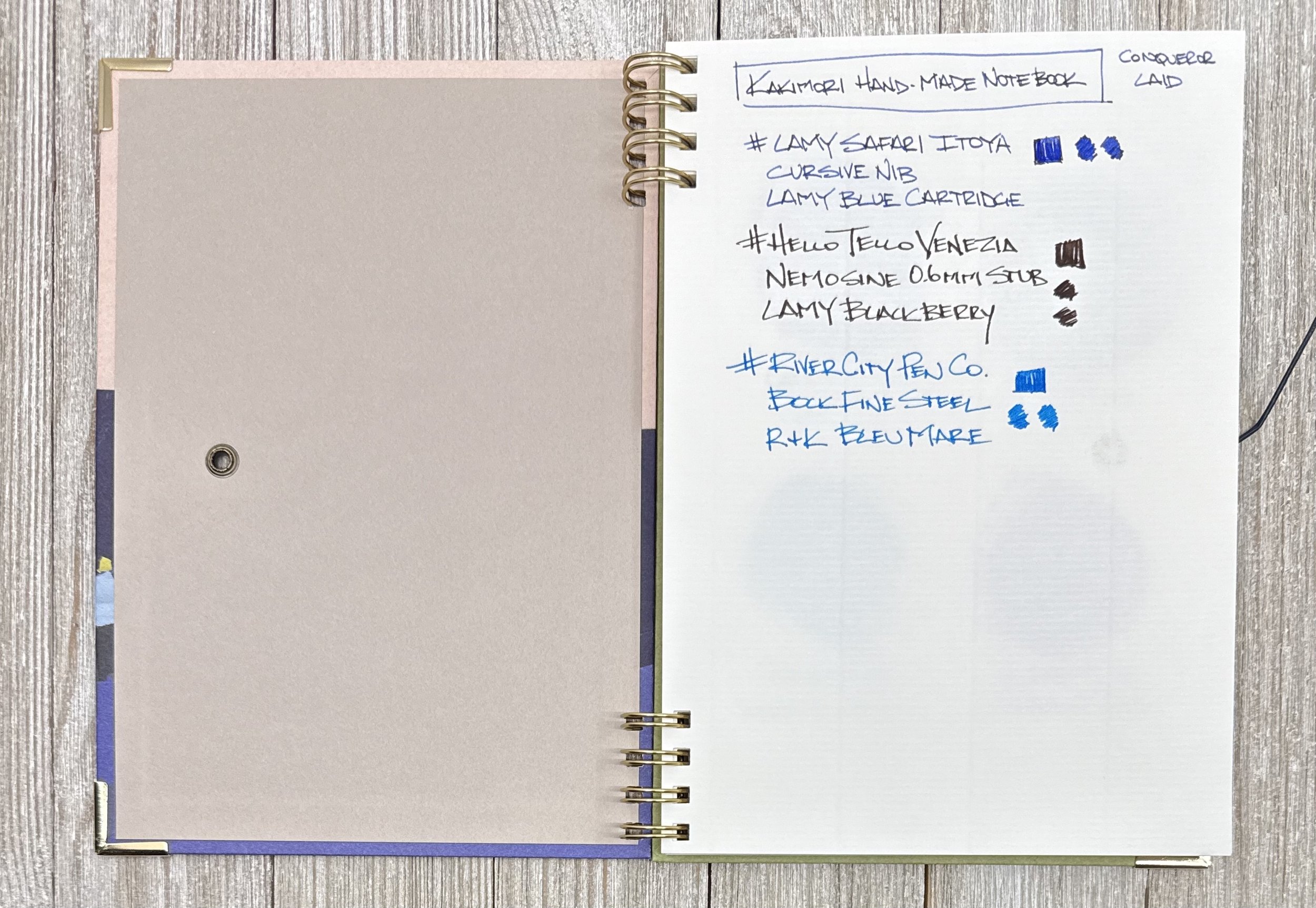
Conqueror Laid Paper. Good for fountain pens, but bumpy - a feature of laid paper.
While this fully customizable experience is only available at Kakimori, their website does offer many other notebook options, which look spectacular in their own right.

Neue Grey Paper in the back half of the notebook. Super smooth and fun to use.
As part of this write-up, I was planning on discussing the Glass Ink Muddler I picked up from Kakimori in-person at last year’s Stationery Fest, but it appears that it is Unobtainium.
Made in collaboration with Tokyo-based maker Werkstatt Tetohi, it was tough for me to find any information on this product. In fact, this is the only online image I’ve come up with so far, despite Kakimori having several for sale in Brooklyn during my visit.
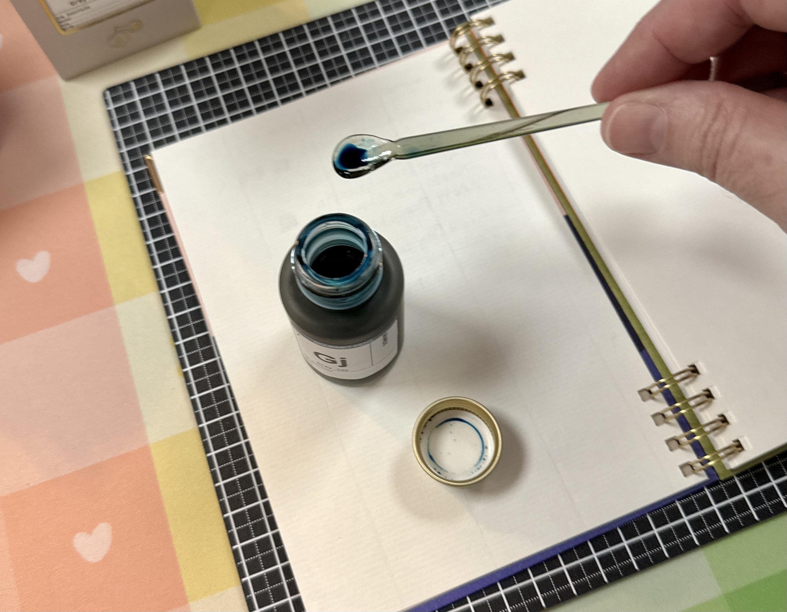
This model is marked as “Gray” and I think there was a Green one available at the time as well. This is a fun product for those of us that like to get inky. Given its shape, a wider ink bottle opening works better in allowing more ink to collect in the spoon-shaped tip. Or you can tilt the bottle slightly … at your own risk.

Muddler swatches on Conqueror Laid. No feathering or bleed even with heavy ink. Antique Brass Dip Nib fitted in a River City Pen Co. Dip Nib Holder.
I keep my Muddler with my other ink testing accessories - yes, including the new-ish Antique Brass Dip Nib. I appreciate Takuma Hirose, owner of Kakimori, gifting me with this nib at Stationery Fest. I had the pleasure of interviewing him at the event, which you can check out here.
With the recent launch of their own Fountain and Rollerball pens, I love seeing Kakimori continue to grow. I can’t wait to see what they come up with next.
Enjoy reading The Pen Addict? Then consider becoming a member to receive additional weekly content, giveaways, and discounts in The Pen Addict shop. Plus, you support me and the site directly, for which I am very grateful.
Membership starts at just $5/month, with a discounted annual option available. To find out more about membership click here and join us!