Posts filed under Anderillium

A Trio of 2025 Chicago Pen Show Inks

(Kimberly (she/her) took the express train down the fountain pen/stationery rabbit hole and doesn't want to be rescued. She can be found on Instagram @allthehobbies because there really are many, many hobbies!.)

One of my favorite things to get at a concert, show, event, or shop, is something that reminds me of the occasion, whether it’s a t-shirt, bag, or sticker that makes me remember that event. In the case of pen shows, it’s no surprise that I am a sucker for show-exclusive inks!

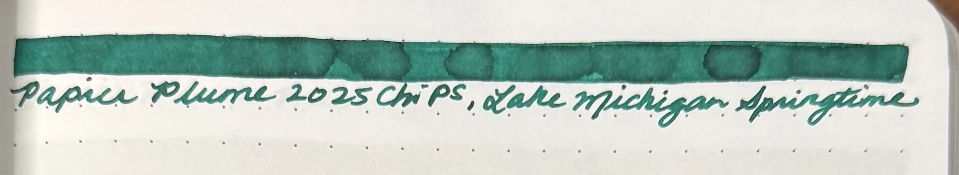
At the 2025 Chicago Pen Show, I bought several bottles of ink, but 3 of them were specifically made for this show! The first one is the official show ink, Windy City Blue, made by Colorverse to celebrate the show’s 45th anniversary. The second one is Papier Plume Lake Michigan Springtime. And last, but not least, is Anderillium’s Chicago River Green.

Note: I add swatches to similar color family inks in both the Hobonichi Weeks and 68 gsm Tomoe River notebook. Unlike the Col-O-Ring swatch card comparisons, the Weeks and TR swatches might not be that close to the ink in question.

2025 Chicago Pen Show Inks

L to R: Colorverse Chicago Pen Show 45th Anniversary Windy City Blue, Papier Plume Lake Michigan Springtime, Anderillium Chicago River Green.

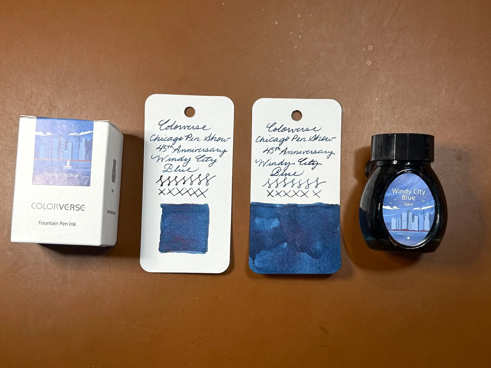
Despite the box and bottle’s lighter blue color, the Windy City Blue is more of a darker blue-leaning teal.

You can see a hint of red/purple sheen in wetter parts of the swatch and writing sample.

Swatch/writing sample of Windy City Blue on 2022 Hobonichi Weeks, which has slightly cream-colored paper, along with Anderillium Indigo Bunting Blue, Montblanc Leo Tolstoy, Montblanc StarWalker Blue Planet.

Swatch/writing sample on 68 gsm Tomoe River Endless Recorder notebook. Accidentally added an “s” to the ink name, oops.

Inks similar to Windy City Blue: Rohrer & Klingner Verdigris, Robert Oster Lake of Fire is the closest match, Van Dieman’s Hanging Lake, New Brew Space, and Robert Oster Great Southern Ocean are also close but a touch too blue.

I’m eager to put Windy City Blue in either the Sailor x Cult Pens Pro Gear Slim, Midnight Sky Blue or the Leonardo x Figboot on Pens Momento Zero, Carolina Midnight.

I love that Papier Plume dips their ink bottle caps in wax and then stamps the top.

My swatches of Papier Plume Lake Michigan Springtime look fairly green but I’ve seen some swatches where it has more teal to it. I double checked with some friends who agreed that theirs is also more green in real person but looks a bit more teal in photos.

First/only swatch/writing sample of Lake Michigan Springtime in the Hobonichi Weeks. This looks more teal than on the Col-O-Ring cards.

A green leaning teal on TR 68, but still fairly green.

Inks similar to Lake Michigan Springtime: Waterman Harmonious Green, Jacques Herbin Vert Metropolitain, Wearingeul Tick Tock Croc, Diamine Velvet Emerald, Iroshizuku Sui-gyoku (this and the Diamine are a touch too blue), Diplomat Deep Green (a bit too dark.)

The Kaweco x GoldSpot Pens Sport, Transparent Turquoise (which is way more of a teal than turquoise), and the greenish parts of the Aurora Optima, Azzurra are both good matches for Lake Michigan Springtime.

Anderillium Chicago River Green is a pleasantly bright, spring green ink.

Chicago River Green in the Hobonichi Weeks along with Pennonia x Inkdependence Hens & Chicks and Anderillium Green Kingfisher Green.

Inks similar to Chicago River Green: Diamine Appletini (too yellow), Papier Plume 2019 SF Pen Show Marina Green, Robert Oster Envy (both of which are close but still too yellow), Organics Studio Frog Green Shimmer, Diamine Merry & Bright (the closest), Van Dieman’s Wasabi (second closest.)

Anderillium Chicago River Green would look great in the Taccia Spotlight Forest Eye or the Kaweco x Cult Pens Apple Green.

Even though I can find similarly colored matches for all 3 inks, I still love having them as souvenirs of this year’s Chicago Pen Show. The inks cost $15-20 per bottle and are a great way to remember a fun pen show. If you didn’t get a chance to snag them, you can reach out to Roger Wooten, (show organizer) to see if they are willing to sell/ship the Colorverse ink. You can order Anderillium Chicago River Green from Atlas Stationers. Papier Plume is currently sold out of Lake Michigan Springtime but you can add it to your wishlist in case they decide to make more.

(Disclaimer: All 3 inks were purchased by me at the show at regular price.)

Posted on May 23, 2025 and filed under Anderillium, Colorverse, Papier Plume, Ink Reviews.

Anderillium Avian Series Fountain Pen Ink Review

(Kimberly (she/her) took the express train down the fountain pen/stationery rabbit hole and doesn't want to be rescued. She can be found on Instagram @allthehobbies because there really are many, many hobbies!.)

I have reviewed all of the Anderillium Cephalopod Inks and the Lepidopteran series so I told the Bossman that I might as well review the Avian series, too! The Avian Series is actually the first series from Anderillium Inks so it definitely needed to be done!

The 8 inks in the Avian series (named for various birds followed by the ink’s main color) are as follows: Pompadour Cotinga Burgundy, Roseate Spoonbill Pink, American Goldfinch Yellow, Green Kingfisher Green, Indigo Bunting Blue, Purple Gallinule Purple, Shoebill Stork Grey, and Common Loon Black. Most people have seen the inks in 1.5 ounce (44ml) sealed glass “jam” jars, but their ink sets are also available in 0.5 ounce (14.5ml) “sample” bottles.

Pack of 8 sample bottles from the Anderillium Avian Series.

I like that there are bird stickers on top so you can tell the ink color. The regular size bottles have stickers on the boxes, but not the bottles.

As usual, all swatches were done on Col-O-Ring cards using a Kakimori steel dip nib and writing samples were done primarily with a Lamy Vista with a steel Medium nib and a TWSBI Go with a Medium nib. The notebook used for writing samples is from Endless Recorder with 68 gsm Tomoe River paper. Dry times for the Vista are shown with “(V)” and the Go will be shown below that with a “(T)”. Dry times may be a bit slower on 52gsm TR or faster on more absorbent papers like Rhodia, copy paper, Cosmo Air Light, or with drier or finer nibs.

Anderillium Avian Series.

Swatches from the Cephalopod series (left) with the Lepidopteran series (right.)

Pompadour Cotinga Burgundy is a dusty pink that isn’t as dark or red as what I think burgundy should look like. I think of burgundy as a wine-colored red and this is a bit more pink. It is still a nice color but the naming does throw my brain off a bit. It was slightly dry in the Vista and had pretty fast dry times with both pens. There is some shading and no sheen.

Pompadour Cotinga Burgundy writing sample.

You can see the Pompadour’s shading from the Vista (top) versus a more saturated writing sample from the Go.

Chromatography from Pompadour Cotinga - I would have never guessed that this muted pink would have such bright bright pinks, coral, and turquoise on top!

Inks similar to Pompadour Cotinga: DeAtramentis Blackberry, Montblanc Antoine de Saint-Exupery, Rohrer & Klingner Alt-Bordeaux, Diamine Tyrian Purple (a bit too much purple), Diamine Forest Gateau (too dark.)

Roseate Spoonbill Pink is a bright, neon/hot pink that dries pretty quickly in the Vista, and flows well in both pens. There is minimal shading in the Vista and no sheen.

Roseate Spoonbill Pink writing sample.

The ink is lighter from the Vista but it isn’t much of a shader. I really liked the bright pink lines from the Go.

Not a whole lot to this chromatography - it’s straight up hot pink all the way.

Inks similar to Roseate Spoonbill Pink: Diamine Hope Pink and Bungubox Sweet Love Pink. Iroshizuku Kosomosu and other bright pinks weren’t the right shades (often too orange) or brightness.

American Goldfinch Yellow is a very yellow ink - I wish I had swatched this before recording the AskTPA episode 660 with the Bossman about ROYGBIV inks! It is almost unreadable in the drier Vista, and while readable from the Go, it’s just too bright to be read comfortably for very long. I think it’d make a great ink for art though! It had an average flow, average dry times, and not much shading.

American Goldfinch Yellow writing sample.

The Vista writing sample is actually lighter in real life than in this picture which is actually quite readable. It’s still a lot of yellow going on. I can’t imagine reading an entire page of this ink.

Yep, yellow and not much else on this chromatography strip.

Inks similar to American Goldfinch Yellow: Blackstone Golden Wattle (rip Blackstone ☹️), Colorverse Golden Leaves, Colorverse Project Series #8 Ornament Yellow, Pilot 100th Anniversary Daikokuten.

Green Kingfisher Green is what I would call an algae green. It isn’t yellow enough to be olive but it’s also not a regular green or forest green. It had average dry times of 30 seconds with a bit of shading from the Vista.

Green Kingfisher Green writing sample.

More shading from the Vista (top) than the Go, which produces not-quite forest green lines.

The Vista swipes (odd) had an almost blue hue to it, while the Go swipes (even) were more of a light forest.

I would have never guessed that Green Kingfisher Green would produce peach and turquoise colors in its chromatography! If I hadn’t done these one at a time, I would have assumed I mixed this up with a different ink!

Inks similar to Green Kingfisher Green: Diamine Oliva , Diamine Salamander, and Bungubox Dandyism were too brown, Montblanc Homage to Brothers Grimm Green is the closest, and Robert Oster Eucalyptus Leaf is close but too dark.

Indigo Bunting Blue is a nice blue that isn’t royal blue or school blue but isn’t a blue black either. It ranges from a light to dark navy depending on the pen’s flow. It dries quickly for the Go but average dry times for the Go. Some shading with the Vista but not as much with the Go, and no sheen.

NOTE: There were issues with the dyes in early bottles of Indigo Bunting Blue and Adonis Butterfly Blue (from the Lepidopteran series) such that the blue component disappeared and the color was off. While the inks were safe to use, they were just the wrong colors. Please reach out to Anderillium if you’re experiencing issues with either of those bottles and they will happily replace them.

Indigo Bunting Blue writing sample.

I liked both the lighter and darker navy colors that you can get from drier and wetter pens.

What an interesting mix of purple (bottom), pinks, and turquoise to produce this colorful chromatography.

Inks similar to Indigo Bunting Blue: J Herbin Bleu Nuit (too “royal”), Colorverse Saturn V (the closest), Diamine Shimmering Seas (also fairly close but the shimmer changes the color a bit), J Herbin Bleu des Profondeurs (a bit more blue-black but still close.)

Purple Gallinule Purple is a blue leaning lavender and purple (depending on wetness of pen). There is a hint of chromashading with the drier Vista and no sheen. It had fast to average dry times.

Purple Gallinule Purple writing sample.

The chromashading is very faint in the drier writing sample (top) but it has nice shading, especially when printing.

Kinda cool to see the purple lines while the swipes of color are blue/bluish purple.

Hot pink chromatography starting from the bottom and ending with turquoise up top.

Inks similar to Purple Gallinule Purple: DIamine Rainbows End, Robert Oster Purple Sunset were a bit too purple, while Kobe 56 Rokko Shichidanka, Bungubox Blue Purple Morning Glory, and Pennonia Arcaska are closer while still being a bit too purple.

Shoebill Stork Grey is a light to medium grey ink with some nice shading in the drier Vista. It had fast dry times and no sheen.

Shoebill Stork Grey writing sample.

Fairly neutral light and medium grey lines with shading in the Vista and less in the Go.

Some grey and a touch of blue in Shoebill’s chromatography.

Inks similar to Shoebill Stork Grey: Vinta Clouds of Grey Pagtangi (shimmer), Sheaffer Bling, Iroshizuku Kiri-same (had a bit too much “brown,”) Diamine Ghost, Visconti Old Vineyard with Peasant Woman, and Iroshizuku Fuyu-syogun was close but too “cool” in tone.

Common Loon Black is more of a grey/dark grey ink as opposed to a black ink. Even with the wetter Go, it is still more grey than black. There is shading from the Vista, but no sheen from either. Dry times were average for both pens.

Common Loon Black writing sample.

The top writing almost has a hint of blue to its grayness. Neither are particularly black.

Similar to Shoebill Stork Grey’s chroma, but more of it. More grey at the bottom and more turquoise up top.

Inks similar to Common Loon Black: Wearingeul Romeo and Colorverse Lucky Star II. It didn’t match any of the grey inks I have and it’s not black enough to match any of my black inks either.

As with the other two series, all of the inks behaved well, and cleaned out easily. I continue to enjoy seeing how different pens can produce such different results with the same ink.

If I had to pick favorites in the bunch, they would be Purple Gallinule Purple in a dry writer because of the lovely chromashading and Green Kingfisher Green because it’s unlike many of the greens I have in that range. I think the colors are nice and they are worth the purchase if you don’t already have similarly colored inks. I do think the inks are fairly “straight forward”, compared to shimmer or sheening inks. The Purple Gallinule Purple is the only purple out of the 3 sets (maybe the upcoming Ichthyoformes series will have a purple? Pretty please?)

Anderillium inks sell for $14.50 per 1.5 ounce bottle, or $50 for 0.5 ounce sample sets of all 8 inks. They can be purchased directly from Anderillium Inks or from authorized resellers.

(Disclaimer: Brad purchased all of these inks at normal price directly from Anderillium.)

Posted on May 2, 2025 and filed under Anderillium, Ink Reviews.

Anderillium Lepidoptera Ink Review. Yes, All of Them.

(Kimberly (she/her) took the express train down the fountain pen/stationery rabbit hole and doesn't want to be rescued. She can be found on Instagram @allthehobbies because there really are many, many hobbies!.)

Last year I went a little nuts and reviewed all of the Anderillium Cephalopod Inks and thought I’d do the same with the latest Lepidopteran series too! This third series of inks was released at the DC Pen Show back in August (the two others are Cephalopod and Avian). Lepidoptera is an order of insects that includes both moths and butterflies.

The 8 inks in the Lepidopteran series are as follows: Rosy Maple Moth Pink, Viceroy Butterfly Orange, Atlas Moth Brown, Tolype Moth Warm, Luna Moth Green, Queen Alexandra’s Birdwing Butterfly Green, Adonis Butterfly Blue and Banded King Shoemaker Butterfly Blue. The inks come in 1.5 ounce (approx. 44 ml) sealed glass jars that look like adorable little jam jars.

All swatches were done on Col-O-Ring cards using a Kakimori steel dip nib and the non-brush end of a paintbrush and writing samples were done primarily with a Lamy Vista with a steel Medium nib, and later also with a TWSBI Go with a Medium nib. The notebook used for writing samples is from Endless Recorder with 68 gsm Tomoe River paper. Dry times may be a bit slower on 52gsm TR or faster on papers like Rhodia, copy paper, Cosmo Air Light or with drier or finer nibs.

Comparison of the Cephalopod series (left) with the Lepidopteran series (right.)

Rosy Maple Moth is a bright pink that isn’t quite bright enough to be a “hot pink”. It doesn’t have as much coral to it as similarly colored inks. It was slightly dry in terms of wetness and pretty fast dry times. There is some shading and no sheen.

Inks similar to Rosy Maple Moth: Vinta Inks Glam Pink Rosas (shimmer), Iroshizuku Kosumosu, Akkerman Gourmet Pens Pink, Inkebara Fairy Tale Pink, Bungubox Sweet Love Pink, Diamine Hope Pink.

Viceroy Butterfly Orange is a nice copper/reddish orange with an average flow and pretty fast dry times. There is some shading and no sheen.

Inks similar to Viceroy Butterfly Orange are Diamine 150th Anniversary Blood Orange, Cult Pens Deep Dark Orange, Franklin-Christoph Ink ‘17, Robert Oster Red Orange (a bit too light and too orange) and Diamine Ancient Copper (too brown.)

Atlas Moth Brown is a dark chocolate brown ink that swatches much darker than the writing sample indicates. It had a slightly dry flow and pretty fast dry times. It has nice shading as well.

You can see a lot of red in the chromatography strip. I’m surprised at how much blue there is too. The writing is more of a milk chocolate brown.

Inks similar to Atlas Moth Brown include Robert Oster Smokescreen (undertones are slightly too red), Kakimori 09 Mukuri (a bit too yellow), Kobe #3 Kyu-kyoryuchi Sepia, Anderillium Cuttlefish Brown (it’s a little easier to see how this one is more yellow in tone than Atlas Moth Brown), KWZ Dark Brown.

Tolype Moth Warm is a light brown ink that borders on grey-brown. The flow felt a bit dry and had very fast dry times. It reminded me a lot of Montblanc’s Swan Illusion. There is some nice shading and no sheen.

Similar to the above, Tolype’s chromatography shows light pink and blues.

Inks similar to Tolype Moth Warm: Sailor Ink Studio 273 (too yellow/peachy), Montblanc Swan Illusion (touch more yellow), Wearingeul Stonecutter’s Song and Robert Oster Chocolate Pudding were both more grey by comparison.

Luna Moth Green is a light green ink that I was surprised I didn’t have more matches for. Like the ones above it, the writing sample was so much lighter than I expected that I decided to ink up a second pen (the TWSBI Go). The flow was average and dry times were average for the Lamy Vista and a bit longer on the TWSBI Go since I was still able to smear it at the 60 second mark. There is a decent amount of shading with the Vista but not as much with the Go. There is no sheen.

The writing samples for this ink and the remaining ones were done with the Lamy Vista, except for the last sentence of the paragraph where I used the TWSBI Go. I don’t know why but I reversed that order with the dry times (first line is with the Go and the second line is with the Vista - marked “(v)”.

Inks similar to Luna Moth Green include Montblanc Homage to Victoria and Albert Green Mint (a touch too blue), Robert Oster Elf’s Cap (a touch too bright and yellow) and Sailor 2020 Pen Show ink (also too blue). Other similar greens either had too much yellow/olive, more blue or were darker.

Queen Alexandra’s Birdwing Butterfly Green is a “regular” green that is slightly darker than a medium green. It has an average flow with a little bit of shading with the drier Lamy Vista. There was only a hint of reddish sheen on the wet swatch. With the drier pen, the ink has a touch more blue than swatches or a wetter pen might show. Dry time is average.

Inks similar to Queen Alexandra’s Birdwing Butterfly Green include Pilot 100th Anniversary Fuku-roku-ju (touch too blue), Robert Oster Green Diamond (the closest match), Sheaffer Very Verde (also very close), Iroshizuku Shin-ryoku, TWSBI Forest Green (too light), and Blackstone Daintree Green (too dark.)

Adonis Butterfly Blue is a really pretty dusty blue color. I did not love how light it was in the Lamy Vista but in the TWSBI Go, it is quite a nice color that had average flow and dry time. The difference in writing samples is especially obvious with this ink.

It’s not just the pen, but the chromatography is very light too.

Inks similar to Adonis Butterfly Blue include Sailor Ink Studio 140 (has a bit too much purple), Colorverse x Goldspot Blue Moon, and Taccia Hiroshige Asahanada (the best match.)

Banded King Shoemaker Butterfly Blue is a blue leaning teal that has average flow and average to slightly long dry times (especially with the Go). There is some shading but no sheen. I was surprised that I don’t really have a lot of inks that were very similar to this one aS they were either too green or too blue leaning.

Inks similar to Banded King Shoemaker Butterfly Blue include Robert Oster Aqua and Monteverde Sweet Life Iced Cookie (both too green), and Robert Oster Clearwater Rain (the closest match) and Fire & Ice (but both are slightly too blue.)

All in all, the inks behaved well, though some felt much drier in the Lamy Vista. This was a great reminder that the pen & ink (and paper) combination really makes a difference, not just in the color & saturation of the ink but also in the writing experience. This is more due to the Lamy Vista (and Safari/AL-Stars, etc) being a drier writer than the TWSBI Go (which is a spring-loaded piston filler). So, before you judge an ink too harshly for being too dry or too wet, etc, consider trying it in a different pen/nib and give it another chance!

If I had to pick favorites in the bunch, they would be Adonis Butterfly Blue because it’s such a lovely muted blue and Tolype Moth Warm because I am now obsessed with finding the perfect pen/nib for it (the Lamy Vista definitely was not it, lol). I think the colors are nice and they are worth the purchase if you don’t already have similarly colored inks. I do think the inks are fairly “straight forward”, compared to chromashading, shimmer or sheening inks and nothing jumped out as a particularly wild or different color (Tolype Moth Warm might be an exception). As I also said with the Cephalopod series, I would have liked to have seen a purple ink in this set.

Anderillium inks sell for $14.50 per 1.5 ounce bottle, or $50 for 0.5 ounce bottles of all 8 inks. They can be purchased directly from Anderillium Inks or from authorized resellers like Amarillo Stationery and The Gentleman Stationer.

(Disclaimer: Brad purchased this ink at regular price from Anderillium Ink at the 2023 DCPen Show.)


Enjoy reading The Pen Addict? Then consider becoming a member to receive additional weekly content, giveaways, and discounts in The Pen Addict shop. Plus, you support me and the site directly, for which I am very grateful.

Membership starts at just $5/month, with a discounted annual option available. To find out more about membership click here and join us!

Posted on September 15, 2023 and filed under Anderillium, Ink Reviews.