Posts filed under Pelikan

Pelikan Pura P40 - A different kind of Pelikan for the Hub

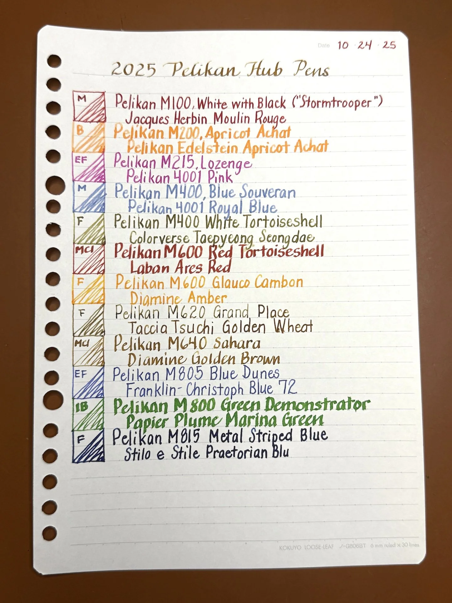
All around the world, people will be gathering to celebrate their love of pens, maybe even with a Pelikan or two! I always ink up a bunch of Pelikans for the Hub and this year is no different, except I inked up a pen that, until earlier this year, I hadn’t really paid much attention to: the Pelikan Pura P40.

(Note: I am typing this after I hand wrote my notes so don’t try to decipher the handwritten content, lol).

The Pelikan Pura P40 is a cartridge fountain pen. The “P” designation in the model indicates that it is a cartridge fountain pen, while its more well-known siblings, like the M200, M400, M800, etc. have the “M” designation, for piston fillers. Side note: “K” is for ballpoint, “D” is for pencil).

Pelikan Pura P40, Bordeaux, inked with Visconti Bordeaux on 68 gsm Tomoe River Endless Recorder.

The Pura is a metal pen with a snap cap, and a steel nib (Extra Fine to Broad). It also snaps to post. The grip is smooth with a slight taper towards the nib. I didn’t have any problems with the grip section being slipper, but I also don’t generally have a problem with metal sections either. There is a slight “lip” where the nib starts but my fingers didn’t really make it down that far, so I don’t know if that would prevent one’s fingers from sliding.

You can see the metal grip, along with the “nib lip”, which my fingers never reached. The nib looks a bit like the Lamy Safari nib but it isn’t the same. To my knowledge, it also isn’t removable.

I think the pen looks very sleek though I wish that the metal stripe lined up with the nib when uncapped. Not a big deal unless I’m staring at it 🙂

You can see the reflection next to my thumb, even though the nib is face up.

It is a slightly heavy pen, compared to most of my pens which are acrylic, or lighter metal, like my Schon pens which are aluminum. This wasn’t an issue when writing because I don’t post my pens, but it really felt back-heavy when I tried to post. It takes a bit of effort to get the cap on and off the back end for posting, but it was definitely secure.

It was definitely too long and back-heavy for me when posted.

The nib is smooth and writes nicely. Having written with it at the Chicago Pen Show, where it was a pretty wet writer, I paired it with a drier ink which I picked for the color, before realizing that the name of the ink and the pen’s colorway were the same.

I don’t clip my pens to anything other than the elastic in pen cases, but the Pura seems to have very little room/clearance for thick fabric. That said, it worked pretty easily when I slid the clip over my Rickshaw pen roll, but you can see that it probably doesn’t love it. I was pleasantly surprised at how easily it slid over a single sheet of this paper.

The clip is pretty flush to the cap but it slides on surprisingly easily. It doesn’t look like it would like this thick fabric for long.

Aside from the grip, which might be slippery for some folks, my only other “gripe”, and it is a minor one at that, is that the polished metal is a fingerprint magnet. As I mentioned above, It takes a bit of force to snap the cap on, especially to post. Now that I think about it, the other thing is that converters don’t fit, so you have to use cartridges, which is not the end of the world but it adds a bit of hassle if you want to use bottled ink.

Comparison pens (L to R): Esterbrook Estie, Pilot Custom 823, Diplomat Aero, S T Dupont D-Initial, Pelikan Pura, Lamy Studio, Leonardo Momento Zero, TWSBI Eco, Sailor Pro Gear.

The Pura’s grip is the most similar to the Lamy Studio, which isn’t entirely surprising since both are German pens.

The Dupont doesn’t really post, so I didn’t force it.

The Pelikan Pura P40 is a solid pen and a good writer, especially if you prefer a slightly heavier pen. It’s not often you find pens with this heft in this price point - one of the few that come to mind would be the Diplomat Aero which is similar in both weight and price. The MSRP for the Pura P40 is around $190 USD, with a street price of around $150, making it pretty similar in price to the smaller and lighter M200 series. I’m enjoying the Pura but we shall see if it results in the “gotta catch ‘em all” vibe that I get from the other models, especially since there are new colors AND a pattern coming out later this year sneak peek on the Pura webpage. I can’t wait to find out what my fellow Hub attendees think about this pen!

(Disclaimer: The Pura was part of my payment for working at the Pelikan table at the 2024 Chicago Pen Show. All other pens are my own.)


Enjoy reading The Pen Addict? Then consider becoming a member to receive additional weekly content, giveaways, and discounts in The Pen Addict shop. Plus, you support me and the site directly, for which I am very grateful.

Membership starts at just $5/month, with a discounted annual option available. To find out more about membership click here and join us!

Posted on September 27, 2024 and filed under Pelikan, Fountain Pens, Pen Reviews.

Pelikan M200 Orange Delight Fountain Pen Review

Is there a more consistent fountain pen brand on the market than Pelikan?

There is an argument to be made for a few brands to sit along side the big bird. I’d advocate for Pilot pretty heavily, for example. But the consistency in every single aspect of a Pelikan fountain pen each time I pick one up is to be applauded. They are rock solid writing instruments, to be sure.

That’s why, even as someone who doesn’t use many Pelikans, I was excited to get the M200 Orange Delight into my hands. Yes, it is Orange, and that is important. Even more important is the fact that it is in the M200 category, which is the Pelikan model that I get along with the best.

M200 series Pelikan fountain pens are small in stature, but large on features. The piston filling mechanism is the standout, and is arguably the best on the market. It’s a smooth, effective twist to draw in ink from a bottle, or to flush with water when cleaning.

The out-of-the-box Steel nib experience is perfect as well. I use a stock Extra Fine nib in my Black M205, and would have gone for the same in this Orange Delight if I didn’t pick it up from Mark Bacas, aka Nib Grinder, at the Atlanta Pen Show. He had a Fine nib, which I immediately turned into a wonderful Cursive Italic. This is my nib width maximum on Pelikan pens, and the reason I rarely use their gold nib models. Those end up being too wide and wet for my writing.

Left to right: LAMY AL-Star, M200, Kaweco Sport.

The aforementioned size of the M200 is perfect for me. It’s small, and light - maybe too small, and too light for some. What I learned about my M205 was that this size is ideal for portability. I can take it - and use it - anywhere. It never gets in the way, and is a joy to use. It is big enough to use uncapped when writing, but posts deep enough that I almost consider going that route sometimes. Only sometimes, though.

To say the Orange Delight fits my aesthetic would be the understatement of the year. The solid Orange resin is set off perfectly by the translucent Orange mid-section. I love seeing the piston hardware, and the ink sloshing around inside the barrel. The Gold trim is a perfect match as well, and for this particular pen, works better than Rhodium-plated hardware would have.

There have been many Pelikan M200 fountain pens that have tempted me over the years, but at around $200, they are not a mindless purchase. I’m glad I bided my time until I found one that delights me as much as this one does.

The biggest takeaway from my experience with the Orange Delight is that I had no inclination to ink it up with an Orange ink. There can never be too much Orange, so maybe one day I will, but so many other colors fit well with this pen and nib. It may be a boring choice, but I’m thrilled with the Brown shades of Pelikan Edelstein Smoky Quartz in this pen, an ink I haven’t given much of a chance to previously. It’s a perfect match, and I wouldn’t hesitate to go a second round with it when I write this one dry.

In a sea of similarities, Pelikan still finds a way to be unique amongst the flock, while staying true to their roots. I can’t help but be continually impressed by everything they make.

(I picked up this pen from Nib Grinder at the 2024 Atlanta Pen Show in a trade for products.)


Enjoy reading The Pen Addict? Then consider becoming a member to receive additional weekly content, giveaways, and discounts in The Pen Addict shop. Plus, you support me and the site directly, for which I am very grateful.

Membership starts at just $5/month, with a discounted annual option available. To find out more about membership click here and join us!

Posted on May 20, 2024 and filed under Pelikan, Fountain Pens, Pen Reviews.

Reflections on Some Currently Inked Pens

(Kimberly (she/her) took the express train down the fountain pen/stationery rabbit hole and doesn't want to be rescued. She can be found on Instagram @allthehobbies because there really are many, many hobbies!.)

Despite being in this rabbit hole for 6.5 years, I continue to learn not just about pens, inks and all that, but about my preferences and habits. There isn’t a right or wrong way to be in this hobby and what works for someone may or may not work for you. For some reason during the past few weeks, a few of my currently inked pens were good reminders of lessons I’ve learned along the way.

On the surface, there isn’t much that is similar among these pens, other than they all happen to be blue! (Bottom to top: Pelikan M215 Blue Stripe, TWSBI Classic Blue, Visconti Van Gogh, Platinum Curidas, Pilot Falcon/Elabo.)

Pelikan M215 Blue Stripe

Hard to tell from this picture but there are silver colored stripes on the barrel of this pen.

  • Patience (and research), Grasshopper - I have wanted this pen for 3-4 years (maybe longer) and have seen it on eBay for very high/ambitious prices. And I am definitely not one for patience. But I also don’t want to overspend. Doing research ahead of time, including reaching out to folks who have better pulses on the Pelikan secondary market, made it easier for me to pounce on a listing that was finally in the right price range.
  • Inks & pen combinations matter - As I mentioned in recent ink reviews, inks behave differently in different pens (and also on different papers too). This M215 is currently inked up with Pelikan Edelstein Tanzanite, which is a lovely blue-black ink. Is it a shocker that this is a good matchup? No, not really, but I haven’t used this ink since I first tried it, gulp, way back in 2017, in a Lamy Safari. I absolutely hated the combination because it felt like writing with sand and I wondered if I should dump the ink out of the pen and get rid of the sample. What I didn’t know then, was that Lamy pens can be on the drier side and that Pelikan inks are also on the drier side (to compensate for their wetter nibs), so that combination was doomed from the start. What’s sad is that I was hesitant to try the ink again, even though I learned more about pens and inks since 2017. I’m glad I decided to try the ink in this pen, because it flows just perfectly from this pen, and it’s a great match colorwise, too. I’ve also since learned that it’s ok to empty out a pen if the ink just isn’t doing it for you. Life’s too short to write with a bad combination.

TWSBI Classic, Blue

  • Oldie but goodie - One of my first TWSBIs is the Classic, in Turquoise. I love the non-demonstrator look but I don’t really think about them as much because I usually want a demonstrator when I want to ink up a TWSBI. I needed to ink up a blue pen so I decided on the blue Classic. It had a Fine nib and even though Mediums are my usual jam, I just shrugged and inked it up anyway. Then I wrote with it and was shocked at how much I liked the Classic AND the fine nib. It is so easy to ink up the latest acquisitions and forget about the older pens (and inks). I try to balance that urge by having a mix of old and new pens in the “to-be-inked-next” tray. I do this with inks too. It’s like discovering a lost treasure.

Visconti Van Gogh, Starry Night

  • It’s ok if looks are important - As a Van Gogh fan, and more specifically of Starry Night, I love this pen. Not because it is an amazing writer (I mean, it writes fine) but because looking at it makes me happy. It makes me think about my favorite piece of art and that makes me happy. People place different levels of importance on the nib vs the appearance and that’s one of the many wonderful things about this rabbit hole. My personal pen preference emphasizes looks over writing (probably 65:35 as long as the nib doesn’t write poorly). In the end, as long as you’re happy, whether it’s with the looks, the nib (or both), it’s a win in my book.
  • Oldie but goodie, this time with ink - I inked this up with an ink that I once loved but sorta put by the wayside (shame on me) - Iroshizuku Tsuki-yo. When everyone was raving about Shin-kai (cough cough, Bossman), I instead fell in love with Tsuki-yo. With all the deluge of inks that currently exist and continue to be released, it’s easy to get caught up in the latest “must-have ink”. I had forgotten how much I liked that ink and I’m glad I decided to use it again.

Platinum Curidas, Matte Blue

  • It is not a popularity contest - Not gonna lie, the Platinum Curidas is probably one of the more polarizing pens when it comes to looks, nock length, design, etc. And yet, I still love it. I have the original demonstrator finishes but I love this Matte Blue with black trim. The Medium steel nib gives me the perfect line width. Do I love it more than the Vanishing Points or Decimos? Probably not, but I still love it, even if it’s not for everyone, and that’s what matters.
  • Don’t judge an ink before using it - I bought a sample of Taccia Ukiyo-e Hiroshige-Ruri and after swatching it, I thought “yet another dark blue ink” and was glad that I hadn’t bought a bottle. After pairing it up with the Curidas though, I’m loving the richness of this blue ink, along with its subtle sheen that can even been seen on Rhodia, and am now adding it to my “bottles to buy” list. It’s another reminder that I shouldn’t judge an ink too quickly!

Pilot Falcon/Elabo, Metal Blue

  • They can’t all be winners - The Pilot Falcon (or Elabo in other markets) is a pen that has a fun, bouncy nib that can give some line variation, which I generally love, but there’s something about this one that isn’t doing it for me. I really like the plastic version of this pen with a Soft Fine nib, but I don’t think it’s the minimally- added weight. The Akkerman Delfts Blauw ink is flowing just fine so it’s not that. Maybe it’s the Soft Medium nib which feels blobby and almost squeaky. I really want to love it, but I don’t, so I think it’s better to part ways, than to have it stay in the collection untouched and unloved.
  • It’s hard saying goodbye - Despite everything I just wrote about the pen not being a good fit, it’s still really hard for me to decide to sell a pen. I just have to remember that someone else will enjoy it more than I do and that I can use the proceeds to get something else, like that bottle of Taccia Hiroshige-ruri :-)

None of these things are earth-shattering or new in any way, but I don’t usually have these revelations when I’m writing with my pens. So when they do pop up, it’s worth taking a moment to pay attention to what they’re trying to teach me.

Posted on November 17, 2023 and filed under Fountain Pens, Pilot, Pelikan, TWSBI, Visconti, Platinum.