Posts filed under Studio Neat

Studio Neat Totebook Notebook Review

I’ve been testing out a new product from my friends Dan and Tom at Studio Neat over the past couple of weeks under the notation REDACTED in my stationery usage log. They gave me an early look and asked me not to share it until it is live, which I’m happy to do. I’m also happy to say that the product is now live!

The Studio Neat Totebook is the portable companion to the desk-bound Panobook and collaborator with the Mark One, their wonderful pen design. Studio Neat is taking over the stationery world!

I’m a big fan of the quality, style, and performance of the Panobook, so my expectations were high for the Totebook. Studio Neat’s design philosophy is present in this new product, with a clean, minimal design, and thoughtful add-ons to what looks like a basic notebook from the outside.

The paper looks, feels, and performs similarly to the Panobook, but spec-wise, it is different. The Totebook uses wood-free paper, which is made via a chemical process as opposed to a mechanical one as used for traditional paper. In use, I wouldn’t have known the difference - I just know that it works well with any pen and paper I threw at it.

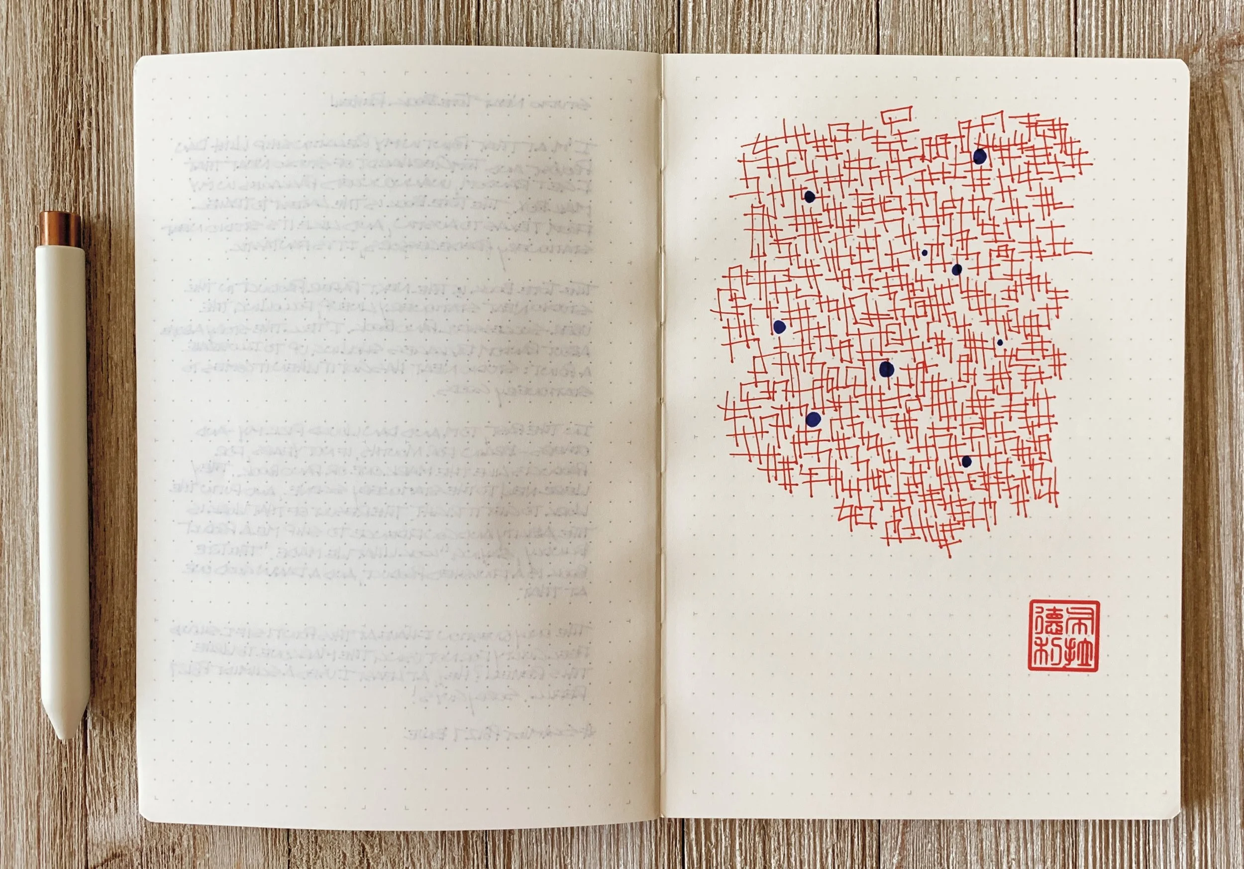
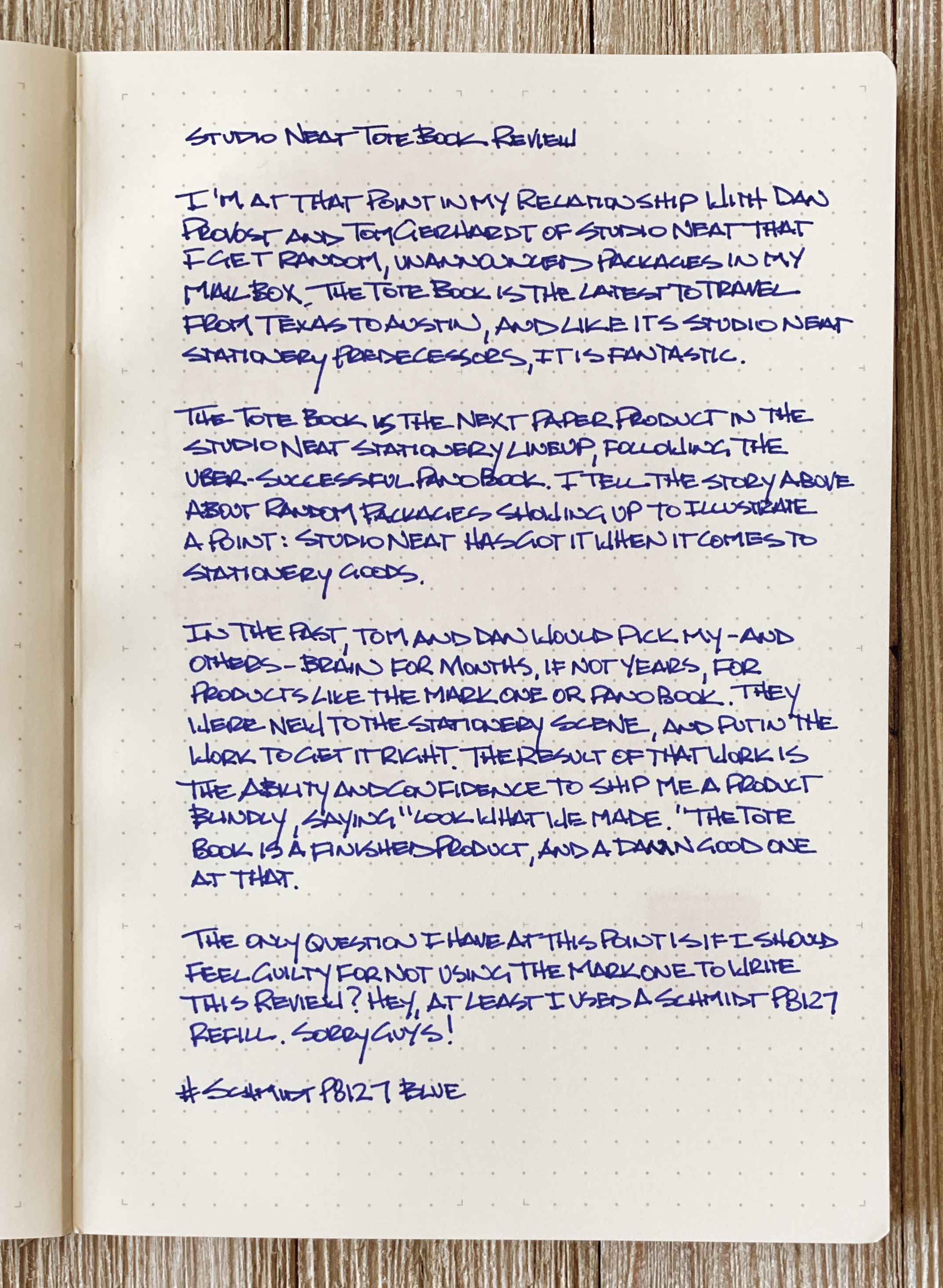
My handwritten review was done with the Schmidt P8127 rollerball in blue, which is a wide, wet writer, and it worked flawlessly. The only feathering I saw was with the even wetter Tombow Brush Pen, and the notorious Sharpie Ultra Fine Permanent Marker wasn’t as tragic as I have seen in other notebooks.

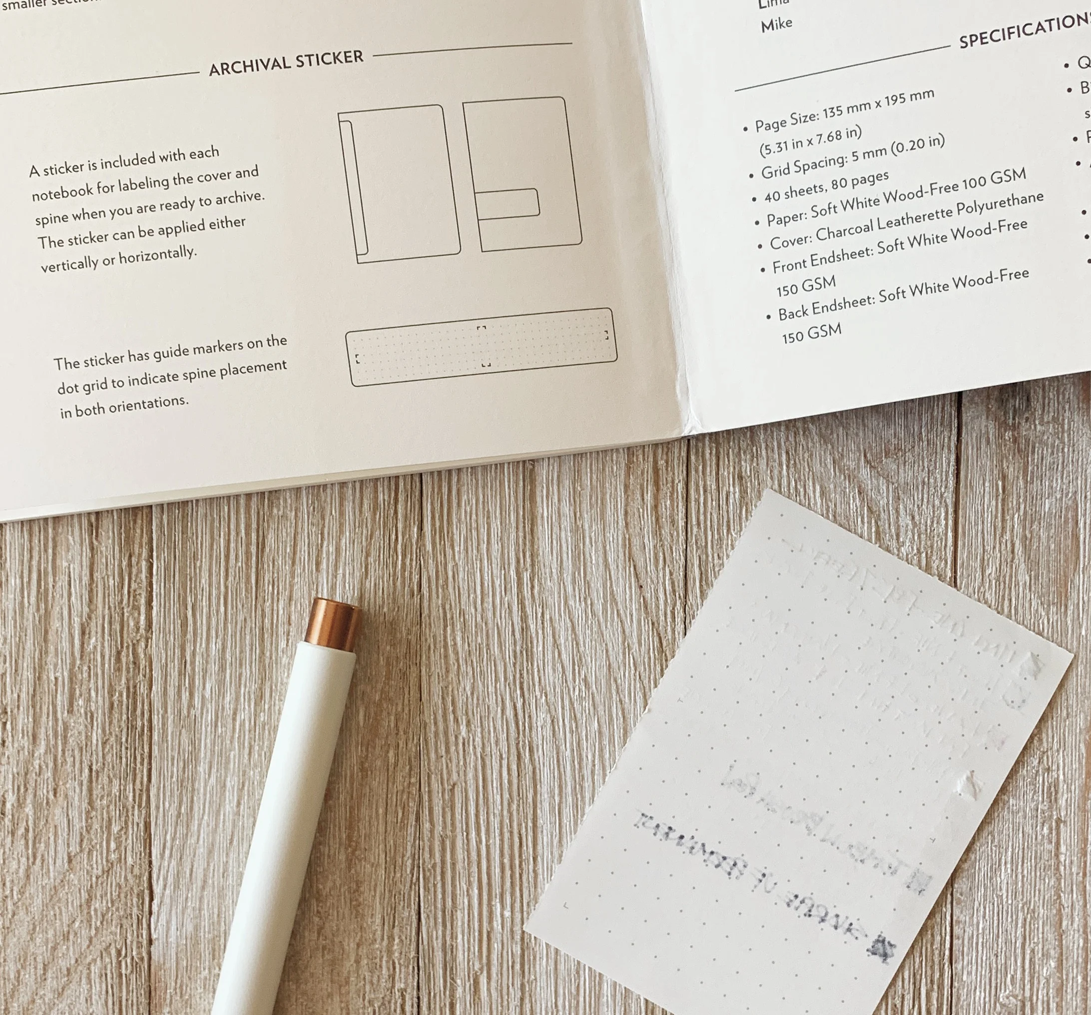
I mentioned add-ons above, and the Totebook has a specific one I don’t normally see: The last 8 pages feature a perforation that splits the page into quadrants. I love this, as seen by my chat recap to Dan when I discovered it. I never want to rip pages out of any bound notebook, and this alleviates any hesitancy I have about tearing away. It also ships with spine stickers for help with archiving your notebook when complete.

I love what this notebook is, but I do have two minor quibbles with it. If you know me at all, the first one is easy to pin down: This notebook has no size. Call it smart-sized, right-sized, Neat-sized - whatever you want to call it, but it’s not normal-sized in the common A or B international standards. This is a me problem, and one of the hills I will apparently die on one day, but I like notebook sizing standards. The best I can come up with for this one is B6-ish.

Secondly, the paper “waves” near the spine. This happens to thicker softcover notebooks from time to time, although I don’t know exactly why. For me, I notice it mostly when I am not writing as opposed to when I am. It doesn’t affect usability, but I can’t help but notice it visually.

The Totebook is made to be small, portable, pliable, have really good paper, and a few bonus extras to boot. It is everything I have come to expect from the Studio Neat Stationery Department, including a more than reasonable $20 for two price tag. If this notebook fits your aesthetic and workflow then it is well worth grabbing a pack or two to add to your portable writing arsenal.

(Studio Neat provided this product at no charge to The Pen Addict for review purposes.)


Enjoy reading The Pen Addict? Then consider becoming a member to receive additional weekly content, giveaways, and discounts in The Pen Addict shop. Plus, you support me and the site directly, for which I am very grateful.

Membership starts at just $5/month, with a discounted annual option available. To find out more about membership click here and join us!

Posted on May 28, 2019 and filed under Studio Neat, Notebook Reviews.

Mark One Pen Review

The Mark One pen is the latest design from Kickstarter gurus Studio Neat. Dan Provost and Tom Gerhardt, the team behind Studio Neat, are friends of mine, and I’ve been lucky to see behind the curtain since this project was just a thought in their heads. And I’m thrilled with the final result.

After the success of their previous project, the Panobook, Dan and Tom rolled right into designing the perfect pen to match an already great notebook.

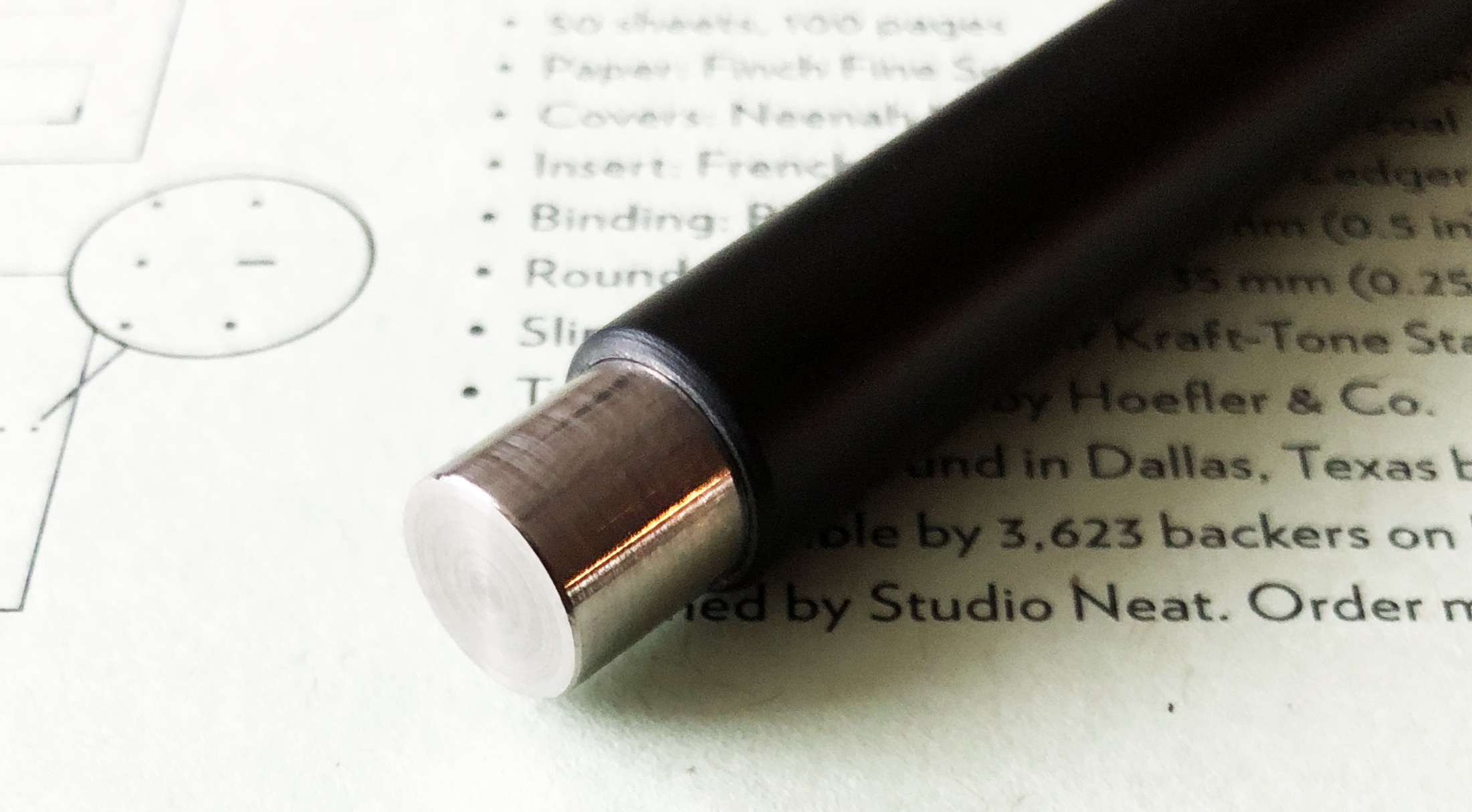
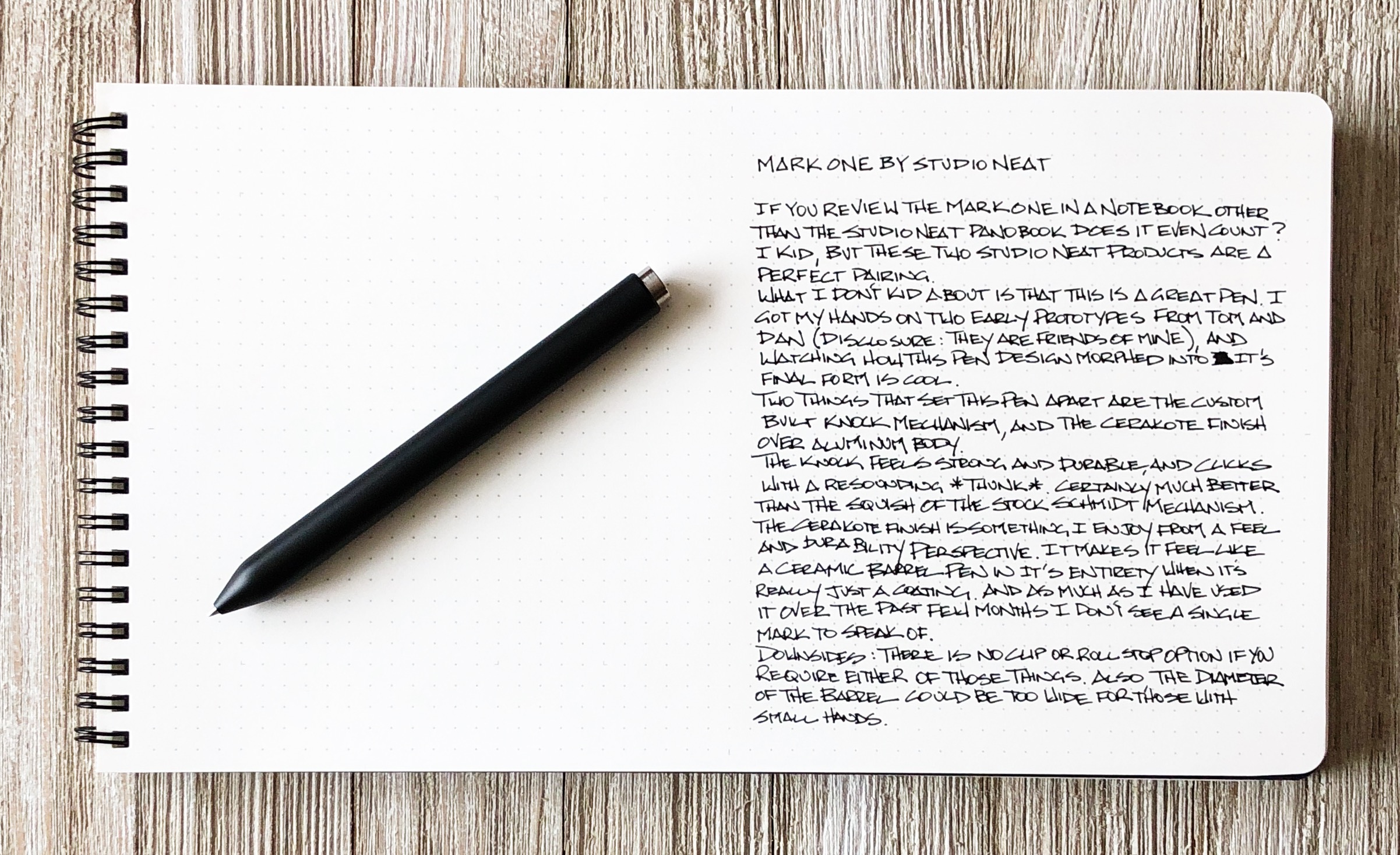
Starting with the Schmidt P8126 - the refill that knocked the Pilot Hi-Tec-C off the Kickstarter pen charts - Studio Neat built an aluminum barrel along the lines of their first Kickstarter project, the Cosmonaut. You can definitely tell these products are related. Where the Cosmonaut had a rubber coated barrel for all of your stylus needs, the Mark One has a Cerakote finish.

Not familiar with Cerakote? It acts like a paint, but the shell is extremely hard and has a satin/matte finish. I have one pen with a Cerakote finish and I love it, but it is not an easy process to get right. Studio Neat got it right with both the black and white finishes on the Mark One.

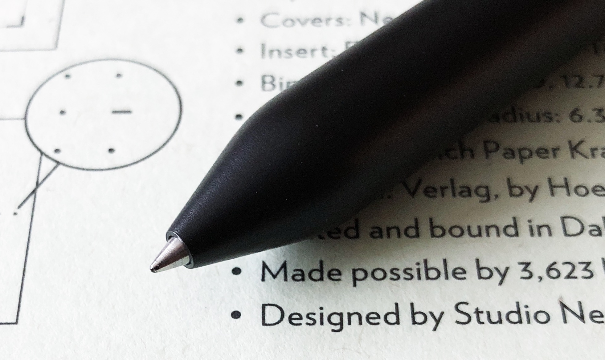
Aside from the coating, the click mechanism was custom designed to fit this pen. It was originally designed around the Schmidt mechanism, but Dan and Tom are never satisfied and set out to build their own. The result is a rock solid knock with great feedback. You know when this pen is engaged.

To me, the only question readers of this site might have is why? Why do I need another Kickstarter pen? Why do I need another Schmidt P8126 barrel? The answer is you don’t. None of us do. At $50, this pen is a great price. I’d pay $80 for it easily. You can buy a Retro for 51 with the same refill for half the price and get an amazing pen and writing experience and be set for years without owning a Mark One.

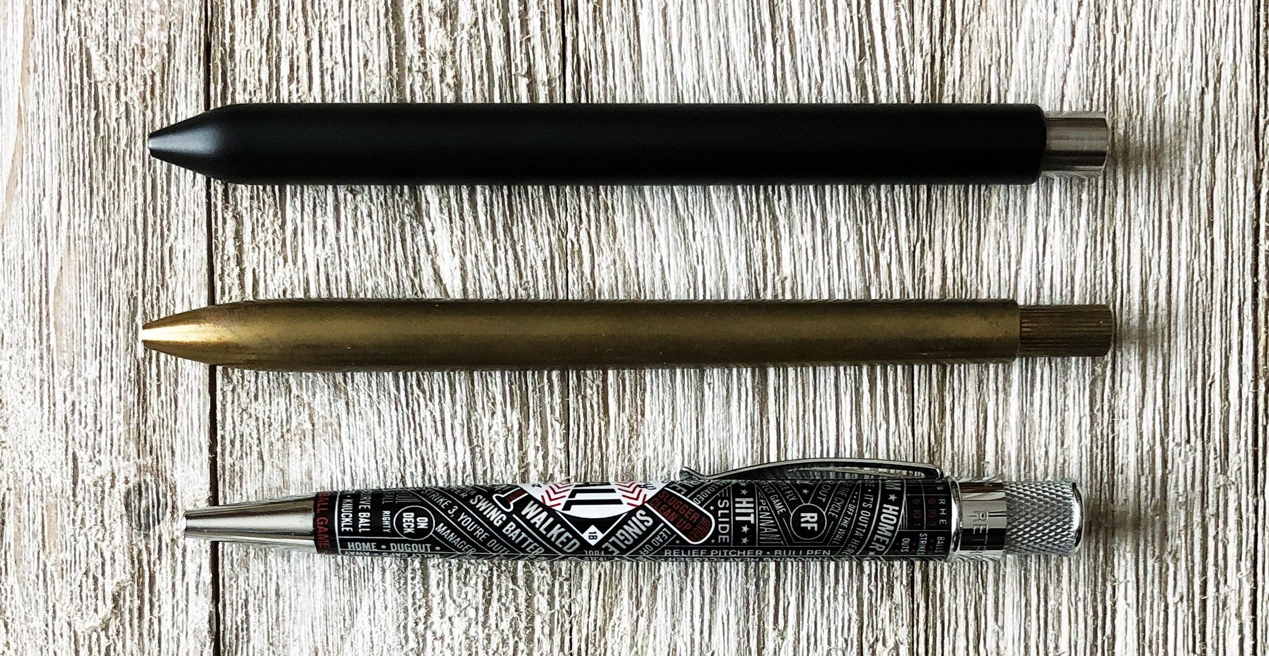
Top to bottom: Mark One Pen, Ajoto Pen, Retro 51

But there is something about supporting small makers who make cool stuff that makes me happy. That doesn’t mean I’ll blindly support every project put in front of my eyes - the value still has to be there, for example - but when it’s right, it’s right, and I’m happy to back a project like the Mark One.

Studio Neat has blown away every goal of this project so far, and with over $120,000 in backing at the time of this writing, there is no end in sight. You can see what the fuss is all about over on the Mark One Kickstarter page.

(Disclosure: Dan Provost and Tom Gerhardt are friends of mine. I’ve received several prototypes of the Mark One over the past six months to test and provide feedback on, including the model in this review, at no charge. I’ve backed this project with my own funds and will be choosing the white barrel.)


Enjoy reading The Pen Addict? Then consider becoming a member to receive additional weekly content, giveaways, and discounts in The Pen Addict shop. Plus, you support me and the site directly, for which I am very grateful.

Membership starts at just $5/month, with a discounted annual option available. To find out more about membership click here and join us!

Posted on March 26, 2018 and filed under Studio Neat, Pen Reviews, Mark One.

Studio Neat Panobook Notebook Review

When my friends Tom Gerhardt and Dan Provost from Studio Neat told me they were interested in making a notebook I was hyped. Knowing these guys like I do, I knew no detail would be spared, and I was right. The Panobook is an awesome notebook.

Yes, I consider Tom and Dan friends, and yes, I gave feedback throughout the design process. I even have some early prototypes laying around here that changed a good bit before the final product was settled on. This is so you know where I’m coming from with my review. But as you know, and as Tom and Dan learned, I don’t hold back my opinions. I deal in honesty and facts based on my experience with the product in question. And with the Panobook, there wasn’t much questioning to go around.

I’ll start you off with this: This is my most used notebook over the last month. By far. What I am enjoying so much about the Panobook is that the firm covers allows me to write comfortably with the notebook in my lap. I’ll grab a drawing pen - recently the Deleter Neopiko - or anything with a Schmidt P8126 refill - recently something Top Secret - and go to town. I can sit in a comfy chair in my living room and just write away. Like I told Myke on last weeks podcast, I wrote two pages of notes in my Panobook for one of the topics we covered. It made for fun and easy show prep.

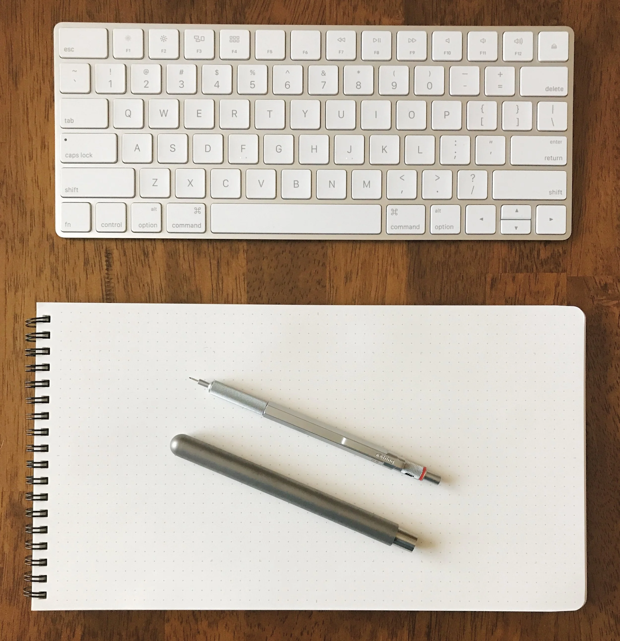
The Panobook is designed to be a desk notebook, and I use mine there too. I generally keep it to the right side of my laptop or keyboard and in the vertical position. I surprised myself by using it in that orientation, as I love landscape mode in notebooks. But that is what works for me. It’s like a tall A5 pad.

It handles all inks very well, including fountain pen ink. I don’t like using fountain pens with the Panobook though, as the paper is dry and uncoated. There is no feathering, bleed, or ghosting, but the colors are flat with no shading or sheen, like the line from a drawing marker. They work fine, but I enjoy other pens and pencils more.

Back side of the ink samples page

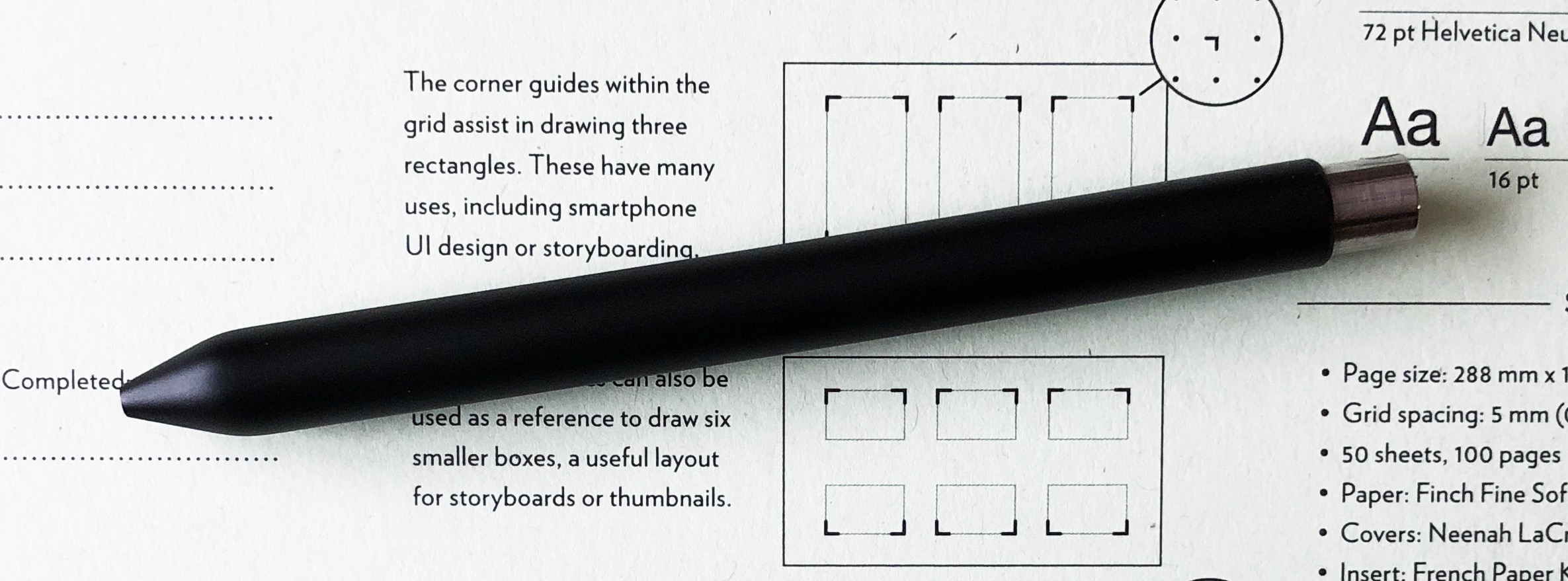
From a design perspective, Studio Neat thought of it all. The covers are firm but have a soft feel. The dot grid is a light grey with subtle guide markers for UI design or storyboards. The wire binding is strong and smooth, allowing you to turn the page easily and lay flat. There is even a slip cover for storage between uses or when done and filed away.

At $20, it is priced right in line with every other quality notebook in this category. I bought all three of mine through their very successful Kickstarter project, and they are taking pre-orders for them on the Studio Neat site for the next batch.

As a Studio Neat fan and customer for years, I’m glad to see them dip their toes into the stationery market. I have a feeling this won’t be the last product we see from them in this area.


Enjoy reading The Pen Addict? Then consider becoming a member to receive additional weekly content, giveaways, and discounts in The Pen Addict shop. Plus, you support me and the site directly, for which I am very grateful.

Membership starts at just $5/month, with a discounted annual option available. To find out more about membership click here and join us!
Posted on November 20, 2017 and filed under Studio Neat, Panobook, Notebook Reviews.