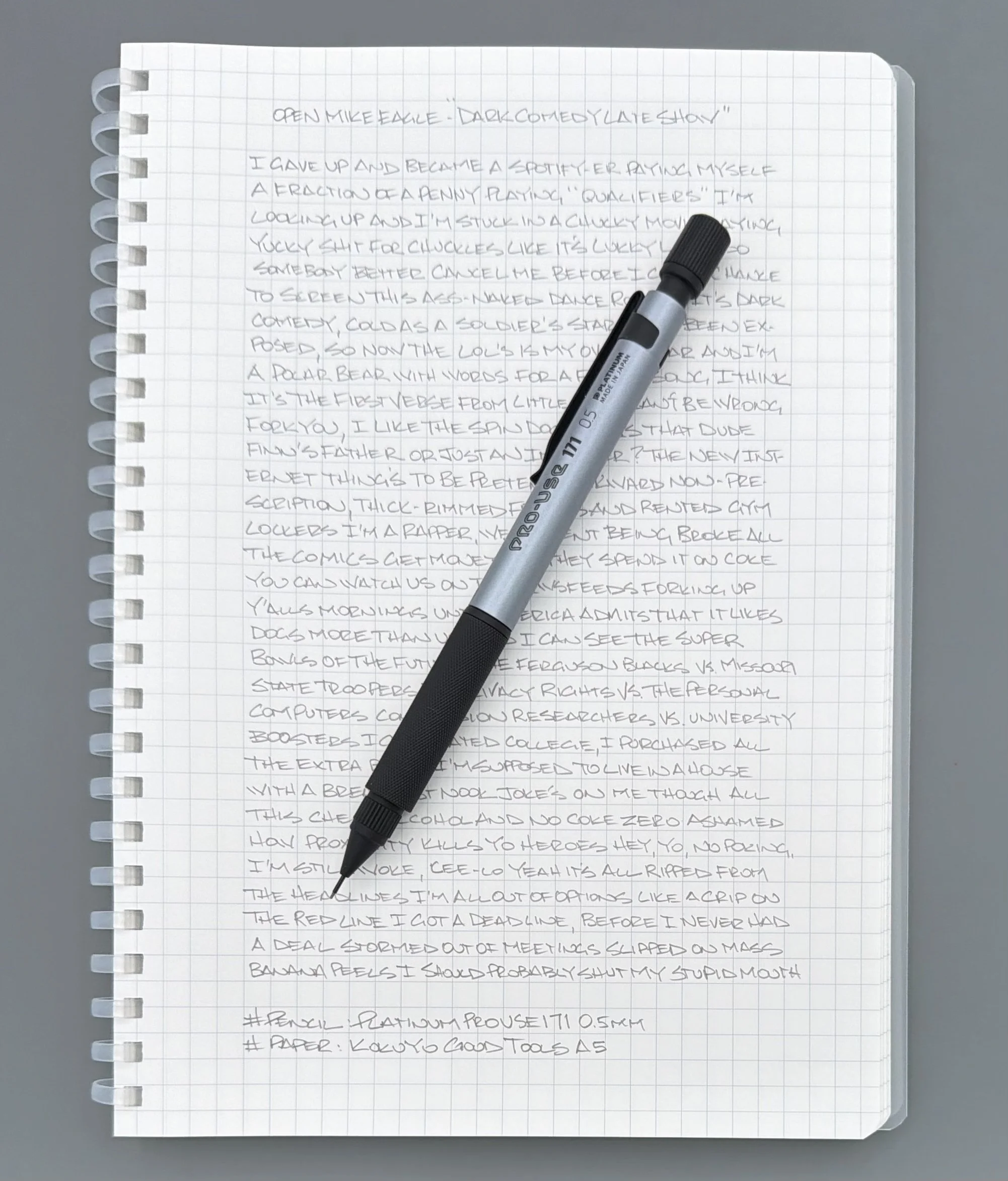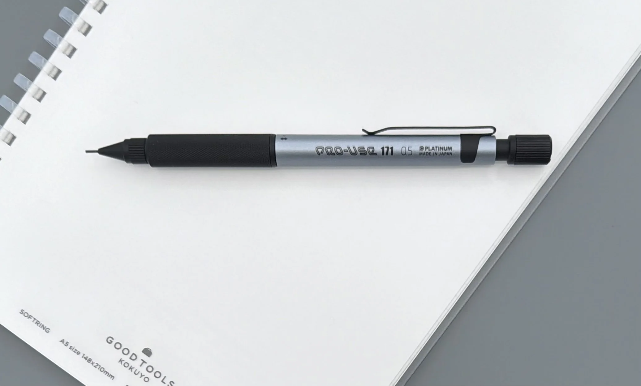
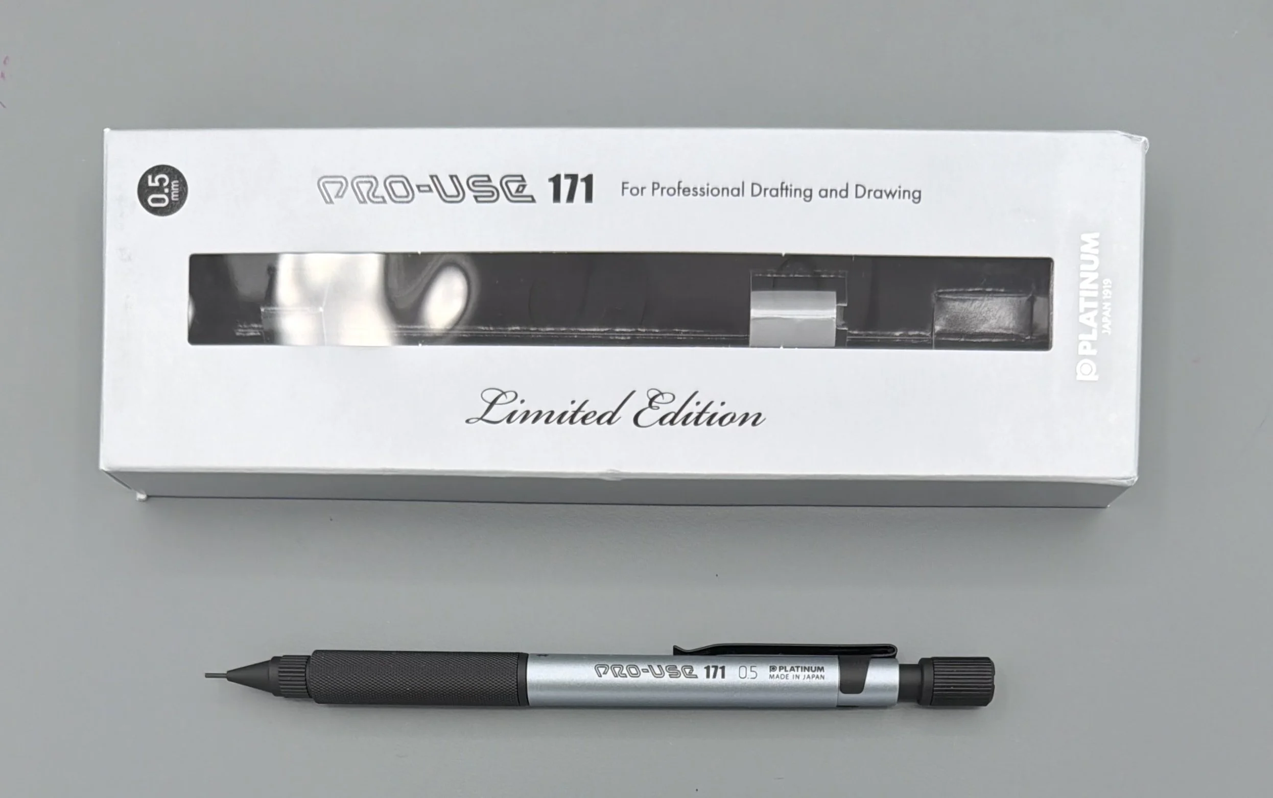
Platinum not only makes some of the best fountain pens on the market, they have done a great job in the mechanical pencil space for decades as well. The Platinum Pro-Use 171 Drafting Pencil is their top of the line model, with a feature list to match the price tag. Is it worth it? Let’s find out.
The Pro-Use 171 has two main selling points outside of the standard setup: an adjustable length lead sleeve, and a toggleable spring mechanism to help prevent breakage. Let’s tackle those first, and then we will get into the traditional features.
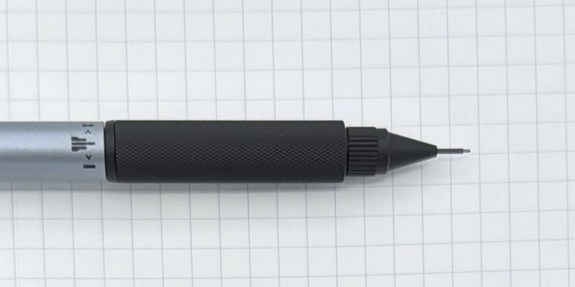
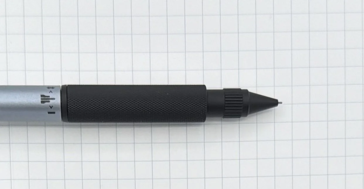
On the front end of the pencil, the nose cone is twistable to extend and retract the lead sleeve. This extension ranges from 0 mm when completely retracted, to 4.5 mm when fully exposed. As a fan of an extended lead pipe, 4.5 mm is a bit too long even for my tastes, but that is the good news - you can customize it to fit your exact needs. It is a bit of a visual trick when doing this, as it’s the nose cone itself moving up and down. The shorter the sleeve appears, the bigger the gap between the nose cone and barrel. I’m not a fan of the aesthetics of this feature, but it’s usable in my normal writing position.
What I can get behind is the spring mechanism to help with lead breakage. Twisting the grip section to the proper station activates or deactivates the mechanism. I’ve kept it “on” for the most part, other than testing if I could feel any difference. If I push it hard I can notice some give with it activated, but my writing pressure is light enough that it’s hardly noticeable in either stage.
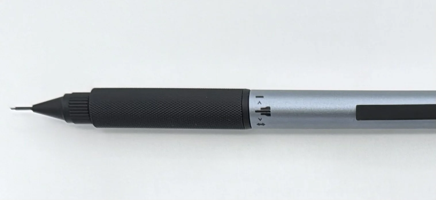
The two stages are marked on the barrel, with a short twist to engage/disengage the spring.
The standout feature of the Pro-Use 171 is the knurled metal grip section, and the balance it prides to the overall writing experience. The knurling is light-to-moderate so it won’t sandpaper your skin during long sessions, and the entire section is heavy, especially when placed against the lightweight plastic barrel. That’s how engineering and drafting pencils should be designed, but I can’t help but wonder if a lightweight aluminum barrel would better fit the price tag of this pencil.
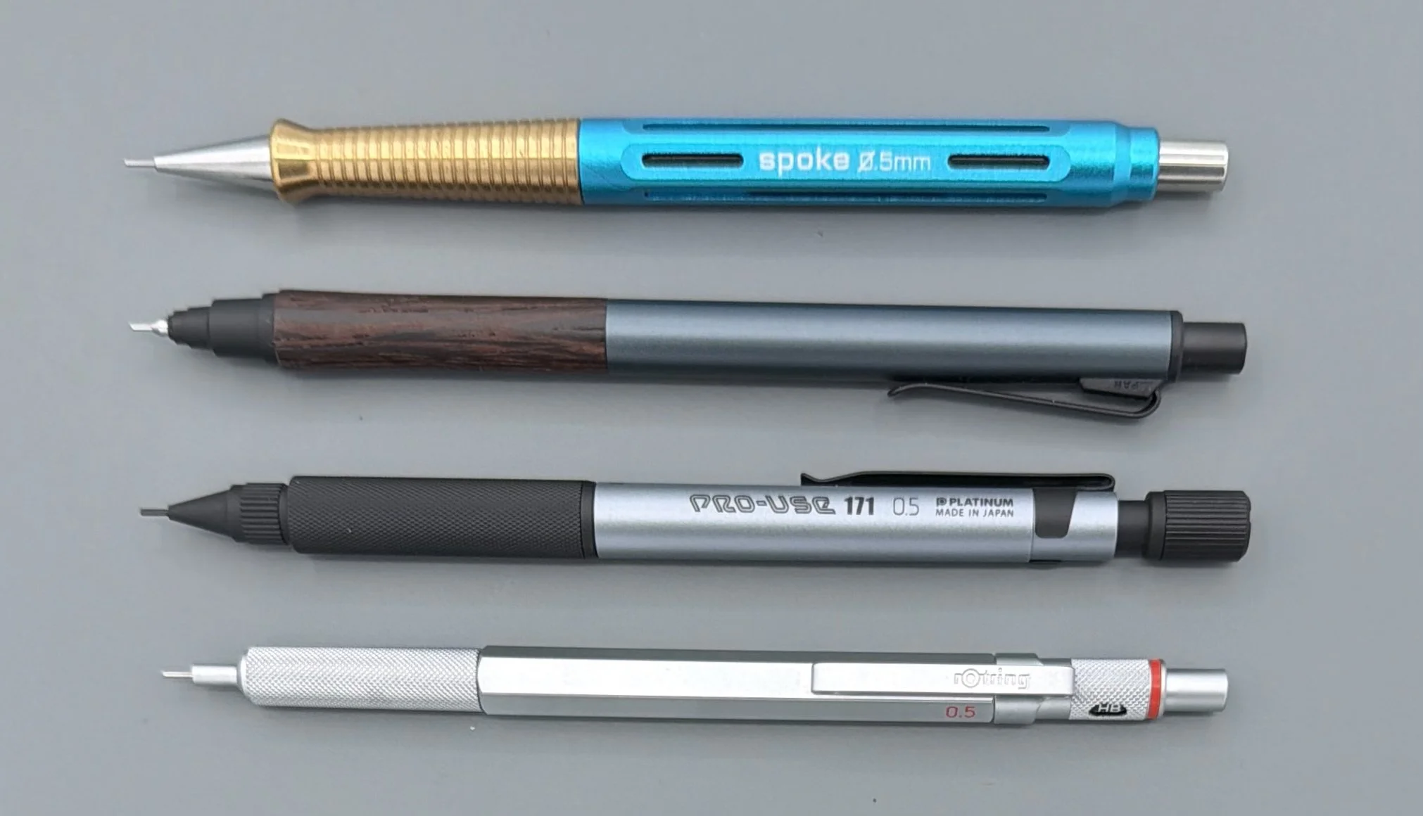
The Pro-Use is a good pencil, but it has a long list of competitors that I would choose before it. Top to bottom: Spoke Design Model 4, uniball Kuru Toga Wood, Pro-Use, Rotring 600.
Price is the kicker for the Pro-Use 171. It’s $43 for this Limited Edition color (the all-Black standard model is $38,) and I’m not sure there is enough there to justify it for my own use. The lead sleeve adjustment is a set it and forget it situation, as is the spring mechanism to assist with breakage. With a few exceptions, I guess you could say I’m a fan of fixed pencils.
Do you have any use cases where the features of the Pro-Use 171 come into play? I’d love to hear them if so.
(JetPens provided this product at no charge to The Pen Addict for review purposes.)