We are many milliliters deep into Inkvent season, and while I’m not participating in any daily ink slinging, that doesn’t mean I can get my shimmery ink on!
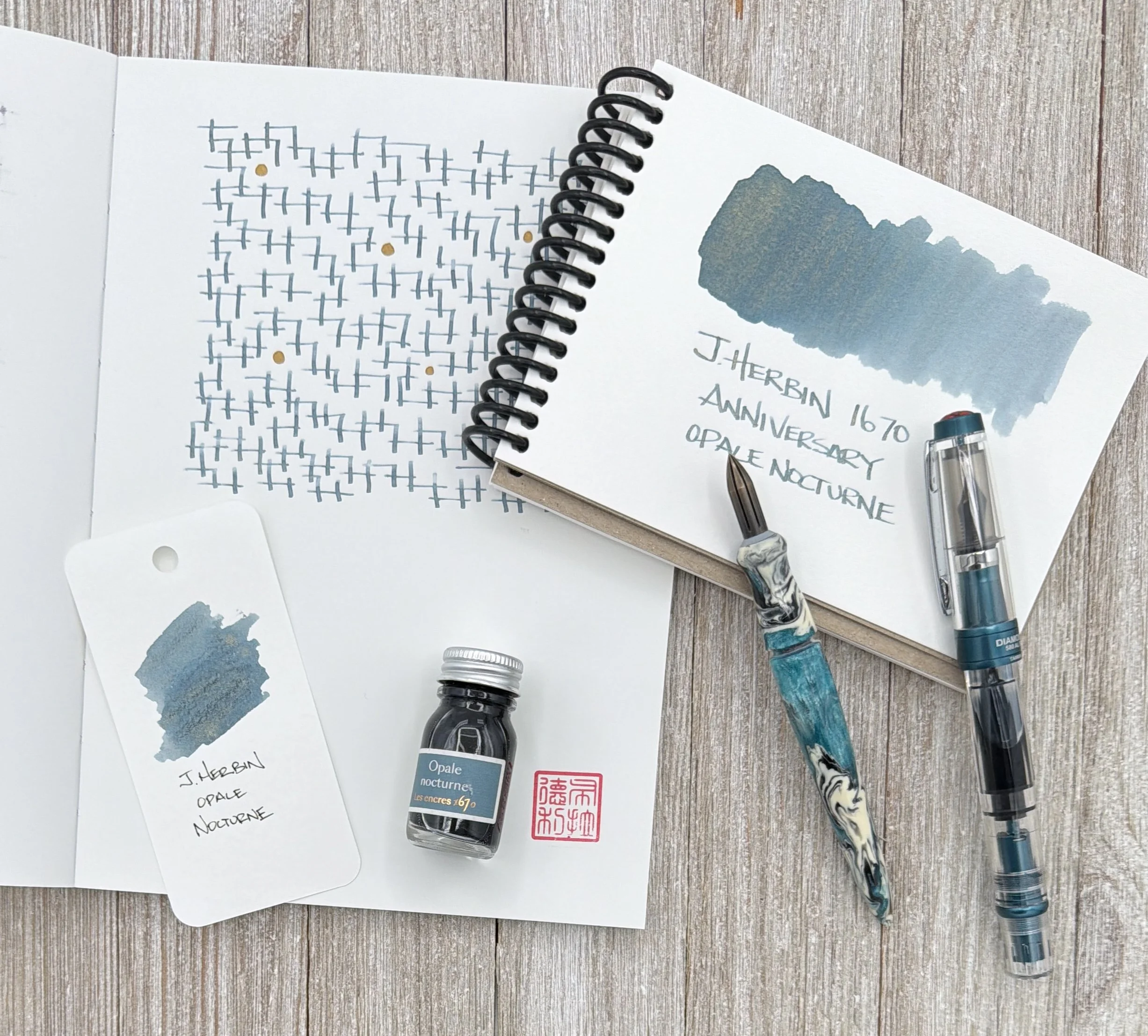
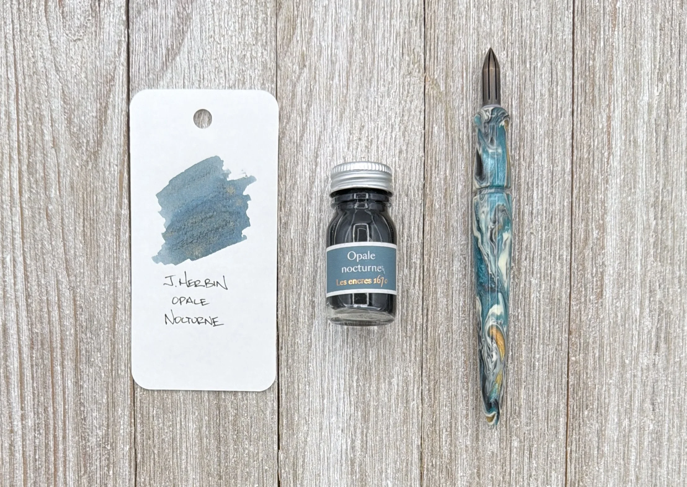
J. Herbin Opale Nocturne is the latest shimmer ink from the company who may do shimmer inks better than anyone. I know, those are fighting words, but ever since Emerald of Chivor knocked down the door over a decade ago, J. Herbin has been on a can’t miss kick with each of their yearly releases.
When I first saw the images of Opale Nocturne, I immediately wondered if this is Emerald of Chivor, part two. Once I got it in hand, I realized that it’s not particularly close, outside of the Gold shimmer that both share.
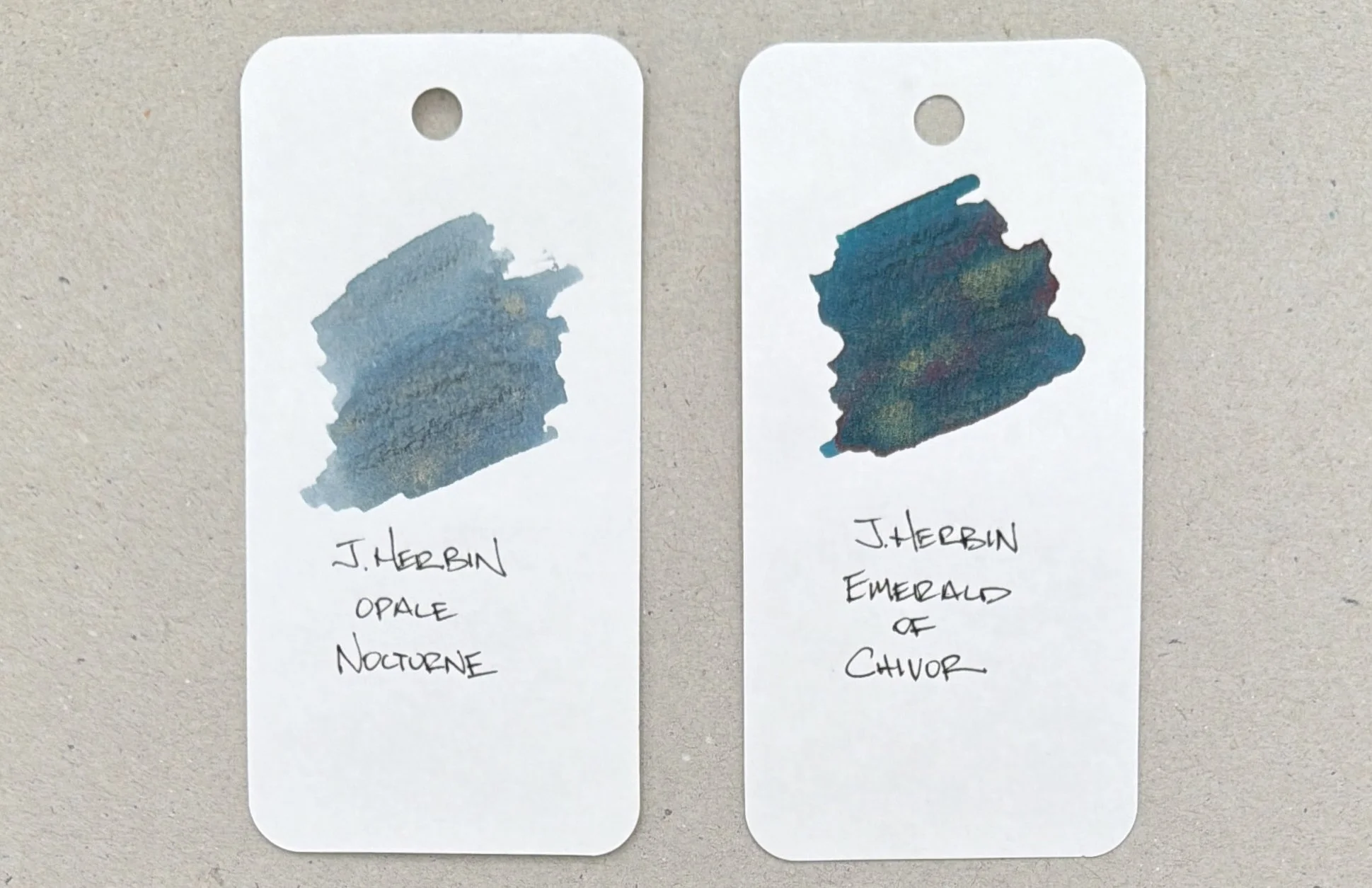
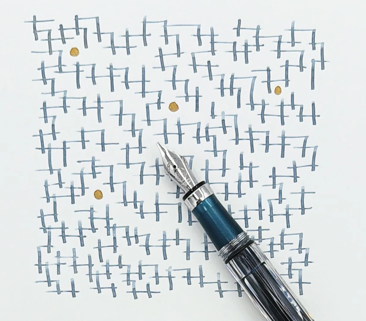
Translated to Night Opal, this Blueish-Green ink has a hint of Grey going down on the page, and then dries into an interesting Dusty Blue. The color should be simple to describe, but it’s just a bit different than any shade I use regularly. Add in the shimmer, and it’s a clear standout.
I used a TWSBI 580 ALR with a 1.1 mm Stub Nib for this review, and it worked well. The flow is wet, and the shimmer shows up in nearly all of the lines. The amount varies with how long I have been writing - there is more shimmer on the first few lines after uncapping the pen, and if I don’t stop for many lines the shimmer lightens up. That’s normal behavior. The ink never missed a beat on the page, and any time I uncapped it over the past couple of weeks it wrote immediately.
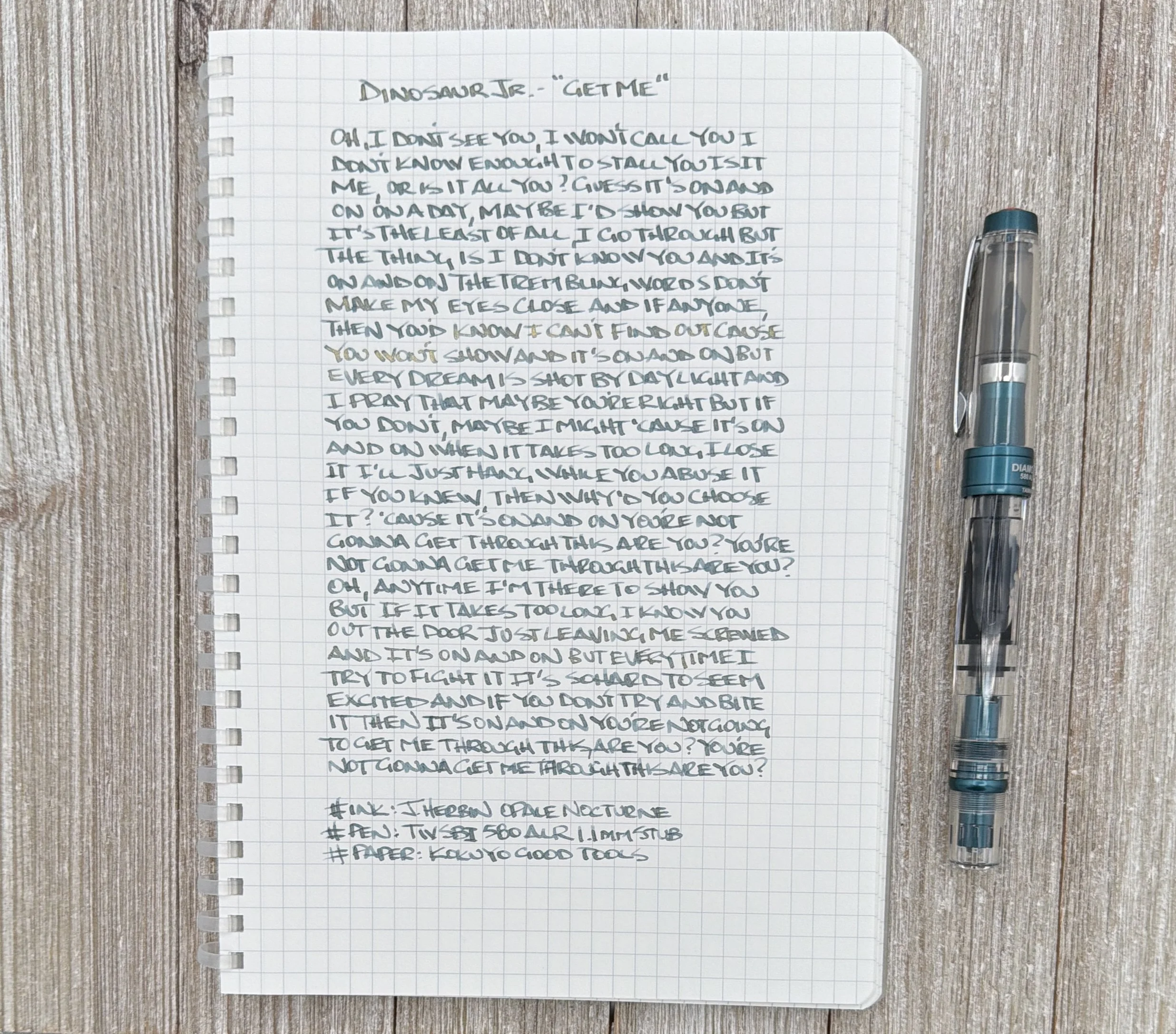
The key with shimmer inks is to use a pen with good flow, and the wider the nib the better time you will have. Also, choose a pen that is easy to clean. I’ve used this pen many times with shimmer ink and never had any issues.
In the grand scheme of all the J. Herbin 1670 shimmer inks, this one ranks near the top. Emerald of Chivor is still the S-Tier choice, but Opale Nocturne is in the conversation. It may only be behind Shogun for my own personal shimmer use.
At $34 for a 50 ml bottle it is on the expensive side, but the quality is worth it. And the bottle is one of the best in the business, and no, I don’t mean my 10 ml sampler! You can pick up a 4 ml sample from Vanness Pens if you want to try before you commit.
What is your favorite J. Herbin shimmer ink release? And what other ink color looks like this base Blue/Green/Grey? I’d be interested to try it out!
(Exaclair, the US distributor of J. Herbin, sent me this ink at no charge.)
Enjoy reading The Pen Addict? Then consider becoming a member to receive additional weekly content, giveaways, and discounts in The Pen Addict shop. Plus, you support me and the site directly, for which I am very grateful.
Membership starts at just $5/month, with a discounted annual option available. To find out more about membership click here and join us!