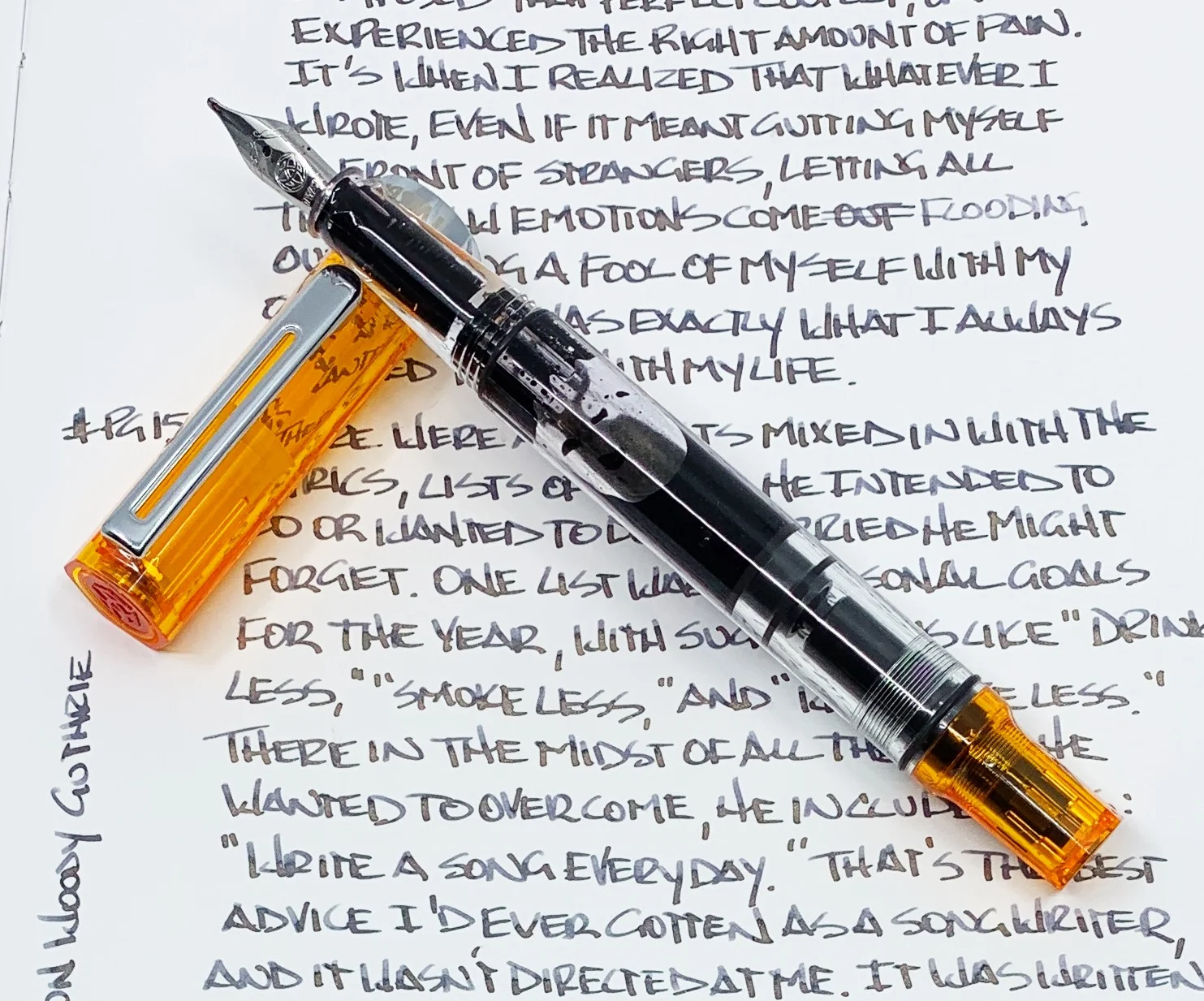
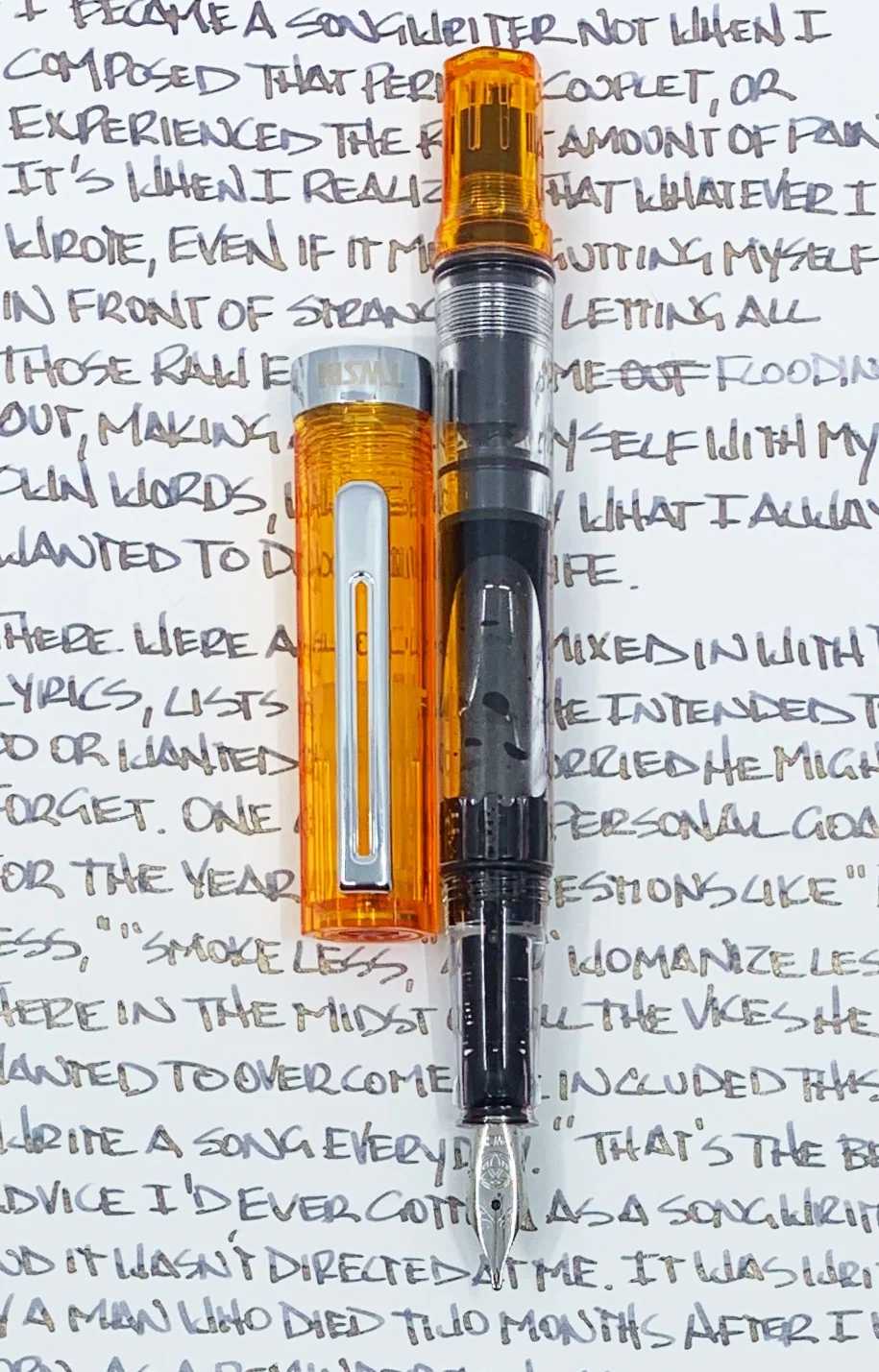
What more can I say about the TWSBI ECO that I haven't said already? It is the best fountain pen for beginners in my book, and it provides experienced users with a fun, high-quality writing experience at a nice price.
The one difference for me this time around - aside from the transparent orange pen parts - is the 1.1 stub nib.
I love how fine and firm TWSBI’s extra fine steel nibs are, which is why they are my preferred nib for this pen. But sometimes I need to sling ink on the page, and that's where stub nibs come into play.
What this nib provides for me is character. Wide vertical strokes combined with thin horizontal strokes make my handwriting pop. This stub nib has enough variation to make that work for me, and an ultra-smooth feel from it's slightly rounded edges.
All of those things add up to be the perfect ink testing pen and nib for me. And what better to show off the shake and shimmy of Robert Oster Barossa Gilt.
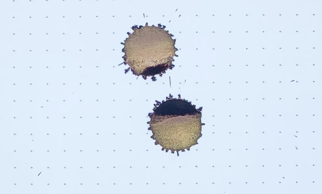
I have a hard time not calling this ink Barossa Grape, because that is an ink color, too. But the “Gilt” nomenclature alludes to what is so special about this ink: The gold shimmer found within. And it shimmers a lot.
That’s one thing Robert Oster has made perfectly clear with his Shake ’N’ Shimmy ink lineup. There is no lack of shimmery particles on the page. When shimmer inks first became a thing, I found the shimmer-to-ink ratio inconsistent. Over time, manufacturers have figured out whatever magic it takes to give every stroke a full compliment of shine.
As hard as it is to describe an ink like this in words, it is even harder to show in pictures unless you angle the page just so in the light. Most of my straight-on pictures make the ink look flat, and maybe even boring. But if you get the light angled just right, you wonder where purple color is for all of the gold.
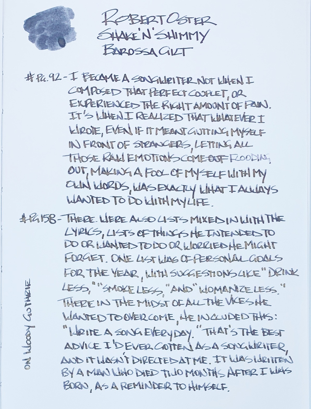
The underlying purple color reminds me of grape juice. More accurately, spilled grape juice where the color and shade changes depending on how much you now have on the paper towel you used to clean it up with. There is even a hint of blue around the edges.
When writing in my Yoseka Notebook for this review, I did run into a dry spot seven lines into it. I hadn’t picked up the pen for about two days at the point I started, and hit a hard stop where you see the word “flooding” show up lightly on the page. I wonder if that was a bit of clogging from the shimmer? I wouldn’t put it past that happening. A few taps of the nib and scribbles on a different page got it going again, and I had no more troubles. This is always a possiblility with shimmer ink.
This is a fantastic ink in a fantastic pen. Will I use this combination a lot? Not likely. I love the purple ink color, but I like my shimmer like I like my pen furniture: Silver in color. Plus, I think this will be my new ink testing pen, so it will be seeing many different inks pass through its feed in the future. That said, Barossa Gilt really does it’s job well, and makes for an impressive look.
(JetPens provided this product at no charge to The Pen Addict for review purposes.)
Enjoy reading The Pen Addict? Then consider becoming a member to receive additional weekly content, giveaways, and discounts in The Pen Addict shop. Plus, you support me and the site directly, for which I am very grateful.
Membership starts at just $5/month, with a discounted annual option available. To find out more about membership click here and join us!

