(Susan M. Pigott is a fountain pen collector, pen and paperholic, photographer, and professor. You can find more from Susan on her blog Scribalishess.)
I’ve been wanting to take a calligraphy course ever since I started using fountain pens. I wanted to learn how to form fancy letters and to improve my regular writing as well. Unfortunately, I could not find an in-person course in Abilene, so I gave it up as a lost cause.
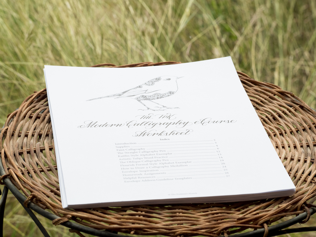
Eventually, I started looking for calligraphy courses I could take online. I found several, but some were over $100, and I wasn’t sure I was ready to commit so much money as a beginner. That’s when I found The Postman’s Knock Beginner’s Modern Calligraphy eCourse. The basic course costs $25 plus supplies. I thought that was a reasonable price to dip my pen into. The $25 fee includes a downloadable calligraphy course worksheet packet and six lessons (some lessons have multiple videos).
Supplies
The supplies recommended for the course were:
- Any pen or pencil (no cost)
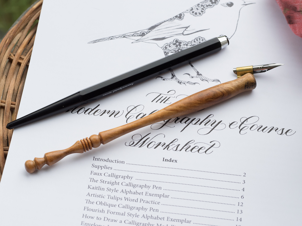
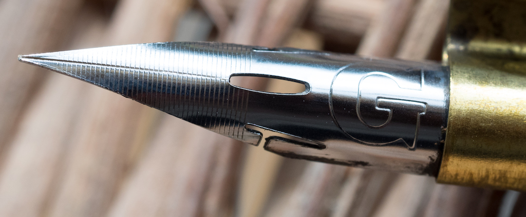
- A Nikko G nib. I bought a pack of three from JetPens. ($4.30)
- A starchy potato (I had one in the fridge)
- A straight pen with a universal insert. I already had a Kaweco Special pen, which I reviewed on Pen Addict here (no additional cost).

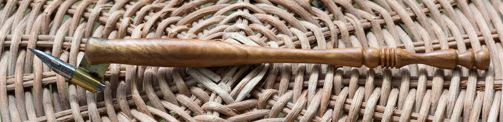
- A brass-flanged oblique pen. I purchased this from PaperInkArts for $14.95 + 3.50 shipping ($18.45)
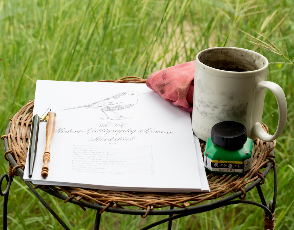
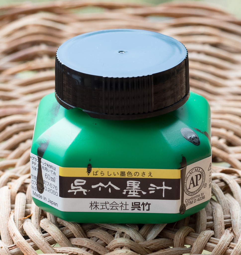
- Sumi or India Ink. I bought a 60ml bottle of Kuretake Sumi Ink from JetPens for $11.00.
- 32# Laserjet Paper. I purchased a ream from Amazon for $14.86.
- A piece of tightly woven cotton cloth. I initially used a microfiber cloth, but later found an old napkin that worked better (no cost).
- A cup or mug for tap water. I used an old faded mug (no cost).
My supplies cost a total of $48.61. So, I paid a total of $73.61 for the course plus the supplies.
The Course
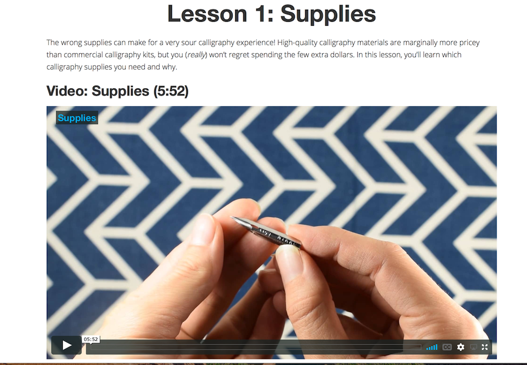
The Beginner’s Modern Calligraphy Course contains six lessons plus a short homework video. Lesson 1 takes you through the supplies you need for the course.
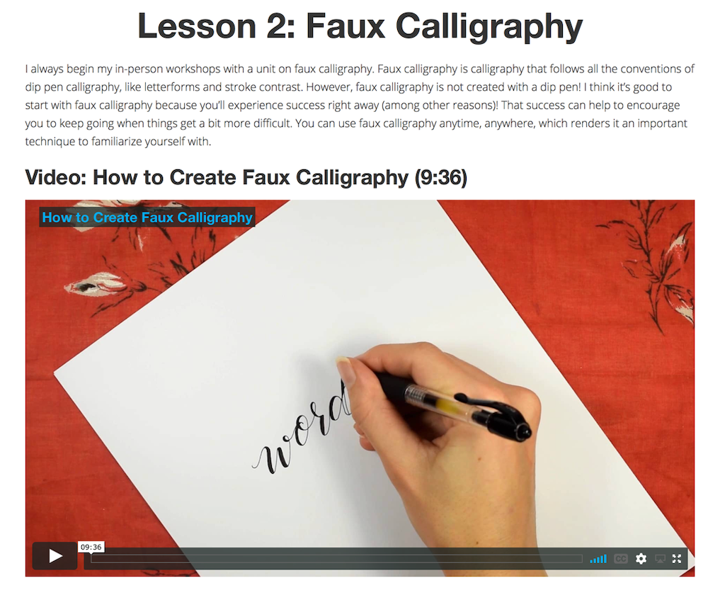
Lesson 2 teaches you faux calligraphy using any writing instrument. I didn’t really find this lesson all that helpful, since I knew I wanted to learn dip-pen calligraphy, but I gave it a try with mixed results.
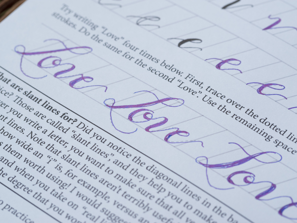
My attempts at faux calligraphy weren’t the best.
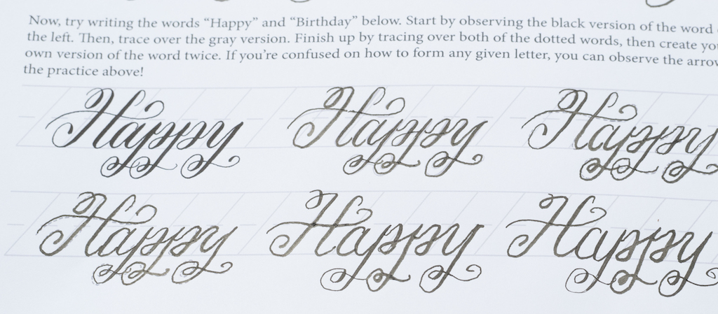
Lesson 3 introduces you to using the straight calligraphy pen using a modern form of calligraphy called Kaitlin Style, created by Lindsey Bugbee from the Postman’s Knock. I enjoyed this lesson because it teaches you the basics of how to use a straight dip pen, first by learning down and up strokes, and then by creating letters. You graduate to writing individual words.
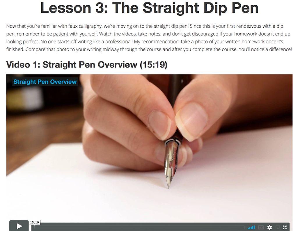
I struggled using the straight pen, mainly because you have to angle the paper so much to get a proper angle.
Plus, even though I dipped and tapped the pen to remove excess ink, my letters often came out blobby and fat.

I emailed Lindsey to ask about this problem (because you’re supposed to have access to email support with the cost of the course), but I never received a reply. I don’t know if this was because my question was asked by someone else in the comments section, and I didn’t see the response, or if my email just got overlooked. I eventually discovered for myself that I had to blot the nib on a paper towel after dipping and before writing to avoid excess ink.
At the end of the lesson, Lindsey provided a traceable project using Amy Style calligraphy. I didn’t exactly feel “proud” of this project since I just traced the letters and didn’t do the calligraphy myself. But, it was good practice.

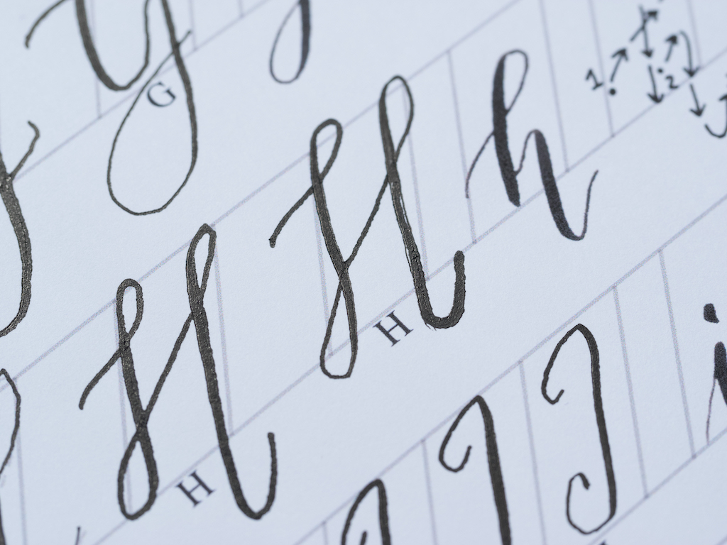
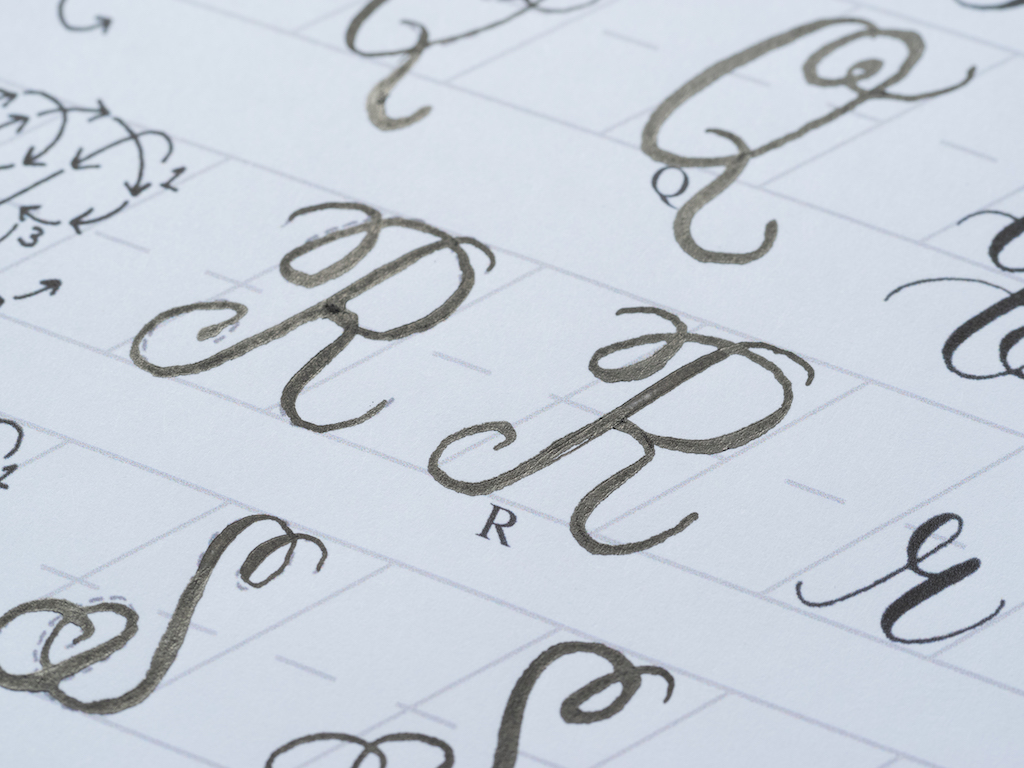
Lesson 4 teaches you how to use an oblique calligraphy pen with a more formal calligraphy style.

This was my favorite lesson. I definitely prefer the oblique pen holder to the straight pen. Even though the oblique holder takes a little bit more practice, in the end you are able to hold your hand at a more natural angle and let the pen do the rest. I also much prefer the formal calligraphy style. I still had some problems with blobs, but not nearly as many, and I felt like my calligraphy improved somewhat with this lesson.
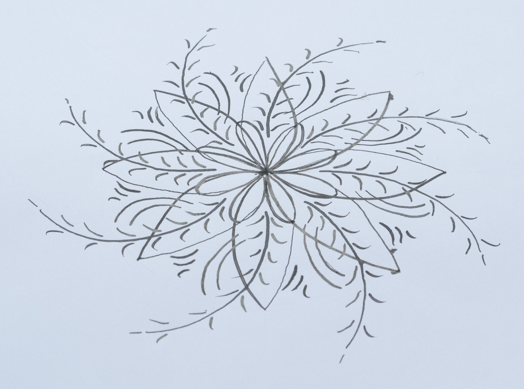
In Lesson 5, you learn how to create a calligraphy medallion. Although this was a fun project that required you to practice different kinds of strokes, in the end, I didn’t find it all that useful. I would have preferred more lettering practice. Still, after a couple of attempts, I created a reasonably good medallion.
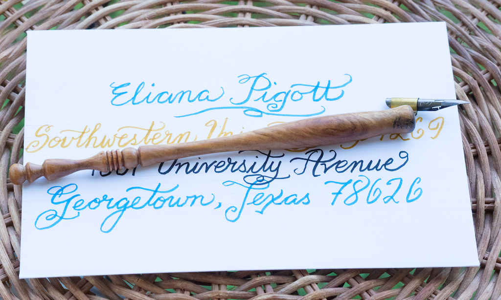
Lesson 6 describes how to create calligraphy envelopes. This was the most challenging lesson of all, because, depending on the style of envelope you want to create, you have to do some measuring and centering. Plus, you have to draw guidelines. I honestly didn’t feel like I was ready for this lesson because I needed more lettering practice. But after several failed attempts, I managed to create a fairly adequate envelope. I sent my daughter, who is a freshman at Southwestern University, her first letter in this envelope.
The last video is simply a reminder to do some homework exercises and to practice. Although you are given two reference alphabets (Kaitlin Style and Flourish Formal), the Beginner’s Calligraphy packet doesn’t include additional practice sheets. For that you must purchase other packets from The Postman’s Knock. I’m planning to purchase the Premium Calligraphy Worksheet Set: Flourish Formal Style ($10.00) as soon as I get more toner for my printer. Obviously, that’s $10 more on top of the supplies and original course, which gets me to about $85. That’s still cheaper than other online courses I considered.
Overall, I was pleased with The Postman’s Knock Modern Calligraphy eCourse. It was not overly expensive, and the supplies were easy to acquire. Lindsey is an excellent teacher, and the videos were never too long or overwhelming. As a beginner’s course, it doesn’t go into too much depth, but instead introduces you to two different alphabet styles, calligraphy medallions, and envelopes.
The main weaknesses of the course were:
- The course did not offer enough writing practice. The two writing lessons essentially let you practice the alphabet once and write a few words. This just wasn’t sufficient to feel competent writing words on my own.
- Because the course is taught through video lessons, there is no way to know if you are holding your pen correctly or writing letters properly. You can’t ask Lindsey to check your style and correct any potential problems. That is, of course, why taking an in-person course is preferable.
- I was disappointed that when I emailed a question to Lindsey, I never received a response. I checked my spam folder to make sure a response wasn’t accidentally sent there, but it wasn’t. Part of what made the course appealing to me was that, supposedly, you could obtain personal assistance when needed.
- The course does not teach you about spacing between letters, drawing calligraphy guidelines, or other technical aspects of calligraphy.
If you’re like me and can’t find a face-to-face calligraphy course, I recommend this one from The Postman’s Knock. As I explained, it won’t make you proficient in calligraphy, but it gives you a sample of different writing styles and a taste of other things you can do with calligraphy. It’s a good starting place, and from here, the best thing you can do is practice.
(I purchased the course and supplies with my own funds.)