

Is “blue” the broadest fountain pen ink category? It has to be, right? Royal Blue, Navy Blue, Blue Black, Turquoise, Sky, insert Ocean or Lake descriptor here. The list goes on and on.
Why are they so popular? Because they are not black, and are mostly appropriate in an office setting. They give your writing character, and co-workers won’t give you the side-eye that green, purple, or orange might bring.
Fountain pen users have no shortage of blue inks at their fingertips, and a wide range of favorites. And you know what else? There is always room for one more. That’s where Van Dieman’s Devil’s Kitchen comes in.

You may have seen Jeff recently review this ink right here in these pages. I’m always open to reviewing the same writing instrument as other reviewers - we all have unique use cases and experiences for pens and pencils. But inks? They are a more static product, and usually one review is enough.
So, why was I compelled to review Devil’s Kitchen a second time? Because the color of ink in my bottle looks completely different than Jeff’s, and different than most retail samples you see online.
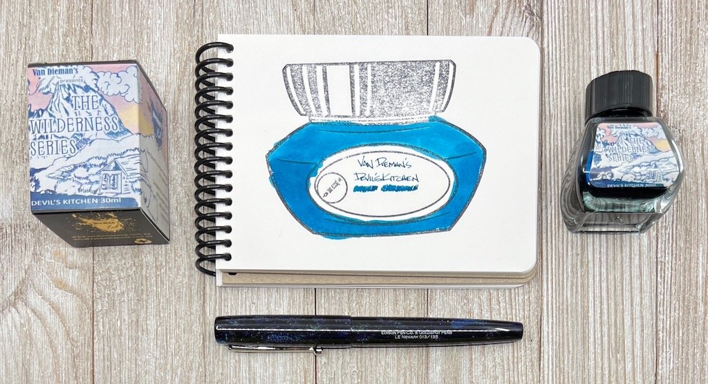
The color of ink in Jeff’s review perfectly matches the most common sample shown online, such as the swab from Vanness Pens, where I purchased my bottle from, and where Jeff’s sample vial was from. It’s a beautiful deep teal green, and a color I would highly recommend if you are looking for that shade.
That’s not what I see from my bottle, though. What I see is represented on Van Dieman’s product page, a rich, complex deep ocean blue. Their image even has more character than I’ve personally seen so far, but that hasn’t kept me from enjoying this ink immensely.
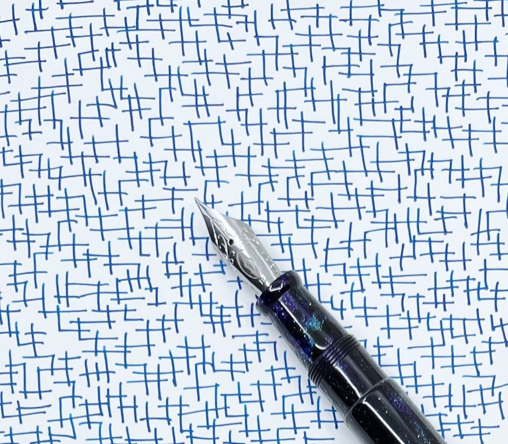

That I use it and enjoy it so much is what got me looking at the color variations online. I think the shade I have is perfect, and one of the best blues I have used in some time. The teal green is good, too, but this blue pops. I’ve used it as part of my #NaNoCoMo project (inked in the recently reviewed Edison x Goldspot Pens Newark Orion Nebula,) and I plan on keeping it on the front of the ink shelf for frequent use in other pens.
But it is blue. And it is different than Jeff’s sample, and other samples online. Right?
It looks like I have some emails to send to sort out the true color. Either that, or have my eyes checked.
(I purchased this ink from Vanness Pens at a discount for review purposes.)
Enjoy reading The Pen Addict? Then consider becoming a member to receive additional weekly content, giveaways, and discounts in The Pen Addict shop. Plus, you support me and the site directly, for which I am very grateful.
Membership starts at just $5/month, with a discounted annual option available. To find out more about membership click here and join us!


