Posts filed under Ink Reviews

Pilot Iroshizuku Fuyu-gaki Ink Review

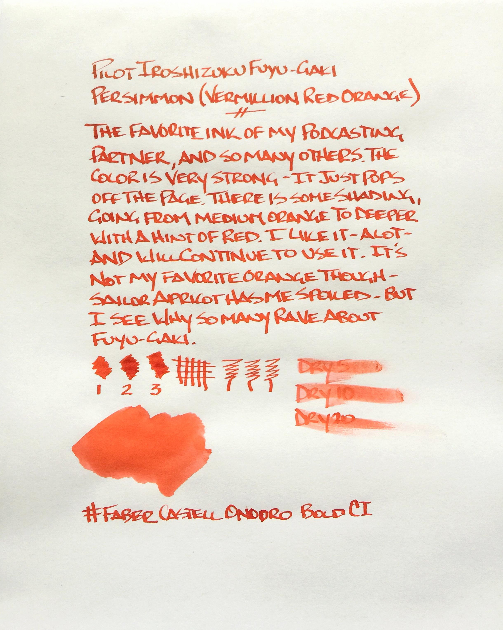
I finally take the favorite ink of Myke Hurley for a spin, thanks to a kind reader (Hi Lori!) who sent me a sample of Pilot Iroshizuku Fuyu-gaki many moons ago. I'm a fan of orange, and orange inks, but Fuyu-gaki isn't going to make my primary ink rotation any time soon.

My feelings on this ink are hard to pinpoint. It's a nice, perfectly fine ink. It behaves wonderfully, as every Iroshizuku ink I have tried does. The orange is bright, but doesn't exactly pop. Nor is there much shading. It moves from medium orange to red, but it's not hugely obvious. It's good, but doesn't knock my socks off.

This is where ink samples come in handy. I'm glad I got to try it before committing to a bottle. Myke drinks the stuff, but my little vial will keep me stocked for a while. Oh Sailor, why did you have to discontinue Jentle Apricot with no valid replacement???

Posted on February 13, 2015 and filed under Ink Reviews, Iroshizuku, Pilot.

Private Reserve Ebony Purple Ink Review

A month ago, I finally signed up for Ink Drop from Goulet Pens. My first sample was "safe for work," meaning they were all reserved and dark colors that wouldn't call much attention in the office. The one that caught my interest first out of the bunch was Ebony Purple by Private Reserve. I thought a dark purple would look great as an everyday writing ink, so I inked it up in a Lamy Vista that was nearby.

I have to admit, I was a little disappointed by just how deep and dark the ink is – I struggle to see the purple when I'm writing. I normally have to hold it up to a light to see purple showing through in the lighter areas of the pen strokes. Despite that, it's a great ink that performs well. Let's get into the details.

This ink flows super smooth – very well lubricated. My Lamy Vista is normally a bit scratchy with other inks, but it's surprisingly smooth with this ink. There's a minor (very minor) amount of shading if you're using a broader nib. Obviously, you can get the best shading if you're using a calligraphy or flex nib, but in my fine Vista, it's hardly noticeable. If you're a big fan of inks that shade beautifully, this one won't please you. The ink does surprisingly well on cheap paper, barely feathering at all. I was impressed by this because I expected it to feather quite a bit because of how dark and smooth it is.

Dry time is a bit of a problem. I gauge it at somewhere between 25 and 30 seconds to completely dry, so this ink is probably out for most lefties. I'm a righty, and I still end up smudging the line above where I'm writing. Dry time is definitely slow with this one.

Cleaning the ink out of a pen is a cinch. No complaints here – it's a pretty easy ink to clean.

The saturation of this ink is incredible, and I think the name they chose is a literal interpretation. It really is ebony in color and the purple is an after-thought. Personally, I'd like to see more purple, but that's not really a problem with the ink – it's just personal preference.

If you like subtle inks that don't stray from the standard colors, this is a good one to try. Like I said, most people will have to look pretty closely to notice the purple, and it's fun when you finally do notice. But it certainly isn't distracting, which is why it's safe for an office environment.

Overall, I wasn't really excited by this ink just because of how dark it is, but I'm certainly interested in trying more inks from Private Reserve. This ink behaves admirably, and if the rest of their line is similar, that's really good news. Now, on to try the other ink samples before the next batch comes in!

Posted on February 4, 2015 and filed under Ink Reviews, Private Reserve.

Montblanc JFK Navy Blue Ink Review

One of the readers of this blog is an ink junkie. I know this because I have received some of the most interesting, hard to find, limited, and discontinued ink samples in my mailbox from him. Sometimes I get the heads up, and sometimes, as was the case with this Montblanc JFK Navy Blue, they just show up.

I’m glad it did too, because this is a pretty great ink. While it isn’t marketed as blue black, one stroke with it makes it clear that it is. The blue is deep, with nice grey undertones. It’s by no means a pure dark blue, which is what I would think an ink named navy blue would dictate.

It reminds me a lot of Pilot Iroshizuku Shin-kai not just in the way it looks, but in the way it shades and the way it performs. There is so much sublte character with inks like these and I think that is why I fall for them. To the naked eye they look like a normal business ink, but upon closer inspection there is a depth and uniqueness you don’t see in any blue ink.

I used up two fills from the sample vial before I went on the hunt to order some for my own stash. It’s a limited edition so you will have to poke around a little bit, but it shouldn’t be too hard to come by. I ordered mine from Fahrney’s Pens, which worked out swimmingly.

One note on the written review below: I used Tomoe River paper, and while it is flat out amazing for dailiy use, it’s not the best for reviews. It crinkles a bit, which manifests itself in odd lighting and shadows, and takes forever to dry, so dry time tests are invalid. I realized all of this once I was done, so after one other review that is already complete I will be moving my ink reviews back to a more standard paper.

Posted on January 23, 2015 and filed under Ink Reviews, Montblanc.