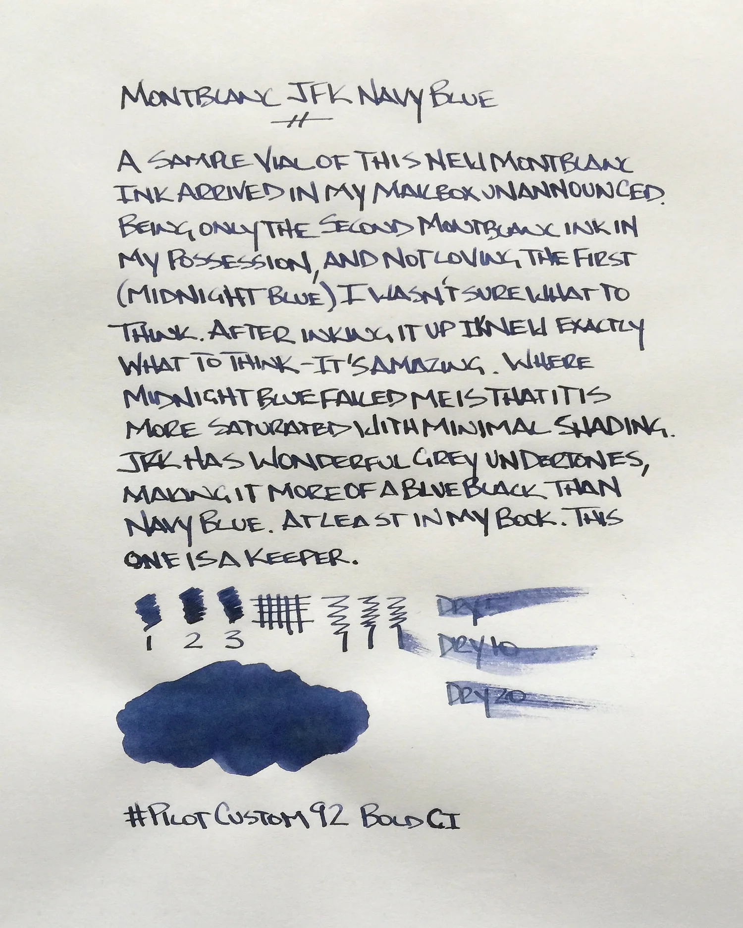
One of the readers of this blog is an ink junkie. I know this because I have received some of the most interesting, hard to find, limited, and discontinued ink samples in my mailbox from him. Sometimes I get the heads up, and sometimes, as was the case with this Montblanc JFK Navy Blue, they just show up.
I’m glad it did too, because this is a pretty great ink. While it isn’t marketed as blue black, one stroke with it makes it clear that it is. The blue is deep, with nice grey undertones. It’s by no means a pure dark blue, which is what I would think an ink named navy blue would dictate.
It reminds me a lot of Pilot Iroshizuku Shin-kai not just in the way it looks, but in the way it shades and the way it performs. There is so much sublte character with inks like these and I think that is why I fall for them. To the naked eye they look like a normal business ink, but upon closer inspection there is a depth and uniqueness you don’t see in any blue ink.
I used up two fills from the sample vial before I went on the hunt to order some for my own stash. It’s a limited edition so you will have to poke around a little bit, but it shouldn’t be too hard to come by. I ordered mine from Fahrney’s Pens, which worked out swimmingly.
One note on the written review below: I used Tomoe River paper, and while it is flat out amazing for dailiy use, it’s not the best for reviews. It crinkles a bit, which manifests itself in odd lighting and shadows, and takes forever to dry, so dry time tests are invalid. I realized all of this once I was done, so after one other review that is already complete I will be moving my ink reviews back to a more standard paper.


