Is there a more underrated stationery item than the simple postcard? Probably, but for the sake of this discussion, let’s talk about how great postcards are, and how I use them.
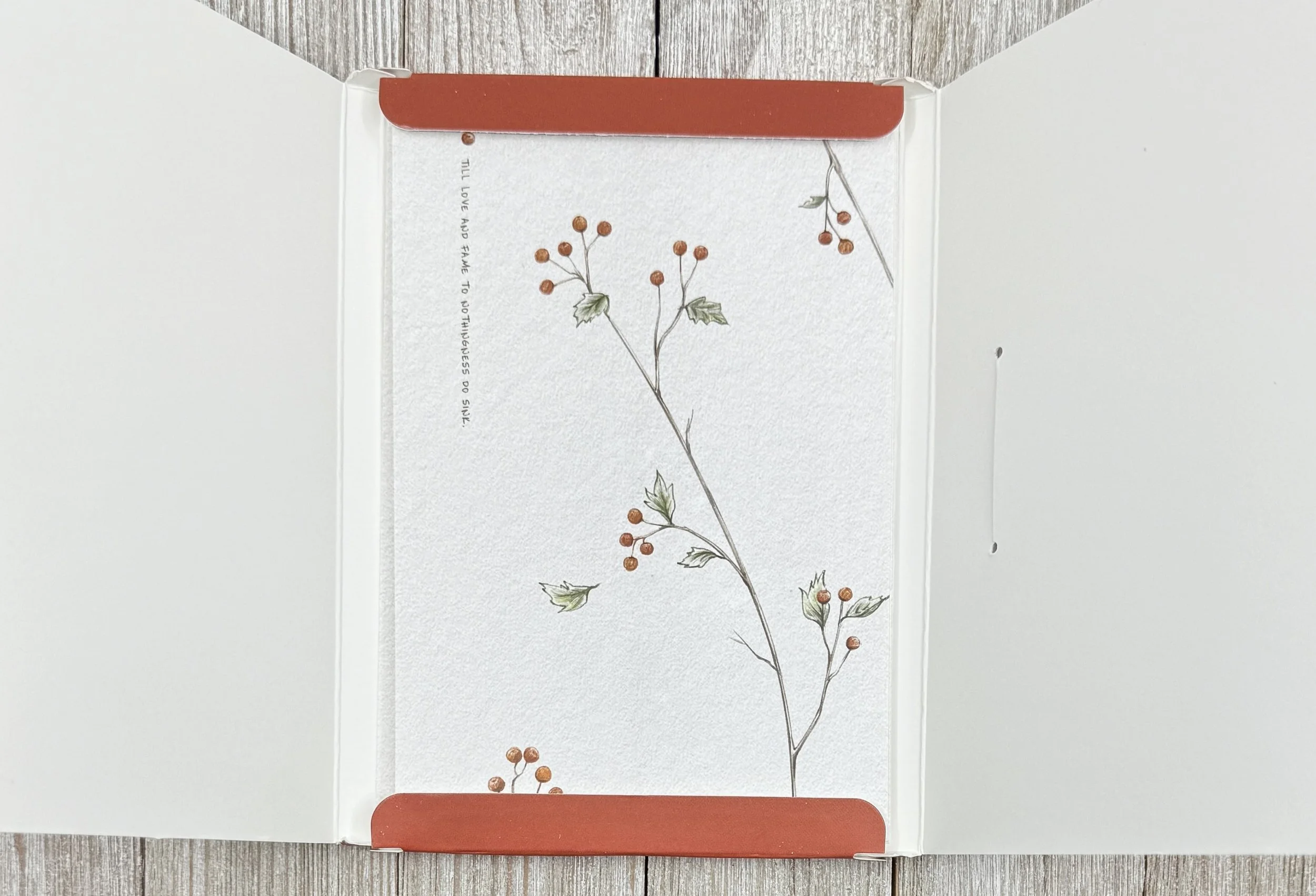
The BGM Encyclopedia of Plants Postcard Set is the latest addition to an ever-growing postcard stash. The design of these fit my aesthetic, but BGM has five other themed sets to choose from if you prefer a different style. Picking out cool designs for postcards is what it’s all about - even ahead of performance, which we will get to in a minute.
All 16 cards in this set feature a different design on the outside, and include various lines of text (Poetry? Motivational quotes?) of unknown origin. It’s interesting to say the least, and I would have been happier with just the beautiful floral imagery, but I can have fun with it. For example:
Grow fonder
Life may always
have
Regret but the future is still good
Beauty, AI, or bad translation? You be the judge.
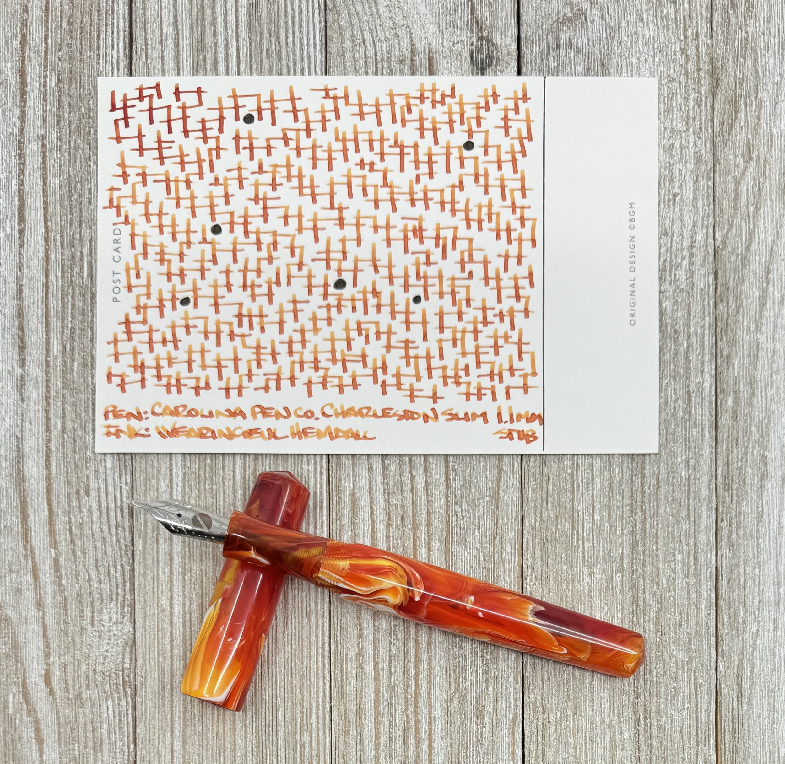
The flip side of the card is where the magic happens, and BGM designed a winner by keeping the extraneous text to a bare minimum. I’ve seen cards that place text in all kinds of random places, have huge lines taking up too much space for the address, and random images that get in the way. Give me a nice, clean space to write or draw, and then I’ll handle the rest. That’s exactly what these cards do.
As a bonus, the paper stock is nice! I never expect a flawless writing experience from postcards, so when I get it I consider that a bonus. The first thing I tested were fountain pens, and there was no bleeding or feathering to be found. That’s always my first test, and then I grab a rollerball because their water-based ink is similar to that of fountain pen ink. Once I saw how well these performed I knew I was in good shape with any ink or graphite I wanted to use.
A few notes on how I use postcards: For starters, I mark out a block on one area of the card for the stamp and the mailing address. I prefer not having built-in lines and rolling my own. I don’t leave a ton of space, but I feel ok about it. I can move this block around as needed. For content, I generally do what I did here - doodle line art, or write song lyrics. I don’t write traditionally, as if I were writing a letter, but more as a meditative, relaxing moment. Finally, I don’t obsess over using waterproof ink or anything like that. Postcards are bound to get damaged, so I figure I use the ink that I want, and they get more beautiful on the way to their destination. I will use a ballpoint ink for the address for permanence reasons, though.
I use a ruler and a ballpoint to draw my address block.
At $6.50 for a pack of 16 (approximately 40 cents per card,) I can’t recommend these postcards highly enough. Yes, even with the odd choice of words alongside the artwork on the front. I mean, I’m adding my own weird words and designs on the back, so who am I to talk!
(JetPens provided this product at no charge to The Pen Addict for review purposes.)
Enjoy reading The Pen Addict? Then consider becoming a member to receive additional weekly content, giveaways, and discounts in The Pen Addict shop. Plus, you support me and the site directly, for which I am very grateful.
Membership starts at just $5/month, with a discounted annual option available. To find out more about membership click here and join us!


