(Jeff Abbott is a regular contributor at The Pen Addict. You can find more from Jeff online at Draft Evolution and Twitter.)
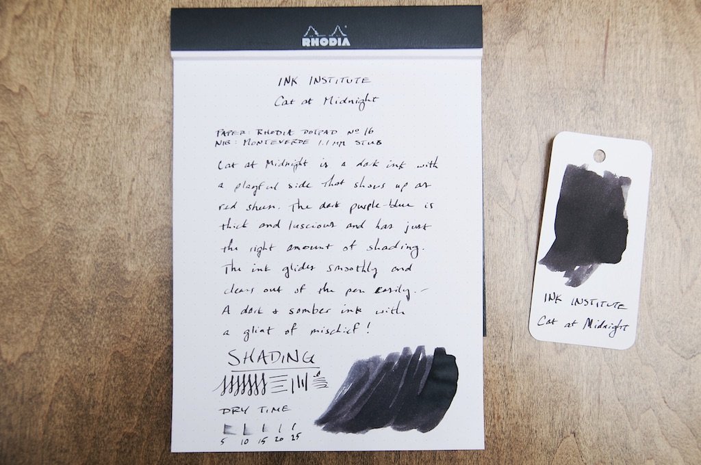
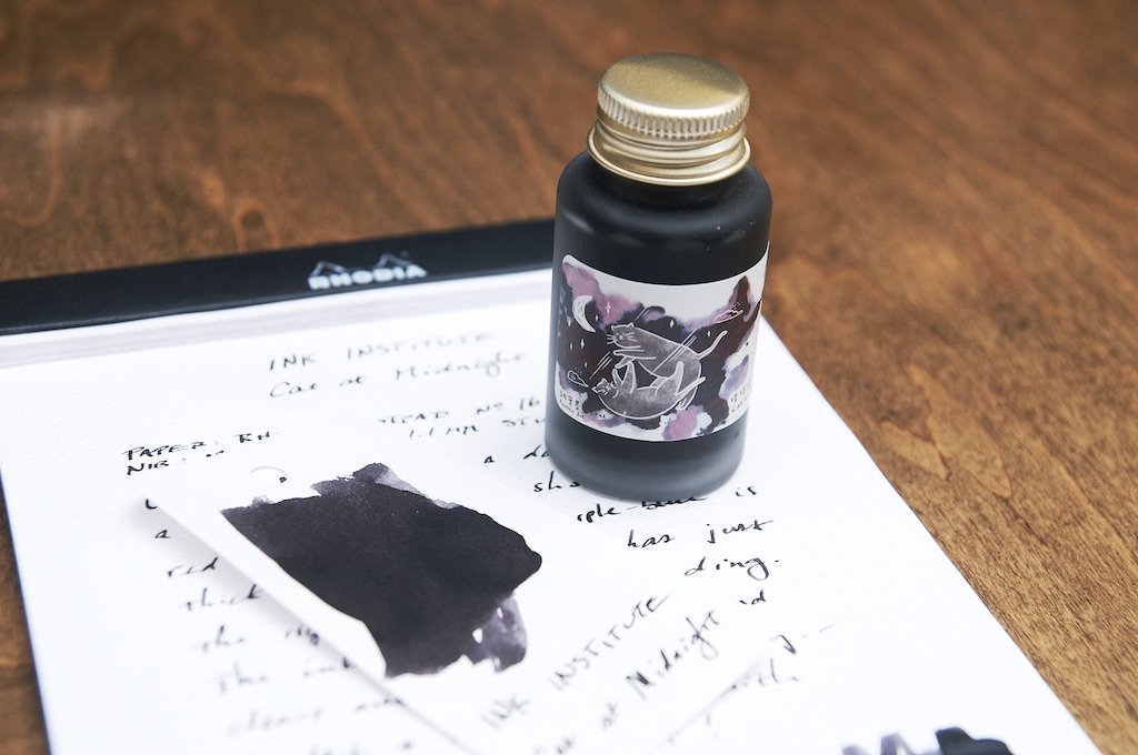
One of the newest inks to hit the scene (at least in my neck of the woods) is a Taiwanese company called Ink Institute. Ink Institute has an impressive selection of inks that feature bright colors and old classics alike. The first ink I've had the pleasure of trying is called Cat at Midnight. This is a dark ink that looks like a black-gray to my eyes, though the marketing says this is actually a dark purple-blue with red sheen. I can see some purple sometimes in certain light when the ink shading is light, and the red sheen shows up minimally in the right light as well. As a dark gray/purple ink, it does a great job.

Being my first ink from Ink Institute, I was most curious about how the ink behaved in my pens. It's one thing to have interesting colors, but that doesn't matter if the ink doesn't play nice with nibs and paper. Fortunately, this ink is fantastic in terms of how it acts in the pen and on the paper. There's plenty of lubrication without the ink feeling too wet, and it does great on a variety of different paper types. Dry time isn't spectacular, but it's usually dry by 20 seconds when using a medium nib. This is a long time for left-handed writers, so it won't be a good pick if you need a fast drying ink.
On the paper, the ink looks crisp and richly saturated. There's no feathering or bleeding with this dye-based ink, even when the ink pools up. It acts the same regardless of what quality the paper is, and it seems fairly resistant to water.

There's a fair amount of shading with this ink, which is what gives it most of its character. Without the plentiful shading, this ink is fairly boring and could be mistaken as a generic black ink. The shading is where the little hints of purple come through, even if they are slight.
At $16 for a 30ml bottle, this ink comes at a premium. I look forward to trying some other inks from Ink Institute because Cat at Midnight just doesn't offer enough to justify the price, and this is 100% due to the dark color. It's just hard to know what's going on in there! If it were a little lighter and the purple was more prominent, I'd probably love this ink. But with it being a black ink in my mind, there are many other inks I'd rather try before landing here.

I recognize that I don't hold any fondness for super dark or black inks, but that doesn't mean that there are plenty of other people that would line up for a color like this one that performs so well. If you're looking for an almost-black ink with a little character, this is an interesting option. For me, I need a little more color in my inks.
You can find Cat At Midnight — along with a lot more from Ink Institute — at Yoseka Stationery.
(Yoseka Stationery provided this product at no charge to The Pen Addict for review purposes.)
Enjoy reading The Pen Addict? Then consider becoming a member to receive additional weekly content, giveaways, and discounts in The Pen Addict shop. Plus, you support me and the site directly, for which I am very grateful.
Membership starts at just $5/month, with a discounted annual option available. To find out more about membership click here and join us!