Posts filed under Sailor

Sailor Yurameku Zare Gokoro Ink Review

(Jeff Abbott is a regular contributor at The Pen Addict. You can find more from Jeff online at Draft Evolution and Twitter.)

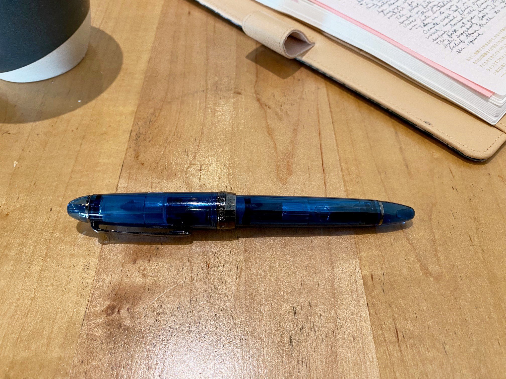
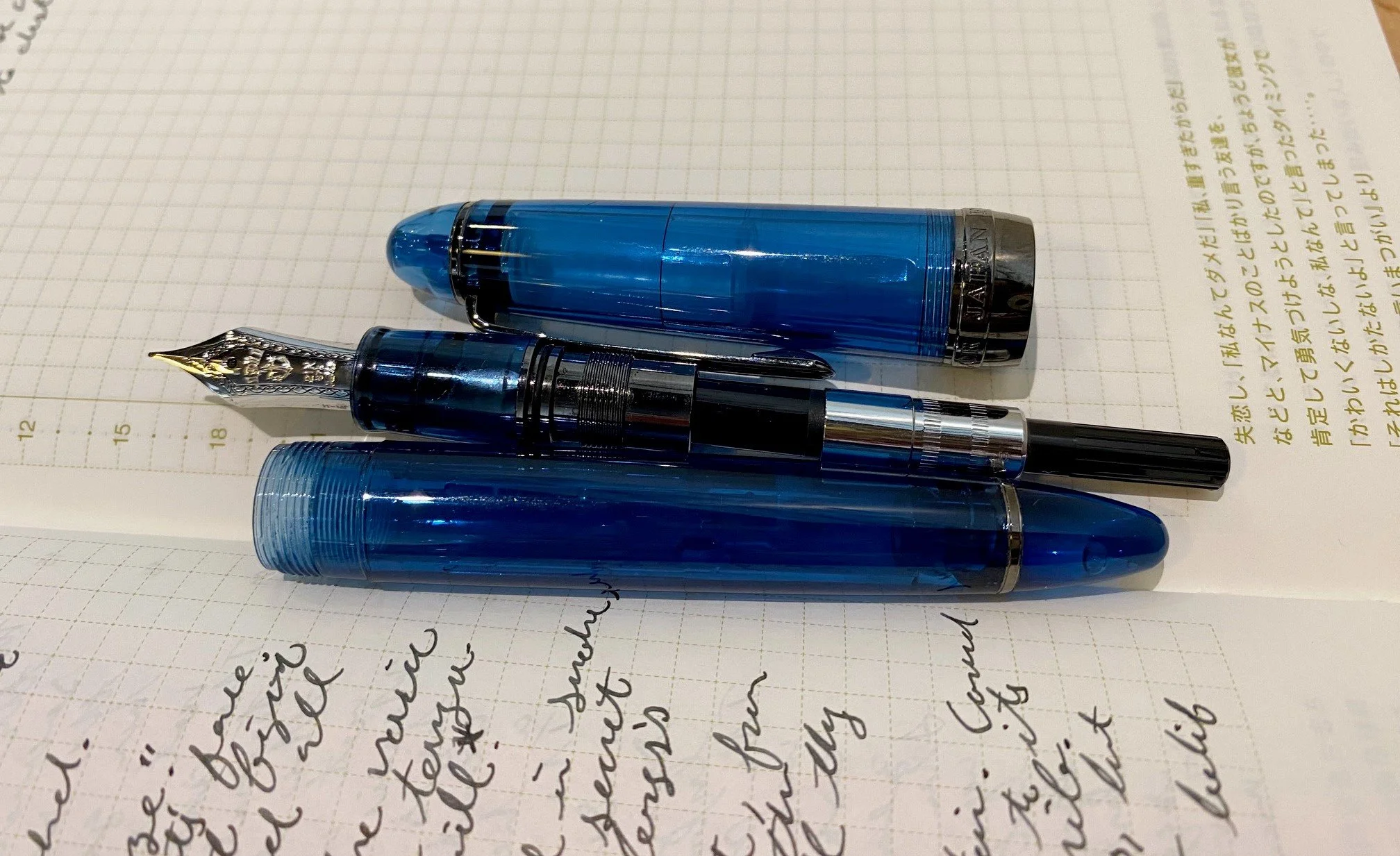
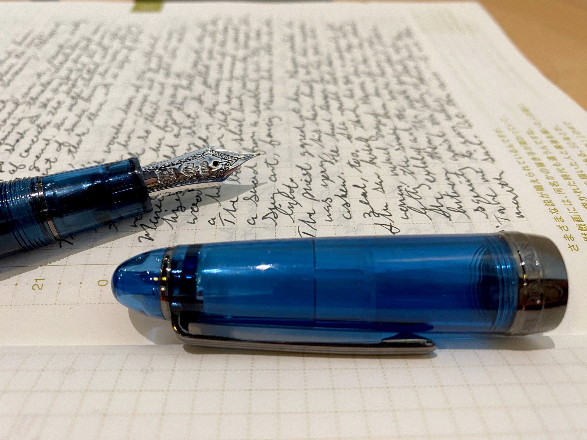
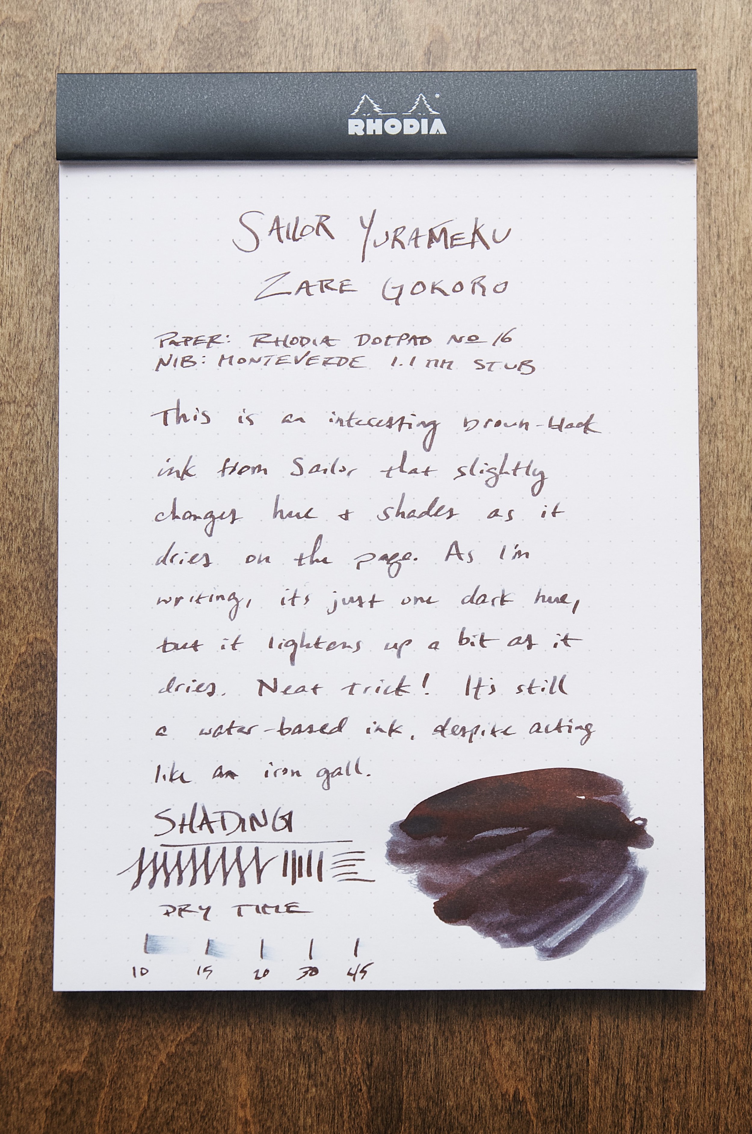
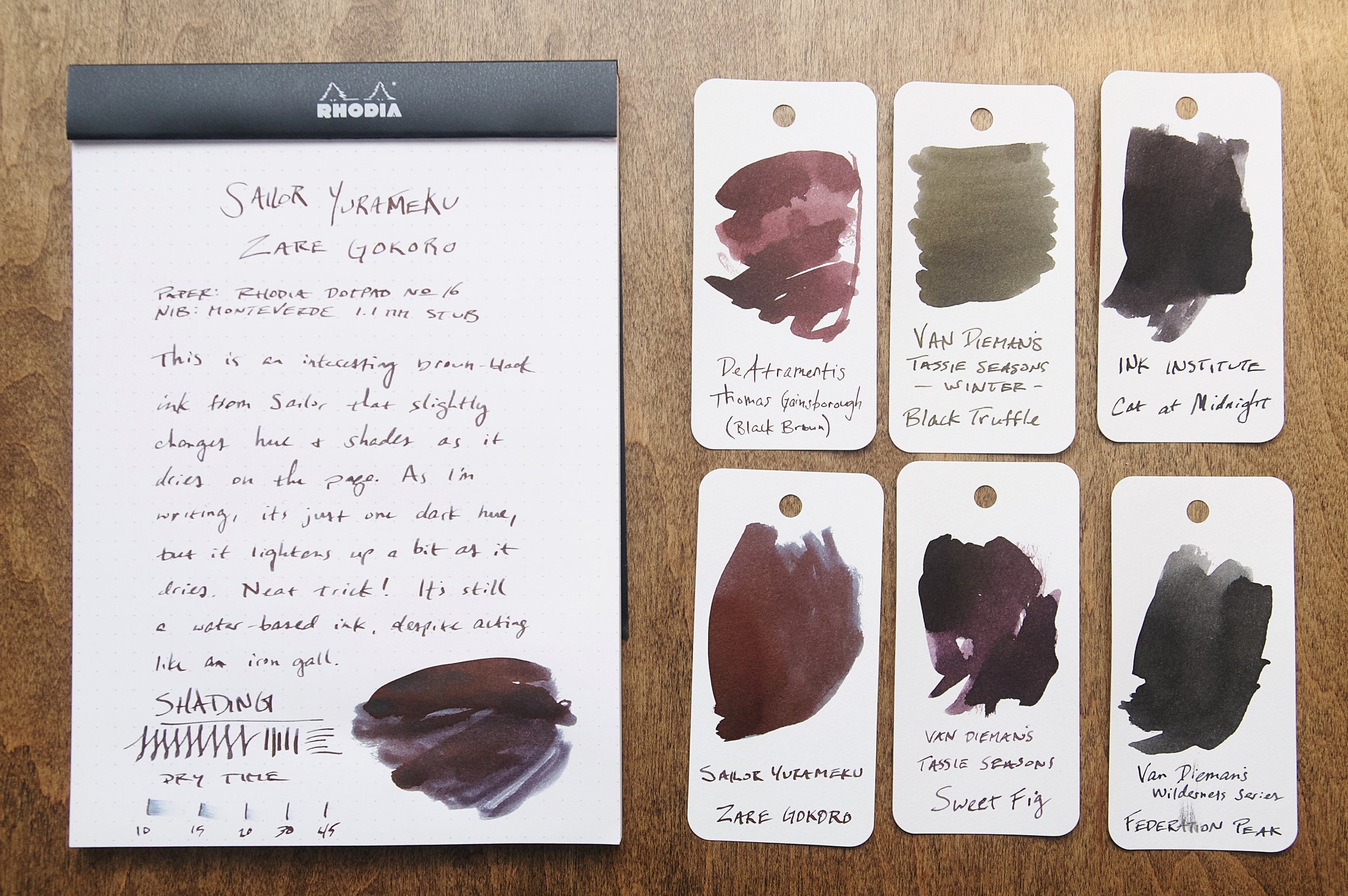
The latest ink that I've been using in a couple of my pens is a dark brown ink from Sailor's Yurameku line called Zare Gokoro. This particular ink looks almost black when wet, but dries to a lighter shade that has some brown-black to dark brown hues that show through.

There are several Sailor inks in my collection, so I'm always excited to try something new from this Japanese brand. Zare Gokoro looks exciting due to the marketing copy that claims this "mysterious" ink changes color as it dries. How can you pass that up? I already have some inks in my collection that do this, but they're most iron gall inks. In this case, Zare Gokoro is a water-based dye ink. How does it stack up against the iron gall alternatives?

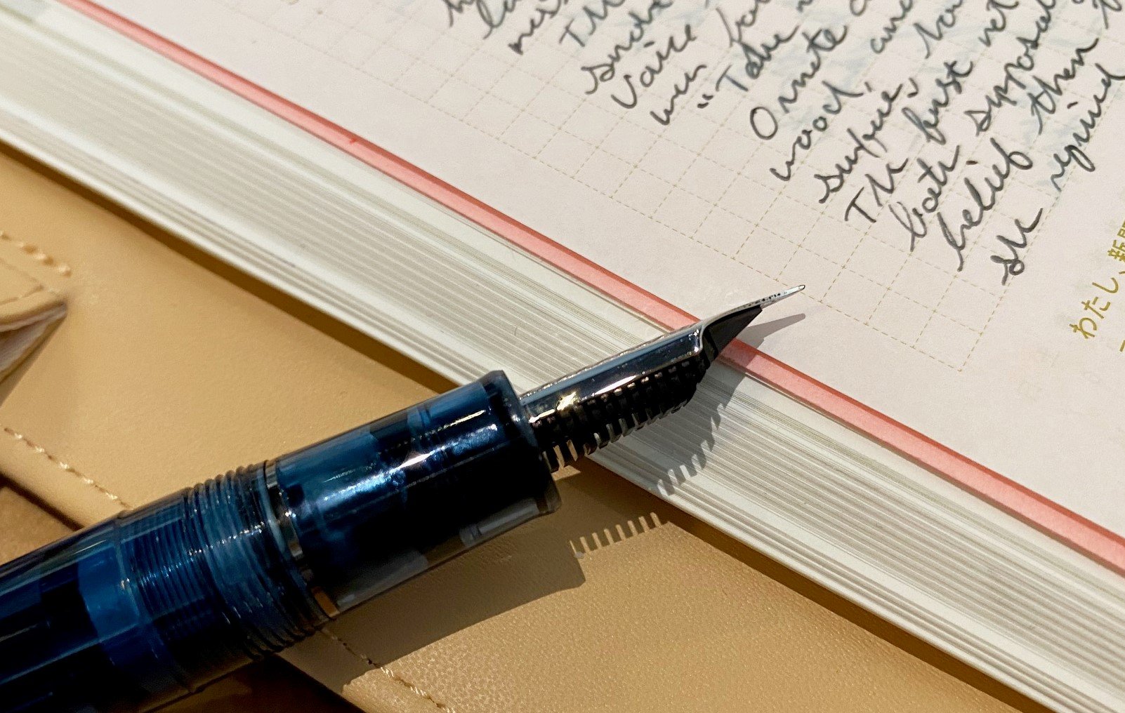
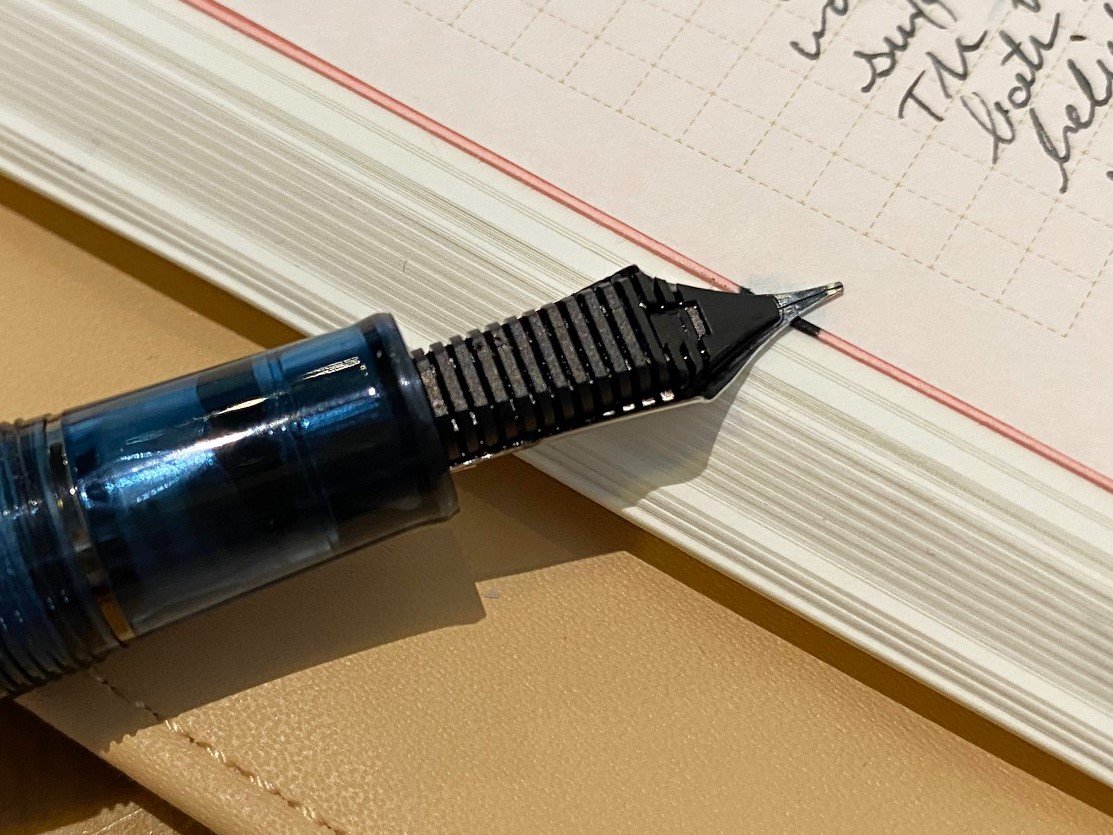
Like all Sailor inks I've used, this ink flows well, doesn't feather or bleed, and is incredibly consistent and easy to use. It's an incredibly slow ink to dry, though. In my tests, it takes at least 30 seconds to dry to the point where it doesn't easily smudge. For areas where more ink has pulled up in the valley of a direction change from the nib, it can take up to a minute to dry. This is a really slow drying ink.

I was really curious to see how the ink color changed as it dried, so that was the first thing I was focused on after inking up the pen. Sure enough, writing with the ink lays down a dark line that looks black to my eyes. I wouldn't even call it black-brown because I can't discern any brown while this ink is wet. Magically, the ink color lightens as the ink dries, revealing a dark brown with mild shading. In some areas, you can even detect some dark red or rust color. It's really fun to watch this transition happen as the ink slowly dries.

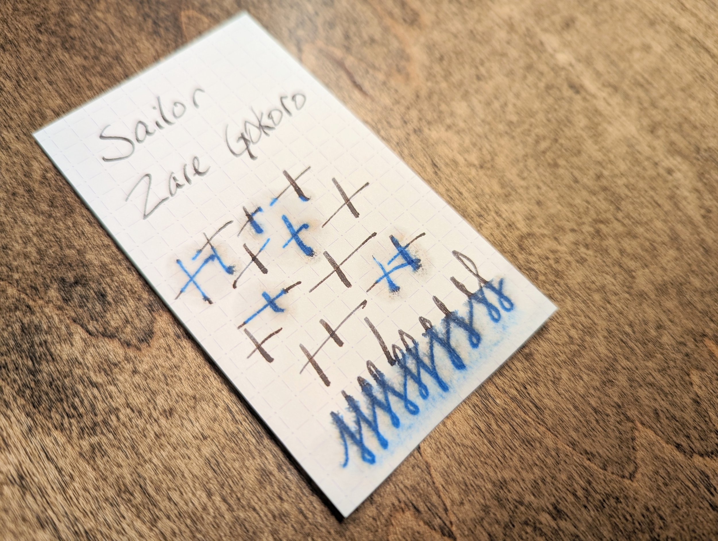
Since this is an ordinary water-based ink, it doesn't fare well when introduced to water. It doesn't wash away, but just a little bit of water rinses away the darkness of the ink and leaves behind a de-saturated blue color instead. You would be able to read what was on the page as long as the paper survived, but it might be difficult in some areas.

Overall, I was expecting more out of this ink. The color changing behavior was interesting since most inks get a little darker as the dry, not lighter. Iron gall inks also get a bit lighter as they dry, which is something I've always liked about them. It was one of their unique qualities aside from their water resistance. The super long dry time, lack of much shading, and the price all put me off this ink.

At $20 for a 20ml bottle, you're paying a premium for the Sailor name, and I don't think the price justifies the ink performance in this case. There are so many other interesting and well-performing inks on the market, so it's easy to point in almost any other direction here.

(JetPens provided this product at no charge to The Pen Addict for review purposes.)


Enjoy reading The Pen Addict? Then consider becoming a member to receive additional weekly content, giveaways, and discounts in The Pen Addict shop. Plus, you support me and the site directly, for which I am very grateful.

Membership starts at just $5/month, with a discounted annual option available. To find out more about membership click here and join us!

Posted on July 19, 2023 and filed under Sailor, Ink Reviews.

Sailor 1911L 4am Fountain Pen Review

(Sarah Read is an author, editor, yarn artist, and pen/paper/ink addict. You can find more about her at her website and on Twitter. And check out her latest book, Out of Water, now available where books are sold!)

Pen shows are a great place to try out the pens you have resisted buying for years, because it's so much easier to resist things online. And by "great" of course I mean dangerous, because it's so much harder to resist things in person. Especially when Brad says, "Hey, you were looking for one of these, right?"

In any case, I left the Chicago Pen Show with a Sailor 1911L 4am, and I'm very glad I did. As a habitual night owl who frequently greets the hour of 4am with pen in hand, that cool, blue glow of pre-dawn is like an old friend. The resin material of this pen matches that tone perfectly, and the gunmetal grey accents look elegant and moody. It's a gorgeous pen, and I coveted it when it was first released. I hesitated, though, because it was a limited edition and pricier than a standard Sailor, and I already have a number of lovely Sailors, and I didn't NEED it, and and and, etc. There was always an excuse. And then Sailor raised their prices, and even though this pen remained at the pre-rise price, I was feeling grumbly about the brand in general. So I kept resisting. Until Brad texted me at the Chicago Pen Show.

Brandon, of Rocky Top Pen Co., had a 4am at his table. It was used, but it also had a MF cursive italic nib grind by John Mottishaw, and he was selling it for $275--$37 under the retail price for a 1911L. While the pen is still available at many retailers in the smaller version for $220, that nib was calling to me. It's practically my favorite grind, and I don't own any other Mottishaw nibs. And that pen was right in front of me, then it was in my hand, then I put it down and walked away, and then I walked right back. Let's just call that the Pen Show Tango.

The pen has a 21k gold nib, and the CI grind on this MF nib is crisp and perfect. It shows just the right amount of character in the lines it creates, while still being both very fine and maintaining good flow. This nib is easily in my top three nibs that I own, maybe even the top one--though I'd need a Platinum showdown to confirm that. In any case, it's almost too good to write with, not because I'm afraid to use it, but because it's difficult to think about what I'm writing when I can't stop swooning over HOW I'm writing. That hasn't stopped me from using it every day since I bought it, though.

Perhaps this is more a review of the nib than the pen, as Sailor hardly needs my voice added to its chorus of praises, or maybe it's a review of the pen show experience, where you can find rare treasures and irresistible deals. But I wouldn't hesitate to recommend all three: The Sailor 4am, which you can still find in most online stores; Mottishaw nib grinds, which have utterly enchanted me; and attending pen shows, where resistance is futile.

This pen has seen two 4am writing sessions already. It will see several more in the coming weeks, as I'm in my heaviest deadline season. I'm very glad to have this aptly themed writing companion along for the ride.


Enjoy reading The Pen Addict? Then consider becoming a member to receive additional weekly content, giveaways, and discounts in The Pen Addict shop. Plus, you support me and the site directly, for which I am very grateful.

Membership starts at just $5/month, with a discounted annual option available. To find out more about membership click here and join us!

Posted on May 25, 2023 and filed under Sailor, Fountain Pens, Pen Reviews.

Sailor Yurameku 2nd Edition Date Gokoro Ink Review

Multi-shading inks are all of the rage these days, and Sailor is at the forefront with their Yurameku fountain pen ink lineup.

When they launched the 1st edition of these inks inks, I was excited, but my expectations were tempered due to the lightness of the colors. I reviewed one of the relatively darker shades in Itezora, and was pleasantly surprised. The color was dark enough for regular writing, and the color - wow - that’s what I signed up for. Is it blue? Green? Purple? How about yes to all of the above?

That is the idea of Yurameku in a nutshell. From Sailor’s website:

“The color changes depending on the length of time and the paper. A mysterious ink that shows glimpses of different colors in shades and streaks.”

Mysterious is the right word. And it’s nice to see Sailor point out, even subtly, that paper matters.

With the 2nd Edition Yurameku inks, Sailor brought in the darker shades, which are more up my alley for day to day use. I get why the light colors went first - they are much more visually appealing in pictures - but the dark colors are where it’s at for day to day writing.

Sailor includes converter stickers in some of their ink lineups.

I bought three bottles of the 2nd Edition at the Atlanta Pen Show, Date Gokoro, Suki Gokoro, and Zare Gokoro, and I’m reviewing the first in the list today. Looking at the packaging of Date Gokoro, I expected a purplish black ink, and I think that’s what we have here. Maybe.

Before even inking it up in a pen, I took my Kakimori dip nib out and laid some ink down on original 52 gsm Tomoe River, new Sanzen Tomoe River, Yamamoto Bank Paper, and Kokuyo Business Paper. I like to know how inks work on these papers. The first three are specialty papers that handle fountain pen inks well, albeit in different ways, and the last one is more of a stock, basic paper.

In general, the color is close on all paper types, but on closer inspection, different colors take prominence depending on the page.

The character of Date Gokoro shines on these fountain pen friendly papers. It’s a deep dark purple with hints of blue and black, a note of pink underneath, and a moderate red sheen after it dries. On the Kokuyo Business Paper, the color is much more flat. That makes sense since it is more absorbent. It’s good for fountain pens, but it dries fast. With these multi-shading inks, you want the ink to dry slower to get the full character of the ink to come out.

I inked up Date Gokoro in a new Mythic Pen Co. Aeschylus model, also bought at the Atlanta Pen Show, with a Medium steel Jowo nib. It flowed very well from this setup, with a deep, dark purple fresh from the nib, and lighter shades as it dried. This is the entire idea of the Yurameku ink lineup. Yes, many inks exhibit this exact behavior, but the multi-color appearance after it dries is what sets it apart. There is a lot going on with these lines on the page.

The color is all over the place depending on how much ink goes down on the page.

Dry time on Yamamoto Bank Paper was on the slow side, which, again, is the expectation here. I wouldn’t buy one of these inks if you worry about smearing the lines right after putting them down.

If you are interested in buying these inks, they are in the premium category. They are “only” $20 per bottle, but the bottle is 20 ml in size. I think we can all do that math, which, for ink, is expensive. I’m ok with it - maybe I’ll actually finish a bottle of ink for a change.

(I purchased this product at a discount from Dromgoole’s at the 2023 Atlanta Pen Show.)


Enjoy reading The Pen Addict? Then consider becoming a member to receive additional weekly content, giveaways, and discounts in The Pen Addict shop. Plus, you support me and the site directly, for which I am very grateful.

Membership starts at just $5/month, with a discounted annual option available. To find out more about membership click here and join us!

Random Kakimori streaks on Sanzen Tomoe River.

Posted on April 17, 2023 and filed under Sailor, Ink Reviews.