Posts filed under J. Herbin

Five J. Herbin Inks: An Overview

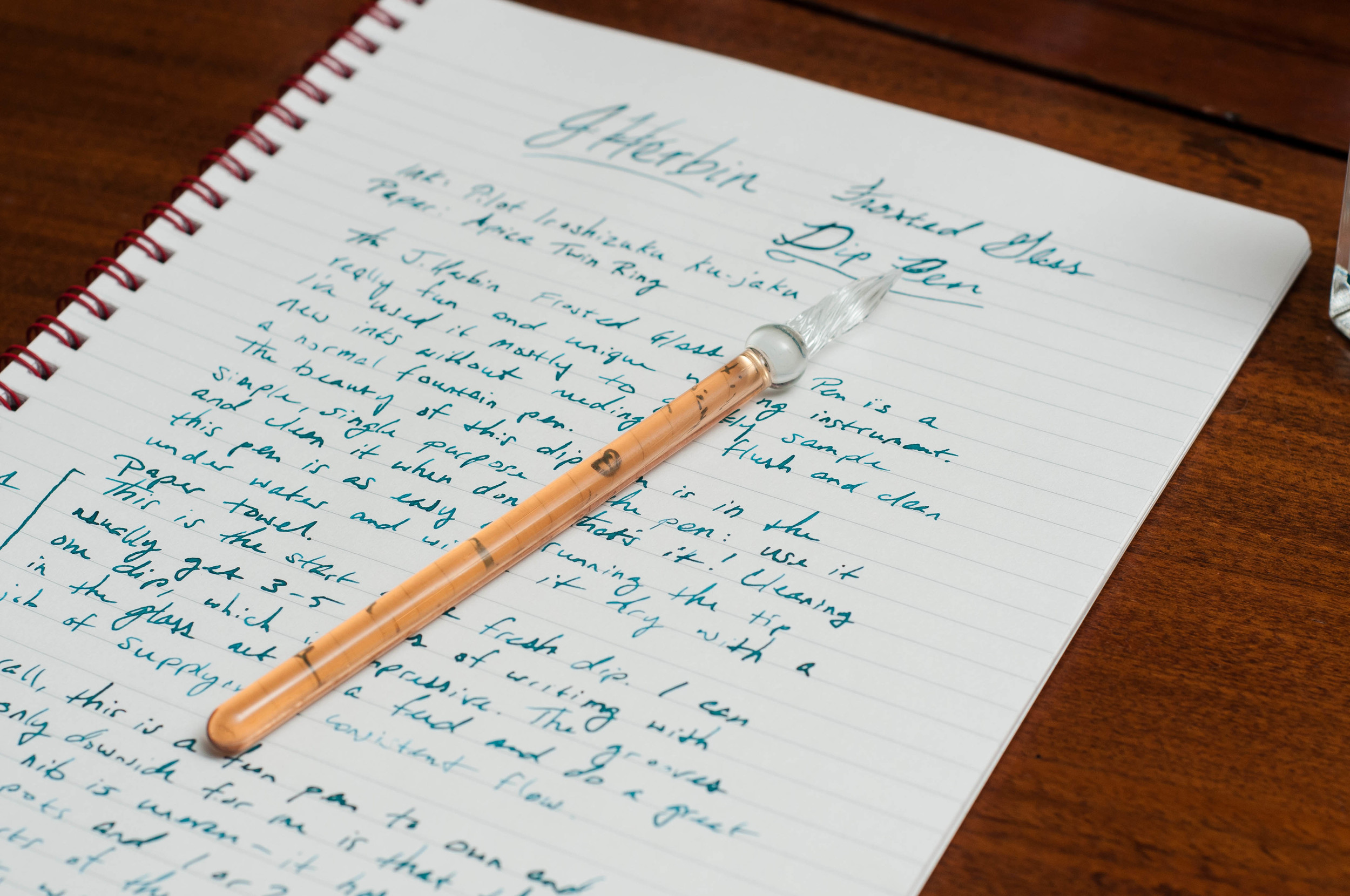
(Susan M. Pigott is a fountain pen collector, pen and paperholic, photographer, and professor. You can find more from Susan on her blog Scribalishess.)

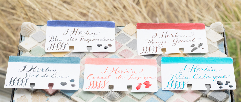
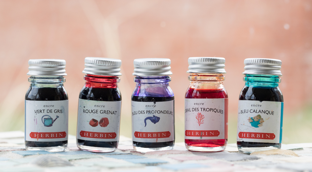
This week I’m doing an overview of five J. Herbin inks. I won’t review each ink in as much detail as I usually do, but I wanted to introduce each ink with a few comments about color, saturation, and wetness.

These five inks come in adorable 10ml bottles (though you can purchase larger 30ml bottles). The 10ml bottles aren’t very practical, however. Since they are so small, the opening won’t accommodate bigger nibs, such as the MB 149. Still, they are a nice size for travel or for an office stash of ink.

The colors range from a very light coral to a deep purple blue.

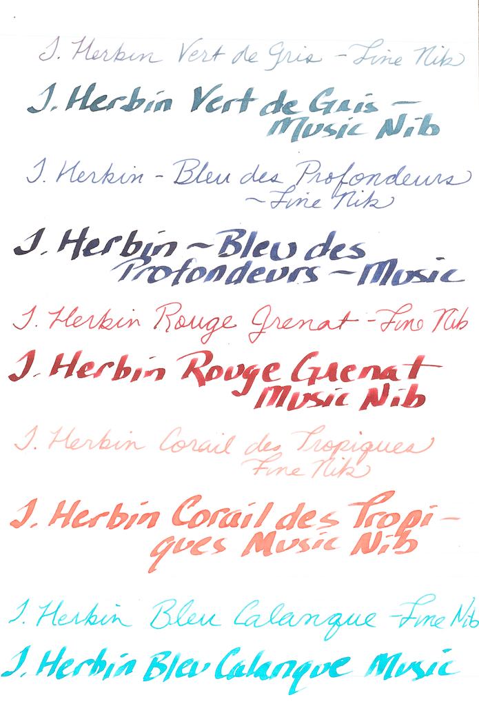
The first ink is Vert de Gris.

This, in my opinion, is the most unique color of the five inks. “Vert de Gris” means “Green-Gray” and this color has both deep turquoise and gray hues. It is gorgeous in fine and broad nibs, and it exhibits good shading but no sheen.

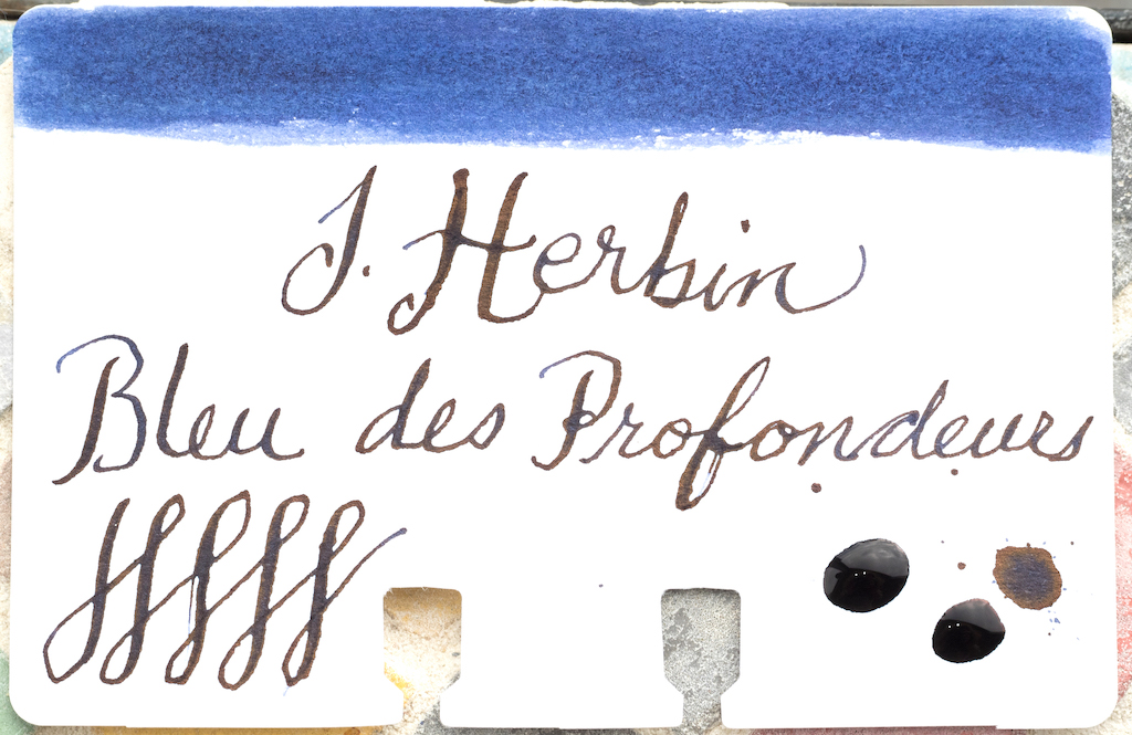
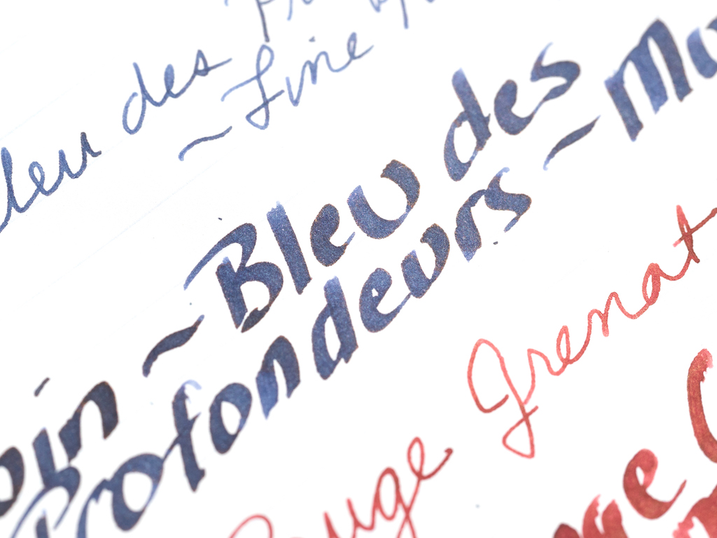
The second ink is Bleu de Profondeurs, which means “deep blue.” This ink is a purple blue. It’s nicely saturated and looks good in both fine and broad nibs. In broad nibs it offers a little bit of shading, but no sheen.

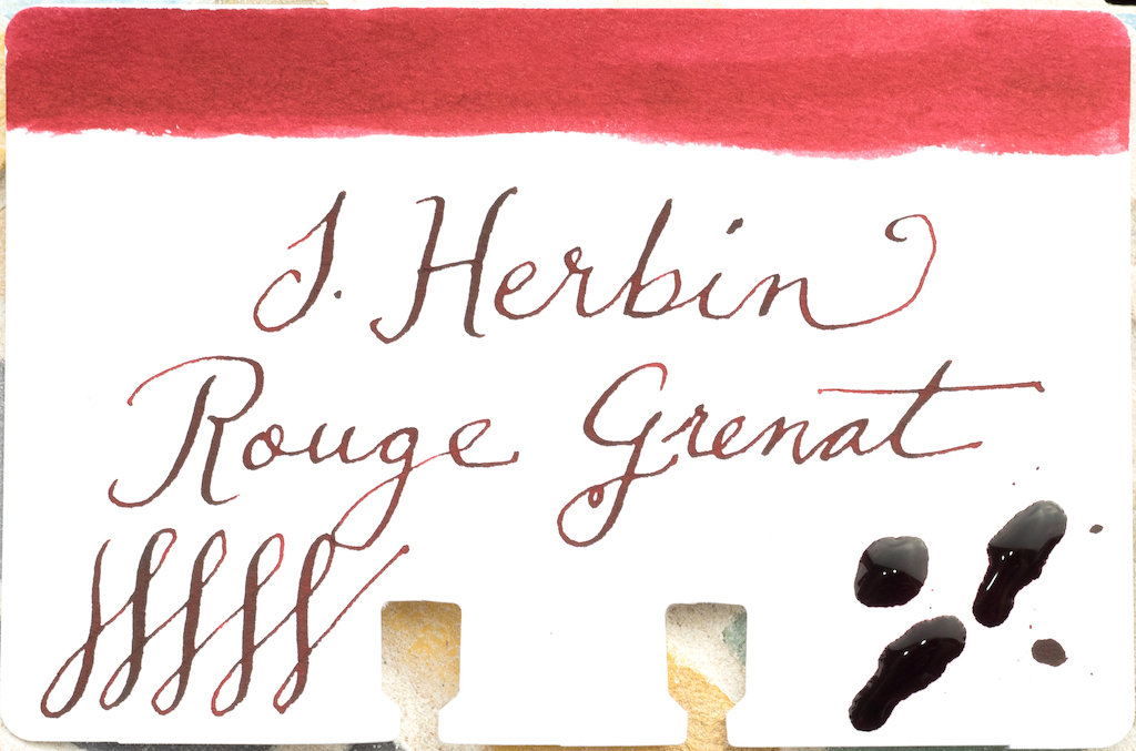
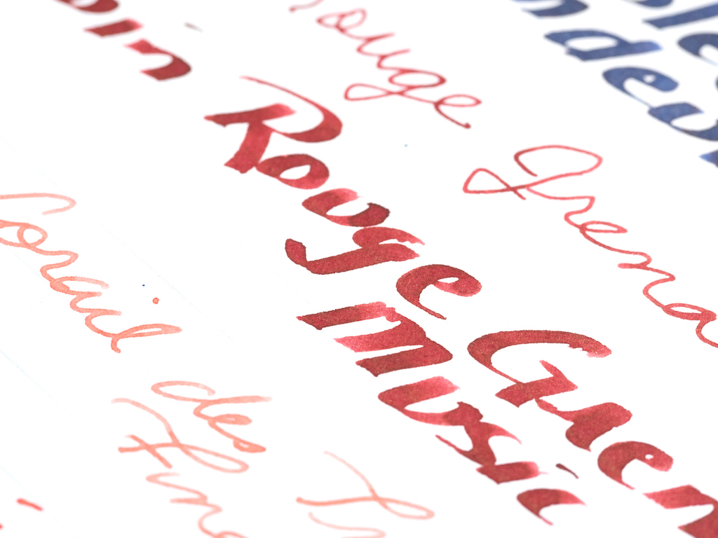
The third ink is Rouge Grenat, which is a lush garnet red.

The ink works well in both fine and broad nibs, and is highly saturated. Although it doesn’t have any observable sheen, it does exhibit a little bit of shading in broad nibs.

The fourth ink is Corail des Tropiques.

Of the five inks, this one is my least favorite, mainly because it’s watery and too light for use in finer nibs. It might work well as a wash. In broad nibs it has enough saturation to be usable and even has a tiny bit of shading. In my testing it exhibited no sheen.

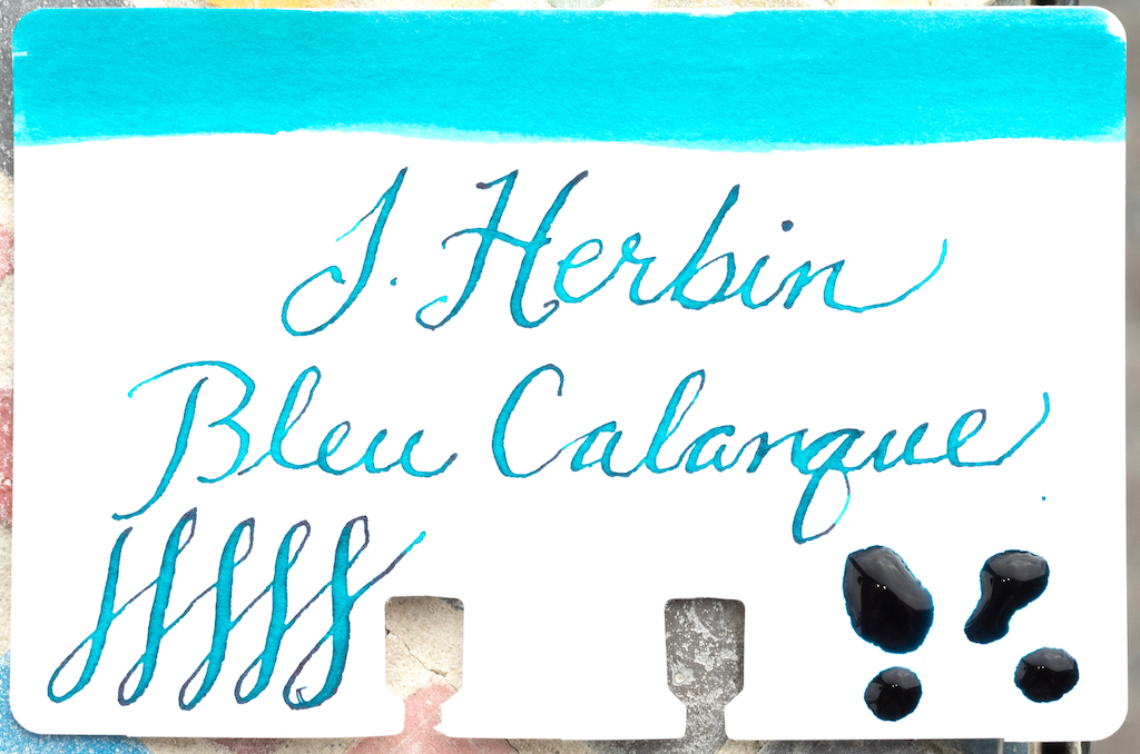
Last is Bleu Calanque or “Blue Cove.”

This is a bright turquoise color that is saturated enough to work well in fine nibs. It also exhibits a bit of shading in broad nibs.

I like all of these J. Herbin inks--in fact, they surprised me. They are far more saturated than I expected. I’ve found J. Herbin inks can be too light and very dry (I’m thinking of you, Rouille d’Ancre). These five inks flow quite well, though Corail des Tropiques was too watery for my taste.

The 10ml bottles are a good size for sampling an ink. Unlike typical 4 or 5ml ink samples, you have enough ink for several fills so you can decide if you want to buy a regular sized bottle. You can purchase J. Herbin 10ml inks from Vanness Pens for $6.00 a piece (30ml bottles are $12.95).

(Vanness Pens provided this product at no charge to The Pen Addict for review purposes.)


Enjoy reading The Pen Addict? Then consider becoming a member to receive additional weekly content, giveaways, and discounts in The Pen Addict shop. Plus, you support me and the site directly, for which I am very grateful.

Membership starts at just $5/month, with a discounted annual option available. To find out more about membership click here and join us!

Posted on March 8, 2019 and filed under J. Herbin, Ink Reviews.

J. Herbin Amethyste de l'Oural Ink Review

(Sarah Read is an author, editor, yarn artist, and pen/paper/ink addict. You can find more about her at her website and on Twitter.)

The Herbin Company (formerly known as J. Herbin) has launched their new line of inks this fall--the 1798 collection, with the stunning Amethyste de l’Oural. I've been known to say that I don't care much for shimmer inks, and then inks like this one make me eat those words for breakfast. I like everything about this ink.

The new 1798 collection is based on another milestone for the Herbin company--the year they moved to their shop in Paris. They sold pen nibs and wax and ink--necessities in those days, and little luxuries today. The new collection makes a few improvements over the 1670 anniversary collection. The mouth of the bottle is wider to accommodate pens more easily, the wax cap seal is thicker and stronger, the labeling and packaging has improved. My favorite thing about this ink might be the beautiful bottle. I love the embossed ship logo on the bottom. The bottle is also heavy and sturdy, so it's not likely to tip over.

The ink is a rich, royal purple with a fine, subtle silver shimmer. The particles need to be gently distributed into the ink before filling your pen. The purple "amethyste" color is to honor the gemstone that was shipped around the world in the 16th and 17th centuries. It's a sophisticated shade, and the silver sparkle adds a bit of smoky shine to it. It's not a glaring mirror-shine, but a more elegant glint. It isn't even noticeable in some lights or on some paper, but when the right light hits it at an angle, it gives a little wink of fairy dust.

The ink is well saturated and has some water resistance to it. Lines were still visible after spending a few minutes in water. I can also say it lingers on the fingertips through many (many) washes. It's a wet, well-lubricated ink. I was delightfully surprised by that. One of the things I dislike about a lot of shimmer inks is how they can feel a bit dry or clumpy. This is one of the wettest inks I've ever used. I put it in the driest nib I own--one of the black-coated Lamy fine nibs--and it lubricated the writing so well that it made me enjoy a nib I usually avoid. Between the wetness and the shimmer, there's very little shading--but it doesn't need it. It's also rather slow to dry on Rhodia paper. There was very mild feathering (there might be more with a wider/wetter nib) and no bleed-through.

Perhaps because the particles seem finer (at least by sight) than in some other shimmer inks, I had no trouble cleaning it out of my pen. It's actually one of the better-behaving inks I've ever used. Still be careful when using it in vintage pens or pens that are notoriously difficult to clean--but I have no concerns about using this ink regularly in an everyday writer. In fact, I've been using it every day for some time, now, and enjoying every minute.

(Exaclair USA provided this product at no charge to The Pen Addict for review purposes.)


Enjoy reading The Pen Addict? Then consider becoming a member to receive additional weekly content, giveaways, and discounts in The Pen Addict shop. Plus, you support me and the site directly, for which I am very grateful.

Membership starts at just $5/month, with a discounted annual option available. To find out more about membership click here and join us!

Posted on November 16, 2017 and filed under J. Herbin, Ink Review.

J. Herbin Straight Body Frosted Glass Dip Pen (or, my favorite ink testing pen)

(Jeff Abbott is a regular contributor at The Pen Addict. You can find more from Jeff online at Draft Evolution and Twitter.)

In all of the different reviews and discussions about the various types of pens that we talk about in the community, there's one type that doesn't get much attention. It's probably because there aren't many of them out there, but that doesn't make them unworthy. Amidst all the talk of gold- and steel-nibbed fountain pens, gel pens, pigment markers, brush pens, and pencils, there's a small, delightful category of glass pens.

Glass dip pens are works of art in the own right, hand-crafted by someone trained in working with glass. Have you ever watched someone craft handmade glass ornaments? It's really something to behold. Obviously, a straight pen isn't as impressive as an intricate ornament, but it's still a thing of beauty.

But when it comes to the writing aspect of these instruments, they have a unique advantage: they're extremely easy to clean. Yes, metal nibs are also easy to clean, but I'm arguing that the glass dip pen is still easier.

I'll be the first to admit that I have absolutely no skills when it comes to lettering and calligraphy. Practice makes perfect, and I haven't put in the hours to become skilled at this art. That being said, I like to think my hand-writing is fairly legible if I want it to be. I'm sure there are more artistic uses for glass dip pens, and that's wonderful. But, my main enjoyment comes from the ease of use and cleaning that come with this pen.

The J. Herbin (get ready for this incredibly long name) Straight Body Frosted Glass Dip Pen, Small is an affordable way to enter this market. It's a simple pen — a smooth, 5 inch body attached to a spiraled tip. In between the two, a small bulb to rest your fingers. The color I chose is the amber tint, which is great because it's mostly see-through.

At $16, this is a great choice for anyone wanting to try out dip pens without having to choose nibs and nib holders. Those have their merits and advantages, but you can't beat the simplicity of the glass dip pen. It's one piece, and each one is unique.

Yes, it's a thing of beauty and each one should be admired and appreciated. But, how does it write?

Let's break this down into pros and cons, starting with the pros.

Pros

Open the package, grab the pen and a bottle of ink, and you're ready to go. It couldn't be simpler. There's no filling, no cartridges to fuss with, and no cleaning of the nib and section after dunking it into a bottle to suck up the ink. You dip the nib into the ink, dab it on the edge of the bottle to prevent drops, and start writing.

In my experience, I usually get 3-5 lines of writing before I need to re-dip. I'm never able to write for this long when using metal nibbed dip pens. The spiral grooves on the tip of this pen do an amazing job of storing ink, and they do an even more amazing job of feeding the tip consistently. The only time I notice any heavy flow issues is when I've dipped the nib too deep or done a poor job of dabbing before starting to write.

The pen takes some practice before you can write with your normal hand, but that doesn't take long. As for the shape and grip, I enjoy the way the pen fits in my hand. I imagine that plenty of people will discover that it doesn't fit their hand at all, though. It has the shape of something that will polarize users. Either you'll do well with it, or you'll loathe it. For me, it's delightful.

Writing with the pen is a fun experience. The thoughfulness behind periodic breaks to dip the pen back into the ink bottle forces you to slow down and focus on what you're writing. Take your time, form the words, and dip for some more ink. It's pleasant.

The writing feel is slightly scratchy at times depending on how much ink is stored in the nib, but it's generally pretty nice and smooth. Since this isn't a standard nib with two tines, it has several "sweet spots" that work better than other spots on the tip. One of the sweet spots on this pen writes like a medium fountain pen, while another writes like an EF. If you can remember where these spots are, it can be quite handy.

Finally, did I mention how easy it is to clean? When you're done using it, simply run the tip under water for a few seconds, and wipe it dry with a paper towel. Done! No flushing, no rinsing — just rinse it, dry it, and start using it with a new ink. That is the #1 attraction of this pen for me. When I want to do some ink testing and sampling, this is my go-to pen. I can fly through different inks because of how quickly I can "reset" the pen to a clean state.

Cons

As much as I love the pen for its character and easy cleaning, it has some downsides. For one, it feels fragile. For normal use, it feels great. But, I worry that if I drop it on the desk or into the sink while cleaning it, it might chip or shatter. This is to be expected for anything made of glass, but most glass objects are decorative and not meant to be handled.

Remember those "sweet spots" I mentioned? Yeah, it also has a couple of dead spots that write like an EF fountain pen that's running out of ink. These are dead spots no matter what usable angle you hold the pen. Luckily, the dead spots are very few and easy to avoid once you learn the pen. Keep in mind, the tip on this pen is very small, so every millimeter gives you a different feel.

Along with the dead spots, there are some scratchy angles to the pen. Luckily, you can smooth out the tip just like you would a fountain pen nib. Grab some micromesh and draw a couple dozen figure-eights and infinity signs, and you will notice an improvement. Just don't get too carried away.

My final complaint is that the pen loves to roll on a flat surface. There's no clip or flat side, so it obviously will have issues staying still on its own. Minor issue, but worth noting.

Conclusion

This definitely isn't an every day carry pen, but it's been so fun to use for testing inks and playing with lettering over the past several weeks. This isn't a pen that I use all the time, but it has a few specific purposes that I wouldn't trade it for. Next time you want to get out that box of inks and play, try using one of these to maximize your fun.

You can grab these on JetPens in several colors, as well as a larger size.

Posted on June 8, 2016 and filed under Pen Reviews, J. Herbin.