Zebra DelGuard Type-ER Mechanical Pencil Review

(Jeff Abbott is a regular contributor at The Pen Addict. You can find more from Jeff online at Draft Evolution and Twitter.)

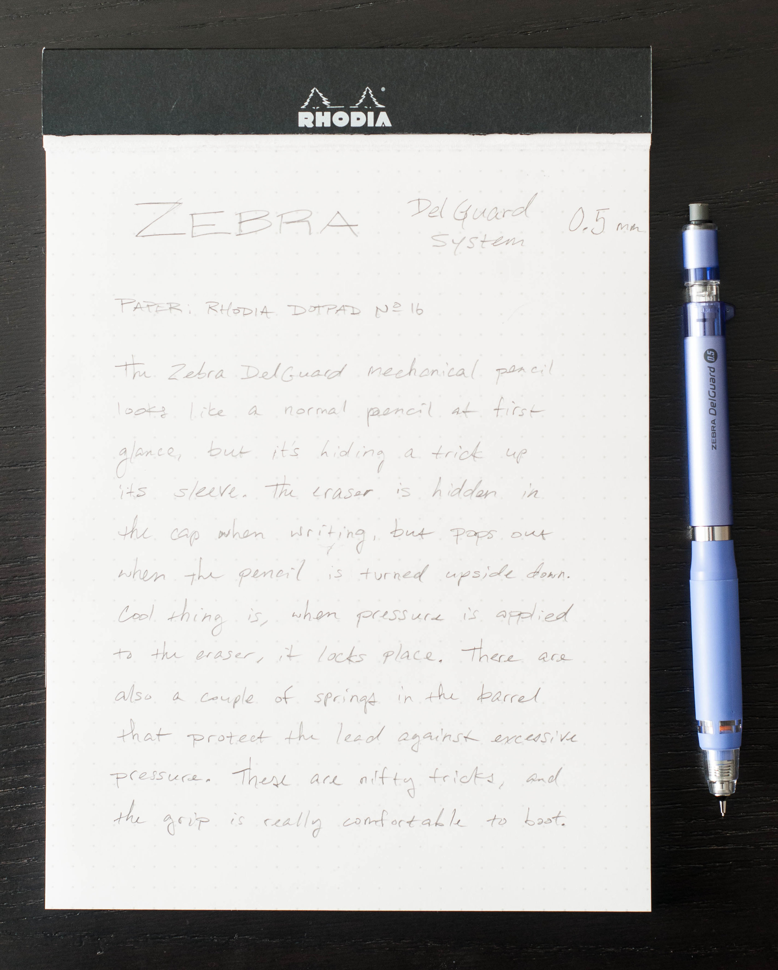
Mechanical pencils come in all shapes and sizes, and it seems that most manufacturers try to introduce a unique angle or feature for their pencils to make them stand out from the pack. Some times, the features are pure gimmicks, but other times we benefit from the ingenuity of their design. In the case of the Zebra DelGuard Type-ER, it's the latter.

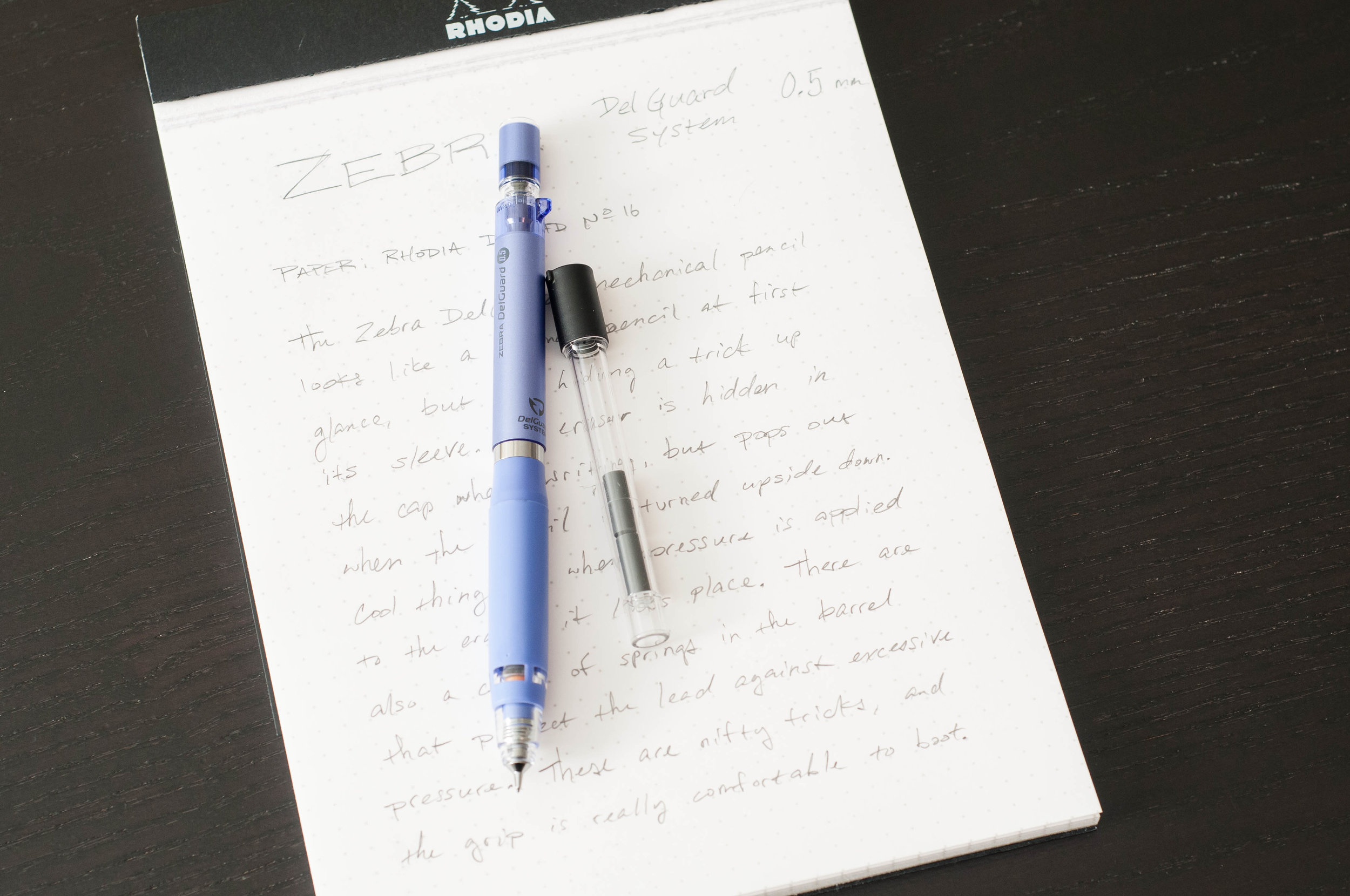
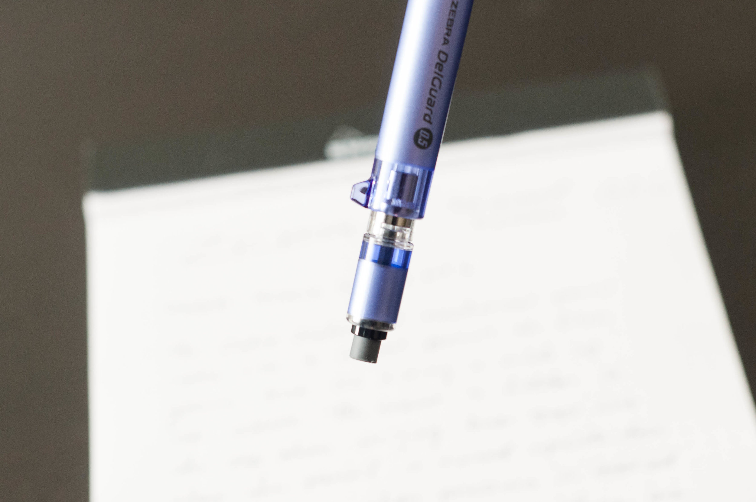
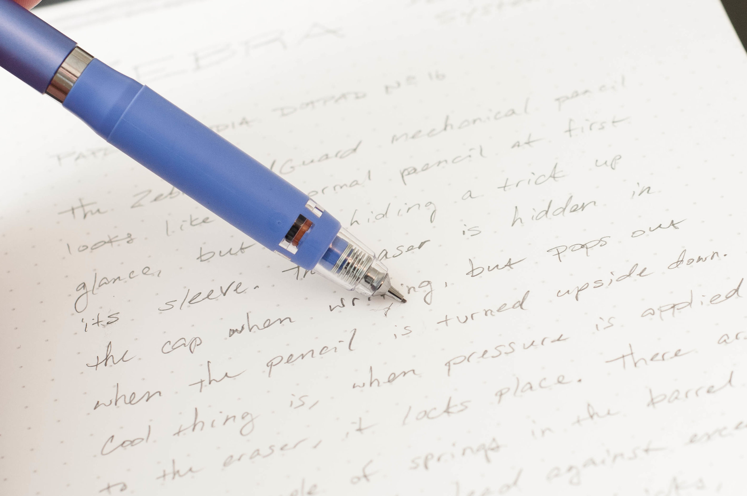
The DelGuard Type-ER looks like an ordinary mechanical pencil, but it has a couple of tricks up its sleeve. The first one involves the eraser. Many mechanical pencils hide the eraser under the click mechanism cap, which means you have to remove it in order to erase. Unfortunately, this makes the metal cap easy to lose. Other pencils use some sort of twist or push mechanism to show or hide the eraser when you need it. This is good, but the Zebra takes it a step further by relying on gravity and friction.

See, when you're writing with the pencil, the eraser is hidden inside the cap. But, when you turn the pencil upside down to erase, the eraser pops out. Once you apply some pressure to the eraser, the friction between the eraser casing and the pen body cause it to stay put while you erase. Brilliant. The only time this won't work well is if you're trying to erase in a position where the normal assumptions of gravity aren't true (say, upside down or up against a wall).

The other tricks this pencil boasts involve the lead system. We all know that if you press too hard on mechanical pencil pencil lead, it will break. Well, the DelGuard Type-ER has a couple of springs in the body that prevent that from happening. Are you pushing down on the lead too hard? Then the lead pipe will slide down to protect the lead until the pressure eases. Same thing is true if it detects too much sideways pressures on the lead. This is handy if you're tracing a ruler with the pencil at an angle and don't realize you're pressing down too hard. Very nifty indeed.

In my tests, this system works great. I'm more prone to put too much pressure on the lead from the side, so this feature is a lead saver for me. It also serves as a training tool to let me know (without wasting lead) that I'm pressing too hard while writing or drawing.

This pencil doesn't have a fancy click mechanism, a lead rotation device, or any of the other usual niceties, but the two features it does sport are down-right cool.

Apart from that, the grip on this pencil is extremely comfortable. Even without the lead protection system and cool eraser, this is a great pencil.

The Zebra Del-Guard Type-ER only works with 0.5mm lead, but it comes in a variety of colors (with an extra couple of erasers included) at JetPens. It will set you back about $12, but that's a sweet price for a pen with a couple of surprising tricks. I've been pleasantly surprised by it, and I'll be keeping it in my "top five" list of mechanical pencils for a while.

(JetPens provided this product at no charge to The Pen Addict for review purposes.)


Enjoy reading The Pen Addict? Then consider becoming a member to receive additional weekly content, giveaways, and discounts in The Pen Addict shop. Plus, you support me and the site directly, which I am very grateful for.

Membership starts at just $5/month, with a discounted annual option available. To find out more about membership click here and join us!

Posted on March 22, 2017 and filed under Zebra, Mechanical Pencil, Pencil Reviews.

The Aurora 88 70th Anniversary LE Fountain Pen with Flexible Nib: A Review

(Susan M. Pigott is a fountain pen collector, pen and paperholic, photographer, and professor. You can find more from Susan on her blog Scribalishess.)

I was beyond excited when I first heard that Aurora was coming out with a flexible nib. I pre-ordered the blue 88 with flex nib as soon as I could. But then I started hearing some ambivalent feedback from pen shows, and my excitement waned. Fortunately, Kenro sent Pen Addict a test pen so I could try out the flex nib for myself.

First, a disclaimer: I am not an experienced flex nib user. I own two Omas pens with extra flessibile nibs and a few vintage pens with semi-flex nibs. I was not willing to push the Aurora test pen too hard (I have to return it, after all). So, keep this in mind as you read my review and look at the photos. It’s possible that users with more experience might get more flex out of the Aurora than I did.

This Aurora 88 70th Anniversary fountain pen is a gorgeous bright orange (a color that will be released later this year). It’s a typical Aurora 88 style, cigar-shaped, with the signature Aurora clip. The pen has a small ink window and is a piston filler.

Of course, what everyone wants to know is, “How is the flex nib?” Well . . .

The nib is solid 14k gold with super long tines. The test nib doesn’t have the usual Aurora scrollwork, but the photos I’ve seen of actual pens for sale show scrollwork on the nibs. The nib tip looks like a fine, though the size isn’t indicated anywhere on the nib itself.

I’ll be perfectly honest. When I inked up the test unit and started writing, I was immediately disappointed. The nib felt pretty stiff like a regular Aurora nib. And while I could get some line variation when I flexed the nib, it was slight.

I worked with the pen for several days, switched out the ink, practiced swirls hoping maybe the nib would loosen up a little, but the flex was still minimal.

I inked my Omas Ogiva Extra Flessibile fine with the same ink, Iroshizuku Tsuki-yo, to compare with the Aurora. What a difference. The Omas nib is springy and exhibits a great deal of flex without much effort. While neither pen flexes as much as a super-flex vintage nib, the Omas beat the Aurora hands down.

The examples below show how the two nibs compare:

Alphabet

Aurora

Omas

Swirls

Aurora

Omas

Sentence

Aurora top, Omas bottom

I canceled my preorder after working with the Aurora. I really wanted to love the pen and the nib, I just wasn’t impressed. While it has some flex, it offers nowhere near the flex that the Omas extra flessibile does. At first I thought maybe I was being unfair comparing the Aurora to the Omas extra flessibile. But then I saw some websites advertising the Aurora as a “super flexible” nib. I think that, if people claim that the nib is super flexible, it should at least be as flexible as the Omas. Unfortunately, it’s not.

Does the nib flex? Yes. Does it flex as much as an Omas Extra flessibile nib? No. Does it flex as much as a vintage superflex nib? Definitely not.

And yet . . . after writing with the nib daily for a week, I have to say that, in spite of the fact that the nib does not flex as much as I’d hoped, it’s a wonderful writer. The long tines offer a different feel from a standard nib, and you can write without flex quite easily.

But here’s the deal. The Aurora 88 70th Anniversary LE fountain pen with a flex nib costs $650. These pens are made of resin. Yes, they are limited, numbered editions (only 188 of each color). Yes, they have special, long-tined, semi-flex nibs. Yes, they write beautifully. But $650 is a pretty steep price for a resin pen with a semi-flex nib. If these were auroloide pens with flex nibs, I wouldn’t hesitate to get one.

Vanness Pens will be stocking the Aurora 88 70th Anniversary Flex Nib Fountain Pen but you have to act fast. The first release in Blue is already sold out. Send them a message to inquire about future releases.

Pros

  • The Aurora 88 fountain pen is a terrific cigar-style pen. It’s a good size and weight for most users.
  • The flex nib is beautiful and has gorgeous long tines reminiscent of some vintage Aurora fountain pens.
  • The nib offers some flex and line variation, and when you write with it normally, it is smooth and the long tines provide a unique writing experience.
  • The anniversary pens will be released over the year in a variety of colors to suit many tastes.

Cons

  • The flex nib is certainly not a “superflex” nib. It isn’t even as flexible as an Omas extra flessibile. I would call it a semi-flex nib at best.
  • The anniversary pens are made of resin not auroloide, and, in my view, they are overpriced. If they were in the $350-$400 range I’d feel better about purchasing one.

(Kenro Industries provided this product at no charge to The Pen Addict for review purposes.)


Enjoy reading The Pen Addict? Then consider becoming a member to receive additional weekly content, giveaways, and discounts in The Pen Addict shop. Plus, you support me and the site directly, which I am very grateful for.

Membership starts at just $5/month, with a discounted annual option available. To find out more about membership click here and join us!

Posted on March 20, 2017 and filed under Aurora, Pen Reviews, Fountain Pens.

Monteverde Yosemite Green Ink: A Review

(Susan M. Pigott is a fountain pen collector, pen and paperholic, photographer, and professor. You can find more from Susan on her blog Scribalishess.)

Monteverde USA recently introduced a whole new line of ink colors, all with their ITF (Ink Treatment Formula) technology. I chose several colors to review, the first of which is Yosemite Green.

The 30ml bottle comes in a clear, flexible plastic box that includes a card explaining the ITF technology in their ink. It states that the ink improves ink flow, extends time with the cap off, lubricates the feed system, and improves dry time.

I tested the ink in my vintage Visconti Manhattan with a medium nib. My ink tests revealed that the ink is a yellow-green with a slightly bluish tint. The ink is wet and flows quite nicely in my medium nib. The ink is not waterproof and exhibits no odor.

I honestly did not notice any difference in ink flow or lubrication with this ink as opposed to other inks I use regularly. It also seemed to have dry times comparable with other inks, such as Robert Oster. I don’t leave my caps off when I’m not writing, especially on my older pens, so I did not test the claim that the ink allows extended time with the cap off.

Chromatography shows that the ink has strong yellow, green, and blue shades in it.

The blue offsets the yellow for a rather unique shade. I compared Yosemite Green with my other green inks and none of them was a match.

The ink exhibits a gorgeous maroon sheen in ink splats.

And the same sheen and good shading comes out nicely in broad nibs. And, at least on Tomoe River Paper, I noticed some sheen even with my medium nib (not pictured).

I honestly didn’t know what to expect with Monteverde inks, but I’m impressed with Yosemite Green. It’s a really nice green with hints of blue and it works well in both narrow and wide nibs, though broader nibs bring out the shading and sheen more.

You can purchase Monteverde inks from JetPens for $8.00 (30 ml bottle).

(JetPens provided this product at no charge to The Pen Addict for review purposes.)

Posted on March 17, 2017 and filed under Monteverde, Ink Reviews.