I am a big believer that writing experience trumps all, but there are rare cases where utility wins out. The Pokka Pen is one of those cases.
Terry O’Connor, the man behind Pokka, reached out to me in late 2014 with an idea for a pen he wanted to create. He was tired of losing his Fisher Space pen due to the cost of replacement, and cutting Bic ballpoints down to half-size was tedious and messy. So Terry set out to do what we have all thought about doing. He designed his own pen.

The first sample Terry sent me was a 3-D printed prototype. It was raw and unfinished, but I liked the concept. Over the years, Terry kept sending me samples as he refined the design and invested in injection molds for the barrels. Every new iteration was better than the previous one, leading up to the launch of Pokka in the Fall of 2016.
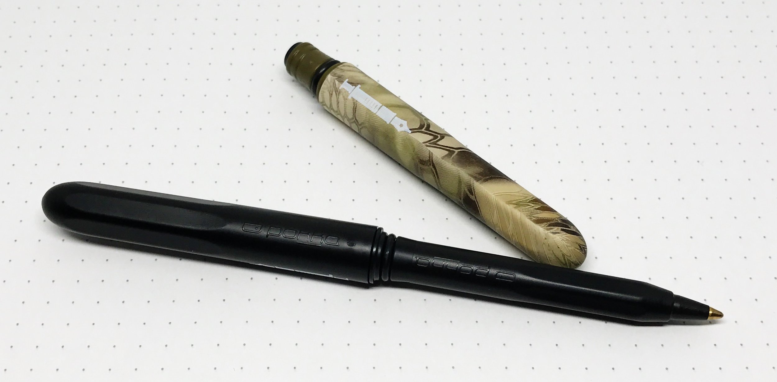
The Pokka Pen was designed with portability in mind. Capped, it is just over 3-1/4 inches, and expands to a comfortable writing length of 5-1/2 inches with the cap posted. The plastic barrel is so lightweight you won’t notice it is there, but is thick and durable enough to take a beating. Both ends of the caps are rounded so the pen slides in and out of any pocket or pouch easily. The Double Dokk system ensures the cap snaps into place firmly when open or closed.
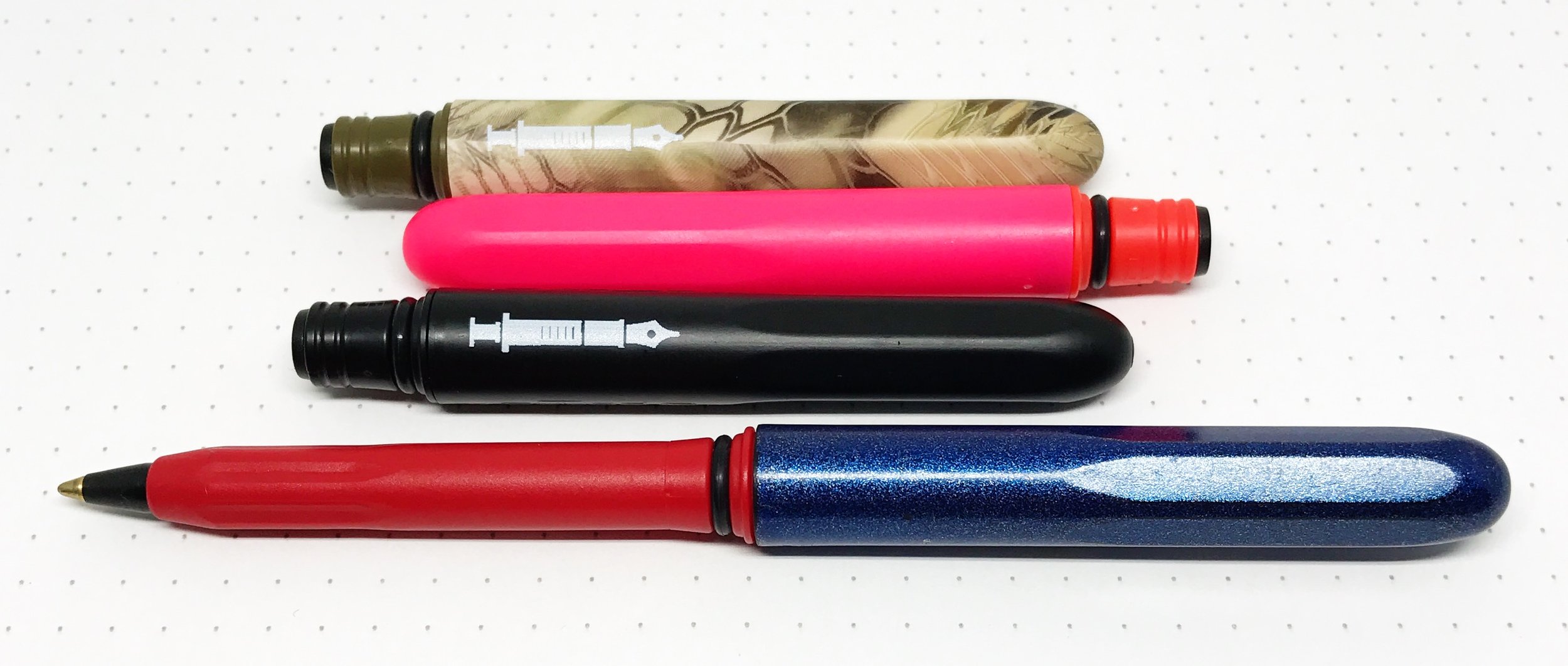
The ballpoint refill is custom made for Pokka to fit the barrel perfectly. Is it the best writing ballpoint? A Uni-ball Jetstream, or even a Bic Crystal, it is not. It leaves a solid, skip-free line, but it could be darker. It is mess free though - no globs of ink on the tip or paper in my time using it, so that is a plus. It won’t challenge your best writing pens, but it isn’t designed to.

What it is designed to do is to be your anywhere and everywhere backup pen. Throw one in a bag, one in a purse, one in your car, one in the kitchen drawer, one pretty much anywhere you may need a pen. You can afford to put them in all of those places because they cost less than $3 each. They come in great barrel designs and colors too, which my kids constantly fight over. The Pen Addict logo ones are all mine though!
I dig everything about this pen, and I appreciate Terry letting me in on the behind the scenes process on creating the Pokka Pen.
(Pokka Pens provided this product at no charge to The Pen Addict for review purposes.)
Enjoy reading The Pen Addict? Then consider becoming a member to receive additional weekly content, giveaways, and discounts in The Pen Addict shop. Plus, you support me and the site directly, which I am very grateful for.
Membership starts at just $5/month, with a discounted annual option available. To find out more about membership click here and join us!