(Kimberly (she/her) took the express train down the fountain pen/stationery rabbit hole and doesn't want to be rescued. She can be found on Instagram @allthehobbies because there really are many, many hobbies!.)
In the vein of last week’s article where I drastically reduced the number of steps to swatch inks, I am happy to report that I have made progress! From the first of January until last week, I had swatched 7 inks (and yes, that included the ones I did for reviews). Since last week, drumroll please, I’ve swatched 20, yes TWENTY, more inks!!! Woohoo!
As you may already know, I like to be matchy matchy with my pens and inks (black, white, clear, silver, and gold pens are the exceptions). Which means I usually start with “what general color pen do I want to use”, then I go through my swatches to find the best match, which is either an exact match, if possible, or slightly lighter or darker depending on mood. Occasionally, I like to go the other route and start with an ink that I really want to use and then pick the pen after. Don’t worry, I’m neither reviewing nor inking up all 20 inks because that would take too long; instead I’ll share some first impressions. Who knows, maybe some of these will jump out and demand to be inked!
A few things to note: (1) Some of the pictures are at an angle because the shimmer showed up better than with head-on photos, (2) even with angled pictures, shimmer is hard to pick up in photos, (3) the picture below has a different colored mat than the other swatches, hence the vastly different background color, and (4) a lot of these are Wearingeul swatches because that’s what I bought samples of and happened to trade with a friend.
Look at all these swatches - I am SO happy to be over the swatching slump!
Here are the 20 inks that I swatched in the past week, sorted roughly by color:
-- Montblanc Le Petit Prince, Rose Burgundy - I knew that I would be inking up a LPP pen since I am nearing the completion of writing out the book, but I had to make sure it matched the pen first. It is a nice shade of burgundy with a hint of copper sheen on very wet swatches. I can’t wait to use it!
-- Wearingeul Anna Karenina - This is a rich red, but not quite burgundy, ink that also has red shimmer and a touch of green sheen on wet swatches. Pretty color but I don’t need to ink up any more red pens right now.
A bit hard to see the shimmer near the bottom.
-- Wearingeul Anne of Green Gables - Yes, this is a red ink, which I was not expecting. Yes, I know that the gables are green but still, it messes with my mind. The ink is actually named “Lucy Maud Montgomery”, and is a bright red ink with some greenish-gold sheen. Off the top of my head, it reminds me a bit of Iroshizuku Momiji.
Anne of Green Gables shows up as a bit more orange than in real life but you can still see the gold sheen in the swatch.
-- Wearingeul Wendy Darling - I am so glad I got a sample of this because I would be a little annoyed with myself if I bought a whole bottle. It is a really pretty, but extremely light, pale, borderline invisible, pastel blue ink with hints of pastel pink, and has silver and turquoise shimmer. I don’t know how readable it is, especially after seeing Kelli’s review from Mountain of Ink, but I’m kind of tempted to put it in a wet Pelikan, but not now, as there are too many other colors that are catching my eye.
Wendy Darling is way too light at any angle.
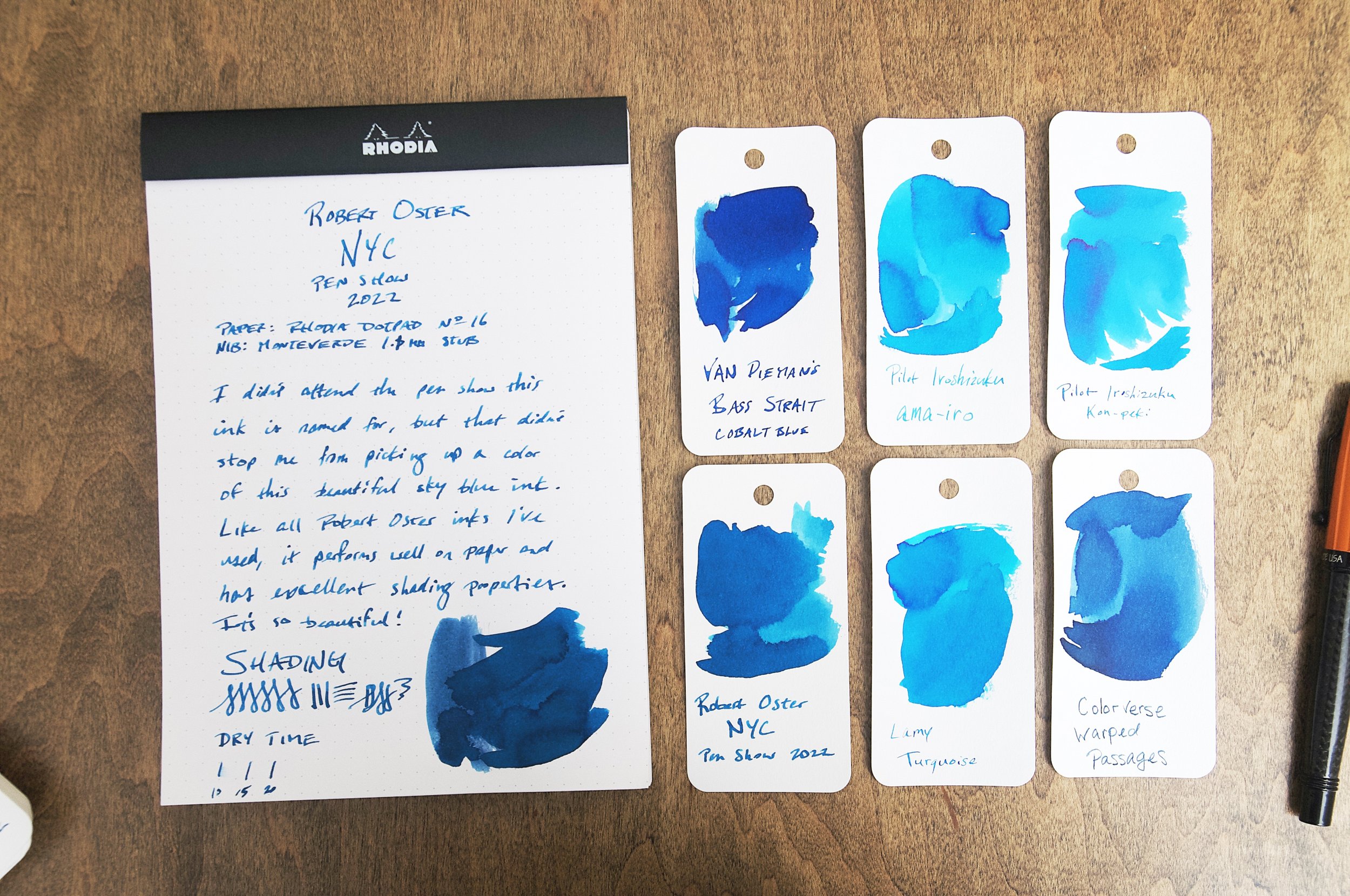
-- Robert Oster Romeo & Juliet - Ooh, now this one is different, especially from Robert Oster, who isn’t typically known for chromashading. This one is a dusty blue with grey shading that is visible in swatches and I suspect, fairly visible with a wetter pen on Tomoe River and similar papers. This is definitely a contender for “ink it up”!
I really want to see Robert Oster Romeo & Juliet on some Tomoe River!
-- Wearingeul Tinkerbell - Another ink from Wearingeul’s Wendy & Peter collection, this is a light muted, dusty green ink with pearlescent (silver? gold? both?) shimmer and is surprisingly readable. Not my usual jam but that might make it a contender as well?
Wearingeul Tinkerbell looked more readable than I expected.
-- Wearingeul Tick Tock Croc - Also from Wearingeul’s Wendy & Peter collection, Tick Tock Croc is a slightly teal leaning green ink. It looks alright, but it’s not jumping out at me. And yes, silly me forgot to get Peter Pan and Captain Hook.
-- Inkebara #236 Sand - A warm yellow-brown that has some green chromashading in wetter swabs. I’ve got a lot of brown inks in pens right now but this is definitely high on the list for the next light brown pen inking.
The “line” near the light part of the swatch is where there’s some green in Inkebara #236 Sand.
-- Sailor Moroccan Mint Tea - This ink is a touch darker than the Inkebara Sand and doesn’t seem to have the green hint to it either. I’m very curious to see how it compares to Sailor x Tinterias Homemade Tortilla.
-- Diamine Tobacco Sunburst - Part of the Gibson Les Paul series of inks from Diamine, Tobacco Sunburst is a medium golden brown. I wasn’t expecting much but was pleasantly surprised at the golden tone and how nicely it shades. Again, if I didn’t have so many browns inked up already …
-- KWZ x Newcastle Pen Show, Newky Brown - A kind friend surprised me with this ink and I am over the moon because I loved drinking Newcastle in my (much) younger days and I also love KWZ ink! This is a darker reddish/orangish brown ink that could potentially show some nice shading in a drier pen.
-- Franklin-Christoph Bronze Age - Was anyone surprised that I bought this one? Me neither. The color isn’t one that instantly grabs me but it is more interesting than the photo shows - it is a darker chocolate brown that has very slight green undertones, like patina’d bronze.
-- Wearingeul 20,000 Leagues Under the Sea - Ooh, this is a pretty royal blue ink with gold shimmer. I am VERY curious to see how this compares to Pelikan’s Ink of the Year, Golden Lapis, which looks quite similar (I can’t wait to get my bottle). This is a contender since I will be need to ink up a mid-toned blue soon.
The shimmer is much more pronounced in real life.
-- Wearingeul Iaros Orna Eperanto - This is a darker, richer blue with gold shimmer and a hint of red sheen in wetter patches. It reminds me of a shimmery Diamine Blue Velvet.
-- Lamy Pink Cliff - One of those instances where I can’t get past the name because it’s not remotely pink. Not a contender for near-term inking but I will be curious to see how it compares to Lamy Blue Black, which is a favorite.
-- Wearingeul Frankenstein - A slightly blue-leaning, royal purple ink with a hint of copper sheen? Yes, please, but is it unique? Not so much, but I still love the color!
-- Color Traveler Miyoshi Pione Purple - A little moodier and more red-leaning purple than Frankenstein, this is right up my alley, but I’m looking at 8 pens with purple ink right now, so this one has to wait a bit. I’m curious to see if it sheens or has shading properties on TR paper.
Oops, accidentally added an extra “L” in my Color Traveler Miyoshi Pione Purple swatch.
-- Wearingeul Persephone - Ok, Wearingeul, I love this one. Dusty purple with purple shimmer? Yeah, short list. I don’t care which purple pen I have to clear out to make room for this one.
Don’t see purple shimmer that often!
-- Wearingeul x EndlessPens, The Black Cat - My witch-crazed friend shared a sample of this one with me and I’m glad that it’s not a “plain black ink” but has a subtle purple and grey tint to it, as well as some pink (?) shimmer. Not in any rush to put black inks in any pens but this one could pass for almost purple-black.
-- Wearingeul Hades - I got a sample of this because I was hoping it would be more blue, but it’s really a dark black ink with blue shimmer, which is kinda cool.
One of the few ways to get me to use a black ink is to put shimmer in it!
So, out of these 20 swatches, which ones am I most eager to ink up?
Top 3 picks:
Montblanc Rose Burgundy - I already knew this was going into a pen, so maybe this is an unfair pick.
Montblanc Le Petit Prince, Rose Burgundy ink with the Le Petit Prince, Red Planet pen.
Robert Oster Romeo & Juliet - the chromashading looks promising
Robert Oster Romeo & Juliet pairs pretty well with S. T. Dupont D-Inital in Shark Blue.
Wearingeul Tinkerbell - This one is giving me all the feels and I don’t know why.
It’s like Wearingeul Tinkerbell and Sailor Pro Gear Slim, Solar Term, Fuki were made for each other!
Honorable mentions:
- Inkebara #236 Sand - I wanna see how this ink shades on TR or Cosmo Air Light paper.
- Wearingeul Persephone - I know, I said shortlist but there are too many purple pens inked up!
There you have it, some (relatively) quick thoughts on 20 different inks. Now to write some more pens dry so I can start using these inks, and get back to swatching!
(Disclaimer: All inks are my own, either purchased from various retailers at recent pen shows including Jimmy Dolive, Franklin-Christoph, and Vanness Pens, or samples swapped with a pen friend.)


