Posts filed under Pen Reviews

uniball Jetstream Lite Touch Ballpoint Pen Review

Top to bottom: uniball Jetstream Lite Touch 0.5 mm, 0.7 mm, two 0.5 mm 4+1 multi pens.

There’s no point in burying the lede: the uniball Jetstream Lite Touch is better than the standard Jetstream in every line width and ink color I have tested so far.

uniball considers the Lite Touch a separate product from all existing Jetstream models. They did this recently with the uniball One as it compares to their other gel ink offerings, like the Signo lineup (which, in itself, has many different ink formulations.) With the Lite Touch, not only has the ink formulation changed, uniball added some design elements - and marketing - into the barrel.

The Jetstream is already the best ballpoint pen on the market, so how did uniball make it better? They focused on smoothness and lower friction while writing on the page, and I’d say they succeeded in comparison to existing models, if only slightly. The biggest change I see is that the ink is richer and darker compared to the standard Jetstream. I was already a big Jetstream fan, but the way the Lite Touch ink looks and performs puts it a clear step ahead.

There is a bit of “Keeping up with the Joneses,” in the Lite Touch release, as the quiet barrel of the Zebra bLen has become a hit on the store shelves. uniball redesigned the barrel interior and knock to limit vibration when writing, which can be an annoyance. An annoyance which I never had with any previous Jetstream model, but the market has dictated with the bLen and Pentel Calme that tip rattle is out, and quiet writing is in. What took them all so long?

Standard version 4+1 on top. Ignore the refill length difference between the two - the orange one has a specialty grip.

I had several models of the uniball Jetstream Lite Touch sent to me by a friend in Japan: 0.5 mm and 0.7 mm single barrel pens, and 0.5 mm 4+1 multi pen. When I began testing them alongside Jetstream pens I already owned, I could instantly tell a difference: the ink is darker.

The Lite Touch refill (top,) is marked SXR-L, assumedly for “Lite Touch.” SXR-L-7 for 0.7 mm, versus SXR-7 for the standard 0.7 mm. The refill shape is the same so you can swap the Lite Touch refill into your favorite Jetstream barrel.

The ink color differences may be difficult to pick up in pictures, but I can tell them apart easily in person.

Lite Touch is on the top, and maybe you can see a slightly darker line compared to the bottom.

The Black 0.5 mm and 0.7 mm Lite Touch inks are fantastic. And the Blue ink from the multi pen is the standout among all of the colors, with a richness that puts it as the single best Blue ballpoint ink on the market. I cannot wait until I can get it in an 0.5 mm single barrel.

These are the Lite Touch 0.5 mm multi pen refills, with the LT ink sample listed first for each color. It’s difficult to tell looking at the image, but in person I can tell them apart.

The only ink that performed poorly was the Green ink. This is expected, as it is always the worst performing of the 4+1 colors. If they dropped it from the lineup completely, it wouldn’t be missed. Red can be hit or miss, and the Lite Touch color is a hit. It’s nice enough to use in rotation with Black and Blue, instead of every once in a while.

Still tough to see in pictures.

Same with the 0.5 mm Blue ink comparison.

What does the future hold for the Jetstream Lite Touch? If we use the uniball One as a roadmap, different barrel types - hopefully still of the quiet variety - are likely in store. It wasn’t until the One F that I became a fan of that ink formulation, and I still prefer most of the Signo gel inks over the One.

With the Lite Touch, I don’t think that’s going to be the case at all. I think it is superior in every way to the existing Jetstream, and I wonder if it won’t completely take over in the next few years. The plan, for now, is to have both Jetstream lineups available. Superfans - like myself - will be relegated to paying a premium price for a premium product. In this case, it is well deserved.

Remember the Jetstream? Those were good times.

Availability of the uniball Jetstream Lite Touch is still mostly limited to Japan, for now. Wider release is expected in 2025, and, of course, there are many importers and second-hand markets where you can currently find these pens.


Enjoy reading The Pen Addict? Then consider becoming a member to receive additional weekly content, giveaways, and discounts in The Pen Addict shop. Plus, you support me and the site directly, for which I am very grateful.

Membership starts at just $5/month, with a discounted annual option available. To find out more about membership click here and join us!

Posted on June 3, 2024 and filed under uniball, Jetstream, Ballpoint, Pen Reviews.

Mad Science Pen Company Beta Type-R Vanness Collaboration Fountain Pen Review

(Jeff Abbott is a regular contributor at The Pen Addict. You can find more from Jeff online at Draft Evolution and Twitter.)

It's not often that we get a pen that is so unique that it's difficult to compare it to anything else already out there. For the most part, fountain pens follow the same basic design language with added flair and character to distinguish the brand. With Mad Science Pen Company, the Beta Type-R is unlike any other pen you've seen or used.

You might remember the name from when Caroline's Meet Your Maker post on Jacob Pawloski, aka Mad Science Pen Company. Jacob's pen turning obsession started around the same time as COVID-19 lock-downs, and it's really impressive and mind-boggling to see how quickly someone can pick up a skill and produce amazing results when they're motivated.

Scrolling through Jacob's Instagram posts features pen after pen that each features a unique shape as well as bright, colorful, even other-worldly materials. The bright and contrasting swirls look like something you'd find in a science fiction lab. It's definitely an aesthetic, and Jacob nails it.

The Beta Type-R is a specific body style that features a friction fit cap, a contoured grip section that partially hoods the nib, and a back section that holds a standard TSWBI cartridge converter. It has all the normal pieces that make up a fountain pen, but they're all unique and fit together so well.

The specific model I have is a collaboration between Mad Science and Vanness Pens. It was a limited edition that sold out in late 2023. And that's something else that makes this pen maker so interesting. Everything is small batch and fleeting. If you see something on Instagram or the website, you better snatch it up quickly before it's gone. Jacob also takes commissions, but you'll likely end up waiting a while (or maybe not — he uses a lottery system to pick the next person in the queue). Before even talking about the pen, I can assure you that if you see something you like, buy it immediately. You won't be disappointed.

The Vanness Beta Type-R that I have features a frosted gray/white section and a swirled purple material that makes up the body and cap. The color combo is definitely more subdued than other materials, but it's just as gorgeous. The resin material is dominantly purple, but there's lots of contrasting colors swirled in as well, like white, dark gray, gray. There's even some areas where the purple has a lovely shimmer or pearlescent effect. It's a lovely material that definitely grabs attention from anyone nearby.

The grip section is made of a semi-translucent light gray material that looks like it should feel like a Dr. Grip grip, but it's actually rigid. I love the way it looks, but I think I love the way it feels even more. It's a fantastic shape, and I love that there aren't any seams or threads to detract from the shape and feel.

The cap on this pen is small! It's about the size of a regular grip section on a standard pen — about 30mm or 1.25 inches. It doesn't post on the back of the pen, but it's easy to hold while writing. What's more fascinating about the cap is the closing mechanism. It uses two o-rings to create a good seal with the pen when not in use. There's also a small hole on the side of the cap to provide air to go in and out when capping/uncapping the pen to prevent any unwanted ink spurts due to pressure changes (at least that's why I assume the hole is there). This little functional design choice is just one example of how thoroughly considered this pen design is.

Back to the grip — it's a first for me in terms of how it shrouds the nib. It's not like a hooded nib — it has a 2-5mm gap between the inside of the grip and the nib, which makes it look like the nib is floating in mid air. If you haven't seen a hooded nib in action, the Parker 51 is a great example. Notice how the nib is meant to look like an integrated part of the grip while hiding the nib and feed. I love how the grip extends halfway down the nib while still providing a substantial grip and flare for your fingers to rest while writing. Since you can hold the pen a little lower than normal, this also provides excellent control of the nib.

Jacob's pens use standard Jowo #6 nibs, and the 1.5mm stub included in mine works flawlessly. Given the excellent level of control I feel I have due to the grip section and light overall weight of the pen, I'm interested in trying a smaller F or EF nib in this pen. I've just been having too much fun using it as-is to perform the swap.

Moving up from the grip, the body of the pen provides a good length for positioning the pen on your hand when writing. It gives you access to the included TWSBI cartridge-converter, which holds quite a lot of ink. Like Jacob recommends, it's best to use a syringe to fill the converter before putting it in the pen. You could certainly fill the pen like a regular converter, but then you have ink all over the section and inside the gap between the nib assembly and inner grip. I wouldn't want the grip to be stained, either! So, follow Jacob's advice and ink the converter before installing it into the pen.

Or, you can always use the pen as an eyedropper. O-rings and silicone grease are included with the pen along with instructions in case you want to go that route. Along with the extra parts, the grip section/body connection has a lot of threads (it takes at least ten full rotations), so I have no concerns that any ink will leak out.

The top and bottom of the pen/cap are almost flat. They are slightly convex and lightly rounded over to give the edges a distinct look but soft feel. One of my other favorite things about this pen design is how all of the mating edges are beveled away from each other. Instead of the surface mating up and reducing any seam lines, the seams are accentuated and integrated into the design. I love the way it looks, though this isn't something that you'll find on all Mad Science designs.

Overall, this pen is definitely a result of something that required a lot of thought and tuning. It's a lovely writing instrument that is a joy to use and look at.

Mad Science pens are typically in the $200 ballpark. I highly recommend you check them out and keep an eye on their Instagram account to be ready for new drops. There's nothing else like them, and they're top-notch writers. Keep up the good work, Jacob!

(Vanness Pens provided this product at a discount to The Pen Addict for review purposes.)


Enjoy reading The Pen Addict? Then consider becoming a member to receive additional weekly content, giveaways, and discounts in The Pen Addict shop. Plus, you support me and the site directly, for which I am very grateful.

Membership starts at just $5/month, with a discounted annual option available. To find out more about membership click here and join us!

Posted on May 22, 2024 and filed under Mad Science Pen Co., Fountain Pens, Pen Reviews.

Pelikan M200 Orange Delight Fountain Pen Review

Is there a more consistent fountain pen brand on the market than Pelikan?

There is an argument to be made for a few brands to sit along side the big bird. I’d advocate for Pilot pretty heavily, for example. But the consistency in every single aspect of a Pelikan fountain pen each time I pick one up is to be applauded. They are rock solid writing instruments, to be sure.

That’s why, even as someone who doesn’t use many Pelikans, I was excited to get the M200 Orange Delight into my hands. Yes, it is Orange, and that is important. Even more important is the fact that it is in the M200 category, which is the Pelikan model that I get along with the best.

M200 series Pelikan fountain pens are small in stature, but large on features. The piston filling mechanism is the standout, and is arguably the best on the market. It’s a smooth, effective twist to draw in ink from a bottle, or to flush with water when cleaning.

The out-of-the-box Steel nib experience is perfect as well. I use a stock Extra Fine nib in my Black M205, and would have gone for the same in this Orange Delight if I didn’t pick it up from Mark Bacas, aka Nib Grinder, at the Atlanta Pen Show. He had a Fine nib, which I immediately turned into a wonderful Cursive Italic. This is my nib width maximum on Pelikan pens, and the reason I rarely use their gold nib models. Those end up being too wide and wet for my writing.

Left to right: LAMY AL-Star, M200, Kaweco Sport.

The aforementioned size of the M200 is perfect for me. It’s small, and light - maybe too small, and too light for some. What I learned about my M205 was that this size is ideal for portability. I can take it - and use it - anywhere. It never gets in the way, and is a joy to use. It is big enough to use uncapped when writing, but posts deep enough that I almost consider going that route sometimes. Only sometimes, though.

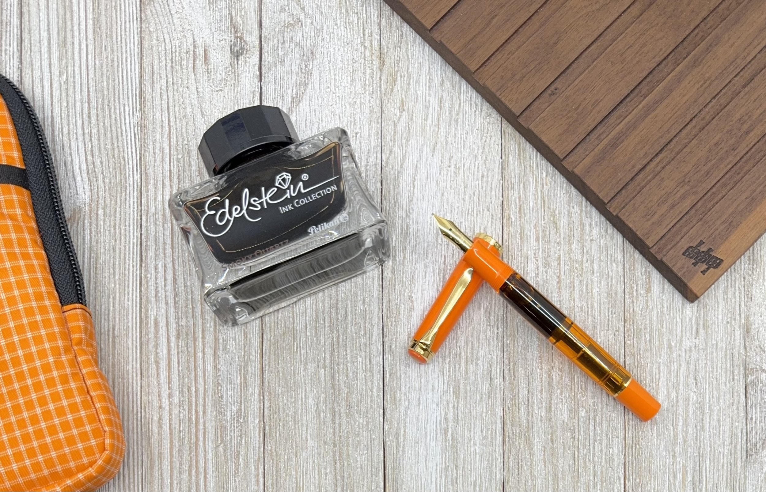
To say the Orange Delight fits my aesthetic would be the understatement of the year. The solid Orange resin is set off perfectly by the translucent Orange mid-section. I love seeing the piston hardware, and the ink sloshing around inside the barrel. The Gold trim is a perfect match as well, and for this particular pen, works better than Rhodium-plated hardware would have.

There have been many Pelikan M200 fountain pens that have tempted me over the years, but at around $200, they are not a mindless purchase. I’m glad I bided my time until I found one that delights me as much as this one does.

The biggest takeaway from my experience with the Orange Delight is that I had no inclination to ink it up with an Orange ink. There can never be too much Orange, so maybe one day I will, but so many other colors fit well with this pen and nib. It may be a boring choice, but I’m thrilled with the Brown shades of Pelikan Edelstein Smoky Quartz in this pen, an ink I haven’t given much of a chance to previously. It’s a perfect match, and I wouldn’t hesitate to go a second round with it when I write this one dry.

In a sea of similarities, Pelikan still finds a way to be unique amongst the flock, while staying true to their roots. I can’t help but be continually impressed by everything they make.

(I picked up this pen from Nib Grinder at the 2024 Atlanta Pen Show in a trade for products.)


Enjoy reading The Pen Addict? Then consider becoming a member to receive additional weekly content, giveaways, and discounts in The Pen Addict shop. Plus, you support me and the site directly, for which I am very grateful.

Membership starts at just $5/month, with a discounted annual option available. To find out more about membership click here and join us!

Posted on May 20, 2024 and filed under Pelikan, Fountain Pens, Pen Reviews.