Posts filed under Pen Reviews

Zebra Super Marble Gel Pens Review

(Sarah Read is an author, editor, yarn artist, and pen/paper/ink addict. You can find more about her at her website and on Twitter.)

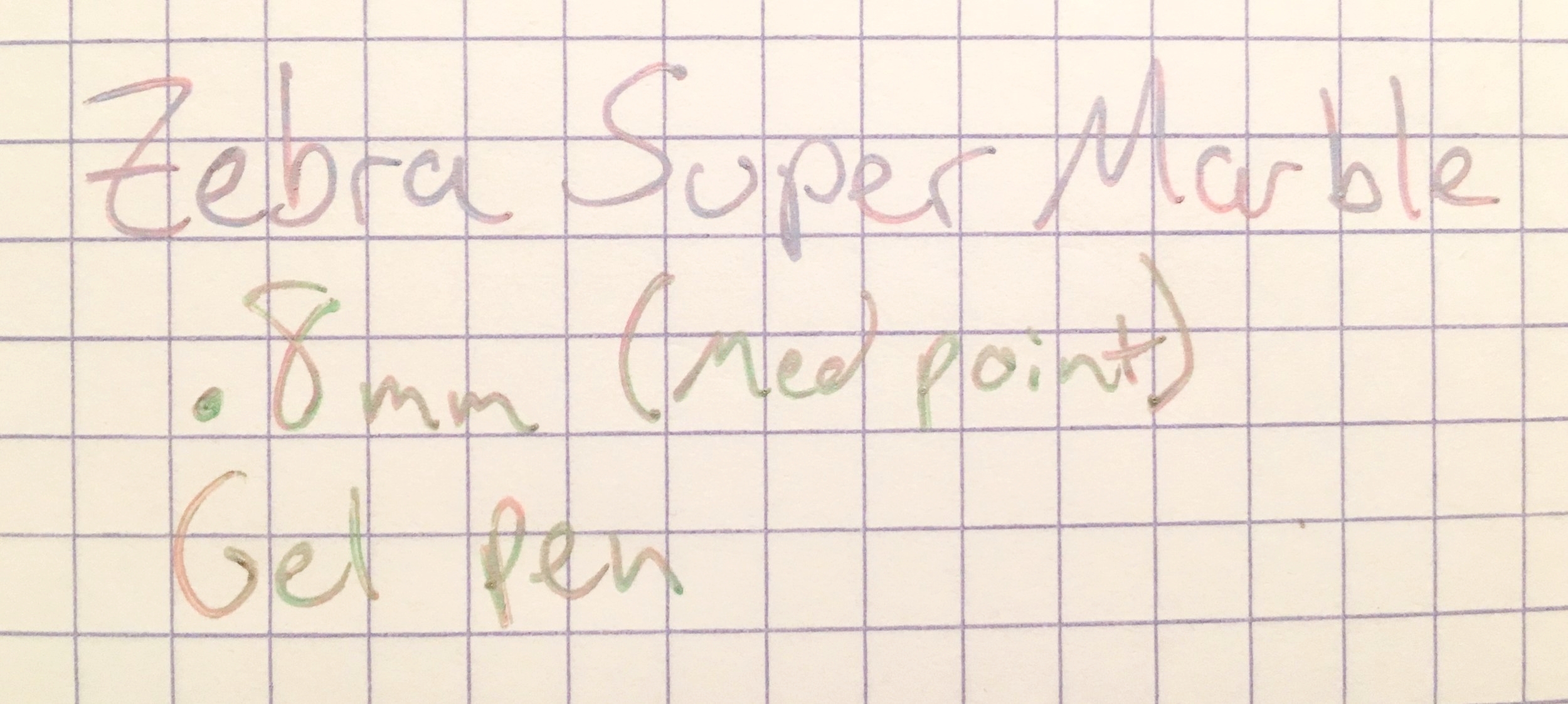
The Zebra Super Marble Gel Pens have a neat marbled ink effect. The colors are swirly with a metallic sheen. They're a fun throwback to classic 90s gel pens and a reminder of how awesome my school notes used to look.

In the set of four pens, one swirls with blue, pink, and purple; one is purple, green, and blue; one is pink, green, and blue; and one would not write at all, but it would be yellow, pink, and blue. Obviously, the one that would not write is a bit of a disappointment. I noticed that pen had a significantly lower ink level in the package, so I wonder if there was an issue with the pressure in the cartridge. No amount of coaxing got any ink to flow. But the other three write very smoothly, so I think I just got a lemon. My expectations of Zebra are pretty high, though, thanks to the quality of their other products, so I hope this is a rare fluke. Especially because the charm of these pens is all in the ink.

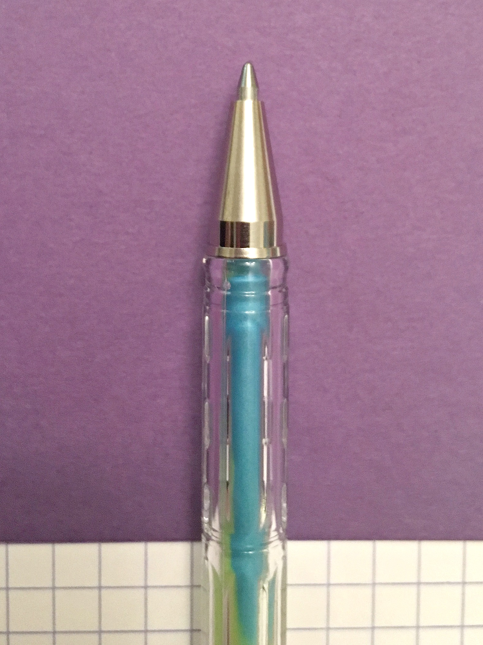
The bodies are lightweight clear plastic. It's cool to see the marbled ink in the cartridge, but the plastic does feel quite brittle and I wonder if they'll show stress fractures over time, or if the clips will break off. They did survive an afternoon with my toddler, so maybe they're made of stronger stuff than they appear.

The cap secures with a click. It clicks to post as well, though in both positions is spins freely and rattles a bit when agitated. Writing with it posted gets a bit irritating.

There aren't many pens out there with this cool effect--so if you want some swirly, colorful writing, it's easy to forgive a few flaws. The color effect can be a bit sporadic--depending on how the ink flows, you might get consistent marbling, or you might get stuck on one color for a few paragraphs before the ink shifts again. And sometimes you might see all three colors in the space of a single character. The randomness is part of the fun, I think. These are pens of whimsy.

I love that they write on different colors of paper. I think they will be great for addressing colorful envelopes, scrapbooking, or planner decoration. The ink is acid-free and archival, so it should stand the test of time. They could add neat effects to coloring books as well.

I can't say I fully recommend them until I see if others have the same quality control issues I had. I don't think I'd buy more, when these run out, but I do think they'll add a bit of pizzazz to my holiday cards this year.

(JetPens provided this product at no charge to The Pen Addict for review purposes.)


Enjoy reading The Pen Addict? Then consider becoming a member to receive additional weekly content, giveaways, and discounts in The Pen Addict shop. Plus, you support me and the site directly, which I am very grateful for.

Membership starts at just $5/month, with a discounted annual option available. To find out more about membership click here and join us!

Posted on November 17, 2016 and filed under Zebra, Gel, Pen Reviews.

Alfred Dunhill Sentryman Art Deco Rollerball Review

Alfred Dunhill is a premier luxury brand, recognized around the globe for it’s classic menswear and accessories. In fact, the parent company of Dunhill, Richemont, owns Montblanc as well, along with more than a dozen other high-end brands.

As a company, Dunhill became popular in the early 1900’s by tapping into the world’s newest fascination: automobiles. Dunhill didn’t make cars, but rather accessories for those who drove them. Goggles, coats, even a wind-proof pipe.

The pipe, and smoking accessories in general, was how I first became aware of the brand. Not that I have ever smoked, but there wasn’t a mall in the 1980’s or 1990’s where you didn’t see some sort of Dunhill presence. That market has changed over the past two decades, and Dunhill has changed right along with it, while remaining true to its origins.

The Sentryman Art Deco Rollerball is the embodiment of the Dunhill brand in a writing instrument. A glorious one at that. You can’t look at this pen and not think, or say, “Wow.”

You also cannot look at the price of this pen and not think “Wow” as well.

At $790, this is far and away the most expensive non-fountain pen I have ever reviewed. I was actually nervous when Dunhill reached out to me to review this pen, and paused for days, if not weeks, before committing to accepting this product from them.

I’m glad I did.

I’ve spoken for years about what I call the “Montblanc Problem”, which is the phrase I use when you are paying for everything about a pen besides the writing experience. The refill is the least expensive part of the equation, which anyone can afford. The refill also fits in many other pen barrels, giving you the Montblanc writing experience without the Montblanc cost. The Montblanc/Pilot G2 hack is famous for this.

As I tell readers all the time, you have to understand what you are paying for in the luxury pen market, and decide what is important to you. Are materials, style, branding, and marketing your primary purchasing factors? Or is it the writing experience? There is no wrong answer, of course, but the most impossible question for me to answer is “I have x dollars to spend on a pen for a gift, what should I buy?”

If money is no object, I would consider the Sentryman over any Montblanc rollerball I have seen. It is absolutely stunning. It feels great to write with. It looks great sitting on my desk, or clipped to a shirt pocket. It writes wonderfully (Unposted, that is. It is too heavy posted.) with the included Dunhill-branded Schmidt EasyFlow refills (International G2/Parker refill compatible). Price excluded, this is a 10 out of 10 pen.

But price can’t be excluded when making a purchasing decision. I’ve spent more on fountain pens, but my opinion is that I get more too. Do you get more when spending this much on a rollerball? That is for you to decide.

My thanks to Alfred Dunhill for sending me this pen at no charge for purposes of this review.


Enjoy reading The Pen Addict? Then consider becoming a member to receive additional weekly content, giveaways, and discounts in The Pen Addict shop. Plus, you support me and the site directly, which I am very grateful for.

Membership starts at just $5/month, with a discounted annual option available. To find out more about membership click here and join us!

Posted on November 14, 2016 and filed under Alfred Dunhill, Rollerball, Pen Reviews.

Kaweco Supra Eco Brass Fountain Pen Review

(Jeff Abbott is a regular contributor at The Pen Addict. You can find more from Jeff online at Draft Evolution and Twitter.)

A while back, I purchased my first Kaweco Liliput. It was the Brass Wave model with an EF nib, and I immediately fell in love with the form factor. A little later, I also picked up a stainless steel version, which strengthened my affection for the little Liliputs even more.

Fast forward a bit to 2016, and we have the Kaweco Supra. The name caught my attention when the pen was first announced because the only Supra I'm familiar with was one that Toyota made back in the day. Let's just they don't have much in common at all.

The Kaweco Supra take the idea of the Liliput and adds a bit of size and flexibility. An all copper body? Check. Threaded rear for posting the cap securely? Check. Slim size and cigar-like shape? Yep. So what does the Supra have that you can't find in the Liliput? Several things.

Size

The Supra is quite a bit larger than the Liliput. When you compare the Supra with a brass Liliput, there's an entire ounce of difference. That's significant when comparing pens. The Supra is 5.1 inches when capped, and the Liliput is 3.8 inches. Both are pocketable, but the Supra has a more normal diameter compared to the Liliput. I've always felt that the Liliput isn't ideal for long writing sessions, but the Supra take care of that concern with no problems. This is a full size pen that still breaks down to a small, pocketable superstar of a pen.

Flexibility

The Supra has another trick up its sleeve, though. Unlike the Liliput, it has an additional section piece that can be removed to reduce the overall size and weight of the pen. The extra section is 3 cm long, which is about a quarter of the overall length. When you remove this extra section, the Supra really is a big brother to the Liliput. But, I love the flexibility that this additional piece offers. For one, you can store an extra short cartridge in the pen, or you can use a full-size converter with the extra space. It also changes the weight and feel of the pen depending on the configuration you're using. For me, I prefer to use the pen unposted when the extra section is installed, but I prefer to use it posted when the extra section is removed. You can certainly post the cap with the section installed, but that makes for a pretty long pen. For me, it threw the balance off too much.

I love the Supra for its flexibility and quirk. It can be a bit hefty since it's solid brass, but it's still a good weight for writing. Of course, the brass will take on a new personality fairly quickly after you start using it. In just three weeks of use, I have some patina starting to show on the more heavily used areas of the pen. Over time, it will develop into a duller, warmer finish.

Personally, I would love a stainless steel version of the Supra as well. It would be a tad lighter, but wouldn't develop a patina. I have a love-hate relationship with brass pens. On one hand, I love the unique and aged look they take on over time. On the other hand, I sometimes feel annoyed by the texture that the oxidation creates. It makes the pen feel dirty in some cases.

But, don't let that bother you. Cleaning off the patina is a simple matter of letting it soak in white vinegar for 15 minutes followed by some mild scrubbing. After that, it's shiny and new again.

Writing

By now, you know I'm a fan of the exterior of the Supra, but let's talk a bit about the important part — the nib.

The nib on the Supra is also a step up over the Liliput (and many other common Kaweco models). It uses a large #6 nib that fits perfectly on this pen. It makes a statement and plays well with the overall aesthetic of the pen. I love the large nib, and I'm also very happy to report that it's an excellent writer. I've had trouble with Kawecos needing minor (and not-so-minor adjustments) in the past, so it was a relief to find this one worked well straight away.

The nib is smooth and delivers ink with constant flow. It's a stainless steel nib, so there's not any flex to report. What I can say is that it's a sturdy, reliable, and enjoyable nib.

Again, depending on how you configure the Supra, it will feel different when writing because of the changes in weight and balance. I look at that as a benefit, but I'm sure others would disagree.

I've used this pen for a solid three weeks and have been very happy with it so far. It does very well for extended writing sessions, but also is the perfect size for going along for off-site adventures in your pocket or bag. The brass material also means you'll pick up dings and scratches that add more character to it over time.

Conclusion

Overall, I'm really happy with this pen. It's a great product from Kaweco that is a "larger than life" take on one of my other favorite Kaweco products, the Liliput. Of course, the Supra is a bit more expensive than the Liliput, but that's easy to explain with the larger size and larger nib. I look forward to other variants of the Supra from Kaweco in the future!

Goldspot have the Supra in EF, F, M, B, and BB nib sizes.

(Goldspot provided this product at no charge to The Pen Addict for review purposes.)


Enjoy reading The Pen Addict? Then consider becoming a member to receive additional weekly content, giveaways, and discounts in The Pen Addict shop. Plus, you support me and the site directly, which I am very grateful for.

Membership starts at just $5/month, with a discounted annual option available. To find out more about membership click here and join us!

Posted on November 9, 2016 and filed under Kaweco, Fountain Pens, Pen Reviews.