Posts filed under Pen Reviews

Retro 51 Tornado - 25th Anniversary Limited Edition Review

(Jeff Abbott is a regular contributor at The Pen Addict. You can find more from Jeff online at Draft Evolution and Twitter.)

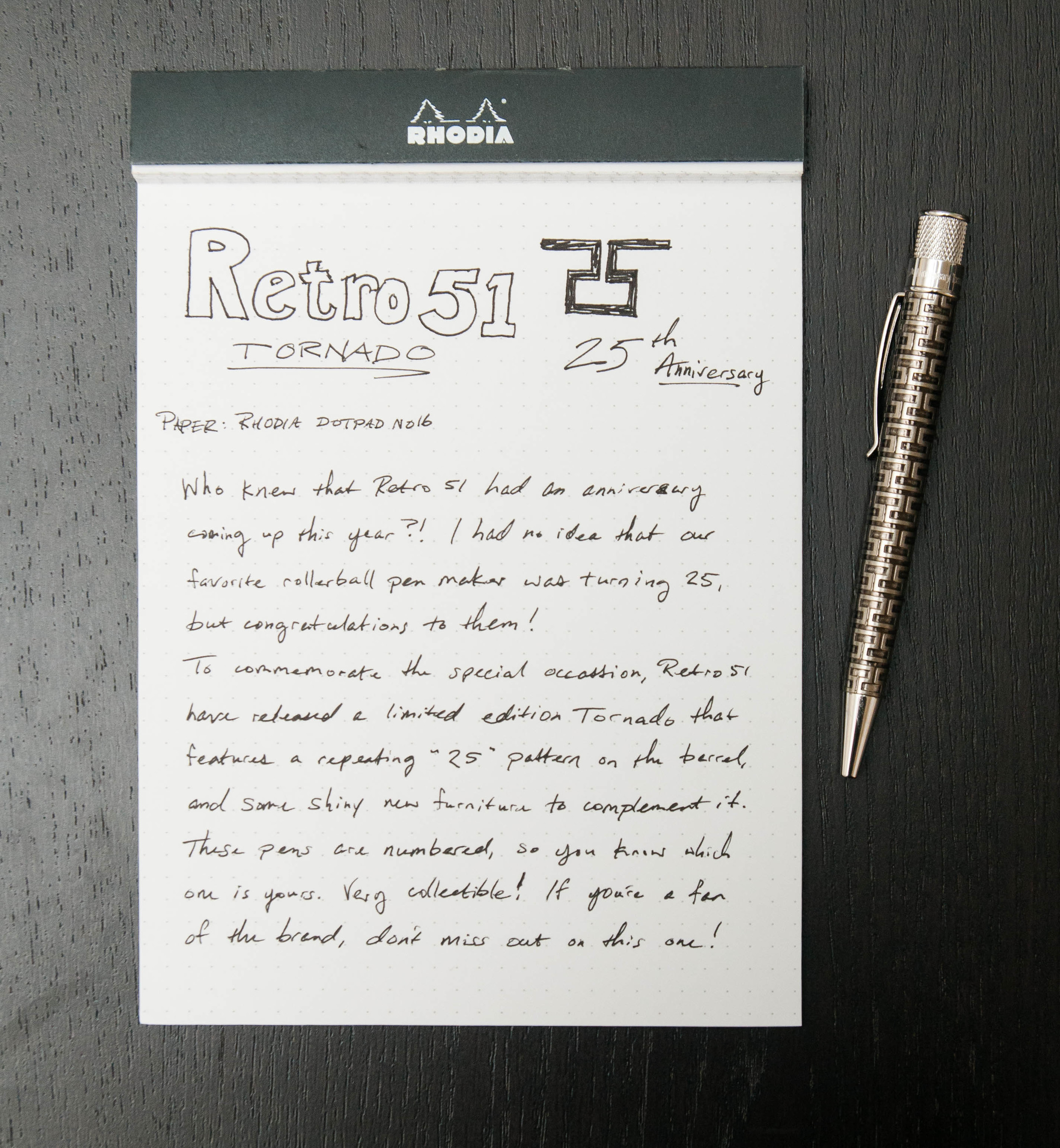
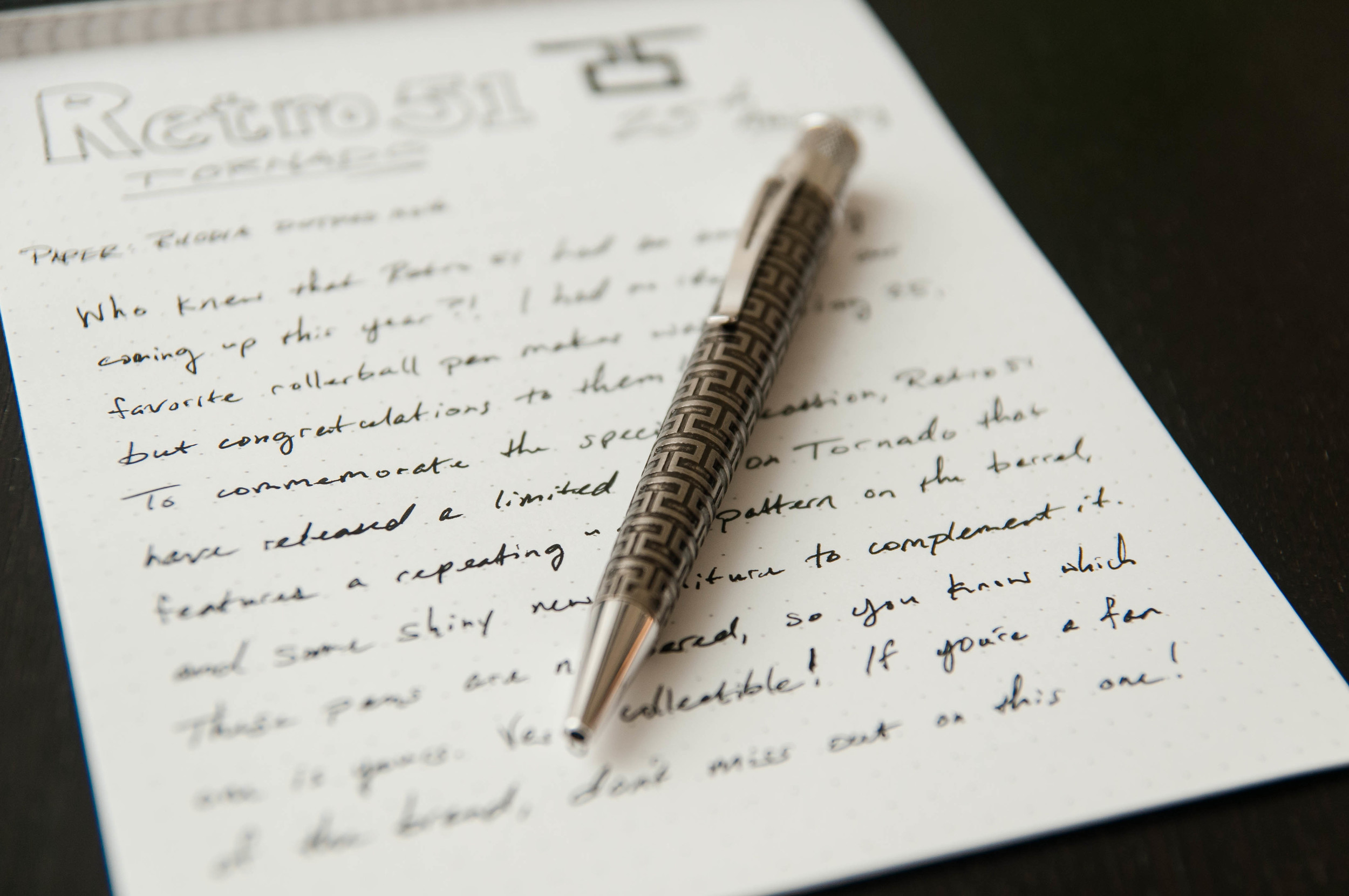
Retro 51 — the darling of rollerballs — recently celebrated an important milestone of making great pens for 25 years. I had no idea that my favorite rollerball pen maker was having such a significant anniversary this year, but it's certainly exciting.

To mark the occasion, Retro 51 have released a special edition Tornado. This pen is a beauty to behold and has a couple of premium features that set it apart from other Tornado editions.

The most obvious feature of the pen is the body design. The pattern is a repeating "25" that stand out from the body like a relief sculpture. According to Goldspot, the barrel is acid-etched with the pattern, and then plated with a "stonewashed pewter" finish. Fancy words, but it all adds up to a positive experience when looking at the pen in person.

On top of the barrel finish, the furniture is made of rhodium, which is more shiny than the normal materials used in Tornados.

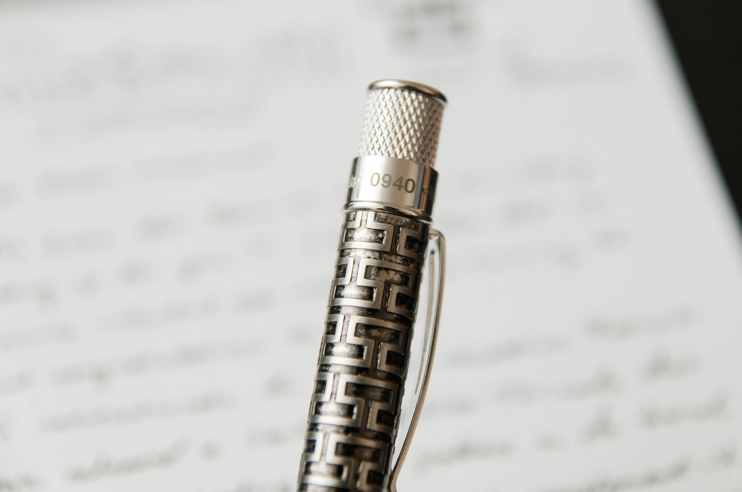
Along with the shiny material, the top band also includes some extra inscriptions that read "Retro 1951 25th Anniversary Tornado," followed by the unique number of the pen. My only complaint here is that the unique number isn't stamped with the same typeface and color as the rest of the text, but that's a really minor niggle.

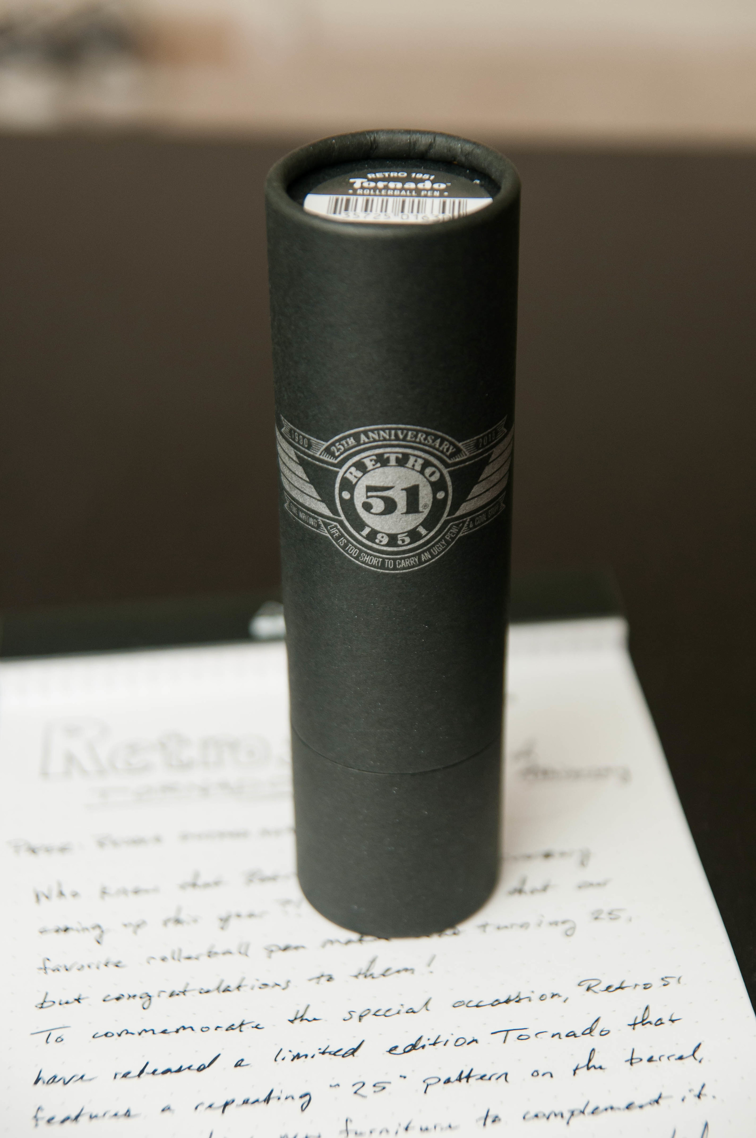
The cardboard tube that holds the pen also receives some special branding attention, with a nice logo that indicates the 25th anniversary edition. Also, the same unique number is included on the bottom of the tube for reference. Apart from the branding, the packaging is the same you'd expect with any Tornado.

This really is a beautiful pen, and I'm glad I got to see one in person. If you're a fan of the Retro 51 brand, then this pen is definitely for you. It has a killer design, premium materials, and a limited appeal.

At around $50 for the pen, it's more costly than the standard or metal Tornado models, but it's a special edition and the price is fair for the premium materials and limited nature of the pen.

As far as writing with the pen, it uses the same cartridge we know and love. The raised etching on the body gives the pen a nice grip. I don't mind it at all, but I'm sure some people will prefer a smooth body for writing. Either way, it's still a beautiful limited edition, and I'm sure they'll be gone fast, so act quickly.

Goldspot graciously loaned this pen for the review, so you be sure to check it out and all of the other Retro 51’s they have in stock.

Posted on October 7, 2015 and filed under Retro 51, Pen Reviews.

Sailor Pro Gear Regency Stripe Review

I don’t normally buy blingy pens, but when I do, it’s the Sailor Pro Gear Regency Stripe.

I first saw this pen at the 2013 Atlanta Pen Show. Mike Masuyama, who rarely sells pens, had this one sitting on his table. I picked it up, becasue, well, it’s gorgeous, and loved the feel of it. It was my first pen show, and there weren’t many Sailor’s available to purchase, so I asked Mike the price.

“$400.”

I put the pen right back down. Not today, but not forgotten.

I didn’t even know what the name of this particular Sailor pen was, but the design was distinctive and stuck with me. It was shiny, yes, but in a sublte way. And it had a nice heft to it, unlike the Pro Gear Slim (aka Sapporo), which was the extent of my Sailor experience up to that point.

Fast forward to May of this year. I was scrolling through the Fountain Pen Network Classifieds (bad idea for your wallet!) and ran across a Sailor pen I had seen before. And it had a name: The Sailor Pro Gear Regency Stripe. It looked to be in great shape, the price was fair ($350), and I had it on the way nearly as quickly as I found it. I wasn’t passing it up for the second time.

The standout feature of the Regency Stripe is the rhodium stripe and barley corn pattern that adorns the barrel. It is as stunning to look at as it is to hold. There is some weight to it as I mentioned earlier, but it’s not too much. It gives it that “just right” feel when writing with it.

Mine came with a broad nib, which wouldn’t have been my first choice, but I never have an issue getting the pen I want and worrying about the nib later. The broad was ok as-is, but I shipped it off to my friend Dan Smith at The Nibsmith to give it a little cursive italic love to fit my writing style better. Dan delivered a sharp, juicy nib that is a pleasure to write with.

Would I have purchased this pen without the opportunity to have held it in Atlanta several years ago? I think the odds are very low that I would have. That’s a lot of money to shell out sight unseen. This is why pen shows are great. You learn more than you buy, and that is valuable when it comes to making purchasing decisions in the future. This was a decision I was very happy with, and I’m not the only one.

Posted on October 5, 2015 and filed under Pen Reviews, Fountain Pens, Sailor.

Visconti Homo Sapiens Bronze Age Fountain Pen Review

The Visconti Homo Sapiens Bronze Age fountain pen is one of my grail pens. It is one of those pens that catches your eye with its striking bronze embellishments and basaltic lava finish. There's nothing quite like it.

I held off ordering one for quite awhile, simply because the pen looked enormous and heavy. It is a big pen, measuring 5.75 inches, and it is weighty at 45 grams (both measurements are with the pen capped). Nevertheless, it balances perfectly in the hand. A seller on Fountain Pen Network offered this Homo Sapiens for an "I-can't-pass-this-by" price, so I bought it.

The packaging is sophisticated and suits the pen. The outer cardboard box is cream colored with the Visconti logo. Inside is a large, leather-like clamshell box. When you open it, the Homo Sapiens is encased in cream-colored cloth that contrasts nicely with the pen. The clamshell box has a slide-out drawer that contains information about Visconti pens and a polishing cloth for the bronze.

The cap attaches using Visconti's special "hook safe lock." I like the design and it's certainly quicker than unscrewing a cap, but I haven't found it to be all that "safe." The cap comes off too easily. I wouldn't trust it in a shirt pocket.

A removable bronze finial with the Visconti logo adorns the top of the cap. You can replace it with Visconti's "My Pen" system and choose your initials or a stone. I like the Visconti finial but might someday buy a stone just for variety.

Finial.jpg

In addition the cap is encircled by two solid bronze bands and the Visconti clip. The Visconti name is painted on both sides of the clip. I think they should have engraved it. If you want to attach the pen to a shirt pocket or papers the clip lifts easily.

The barrel has two bronze bands. The top band is engraved with "Homo Sapiens." The letters are filled with black ink so they stand out nicely against the bronze.

The bottom band is slender and encircles the piston. It actually popped off when I was cleaning the pen. It's not hard to press it back into place, but I'm not impressed when bronze parts fall off.

The pen uses Visconti's high power vacuum filler system. It's simple to use. You unscrew the piston, pull to extend it, submerge the nib in the ink and push. I do this two or three times to make sure I get a good fill. Unfortunately, the Homo Sapiens does not have an ink window, so you don't know how much ink is in the barrel. And vacuum fillers are notoriously difficult to clean. When I changed ink for this review it took a half hour of plunging to get the water to run semi-clear.

My nib is a 23K palladium stub (1.3mm). It's a beautiful nib with scrollwork and the Visconti name. Visconti calls it a "dreamtouch nib" which means it writes without any pressure being applied. It is definitely a smooth nib. The stub lays down a thick, juicy line. But, I've experienced hard starts and skipping, which is disappointing considering the retail price of this pen ($695.00). I suspect I'll have to send it to a nibmeister to tune it and maybe turn it into an italic.

Over time, the bronze elements tarnish. In fact, I've only had the pen a few months and the bronze has tarnished substantially. I used the included polishing cloth before I took photos for the review. It got some of the tarnish off, but the bronze isn't as shiny as before. The cloth is thin and doesn't seem to work all that well. Some Homo Sapiens owners prefer the look of the tarnished bronze; I prefer it shiny.

The lava body is something you simply have to touch to appreciate. It's a mixture of basaltic lava from Mt. Etna and resin. The lava surface is smooth to the touch, but has tiny pits in it, giving the pen a matte look.

The material quickly warms to your hand. And, if your hand gets sweaty, the lava absorbs the moisture. I've read elsewhere that when you ink the pen you should wipe off any remnants on the grip quickly with a wet cloth so the ink doesn't get absorbed into the lava.

The Visconti Homo Sapiens is an iconic pen. It's unique and beautiful. I've read that Visconti nibs can be hit or miss, and mine definitely has some faults. But, after a trip to a nibmeister, I suspect this will be one of my favorite pens.

Pros

  • The basaltic lava composition of this pen is unique and wonderful to touch
  • The power-fill system works well, but it's hard to clean thoroughly
  • The nib is gorgeous and writes a wet, smooth line (but see below)
  • Although the pen is large it balances nicely in the hand
  • The matte black and bronze accents are striking

Cons

  • Some people might find this pen too heavy
  • There's no ink window, so you don't know how much ink is left or if you've gotten a good fill
  • The bronze appointments tarnish over time
  • The cap is easy to remove accidentally
  • My nib exhibits hard starts and skips occasionally
  • At retail price, this pen is very expensive
Posted on September 25, 2015 and filed under Visconti, Pen Reviews, Fountain Pens.