Posts filed under Pen Reviews

Bexley Phoenix Fountain Pen Review

(Susan M. Pigott is a fountain pen collector, pen and paperholic, photographer, and professor. You can find more from Susan on her blog Scribalishess.)

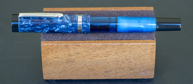
The Bexley Phoenix collection includes four colors: black with a clear barrel, red with a clear barrel, blue velvet with a blue translucent barrel, and cappuccino with a bronze translucent barrel. The caps on these pens are marbled acrylic, and the piston knobs are black, except for the cappuccino's which is caramel.

Goldspot Pens kindly loaned the Bexley Phoenix in Velvet Blue for review. The retail price for this pen is $219.00, but it is currently on sale at Goldspot for $164.95. The pen is 5.3 inches capped, 5.125 inches uncapped, and 6.45 inches posted.

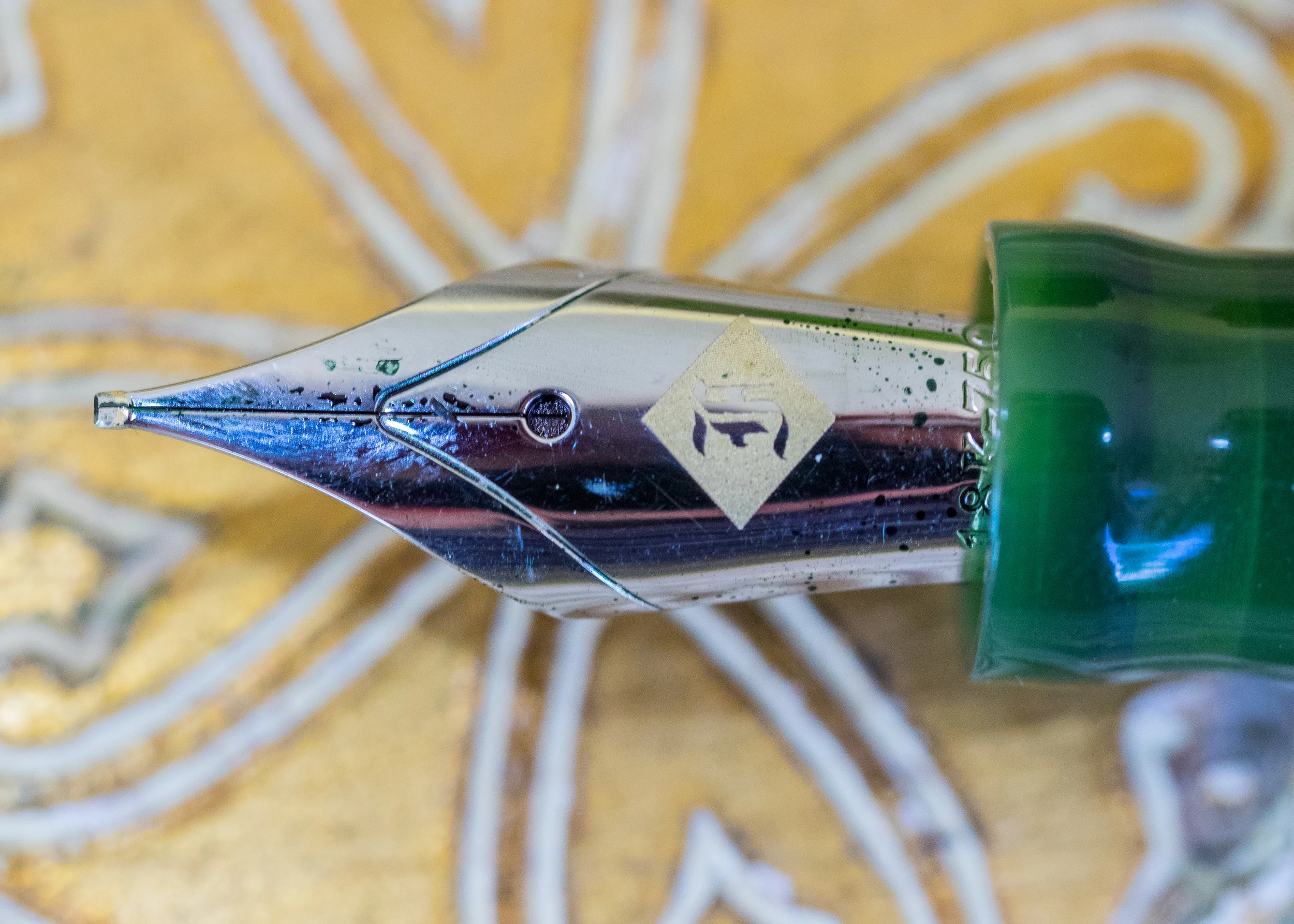
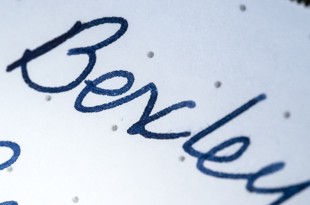
The nib is a two-tone, custom-engraved, stainless steel nib that comes in fine, medium or broad. The nib on the loaner pen from Goldspot is a fine.

And the nib is the best part of this pen. It is large and writes smoothly. It's a very firm nib (no flex or bounce). But it isn't scratchy nor does it exhibit hard starts.

The marbled blue cap with a black top section is elegant, and the steel accents complement the silver swirls in the marbled acrylic.

The clip is unadorned except for a small "B" stamped at the top and the ring is plain. The clip is flexible enough to attach to a pad of paper or a shirt pocket.

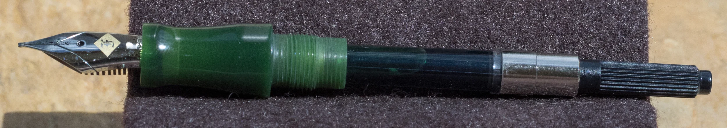
Unfortunately, the pen's design begins to fall apart once you remove the cap. The grip portion of the barrel and the piston are black. The mid-section of the barrel is translucent blue, allowing you to keep track of your ink level. This unusual combination of a marbled acrylic cap with a demonstrator barrel doesn't work well. When I look at the pen, I think "someone put the wrong cap on this pen."

Then there's a section I can't quite describe. It's opaque, and it looks like a wad of wet Kleenex was stuffed into the barrel.

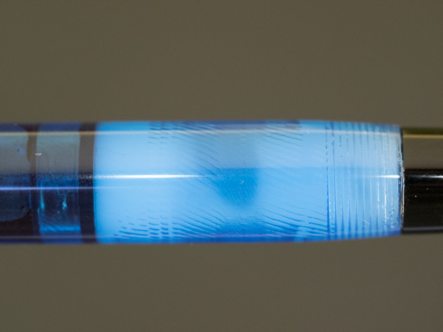
I have no idea why the pen was designed with this element which, frankly, I think is ugly. Had the designers simply used the marbled acrylic or translucent blue, the pen would be more attractive. Maybe they were trying to hide the piston mechanism. But this strange opaque white section ruins the appearance of the pen, especially since it isn't uniform but mottled.

In the photographs, it looks like this section is textured on the inside, but you can't see that with the naked eye. It may be a trick of the light or an aberration the camera picked up.

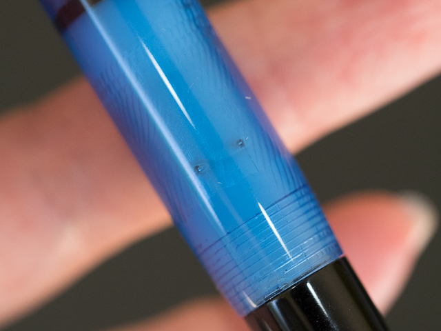
In addition, two holes, which I assume are necessary, mar the appearance of the barrel.

Appearance isn't the only problem with this pen. The piston does not turn smoothly at all. You can feel the piston bump along as you turn it–gallumpf, gallumpf. It's quite disconcerting. I don't know if the barrel is misshaped or if the piston is not perfectly round. I've owned Pelikans with hard-turning pistons (something easily fixed with a little silicone grease), but I've never felt a piston "gallumpf." Maybe this is simply how Bexley pistons turn. If so, I don't like their pistons.

Whatever causes the Bexley piston to stutter doesn't seem to affect the seal. However, I discovered that the pen won't fill unless you have the entire nib submerged plus a little of the grip. Since the nib is so large, you'll need to have deep, full ink bottles or figure out a way to angle bottle so the nib is completely submerged. That's what I did to fill the Bexley with Diamine Denim.

My son demonstrates the tip fill

My son demonstrates the tip fill

I am not impressed with the Bexley Phoenix fountain pen. Although it is a smooth writer, the design of the pen is disappointing, and the piston mechanism, at least on the loaner pen, is bumpy. I've not tried other Bexley models, but I would not recommend this one.

Pros

  • Smooth writing, large steel nib
  • Piston filler

Cons

  • Unattractive design, especially the opaque white section
  • Rough piston movement
  • A bit difficult to get a good fill
Posted on July 17, 2015 and filed under Bexley, Fountain Pens, Pen Reviews.

Copic Doodle Pack Brown Ink Review

(This is a guest post by Nick Folz. You can find more of Nick and his work on Twitter, Instagram, and Tumblr.)

Okay listen, I'm a black and white sort of fella. No no no, I like grey as much as the next person and life is so rarely as simple as the bright clear white and the rich dark black, but when I'm doodling I prefer the starkest of contrasts. Good ol' B & W.

That said, comfort zones are made to be stepped away from. Markers are decidedly outside of mine. Sure, as an awkward youth I burnt through many a flimsy yellow cardboard box of brightly toned cylinders, and had fun while doing so, transforming white sheets into worlds where the grass really was green and the sky always a brilliant blue. I think I was probably in high school when I abandoned colors in general in my drawings. Too much work! The thing was done and now I have to risk ruining it by coloring? No thanks. I have talked to many people who feel the same way about inking, which I have always found relaxing and a general refinement of the previous version, but I digress. Let’s get down to the business at hand - Copic Markers Doodle Pack in Brown. A fine way to test the swirling waters of color.

Here is the (my) thing about colors: when given all of the choices in the world, it is crippling. It can be overwhelming trying to choose the right color when there are limitless options. It is much easier and even more effective to limit a pallet and work within constraints. That is what piqued my interest in these packs. You are giving various tones of a single color group and a variety of tools as well. Let’s do a quick breakdown of the four items:

CopicPackBreakdown.jpg

• Copic Ciao Marker - E31 Brick Beige: dual edge (one chisel, one brush) perfect for large area toning. A light (but not too light) brown.
• Copic Ciao Marker - E35 Chamois: dual edge (one chisel, one brush) perfect for large area toning. A dark (but not too dark) brown
• Copic atyou Spica Glitter Pen - Chocolate: Lays down a decent sized deep dark brown. 
• Copic Multiliner Pen - 0.3 mm Brown: Lays down a super fine deep dark brown.

For an analogy, let’s say you are painting a room: Your Ciao Markers are your rollers, Spica is your edge brush and the Multiliner is your tiny-detail-single-hair brush. They work wonderfully in concert with one another, each doing a job the other couldn't do and making the whole better.

To be honest I totally forgot how to use markers and started to do line work with one of the Ciao markers. Rookie move. Markers bleed like my nose in allergy season, what was meant to be a fine line wound up a broad stroke and I sat agape watching the pigment do it slow march outward. Oops. I shrugged it off, finished lining it with the marker and relined it with the Spica. Went back with the Ciaos to fill and then finished it up the details with the Multiliner. Suffice to say it was like riding a bike and before long I was grinning like that awkward child I once was (I am now an awkward adult, thank you very much).

One of my favorite aspects is the layering effect of the Ciaos. You might have only two colors but you can overlap the color for slightly darker shades of each, adding nuance to the shading. The Spica was my main outliner, the flow was solid and clean. Yes, it is a glitter ink pen but I hadn't noticed HOW glittery till the next day in better light. Glitter ink is, admittedly, not my bag, but it has a very nice look to it! The Multiliner worked well, but I am not wild about the tips on these types of pens. The super fine point is made of what feels like felt and they crush too easy for me, but tip works perfect for details and the shade is close to the Spica, so they work well together.

All in all I would highly recommend the Doodle packs to anyone interested in trying either expanding their marker knowledge or color palette. They are extraordinarily fun to use and will add some variety to an otherwise drab sketchbook. They can be purchased at JetPens and are available in a variety of color spectrums (I have my eye on the turquoise next).   Cheers.

(Disclaimer: This product was provided for me free of cost but I am not otherwise being compensated for this review. The opinions contained are my own.)

Posted on July 15, 2015 and filed under Copic, Drawing Pen, Pen Reviews.

Franklin-Christoph Model 20 "Marietta" in Vintage Green: A Review

(Susan M. Pigott is a fountain pen collector, pen and paperholic, photographer, and professor. You can find more from Susan on her blog Scribalishess.)

The Franklin-Christoph Model 20 "Marietta" is a simple, minimalistic pen. Originally offered in black, the pen also comes in a beautiful olive- green color, and I'm told other colors will be offered soon. The design, with clean lines and a few flourishes, is reminiscent of vintage pens.

The Marietta is the perfect size for me. It's a slender pen compared to many of the other Franklin-Christoph models. It can be comfortably used posted or unposted. The pen is 5.0 inches (127mm) from nib tip to barrel end and 5.45 inches capped (138.43mm). The barrel diameter is .51 inches (12.95mm), and the grip is .41 inches (10.41mm) at its smallest. The pen weighs 22.7 grams with the converter (no ink).

One of the best design features is that the grip has absolutely no threads to worry your fingers. The cap slips on and off rather than screwing, so the grip is completely smooth. And, the cap makes a satisfying "click" sound when you slip it off the pen.

Matching grooves adorn the top of the cap and the bottom of the barrel adding interest to the otherwise straight lines.

The clip is small (about half the size of the cap) and sports the diamond motif.

An "F" is engraved in the finial.

The company's name and model number are lightly engraved around the cap. I appreciate the subtle branding of Franklin-Christoph pens.

I chose an 18K gold Masuyama medium cursive italic for my Marietta.

Even though I love the steel nib on my Model 65, I wanted a gold nib for the Marietta. I thought the gold diamond etched on the nib would complement the green color of the pen, and it does.

Like most of the other Franklin-Christoph pens, the Marietta can be used with a cartridge, a converter (included), or as an eyedropper. For now, I'm using the converter though I may turn my Marietta into an eyedropper eventually.

The pen wrote perfectly the first time I inked it. For my written review, I used Sailor Jentle Epinard, an ink that matches the pen almost exactly. I've had no problems with hard starts or skipping. It's a firm nib, but it writes a gorgeous line with just enough variation to give my handwriting character.

I don't have anything negative to say about this pen. It's beautiful, light, comfortable to write with, and has a great nib. The color is unique and sophisticated. I love the ease of the slip on cap and the simple, elegant design. I am so glad Franklin-Christoph made the pen in a color other than black, and I'm looking forward to the other colors they will offer in the future.

The Marietta starts at $165 (steel nib) and comes with a leather case. With a Franklin-Christoph 1.9 steel music nib, the pen costs $175. The pen costs $255 with any 18K Franklin-Christoph nib. And for nibs specially ground by Mike Masuyama, you'll pay $180 for steel and $270 for 18K gold.

Pros

  • Elegant, simple, classic design
  • Easy on and off slip cap
  • Comfortable length, width, and weight
  • Beautiful, sophisticated color with gradations from light to dark green
  • Customizable with numerous nib choices
  • Comes with a leather zipper case

Cons

  • People who like heavy pens may find the Marietta too light
  • Similarly, those who prefer pens with a wider girth may not like the Marietta's slender profile

Note: I purchased this pen for my own use and was not compensated by Franklin-Christoph for this review.

Posted on July 10, 2015 and filed under Franklin-Christoph, Fountain Pens, Pen Reviews.