Posts filed under Pen Reviews

Lamy 2000 Fountain Pen Review

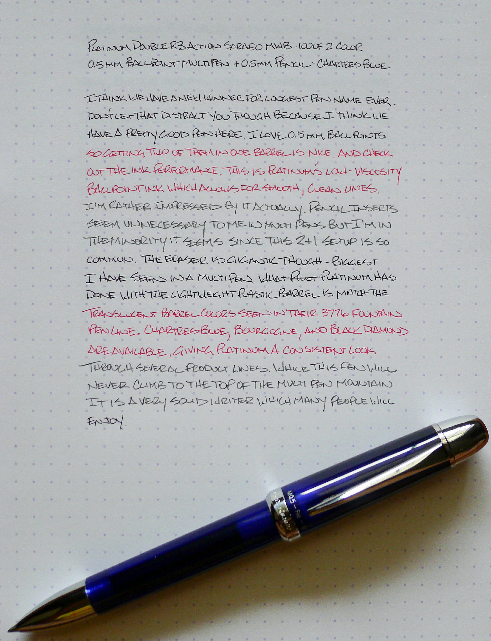
There are few pens that match the iconic design of the Lamy 2000. That's a bold statement, but this is a pen that's included in the Museum of Modern Art.

It's not uncommon to hear negative thoughts on the 2000 because of it's finicky nib. It seems Lamy have a quality control issue with this model, because it happens far too often. Yes, I'm starting this off with the negative aspect first because I want to get it out of the way.

Full disclaimer: the Lamy 2000 that I bought had a problematic nib out of the box. It wrote, but it wasn't smooth and it wasn't enjoyable. It caused anxiety and frustration more often than good feelings. With a pen that looks so awesome (and cost this much), you expect it to write with 100% consistency.

I bought my 2000 before the 2014 Atlanta Pen Show. I did this on purpose so that I could bring it along in case it had a bum nib. I'm glad I made that choice, because it did have a bum nib, and I was able to have Mike Masuyama fix it for me. If I didn't end up going to the show, I would've sent it off to a nib meister shortly after receiving it.

I love my Lamy 2000, and I think it's a great pen. But, if you buy one, it might be wise to set aside a little bit of money for nib work – just in case. That's my advice, but I really hope that the pen you buy is perfect right out of the box.

Now, on to the good stuff about this pen.

Looks

Not to be superficial, but I kind of think other pens are jealous of how hot this pen is. I know that's just personal preference, but I'm smitten.

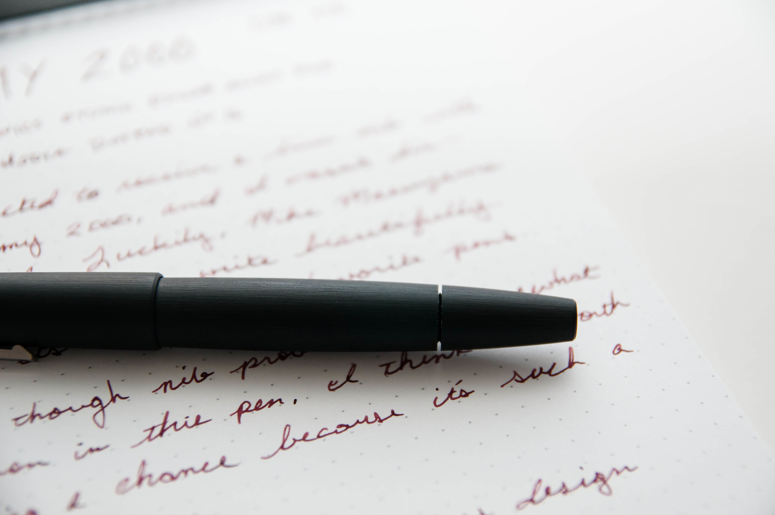
The Lamy 2000 is unique. There isn't another pen like it in design. It's sleek, modern, and welcoming at the same time. It looks like a pen meant to write, but classy at the same time. It works with casual and dress clothes splendidly. It always gets comments out in the wild.

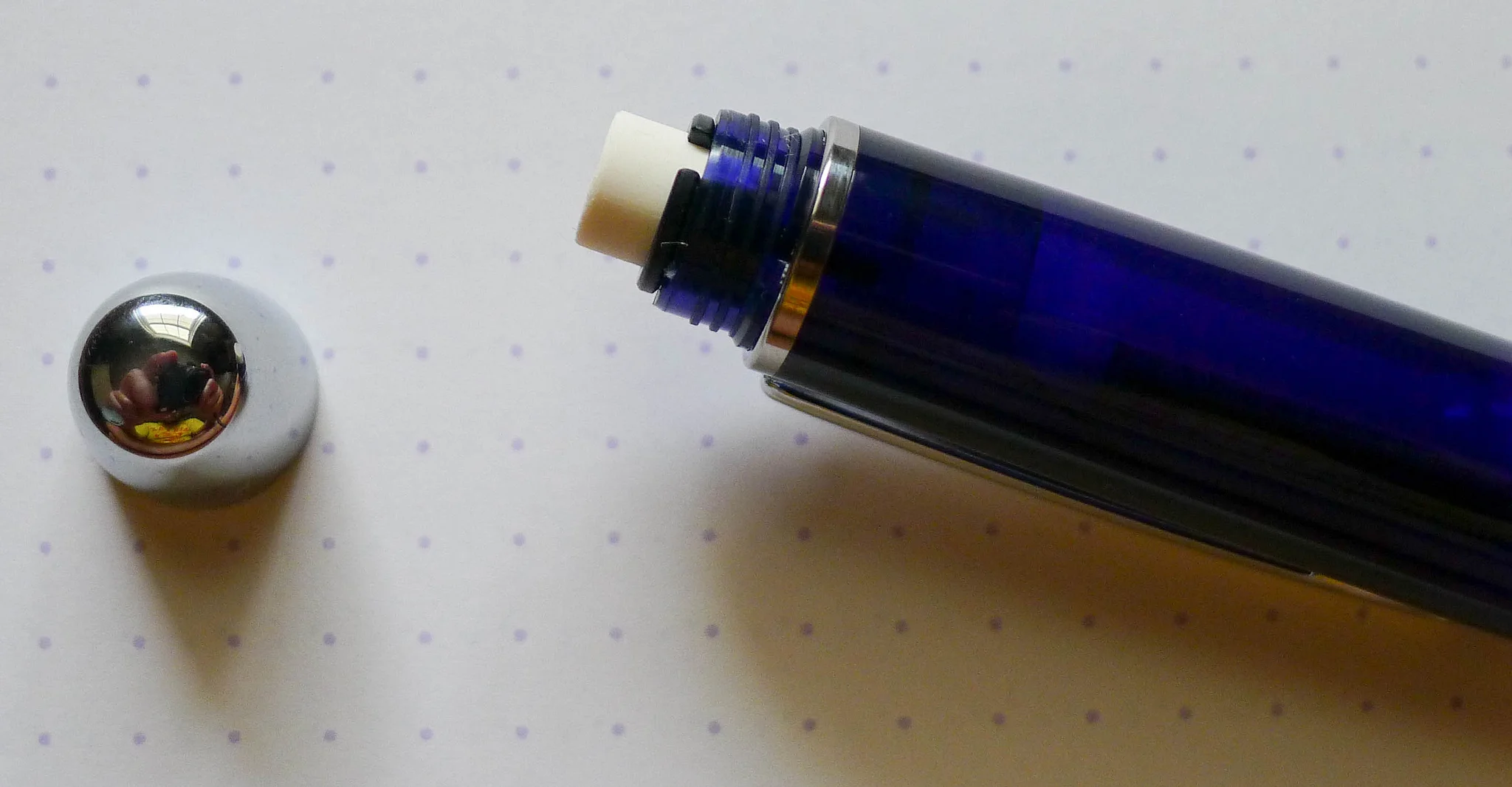
One of my favorite aspects of the pen is the grip and nib section. The nib is hooded, and looks very small since most of it is hidden beneath the metal grip. Now, I'm no expert in metals, but I think the grip is stainless steel. Whatever it is, it feels fantastic to hold.

The body is made of Makrolon, a form of fiberglass. It looks unique, but it also feels unique. It's a subtle difference, but I always notice it. After you write for a while, the body warms up as it rests on your hand. When writing, my fingers rest on the stainless steel grip and the body rests on my hand. I've written with this pen over numerous long writing sessions, and it never got uncomfortable. It's a great material, and well-balanced in the hand.

I normally write with this pen unposted, but it also feels well-balanced when posted.

The pen is a piston filler, and the piston section is so flush with the rest of the pen body, that it's often easy to miss. I love this aspect of the design. It makes the pen look like a solid, single piece.

Another fascinating design feature is the ink window. Toward the grip section of the barrel, some of the Makrolon is thin enough to let light through so you can see (roughly) how much ink is left. This is nothing similar to a demonstrator body – it's in no way completely transparent, but it does allow you to keep an eye on your ink level. It's a great feature.

Writing

Ah, the writing. At the start, the nib was inconsistent with ink flow, and it tended to stick to the page a bit. It's hard to describe, but it was dry and seems to be held to the page with some sort of really mild adhesive. Despite cleaning the pen numerous times, this didn't go away. I took it to Mike Masuyama in April, and he smoothed it out and increased the flow. Now it writes like a dream.

This is my first gold Lamy nib, and it's not dramatically different from the steel nibs, but I do notice it every now and then. There's more give in the gold nib compared to a steel nib.

Even after being adjusted, the nib still requires a fairly strict angle of attack on the page. I've grown used to this unique aspect of the pen, and after a few sentences, I don't even have to think about it.

As I said earlier, I love writing with this pen, and that's really all that matters. I'm really happy with the work Mike did on the nib, and I hope that everyone who owns or purchases one of these little beauties has a good nib to begin with or a good nib meister that can help.

Overall, I recommend the Lamy 2000. I've heard that some vendors will check the nib before they ship the pen to you – if you ask them to. Sure, you might get a bum nib, and I don't think that's right considering the price tag. That considered, a well-writing Lamy 2000 is a glorious thing. I think it's worth the risk.

I personally bought a fine nib model, but they have extra fine, medium, and bold as well. I'm tempted to have Mike put a cursive italic on it next time, but we'll see.

(You can find more from Jeff online at Draft Evolution, Twitter, and App.net.)

Posted on August 6, 2014 and filed under Pen Reviews, Lamy, Fountain Pens.

Triple Aught Design Fellhoelter TiBolt Pen Review

I first heard of Brian Fellhoelter when he launched his TiBolt Kickstarter project in late 2012. The looks of the original pen didn’t strike my fancy so I passed on it, but it ended up being a very successful project in the end, and many backers have sung the pens praises.

Fast forward to 2014 and Brian raised the bar on his original design, launching the TiBolt ReLeaded, a mechanical pencil using the original bolt action from the first pen. The barrel upgrade was noticeable, so it was only a matter of time before these two products merged, allowing for a Parker style refill to fit into the nicer ReLeaded barrel.

One of the results of this mergining of styles is the Fellhoelter TiBolt Pen TAD Edition from Triple Aught Design. They recently sent me this pen to check out and I came away more impressed than I thought I would originally. Triple Aught Design is known for their highly engineered and functional apparel and equipment so this collaboration fits their product line perfectly. The TiBolt pen is hardcore, that’s for sure.

Tactical pens can be a confusing thing for those who aren’t into them. What is the definition of a tactical pen? While I’m no expert in the field, I define them as a pen that is over-engineered to an extreme degree to be virtually indestructible. They are often used out in the field by professions that value durability at all costs, and often times provide multiple functions or have self-defense features.

The TAD Fellhoelter TiBolt is an excellent example of a well engineered pen. The titanium body is dead solid. All the pieces fit together so well It feels like you are writing with a single block of titanium. The grip rings are deep enough to provide a good grip without digging into your fingers, and the clip is solid enough to stay attached anywhere you put it. Even the barrel markings a sleek and subdued, especially compared to what I have seen from other tactical pens.

My only hangup with the TiBolt is a Fellhoelter design feature: The extra long bolt mechanism. It is tight, snappy, and works perfectly. But it is too big for me and my non-tactical uses. I understand the reason for its size - it helps users whose jobs require gloves - so therefore it’s not something I can truly complain about. Still, it digs into my hand unless turned just right, so it is not a perfect pen for me for that reason.

The pen ships with a Schmidt Easy Flow 9000 refill, which wouldn’t be my choice for this pen, but is easy enough to replace with your favorite Parker style refill. My choice would be the fine blue Fischer Space pen ballpoint for outdoor work, or the Moleskine gel for normal use.

Some may balk at the $160 price tag for this pen, but the quality, materials, craftmanship, and buy-it-for-life nature of this item will appeal to many. Plus, it is made right here in the USA. All of that adds up to a great product in my book.

(My thanks to Triple Aught Design for sending me this pen at no charge for review purposes.)

Posted on August 1, 2014 and filed under Pen Reviews, Tactical Pen, Fellhoelter.

Platinum Double R3 Action Sarabo MWB-1000F 2 Color 0.5 mm Ballpoint Multi Pen + 0.5 mm Pencil - Chartres Blue Review

Longest. Pen. Name. Ever.

I’ve seen some long, winding, nonsensical pen names before but this Platinum may take the cake. Good thing it is a decent pen or I’m not sure my brain could have handled it.

The Platinum Double R3 fills a spot in Platinum’s lineup for those wanting a complimentary pen to go along with their popular #3776 Century Fountain Pen. The barrel colors are a perfect match - Black, Bourgogne, and Chartres Blue - although the multi pen has silver furniture, while the fountain pens use gold.

The Double R3 features a lightweight, translucent, plastic barrel that is very sharp looking - especially the Chartres Blue. It is very light though, but feels sturdy enough to handle any normal carry situation.

Where this pen seperates itself from its competitors is the use of Platinum’s low-viscosity Sarabo ink in the 0.5 mm ballpoint refills. They are very fine, clean, and impressively smooth. I have never used a Sarabo refill before but it is so nice I would love to see it used in other single cartridge pens.

I don’t use pencils in multi pens very often so I don’t have much to say about it besides it works. What is cool is that it has possibly the largest eraser I have seen in a multi pen before. That’s a nice bonus for my fully leaded friends.

The only hangup I have with the Double R3 is a common multi pen design problem. To switch refills you twist the top part of the barrel from station to station, but if you take it past the far right station you start to unscrew the barrel. This is the nature of the beast until you get into more expensive barrels that feature constant 360 degree rotation.

At $16.50 it isn’t exactly cheap, but it is a fair price for a complementary pen. It’s great looking, feels nice, and the ballpoint refills are excellent. Well done Platinum.

(JetPens is an advertiser on The Pen Addict and I received this product at no charge.)

Posted on July 28, 2014 and filed under Multi Pen, Pen Reviews, Platinum.