Posts filed under J. Herbin

J. Herbin Stormy Grey Fountain Pen Ink Review

I've only been deep into fountain pens and inks for a few years and I don't recall a product - especially an ink - causing this much noise in our little world. J. Herbin Stormy Grey has taken the internet by storm, proving that we all like shiny and new. Especially shiny.

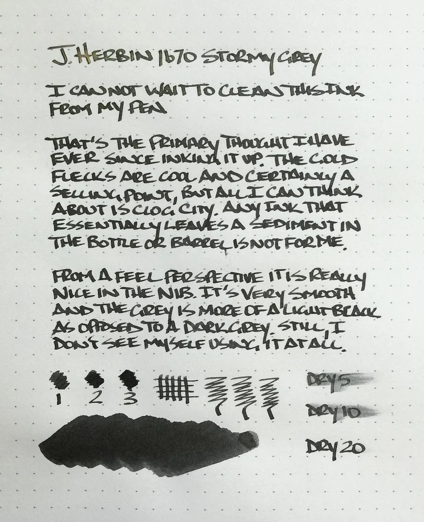
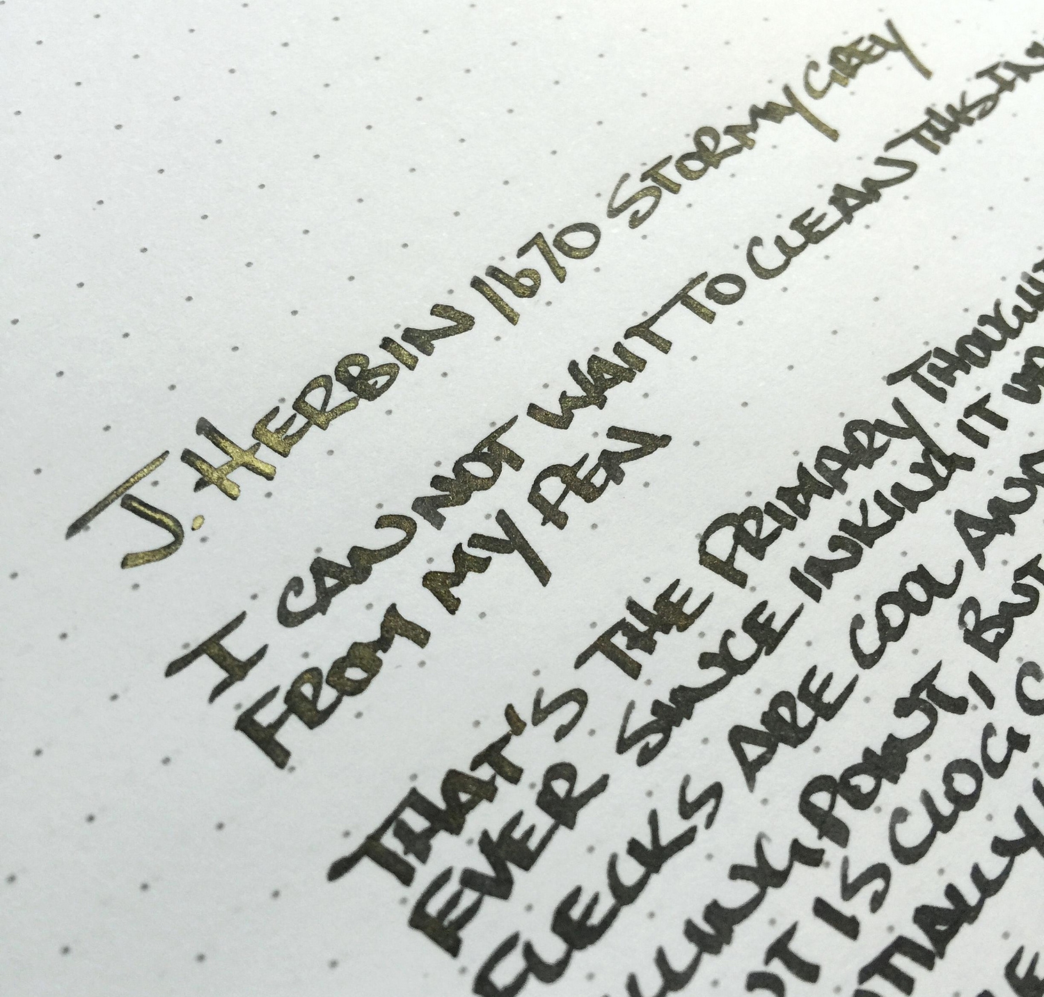
Gold flecks contained within the deep grey ink are the big selling point in J. Herbin's latest anniversary ink release. Rouge Hematite, the first release in the 1670 series, also had a gold feature, but in the form of a sheen, not actual flecks in the ink. That one slight change really sets Stormy Grey apart.

The grey is a beautiful, saturated coal grey, bordering on light black. I had zero flow issues in either my TWSBI 1.5 mm stub nib that this writing sample was done with, or a medium dip pen nib which I used for a few notes. I found the gold flecks to be inconsistent, with a heavy presence on some letters, and a light to no presence on others. This happens when there are actual physical materials that need to be dispersed within the ink.

My biggest issue with Stormy Grey is the additional maintenance required to keep the ink flowing consistently. J. Herbin even has a label warning:

Having these additional things to worry about doesn't fit my usage pattern. I would be very worried to leave this ink loaded for more than a week or two. Plus, the bottle and reservoir shaking that is needed to get even fleck dispersion before use is annoying. Using a dip nib is an option, but that limits portability.

I must be the only one with this issue though, as JetPens can't seem to keep it in stock. There was a short reload right before Christmas that vanished within hours, so if you want to get your hands on this ink be sure to sign up to be notified when inventory becomes available again.

(JetPens provided this product at no charge to The Pen Addict for review purposes.)

Posted on December 26, 2014 and filed under Ink Reviews, J. Herbin.

J. Herbin 1670 Anniversary Rouge Hematite Ink Review

(Jeff Abbott is a regular contributor at The Pen Addict. You can find more from Jeff online at Draft Evolution and Twitter.)

I've been on quite an ink kick lately, and this week brings the end of the J. Herbin tour...for now at least. I've read a lot of good things about this particular ink, and I'm happy to say that the things I read were spot on.

J. Herbin 1670 Anniversary Rouge Hematite is a brilliant red with some orange undertones and fantastic sheen. I've never seen an ink that has so much character as you're writing and even after it dries.

First off, the packaging for this ink is unique compared to the regular J. Herbin packaging, bottle included. I assume this is because the ink is a special anniversary edition. The bottle has a faux-rustic look due to the wax cap and wax stamp on the front. Upon closer inspection, they're not real wax, but they still look cool.

The only negative comment I have about this ink is about the bottle. The first two pens I tried to ink were unable to fit into the small hole on this bottle. The first pen I tried was a Pilot Penmanship with a cursive italic nib – I thought it would be a great pen to try out the shading behaviors, but it simply would not fit into the bottle. The second pen was a large Jinhao, and it didn't even come close to fitting. Finally, my Monteverde Artista and Lamy Safari had no problems inking up. This is definitely something to consider going forward – it's likely that some of your pens may not fit in this bottle, so look at something like the TWSBI inkwells or plan on using a syringe to fill your pens if they won't fit.

After getting my Monteverde and Safari inked, I was a very happy camper from the get-go. This is a beautiful ink that has many characteristics. I've always thought that J. Herbin inks can be slightly dull after they dry, and that always left a little to be desired. Not the case with the Rouge Hematite. This is a highly saturated, bright red with hints of orange and gold. When you tilt the page the right way under the light, the ink turns almost completely gold. Honestly, this probably made me a bit too excited. It's just unfathomable for an ink to change this much on the paper.

Apart from the deep saturation, the ink also shades fairly well. It's nothing amazing, but there is noticeable shading when using a regular tipped pen, and exaggerated shading in a large calligraphy nib. I think this would be a perfect red ink for use in a cursive italic medium nib.

Like all J. Herbin inks I've used, this ink behaves like a charm. It's a well-lubricated ink with no issues starting or stuttering. It has issues every so often in the 1.5mm Lamy nib, but so does every other ink I've used in that nib.

Dry time is a bit long, and I'm not really sure when the ink is actually dry because it's not smudge-proof. This is a pretty ink, but it has absolutely no archival properties (big surprise, I know). 30 seconds seems like a good average for dry time on this ink.

When using this ink, gold sludge builds up on the nib of your pen. This might bother some people, but I actually like it. Although, nib creep never really bothers me unless it's affecting the writing experience or functionality of the pen. The gold nib creep is a positive aspect in my book.

Overall, the J. Herbin 1670 Anniversary Rouge Hematite is a fantastic bright red ink that will probably stay inked at all times in one of my pens. I love the multiple characterstics that this ink exhibits – so much so that it often distracts me when writing. Depending on the situation, this could be a good or bad thing, but that doesn't change the fact that this is a beautiful ink.

Posted on September 10, 2014 and filed under Ink Reviews, J. Herbin.

J. Herbin Lierre Sauvage Ink Review

Three weeks ago, I reviewed a lovely green ink from J. Herbin called Vert Réséda. I called it a light-medium green and said I would likely try out more green inks. Well, I did, and I don't think I'm done yet.

This time around, it's the J. Herbin Lierre Sauvage that caught my eye. Ever since JetPens started carrying the adorable little 10ml bottles of J. Herbin ink, I've been looking for excuses to buy some. I guess other people felt the same way, because they sold out fast. Finally, I got mine after stock returned. First up is my second green ink, and I'm pretty sure I like it better than the first.

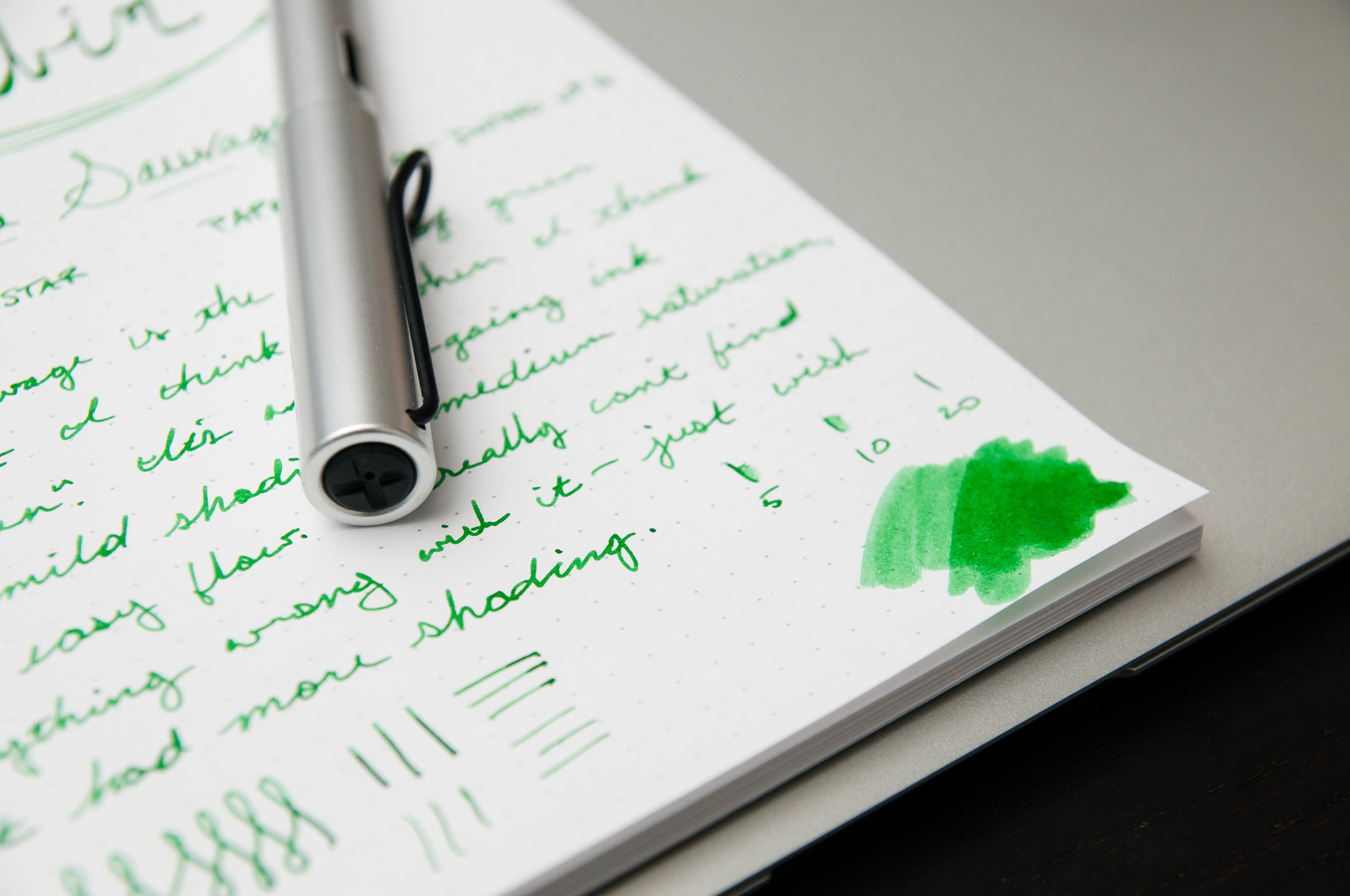
Where Vert Réséda was a light, medium green, Lierre Sauvage is a darker green that reminds me of ferns and moss. It's a forest green, and I love it. It looks fantastic on paper and has more shading qualities than the former. This ink is what I think of as a true green. The Vert ink had a bit of aqua blue coloring, which pushed it slightly toward the turquoise range. It's a beautiful ink, but not quite what I had in mind for a standard green. You can never really tell what you'll actually get when looking at ink samples online, but I'm very happy so far with the Lierre Sauvage.

This ink is exactly what I expect from J. Herbin at this point: very well-behaved. It's worked flawlessly in both pens I've tested it in. One of the pens is a bit dry, while the other is normal. It's a lubricated ink that has no problems starting or keeping up with hasty writing, and it also does not dry or clog the nib after being uncapped for a couple of minutes.

It's a medium saturation and does have some mild shading properties. I've noticed that the shading comes out more on bright paper compared to ivory or cream paper. Dry time isn't fantastic, but it's not terrible either. It normally takes about 15 or 20 seconds to be smudge-proof.

Sadly, it doesn't shade as much as I'd like for a green. I'm still on the lookout for a beautiful green that shades easily, so let me know if you have one in mind.

Like the other J. Herbin green, this ink cleans out of pens very easily. Also, this new sample bottle size from J. Herbin is fantastic. I love the size, although it might be a problem for larger pens. The Lamy Safari and Al Star I used barely fit deep enough to draw ink up. That's something to consider when purchasing these bottles.

Overall, Lierre Sauvage is now my favorite green ink, but I'm still looking for more. It's a beautiful, well-behaved ink that lays down a gorgeous line. If you're in the market for a green ink, I think you should start with this one.

(You can find more from Jeff online at Draft Evolution, Twitter, and App.net.)

Posted on September 4, 2014 and filed under J. Herbin, Ink Reviews.