Posts filed under Ink Reviews

Montegrappa Saffron Fountain Pen Ink Review

(Jeff Abbott is a regular contributor at The Pen Addict. You can find more from Jeff online at Draft Evolution and Twitter.)

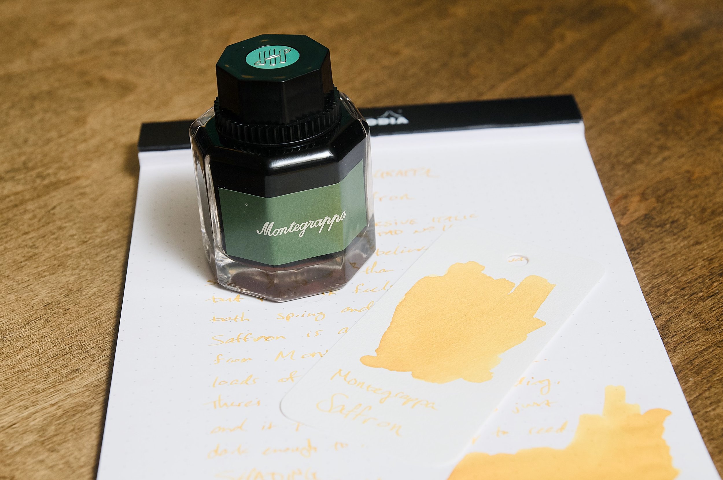
Montegrappa Saffron is a lovely yellow ink from the Italian luxury brand that is more known for their unique and bold writing instrument designs. While the name would have you believe this is a dark red or maroon ink like the spice it shares a name with, it's actually a golden yellow color.

Despite the misnomer, this ink is a beautiful color that behaves well. This is the first ink I've ever tried from Montegrappa, and I haven't heard a lot in the past about their ink offerings, so I really didn't have any expectations. Luckily, I've had a really great experience with Saffron. The ink flows well, resists bleeding and feathering, and dies relatively quickly. While it flows well and keeps up with fast writing, it does feel a little dry when writing. I doubt this is something that you'll experience in every case as each nib/feed accounts for a lot of the writing feel.

Along with the crisp lines that this ink produces, it also has some mild shading effects. The ink is just a tad more golden yellow in areas where the ink pools when drying. Most of the ink strokes are a medium yellow, but the darker areas make it look more interesting as well as making text easier to read. This ink has just enough saturation and depth to stay bright and vivid, but still easy to read on white paper.

Writing with this type of color isn't something I do regularly, but I definitely prefer that the yellow color be dark enough that it's easy to read while also still looking cheery and yellow instead of light red or brown. It's a tough line to walk, but Montegrappa have done a good job here.

Another positive thing regarding this ink is the dry time. In my testing, it was smudge-proof by about 15 seconds. Not bad! It might not be fast enough for some cases, but it's pretty quick when comparing it to the majority of fountain pen inks.

Just shy of $19 for a 50ml bottle, this is a fairly average ink price. There are plenty that average lower and higher, but this price feels fair for the performance and amount you get. By all means, if the color speaks to you, you won't regret picking up a bottle of Saffron. It's a great performer and adds joy and brightness to any page!

(Pen Chalet provided this product at a discount to The Pen Addict for review purposes.)


Enjoy reading The Pen Addict? Then consider becoming a member to receive additional weekly content, giveaways, and discounts in The Pen Addict shop. Plus, you support me and the site directly, for which I am very grateful.

Membership starts at just $5/month, with a discounted annual option available. To find out more about membership click here and join us!

Posted on May 30, 2024 and filed under Montegrappa, Ink Reviews.

Taccia Hiroshige Ainezu Fountain Pen Ink Review

For a color with a name as well-defined as Blue Black, the actual shade on the page is difficult to define. As a superfan of the color, I tend to classify many different shades as Blue Black. From basic Navy, to Grey-infused colors, to brighter Blues with a hint of Black - and that’s just for starters. The range of Blue Black inks is practically endless.

So, is Taccia Hiroshige Ainezu a Blue Black ink? For me, yes.

Ainezu has been out for several years, but only recently did I acquire a bottle. And that was only after I was sent an envelope full of ink swatches from a friend, where Ainezu jumped off the page. In fact, this envelope cost me three bottles of ink so far. Thanks Lisa - I think?

What did I see that made me want to add it to my collection? On the page it looked like Blue Black, but weirder. It’s a bit hard to explain, which made me want it even more. There is definitely a healthy dose of Grey, and maybe a hint of Teal that doesn’t show up in pictures and may simply be a figment of my imagination. Ainezu is certainly not straightforward, but remains simple.

Looking at my lettering with an Architect grind in my Skogsy Pens Cholla Micarta, the ink looks Grey in pictures, but leans more Blue in person. To see if I was crazy thinking there was Teal, I swabbed Ainzeu next to Graf von Faber-Castell Deep Sea Green on Tomoe River 52 gsm paper. There is maybe a hint if you look closely.

Is it closer to the Navy of DeAtrementis Benjamin Franklin? Ainezu makes it look bright, but not as bright as Pilot Iroshizuku Shin-Kai. I love Shin-Kai for its character on the page, but it’s not the dictionary definition of Blue Black that I have in my head. LAMY Blue Black is close my platonic ideal of a Blue Black, especially one that is dark enough, and Grey enough. Is Ainzeu a combination of Deep Sea Green and LAMY Blue Black?

Maybe Ainezu is just Ainzeu, and that is good enough. I’ve only tried a few Taccia inks so far, and they have all been great performers. Ainzeu is no exception. My Broad Steel Jowo #6 Architect nib is not the most ink-friendly of nibs, but I had perfect flow and color with Ainzeu from start to finish. I will say their is not a lot of shading with this setup and my handwriting style, but I bet there would be more opportunity with a different nib.

I’ll try a standard nib the next time I ink up Ainezu, because there will be many next times. I’ll likely pick up more Taccia inks, too. At $20 for 40 ml in the Ukiuo-e Series, they are priced well enough to add some of the other unique shades in this set.

(Pen Chalet provided this product at a discount to The Pen Addict for review purposes.)


Enjoy reading The Pen Addict? Then consider becoming a member to receive additional weekly content, giveaways, and discounts in The Pen Addict shop. Plus, you support me and the site directly, for which I am very grateful.

Membership starts at just $5/month, with a discounted annual option available. To find out more about membership click here and join us!

Posted on May 27, 2024 and filed under Taccia, Ink Reviews.

Did Less, Swatched More, First Impressions

(Kimberly (she/her) took the express train down the fountain pen/stationery rabbit hole and doesn't want to be rescued. She can be found on Instagram @allthehobbies because there really are many, many hobbies!.)

In the vein of last week’s article where I drastically reduced the number of steps to swatch inks, I am happy to report that I have made progress! From the first of January until last week, I had swatched 7 inks (and yes, that included the ones I did for reviews). Since last week, drumroll please, I’ve swatched 20, yes TWENTY, more inks!!! Woohoo!

As you may already know, I like to be matchy matchy with my pens and inks (black, white, clear, silver, and gold pens are the exceptions). Which means I usually start with “what general color pen do I want to use”, then I go through my swatches to find the best match, which is either an exact match, if possible, or slightly lighter or darker depending on mood. Occasionally, I like to go the other route and start with an ink that I really want to use and then pick the pen after. Don’t worry, I’m neither reviewing nor inking up all 20 inks because that would take too long; instead I’ll share some first impressions. Who knows, maybe some of these will jump out and demand to be inked!

A few things to note: (1) Some of the pictures are at an angle because the shimmer showed up better than with head-on photos, (2) even with angled pictures, shimmer is hard to pick up in photos, (3) the picture below has a different colored mat than the other swatches, hence the vastly different background color, and (4) a lot of these are Wearingeul swatches because that’s what I bought samples of and happened to trade with a friend.

Look at all these swatches - I am SO happy to be over the swatching slump!

Here are the 20 inks that I swatched in the past week, sorted roughly by color:

-- Montblanc Le Petit Prince, Rose Burgundy - I knew that I would be inking up a LPP pen since I am nearing the completion of writing out the book, but I had to make sure it matched the pen first. It is a nice shade of burgundy with a hint of copper sheen on very wet swatches. I can’t wait to use it!

-- Wearingeul Anna Karenina - This is a rich red, but not quite burgundy, ink that also has red shimmer and a touch of green sheen on wet swatches. Pretty color but I don’t need to ink up any more red pens right now.

A bit hard to see the shimmer near the bottom.

-- Wearingeul Anne of Green Gables - Yes, this is a red ink, which I was not expecting. Yes, I know that the gables are green but still, it messes with my mind. The ink is actually named “Lucy Maud Montgomery”, and is a bright red ink with some greenish-gold sheen. Off the top of my head, it reminds me a bit of Iroshizuku Momiji.

Anne of Green Gables shows up as a bit more orange than in real life but you can still see the gold sheen in the swatch.

-- Wearingeul Wendy Darling - I am so glad I got a sample of this because I would be a little annoyed with myself if I bought a whole bottle. It is a really pretty, but extremely light, pale, borderline invisible, pastel blue ink with hints of pastel pink, and has silver and turquoise shimmer. I don’t know how readable it is, especially after seeing Kelli’s review from Mountain of Ink, but I’m kind of tempted to put it in a wet Pelikan, but not now, as there are too many other colors that are catching my eye.

Wendy Darling is way too light at any angle.

-- Robert Oster Romeo & Juliet - Ooh, now this one is different, especially from Robert Oster, who isn’t typically known for chromashading. This one is a dusty blue with grey shading that is visible in swatches and I suspect, fairly visible with a wetter pen on Tomoe River and similar papers. This is definitely a contender for “ink it up”!

I really want to see Robert Oster Romeo & Juliet on some Tomoe River!

-- Wearingeul Tinkerbell - Another ink from Wearingeul’s Wendy & Peter collection, this is a light muted, dusty green ink with pearlescent (silver? gold? both?) shimmer and is surprisingly readable. Not my usual jam but that might make it a contender as well?

Wearingeul Tinkerbell looked more readable than I expected.

-- Wearingeul Tick Tock Croc - Also from Wearingeul’s Wendy & Peter collection, Tick Tock Croc is a slightly teal leaning green ink. It looks alright, but it’s not jumping out at me. And yes, silly me forgot to get Peter Pan and Captain Hook.

-- Inkebara #236 Sand - A warm yellow-brown that has some green chromashading in wetter swabs. I’ve got a lot of brown inks in pens right now but this is definitely high on the list for the next light brown pen inking.

The “line” near the light part of the swatch is where there’s some green in Inkebara #236 Sand.

-- Sailor Moroccan Mint Tea - This ink is a touch darker than the Inkebara Sand and doesn’t seem to have the green hint to it either. I’m very curious to see how it compares to Sailor x Tinterias Homemade Tortilla.

-- Diamine Tobacco Sunburst - Part of the Gibson Les Paul series of inks from Diamine, Tobacco Sunburst is a medium golden brown. I wasn’t expecting much but was pleasantly surprised at the golden tone and how nicely it shades. Again, if I didn’t have so many browns inked up already …

-- KWZ x Newcastle Pen Show, Newky Brown - A kind friend surprised me with this ink and I am over the moon because I loved drinking Newcastle in my (much) younger days and I also love KWZ ink! This is a darker reddish/orangish brown ink that could potentially show some nice shading in a drier pen.

-- Franklin-Christoph Bronze Age - Was anyone surprised that I bought this one? Me neither. The color isn’t one that instantly grabs me but it is more interesting than the photo shows - it is a darker chocolate brown that has very slight green undertones, like patina’d bronze.

-- Wearingeul 20,000 Leagues Under the Sea - Ooh, this is a pretty royal blue ink with gold shimmer. I am VERY curious to see how this compares to Pelikan’s Ink of the Year, Golden Lapis, which looks quite similar (I can’t wait to get my bottle). This is a contender since I will be need to ink up a mid-toned blue soon.

The shimmer is much more pronounced in real life.

-- Wearingeul Iaros Orna Eperanto - This is a darker, richer blue with gold shimmer and a hint of red sheen in wetter patches. It reminds me of a shimmery Diamine Blue Velvet.

-- Lamy Pink Cliff - One of those instances where I can’t get past the name because it’s not remotely pink. Not a contender for near-term inking but I will be curious to see how it compares to Lamy Blue Black, which is a favorite.

-- Wearingeul Frankenstein - A slightly blue-leaning, royal purple ink with a hint of copper sheen? Yes, please, but is it unique? Not so much, but I still love the color!

-- Color Traveler Miyoshi Pione Purple - A little moodier and more red-leaning purple than Frankenstein, this is right up my alley, but I’m looking at 8 pens with purple ink right now, so this one has to wait a bit. I’m curious to see if it sheens or has shading properties on TR paper.

Oops, accidentally added an extra “L” in my Color Traveler Miyoshi Pione Purple swatch.

-- Wearingeul Persephone - Ok, Wearingeul, I love this one. Dusty purple with purple shimmer? Yeah, short list. I don’t care which purple pen I have to clear out to make room for this one.

Don’t see purple shimmer that often!

-- Wearingeul x EndlessPens, The Black Cat - My witch-crazed friend shared a sample of this one with me and I’m glad that it’s not a “plain black ink” but has a subtle purple and grey tint to it, as well as some pink (?) shimmer. Not in any rush to put black inks in any pens but this one could pass for almost purple-black.

-- Wearingeul Hades - I got a sample of this because I was hoping it would be more blue, but it’s really a dark black ink with blue shimmer, which is kinda cool.

One of the few ways to get me to use a black ink is to put shimmer in it!

So, out of these 20 swatches, which ones am I most eager to ink up?

Top 3 picks:

Montblanc Rose Burgundy - I already knew this was going into a pen, so maybe this is an unfair pick.

Montblanc Le Petit Prince, Rose Burgundy ink with the Le Petit Prince, Red Planet pen.

Robert Oster Romeo & Juliet - the chromashading looks promising

Robert Oster Romeo & Juliet pairs pretty well with S. T. Dupont D-Inital in Shark Blue.

Wearingeul Tinkerbell - This one is giving me all the feels and I don’t know why.

It’s like Wearingeul Tinkerbell and Sailor Pro Gear Slim, Solar Term, Fuki were made for each other!

Honorable mentions:

  • Inkebara #236 Sand - I wanna see how this ink shades on TR or Cosmo Air Light paper.
  • Wearingeul Persephone - I know, I said shortlist but there are too many purple pens inked up!

There you have it, some (relatively) quick thoughts on 20 different inks. Now to write some more pens dry so I can start using these inks, and get back to swatching!

(Disclaimer: All inks are my own, either purchased from various retailers at recent pen shows including Jimmy Dolive, Franklin-Christoph, and Vanness Pens, or samples swapped with a pen friend.)

Posted on May 24, 2024 and filed under Ink Reviews, Wearingul, Robert Oster, Lamy, Sailor, KWZ, Montblanc.