Posts filed under Ink Reviews

Kala Tribute to Neon “Groovy Neon Violet” Ink: A Review

Kala Tribute to Neon “Groovy Neon Violet” Ink: A Review

(Susan M. Pigott is a fountain pen collector, pen and paperholic, photographer, and professor. You can find more from Susan on her blog Scribalishess.)

Kala Ink is a new brand that I’d never heard of until Brad sent me a bottle to review. The ink is made in Taiwan, and the “Tribute to Neon” series is quite unique. The colors in the series are bright, opaque, waterproof, and look wet even after they dry.

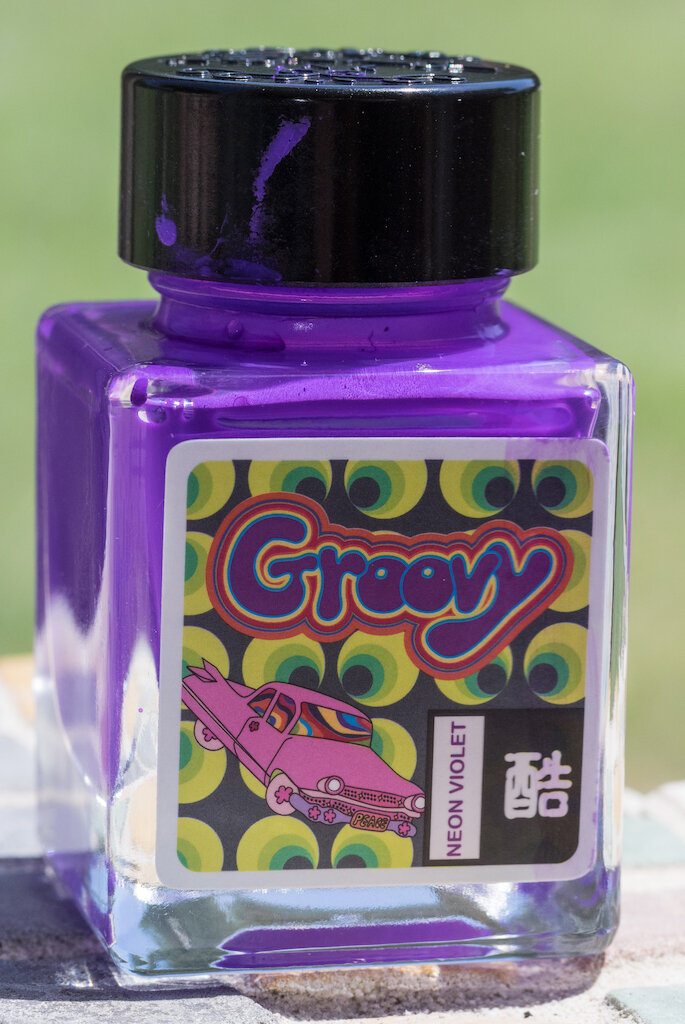
Groovy Neon Violet is a neon purple color that leans toward the pink/purple side of the color spectrum. On the Col-o-dex card, the ink comes out rather flat in the swab. But in writing, swirls, and splats, you can see how the ink maintains a wet appearance even after drying. (This card was created over three weeks ago!)

Kala Tribute to Neon “Groovy Neon Violet” Ink

The ink exhibits good shading/pooling on Rhodia Dot Grid paper with the Noodler’s Triple Tail Flex Nib (reviewed here). The ink is completely waterproof.

Kala Tribute to Neon “Groovy Neon Violet” Ink Test

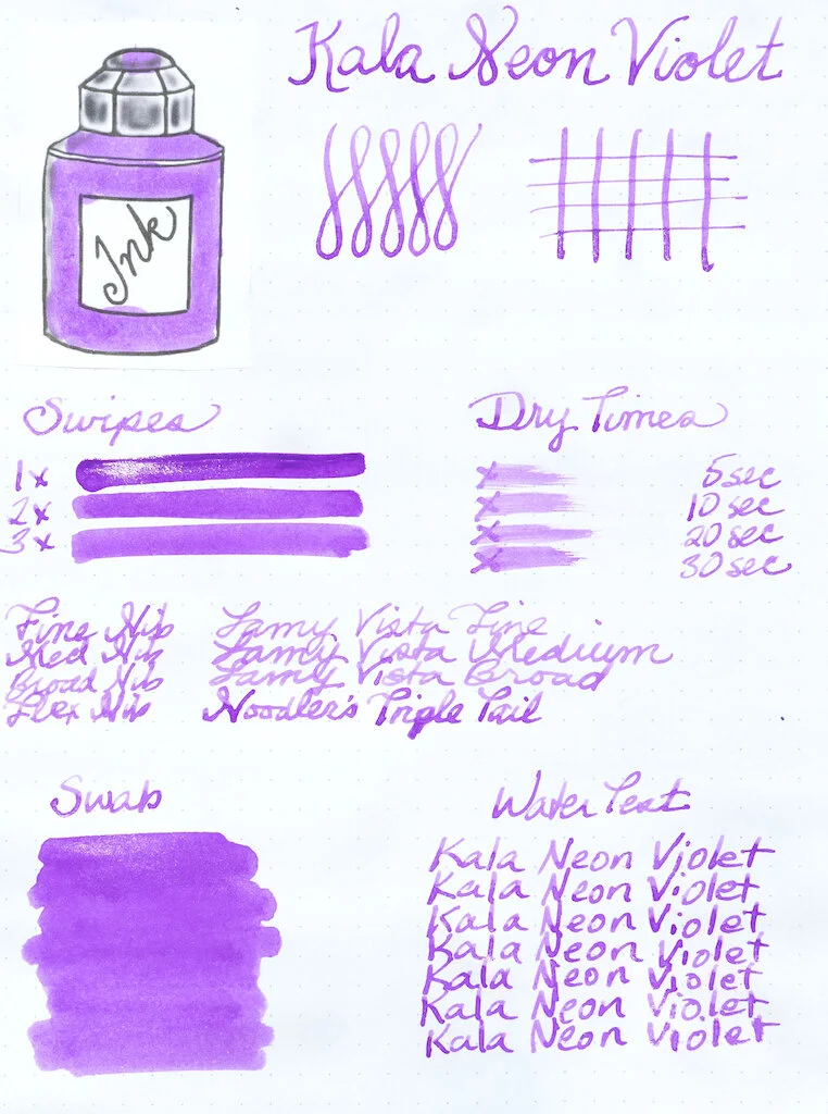
In finer nibs, the ink looks lighter and the shading/pooling is not as evident.

Kala Tribute to Neon “Groovy Neon Violet” Ink Nibs

Kala Neon Violet is the first waterproof ink I’ve ever tested. This stuff really is impervious to water, making my chromatography test rather useless. Alas.

In super wide nibs, like my Handwritmic Ruling Pen, the ink exhibits excellent shading and pooling. I apparently did not wait long enough for the ink to dry, and stacked other papers on top of this one. That accounts for the blotchiness you see where the ink pooled.

Kala Tribute to Neon “Groovy Neon Violet” Ink Writing

When I first opened the bottle, I wasn’t sure if Kala Neon Violet was actually for fountain pens. I had never seen such an opaque, thick ink. It isn’t quite the consistency of acrylic paint, but that’s what came to mind when I looked at it. I inked up my Noodler’s Triple Tail thinking that, if the ink didn’t come out of the pen, it wouldn’t be the end of the world. I actually left the ink in the pen for several weeks before cleaning it (not recommended). Most of it rinsed out pretty easily, though a bit remained in the threads and piston. I wouldn’t use this ink in any of my really expensive pens, and best practice would be to clean out your pen immediately after use to avoid stains.

Kala Tribute to Neon “Groovy Neon Violet” Ink Piston

Kala Neon Groovy is the most unusual ink I’ve used. I love how opaque it is and the wet finish it leaves. It’s really quite fun to write with (wet, smooth, and good flow) and excellent for art.

Kala Tribute to Neon “Groovy Neon Violet” Ink Mandala

You can purchase Kala Tribute to Neon “Groovy Neon Violet” Ink from Shigure Inks for $12.00 (30 ml). Neon Violet is currently out of stock, but you can sign up for an email to be notified when it’s available again.

(The Pen Addict purchased this ink from Shigure Inks at full retail price.)


Enjoy reading The Pen Addict? Then consider becoming a member to receive additional weekly content, giveaways, and discounts in The Pen Addict shop. Plus, you support me and the site directly, for which I am very grateful.

Membership starts at just $5/month, with a discounted annual option available. To find out more about membership click here and join us!

Kala Tribute to Neon Groovy Review
Posted on July 10, 2020 and filed under Kala, Ink Reviews.

Kala Nostalgia Neon Dude Ink Review

Kala Nostalgia Neon Dude Ink Review

(Jeff Abbott is a regular contributor at The Pen Addict. You can find more from Jeff online at Draft Evolution and Twitter.)

Bright blue inks are some of my favorite inks, and that hasn't changed much in the past several years. I love the way they pop and look slightly translucent in the right light, and they tend to add some joy to any piece of paper they come in contact with. One thing I haven't expected from any of the bright blue inks I've used in the past is any sort of water resistance, let alone waterproofing. With the latest blue ink I've tested, I can take that last thing off the list.

Kala Nostalgia Neon Dude Ink Bottle

Kala Neon Dude is part of their Nostalgia series that borrows colors and imagery from the 60's and 70's. Lots of bright, in-your-face colors in this series of eight inks. The one I'm using is called Dude (or just "neon blue") and is one of my new favorites.

Dude is an intensely-pigmented ink that screams at you while still in the bottle. I remember saying "Whoa" when first getting the bottle out. It looks like something that shouldn't be possible in a fountain pen ink. There's zero visibility into the ink for all the pigment, and looks more like neon blue Gak than fountain pen ink. I was incredibly skeptical that this ink would be anything more than a marketing stunt. There's no way something that looks like that can work properly in a fountain pen nib, right? Wrong.

Kala Nostalgia Neon Dude Ink Swab

The ink color resembles a bright turquoise that virtually every ink manufacturer offers. It reminds me a lot of Lamy Turquoise or Diamine Turquoise, which are just a couple of inks I have on hand that come really close to this color. When writing, it looks joyful and fun. There's a subtle amount of light shading that also adds some depth to the colors. Blue inks should make you think of water, and the best blue inks make you think of the shallow tides of some tropical paradise. Dude does all of this, while also drying fairly quickly. In my tests, it's smudge-proof at around 10 seconds — 15 max.

Kala Nostalgia Neon Dude Ink Waterproof

The main attribute of think ink that sets it apart from other similar turquoise inks is that it's waterproof. I tested this out myself and can confirm that the ink lines and coloration stays in place when the paper comes in contact with water. This applies to both droplets of water, spills, and even total submersion. This is due to the high level of pigmentation in the ink formula. In my limited experience with different inks, I've never come across a truly waterproof ink that has such vibrant colors! I normally don't care about the waterproof or water-resistant properities of inks, but I'm really impressed that this one backs up the claim while being so pretty at the same time.

While the waterproof nature and bright hue are great aspects of this ink, it does take a little more effort when cleaning it out of your pen. Nothing strenuous — just a few extra rounds of water to completely rinse out all the tiny particulates the ink leaves behind. I have several non-waterproof/resistant inks that are more difficult to clean than this ink, so it's not a major concern for me. The bottom line is that I won't think twice about putting this ink in any modern pen.

Kala Nostalgia Neon Dude Ink Test

One negative behavior that I've noticed with this ink is that it does not work well with highly-absorbent papers. It's a fairly wet ink, so uncoated papers tend to drink the ink very quickly, which pulls more ink out of the feed as you write. In most cases, it isn't a big deal — especially if you're writing on coated paper (like Rhodia). But for cheaper paper or uncoated paper, it can be disastrous. In my testing, Baron Fig paper performed the worst. I like testing Baron Fig because it's so unique when compared to the other paper brands I keep on hand. It's thick, but it's also very absorbent and tends to bleed and feather very easily. In the case of Kala Dude, it not only feathers and bleeds, but it also pulls ink from the feed so fast that it causes my pens to drip large dots of ink while writing with this ink. That's an impressive but inconvenient example of capillary action! So, all that to say, don't use this ink with uncoated, absorbent papers.

Kala Dude is an ink from a brand that I'd never heard of prior to trying the ink. I'm happy to say that I'm really pleased with this ink and look forward to trying other inks from the Taiwanese brand. I'm also tempted to try out the other seven crazy colors!

(The Pen Addict purchased this ink from Shigure Inks at full retail price.)


Enjoy reading The Pen Addict? Then consider becoming a member to receive additional weekly content, giveaways, and discounts in The Pen Addict shop. Plus, you support me and the site directly, for which I am very grateful.

Membership starts at just $5/month, with a discounted annual option available. To find out more about membership click here and join us!

Kala Nostalgia Neon Dude Ink Writing
Posted on June 24, 2020 and filed under Kala, Ink Reviews.

Vinta Inks Aegean (Armada 1944) Ink Review

Vinta Inks Aegean (Armada 1944) Ink Review

I love unique fountain pen ink names. Sure, Diamine Orange describes exactly what you are getting into. But Vinta Inks Aegean (Armada 1944) - what exactly am I getting into here?

I’ve been using this ink for a while, but only this past weekend did I dig into what the name of this product is in reference to. And by looking into that, I ended up into an interesting rabbit hole.

Vinta’s product description is simple:

“Armada is a fleet of warships. Throughout time, we've seen how the multitude of ships on sea can transform its color from grey to blue to everything in between. The biggest naval war in history is the Battle of Leyte in 1944.”

Vinta Inks Aegean (Armada 1944) Ink

In reading about the up the Battle of Leyte Gulf, I learned that it was the US invasion of the Philippine island of Leyte against Japanese forces in World War II. And yes, it is at least on the list of largest naval battles in history. With Vinta Inks being based in the Philippines, I can only assume this ink is a nod to the history of the country.

With Vinta’s own description of ships in colors of “grey to blue” on the seas, that’s what I expected from the color of this ink. It’s more of a grey to green, with a hint of purple. How the bright blue of the Aegean Sea plays into all of this I’m not sure, but the ink color represented on the page is nice in its own right.

Vinta Inks Aegean (Armada 1944) Ink Writing

When fresh out the nib onto the page I see mostly a muted, mossy green from this ink. When dry, some of the grey pops out, and you get a decent amount of shading. There is also a hint of purple around the edges of where the ink pools in the line, giving it a unique whole-page look.

I think this is the thing with Vinta Aegean: You need a large sampling to get the full effect. Whether that means the wide lines of a medium or broad nib, or a full page of writing, it looks the best when you see a lot of it. I don’t think it would be as enjoyable in my finer nibs.

Vinta Inks Aegean Ink

Also, this ink worked best on papers that allow the ink to sit up a little bit. The color looks the best on the Clairefontaine Triomphe pad I used for the written review, while it came off a little flatter, but still nice, on the Yoseka Notebook and Col-o-ring Oversize. The dry time was impressive across the board, reaching fully dry in under 20 seconds on the Clairefontaine.

Vinta Inks Aegean Ink Dry Time

This is a more unique and fun color than I thought I would be when I first received it. It’s not blue by any stretch, but that alone made me dig into this ink and its story more than I would have otherwise. I’m glad to add it to my library.

(Cityluxe provided this product at no charge to The Pen Addict for review purposes.)


Enjoy reading The Pen Addict? Then consider becoming a member to receive additional weekly content, giveaways, and discounts in The Pen Addict shop. Plus, you support me and the site directly, for which I am very grateful.

Membership starts at just $5/month, with a discounted annual option available. To find out more about membership click here and join us!

Vinta Inks Aegean
Posted on June 22, 2020 and filed under Vinta, Ink Reviews.