Posts filed under Ink Reviews

Lamy Petrol Ink Review

(Jeff Abbott is a regular contributor at The Pen Addict. You can find more from Jeff online at Draft Evolution and Twitter.)

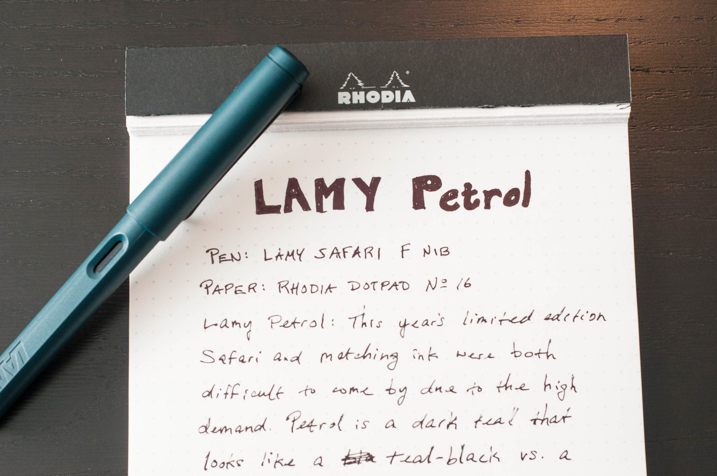
Every year, Lamy introduces new colors for their Safari and AL Star pens, along with corresponding ink colors. And, every year, they eventually sell out. In the case of Lamy Petrol, the rate at which the pens, ink bottles, and ink cartridges sold out was phenomenal. At this point, it's difficult to find a retailer that sells the ink, and there's slim pickings when it comes to the pen. Earlier this year, the Pacific Blue edition AL Star and ink and it had a similar effect. All that to say that people really love the Lamy special editions.

If you're in the market to pick up some Petrol ink from the used market or for samples, here's what you can expect. If you're familiar with Lamy Blue-Black, Petrol is nothing like it. Petrol is described as a dark teal, but it's really more of a teal-black. Unlike Lamy Blue-Black, Petrol actually lives up to the "teal-black" name I've given it. Saturation is dark and luscious, and there's not much shading at all. Light that falls on this ink hardly escapes. The light that does escape does so through the fairly high amount of sheen, which casts a red shade in the certain light. Overall, it's a fascinating ink and one that I wish Lamy would keep in stock.

Like all other Lamy inks, this one is well-behaved and predictable. I haven't had any issues with show-through, bleeding, feathering, or skipping. It's a balanced ink when it comes to lubrication and flow, and it suits any nib with similar results due to the dark saturation. As someone who enjoys lighter inks that shade profusely, Petrol is a bit out of my comfort zone...but in a very good way.

Dry time for Petrol can be a bit long. I've measured anywhere from 15 to 35 seconds using a fine nib. Results aren't much better in a smaller nib, and they're understandably worse in larger, wetter nibs. If quick-drying inks are your thing, this one won't hit the spot.

Like I mentioned a bit earlier, there's not much shading with this ink when writing. The only time I've noticed shading is when doing swabs. Even then, it's fairly mild. The surprise feature, however, is the sheen that pops off the page. It's really easy to see the red sheen when there's indirect light on the paper. Sheen always fascinates me because it makes the ink appear wet and also gives the illusion of a different color in the right light. It's a fun effect, and Petrol has gobs of it.

As far as color and darkness, I don't really have anything close that I can compare to. Both Franklin Christoph's Midnight Emerald and Oster's River of Fire are notably teal. Midnight Emerald is fairly dark, but it's very easy to distinguish the green and blue. Petrol, on the other hand, is incredibly easy to mistake as black.

Overall, Petrol is a pretty ink with some awesome sheen. I just wish it resembled the color of the pen more, which is the same color lightened up a bit. When I think of dark teal, I think of Midnight Emerald. With Petrol, we get a black with a bit of teal mixed in that sometimes pops up above the black surface.

(Goldspot provided this product at no charge to The Pen Addict for review purposes.)


Enjoy reading The Pen Addict? Then consider becoming a member to receive additional weekly content, giveaways, and discounts in The Pen Addict shop. Plus, you support me and the site directly, for which I am very grateful.

Membership starts at just $5/month, with a discounted annual option available. To find out more about membership click here and join us!

Posted on November 1, 2017 and filed under Lamy, Ink Reviews.

Diamine Blood Orange Ink Review

(Jeff Abbott is a regular contributor at The Pen Addict. You can find more from Jeff online at Draft Evolution and Twitter.)

Diamine Blood Orange, part of a collection of inks released to celebrate the 150th anniversary of Diamine, is a stellar red-orange that hits a great balance between bright orange and murky blood.

When you buy an ink from Diamine, you can be sure that it will perform well and be easy to clean. The same is true of Blood Orange.

The first thing you probably noticed about this ink is the color. When you hear the words "blood orange," a wide array of colors come to mind. With this ink, I think Diamine has hit the perfect balance between all the colors that come to mind in this combination. It's a medium blood red mixed with just enough bright orange to make the ink pop. It's a great color, but probably not work-friendly. It's perfect for Halloween, though.

Like all Diamine inks I've used, the flow is great. It starts immediately and doesn't have any issues with skipping or starting. In the pens I've tried with this ink, it hits the middle of the road in terms of ink flow. One of the pens I tried is a dry writer, and this ink did just fine with lubricating the nib and providing enough ink to form consistent and reliable lines.

I haven't noticed any feathering when using broad nibs and good paper (by good I mean anything 80gsm or higher), but it does start to feather a bit on cheap copy paper. Being an orange-red, the show-through is also minimal. In most cases, you can't see any ghosting or ink spots on the back side of the page.

One of my favorite features of any ink is the shading, and this ink doesn't disappoint. It's not a dramatic amount of shading, but it's enough to move from a light red-orange to a darker blood-orange color. The fading back and forth is really pretty, and I enjoy it a lot. It's very similar to Diamine Ancient Copper in terms of shading, but lighter and with more orange tones.

Overall, I'm really impressed by Blood Orange and have enjoyed using it in a variety of pens. It looks great in broad or specialty nibs, but the character still shows through in small nibs. If the color appeals to you, I highly recommend picking this up.

You can order this ink in a special 40ml bottle or a 20-pack of cartridges.

(JetPens provided this product at no charge to The Pen Addict for review purposes.)


Enjoy reading The Pen Addict? Then consider becoming a member to receive additional weekly content, giveaways, and discounts in The Pen Addict shop. Plus, you support me and the site directly, for which I am very grateful.

Membership starts at just $5/month, with a discounted annual option available. To find out more about membership click here and join us!

Posted on October 11, 2017 and filed under Diamine, Ink Reviews.

Six Shades of Grey: An Ink Comparison

(Susan M. Pigott is a fountain pen collector, pen and paperholic, photographer, and professor. You can find more from Susan on her blog Scribalishess.)

A few weeks ago I reviewed Kaweco Smokey Grey ink. Unfortunately, I was unimpressed with that ink, but I needed a matchy ink to go with my lovely Montblance Alexandre Dumas fountain pen. So, I bought some grey ink samples from Vanness Pens and decided to compare them.

The six inks I compared are Kaweco Smokey Grey, Robert Oster Graphite, Kobe #10 Mikage Grey, Papier Plume Oyster Grey, Akkerman #29 Hofvijver Grijs, and Kobe #46 Nagisa Museum Grey.

In the comparison above, you can see that I wound up with quite a variety of greys, ranging from the very light Kaweco to the almost black Nagisa Museum Grey.

The chromatography on each ink reveals some interesting characteristics.

L to R: Kaweco Smokey Grey, Robert Oster Graphite, Kobe Mikage Grey, Papier Plume Oyster Grey, Akkerman Hofvijver Grijs, and Kobe Nagisa Museum Grey

Kaweco Smokey Grey has virtually no color range, varying slightly from grey to light lavender. Robert Oster Graphite is the most spectacular of the bunch at least in terms of chromatography, with lots of magenta and blue. Kobe Mikage contains mostly lavender and a little bit of blue. Papier Plume Oyster Grey contains blue and magenta tones. Akkerman Grijs is, perhaps, the truest grey, revealing no other colors. Kobe Nagisa Museum Grey is the darkest of all, and like the Akkerman, it demonstrates virtually no color variation.

Close ups of the ink swatches show what each ink looks like using a Brause 361 Steno Blue Pumpkin Calligraphy Pen Nib along with splotches and swabs.

Kaweco Smokey Grey is quite light in the swab, but with the wet dip nib, it writes more like a dark grey.

Robert Oster Graphite, despite its colorful chromatography, is a dark grey both in the swab and with the pen. The ink splats show a tiny bit of sheen, but unfortunately it’s been raining in Abilene all week, and I couldn’t get pictures with sunlight displaying the sheen in all its glory.

Kobe Mikage Grey, in my opinion, is the most intriguing shade of grey. In the swab, the writing, and the splats its purple hue is quite striking.

Papier Plume is a really nice blue-grey as revealed in the swab. With the pen, it appears as a dark grey with some blue sheen.

Akkerman Grijs is definitely the truest grey. The swab shows that it’s a flat color with little variation.

Kobe Nagisa Museum Grey is very close to black with some nice sheen.

I was really pleased with the wide variety of grey shades in these samples. I’ve pretty much written off Kaweco Smokey Grey as being too light and uninteresting for my use. If I wanted a true grey, I would choose the Akkerman. I found Kobe Nagisa to be too close to Iroshizuku Take-Sumi which I already own. Although Robert Oster inks are usually among my top picks, I didn’t much like Graphite, even though the chromatography made the ink look really interesting. So, of the six shades of grey, my two favorites are Papier Plume Oyster with its beautiful blue-grey tones and nice shading and Kobe #10 Mikage Grey with its deep purple-grey hue. It also shades quite well and has some sheen.

Currently my Montblanc Alexandre Dumas is inked with Kobe Mikage. When I run out of that, I’ll put the Papier Plume in the pen and make my final decision about which ink I’ll buy.

You can purchase a 30ml bottle of Kaweco Smokey Grey from JetPens for $13.50. All the other inks are available from Vanness Pens. Robert Oster Graphite is $17.00 for 50ml. Kobe #10 Mikage Grey and Kobe #46 Nagisa Museum Grey are $30.00 for 50ml. Papier Plume Oyster Grey is $7.00 for 30ml. And Akkerman Hofjijver Grijs is $28.00 for 60ml.

(I purchased the ink samples above with my own funds from Vanness Pens.)


Enjoy reading The Pen Addict? Then consider becoming a member to receive additional weekly content, giveaways, and discounts in The Pen Addict shop. Plus, you support me and the site directly, which I am very grateful.

Membership starts at just $5/month, with a discounted annual option available. To find out more about membership click here and join us!

Posted on September 29, 2017 and filed under Ink Reviews, Akkerman, Kaweco, Kobe, Papier Plume.