Posts filed under Ink Reviews

Graf Von Faber-Castell Deep Sea Green Ink Review

When I think of Graf Von Faber-Castell I think of high end writing instruments like the Perfect Pencil or the somewhat extreme Pen of the Year release. What I haven’t thought about, until now, are their fountain pen inks. I had no idea what I had been missing.

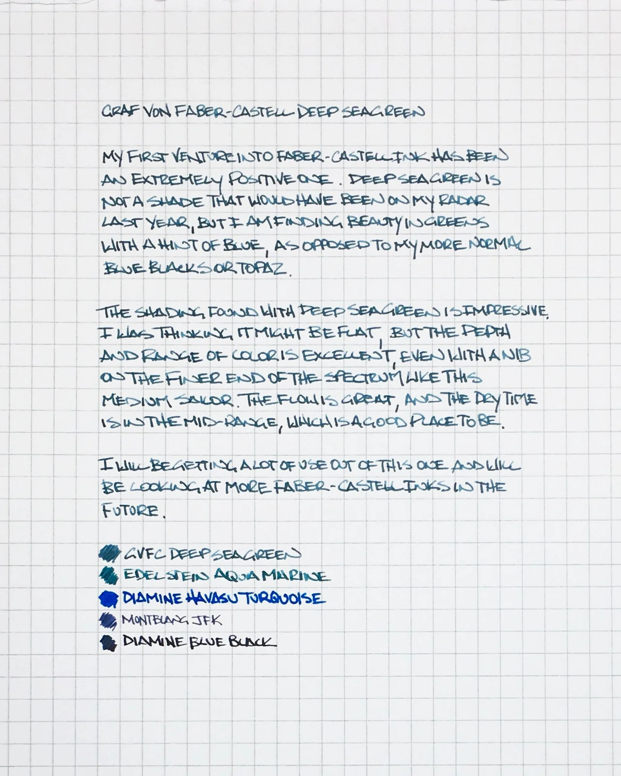
Deep Sea Green is my first foray into GVFC inks and I am completely enamored with it. It was an easy choice actually, because the colors in the rest of the lineup aren’t all that inspiring. They offer ink colors that all fountain pen companies have to offer: Black, blue, red, green, brown, grey. Sure, they have fancier names - “Garnet Red”, “Cobalt Blue” - but they aren’t all that exciting. Deep Sea Green is a clear outlier.

Despite the basic colors, these are not basic inks. All GVFC inks are indelible, meaning they are smudge-resistant, light-fast, waterproof, and solvent resistant. For all intents and purposes, they are permanent. That is something I can get behind despite the blandness of the shades available.

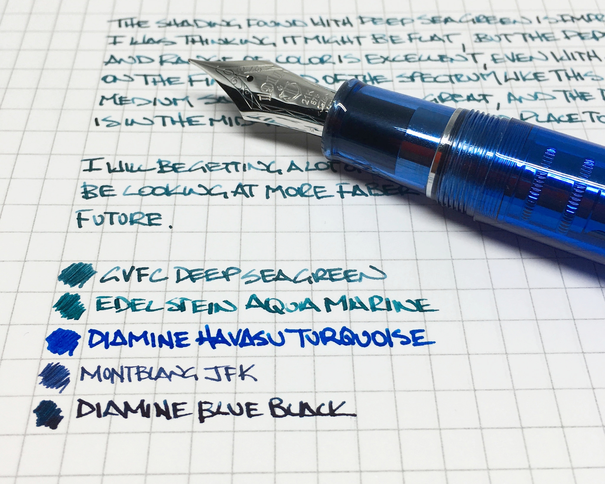
Deep Sea Green has more character than I expected when I received this bottle from Goulet Pens. I’ve been using it in my Sailor King of Pens with a stock medium nib, and it shades well despite the fineness of the nib. There are showings of light and dark greens and blues, plus appearances of grey. It flows wonderfully and dries quickly too. I’ve had nothing but positive experiences so far, and yes, it makes me even want to try some of the more boring colors.

$30 may seem steep for a bottle of ink, and it is, but keep in mind the bottle holds 75ml, which is a 50% increase over the similarly priced Pilot Iroshizuku. And the ink contained within has far more features. The bottle itself is strong, sturdy, and wonderful to look at on a desk or shelf.

Now, if the higher-ups at Graf Von Faber-Castell would mix in a purple or turquoise we would be off to the races.

(GouletPens provided this product at no charge to The Pen Addict for review purposes.)


Enjoy reading The Pen Addict? Then consider becoming a member to receive additional weekly content, giveaways, and discounts in The Pen Addict shop. Plus, you support me and the site directly, which I am very grateful for.

Membership starts at just $5/month, with a discounted annual option available. To find out more about membership click here and join us!

Posted on July 25, 2016 and filed under Faber-Castell, Ink Reviews.

Bungubox Sunset of Omaezaki Ink Review

(Jeff Abbott is a regular contributor at The Pen Addict. You can find more from Jeff online at Draft Evolution and Twitter.)

One of the greatest things you can ever hope to do when it comes to buying new inks is to have the opportunity to try the inks before you make your choice. Like I wrote about with my Akkerman purchase at the 2016 Atlanta Pen Show, Vanness pens provided a testing station that had a couple dozen inked pens that you could try at any time. I think I tested out every single ink they made available, but I only picked two inks to come home with me. Obviously, one of those was the Akkerman Passage Blauw. The other ink was a tad uncharacteristic for me: Bungubox Sunset of Omaezaki. It was uncharacteristic because this is a bright orange ink...something that I've never ventured into when it comes to ink colors. Short story: I'm glad I took the leap.

Omaezaki is a city located in Shizuoka Prefecture, Japan, which is at the very tip of the Omaezaki Peninsula. Being a surf town, the sunset orange seems fitting against the other blue ink that uses the same namesake. The flag of Omaezaki also features a similar orange color as the backdrop.

Now, back to the ink. As far as I understand, the Sunset of Omaezaki ink is a limited edition for this year. It really caught my attention at the testing table because it had a subtle shading effect instead of a basic highlighter-orange color. It's bright and pops off the page, but it also has character.

Being a Bungubox ink, I had no concerns about it being a poor performer in my pens, and I was correct to assume. This is a fabulous ink. The writing performance is on par with other Bungubox and Sailor inks, which is to say it's an exceptional ink. I haven't noticed any hard or skippy starts, no problems when writing, and easy clean up.

When writing with this ink, the nib is lubricated to provide a smooth writing experience. The ink isn't overly wet, but does a nice job of keeping a good level of flow in the different pens I've tried it with. My favorite characteristic of the ink is the shading. It's not a dramatic level of shading like some inks, but it's enough to catch my eye and make me smile. In the areas where ink pools up slightly, the ink takes on a darker, red-orange hue that I love. The normal color of the ink is a brighter orange tone that you can't miss.

The dry time on this ink is another huge plus. In my tests, the ink was consistently dry and resisting smudges by 10-15 seconds. That's impressive.

Another thing to note about this ink is that it does produce a smell when you're writing. It reminds me of certain art supplies or paints — nothing offensive, but just something that you notice. Most fountain pen inks are fairly odorless unless you try really hard to notice a scent. This one hits your nose while you're writing in a proper position where the pen is a good 2+ feet from your nose. It's not an unpleasant smell, but it's worth mentioning. I happen to like the smell.

The bottle is exactly like other Bungubox and Sailor ink bottles. I love the shape of these bottles more than any other (yes, even the Akkerman bottles) due to the sleek design. These bottles feature an ink well system that allows you to ink up your pens even if the ink level in the bottle is low. It's a nice feature that I wish all ink bottles included.

I'm brand new to the world of orange inks, but I think I might be in the market to try some more. I've always heard great things about Iroshizuku Fuyu-gaki, so that might be my next experiment. Either way, this Bungubox ink is a huge win for me. I'm loving this ink and find myself using it pretty heavily during the day, even though it's not a standard "business" or "work" color. It's just too pretty and exciting to let it sit all day.

Also, if you happen to own any Karas Kustoms pens with the orange anodized finish, it matches this ink perfectly.


Enjoy reading The Pen Addict? Then consider becoming a member to receive additional weekly content, giveaways, and discounts in The Pen Addict shop. Plus, you support me and the site directly, which I am very grateful for.

Membership starts at just $5/month, with a discounted annual option available. To find out more about membership click here and join us!

Posted on July 20, 2016 and filed under Bung Box, Ink Reviews.

Sailor Jentle Uca Arcuata Fiddler Crab Green Ink: A Review

(Susan M. Pigott is a fountain pen collector, pen and paperholic, photographer, and professor. You can find more from Susan on her blog Scribalishess.)

I must admit, this has to be one of the most unusual ink colors I've reviewed. When I opened the bottle, my first thought was that the color looked like something from a festering pond.

I had no idea what it was supposed to be, and the name on the ink bottle, Uca Arcuata, didn't exactly reveal anything. So, I did some Googling and discovered that this ink is part of a bespoke collection made for the Kingdom Note Store based on various crustaceans. These inks include Zarigani blue, coconut crab brown, giant spider crab red, tiger prawn brown and Uca Arcuata (Fiddler Crab Green) which is currently sold out.

I've never seen an actual Fiddler Crab, but the ink color certainly looks like the color from the Fiddler Crab illustration on the box.

Still, I wouldn't call this color "green" at all. Maybe the color varies a bit from bottle to bottle since it's a specially formulated ink, but to me the color is yellow-brown, not green. Of course, Sailor can name their inks whatever they want, so if they want this to be green, who am I to argue?

Like all Sailor inks, this one has a distinctive odor to it due to the preservative phenol. It's not an unpleasant odor, just noticeable. And it keeps the ink from getting moldy, although I'm not sure mold would affect this color much.

The bottle comes with a built-in ink miser. Just turn the bottle upside down (cap on, of course) so the ink collects in the inner ink well, then turn it over and fill your pen. I usually remove the ink miser because I feel like it gets in the way of filling bigger pens. But, when ink runs low, it can be helpful.

The ink flows well and is even a bit wet. It exhibits nice shading qualities, but as far as I can tell, it has no sheen. It is also not waterproof.

The central question is, why would anyone use this color for writing? I can see it as a color for sketching, but for writing? I'm not sure. It's not a color that appeals to me, at least not yet. Maybe, in the fall when I want a color that matches the fallen leaves in Abilene (a drab yellow). . . .

Still, Uca Arcuata is quite similar to an ink I do love: Iroshizuku Ina-Ho. When placed next to one another, Ina-Ho actually seems to have more green than Uca Arcuata. But on its own, Ina-Ho comes across like a gold ink, whereas Uca Arcuata seems more brown.

I suspect both these colors are acquired tastes, sort of like Brussels Sprouts. I do enjoy breaking out of my blue ink rut, so I suspect that I will use Uca Arcuata from time to time. It might look especially nice on Tomoe River paper. I'm teaching a Harry Potter class this fall at my university, so Uca Arcuata might be just the thing to write acceptance letters to my aspiring wizards. Though, clearly, I need to work on my wax seals.


Enjoy reading The Pen Addict? Then consider becoming a member to receive additional weekly content, giveaways, and discounts in The Pen Addict shop. Plus, you support me and the site directly, which I am very grateful for.

Membership starts at just $5/month, with a discounted annual option available. To find out more about membership click here and join us!

Posted on July 8, 2016 and filed under Sailor, Kingdom Note, Ink Reviews.