Posts filed under Ink Reviews

Waterman Mysterious Blue Ink Review

(Jeff Abbott is a regular contributor at The Pen Addict. You can find more from Jeff online at Draft Evolution and Twitter.)

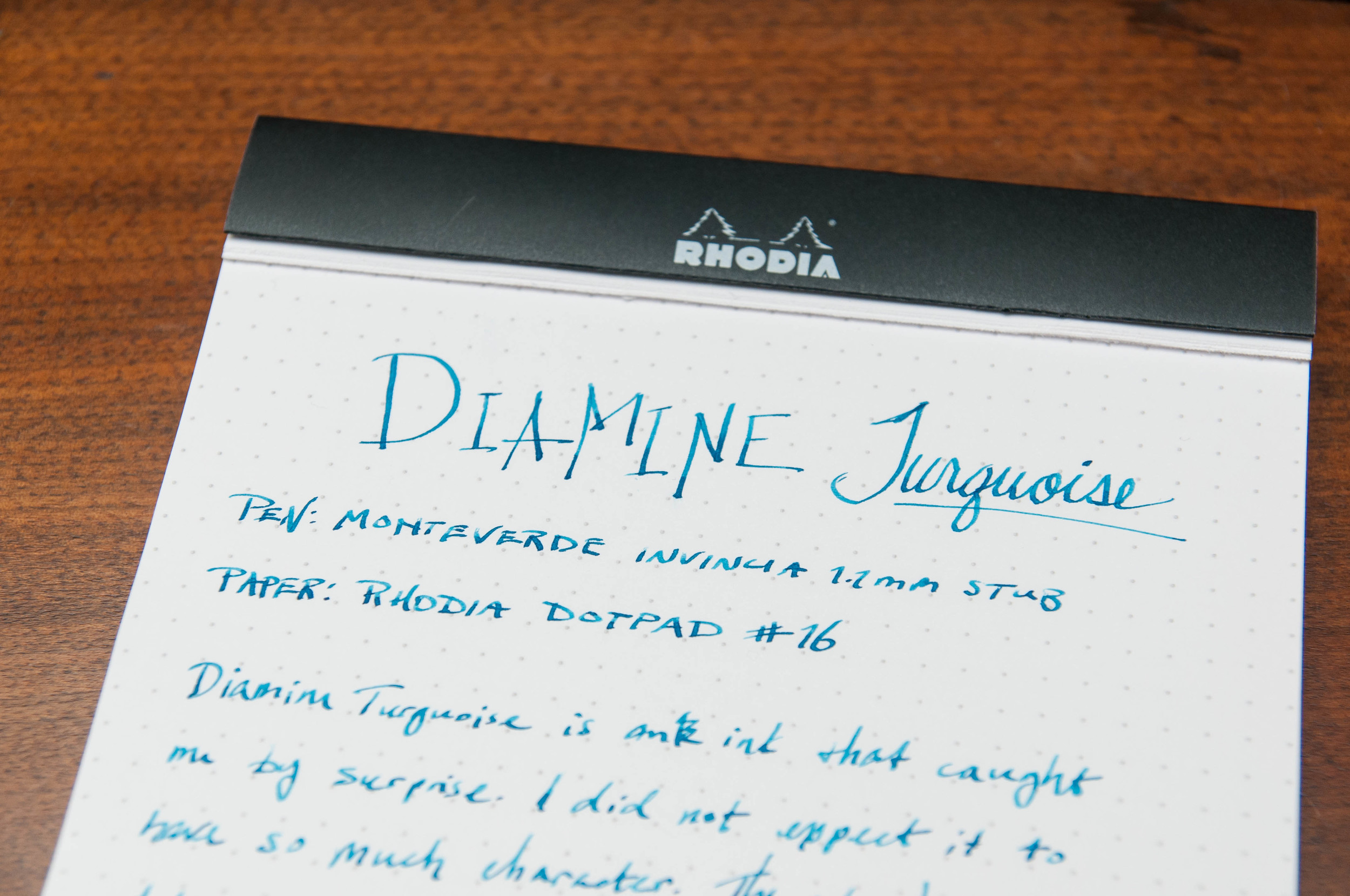
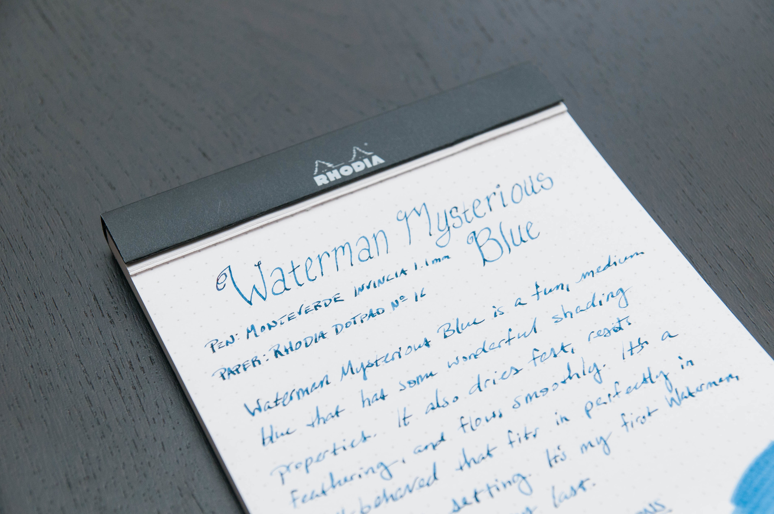
I'm always on the hunt for exciting blue inks, and the most recent to come across my desk is Waterman's Mysterious Blue. I've had some trouble coming up with a description for the color of this ink, but I've settled on a rusty blue jeans color. It does have a bit of mystery to it, but that's bound to happen when using the same inks between different pens and papers. But, for being a dark blue ink, it's got some great character.

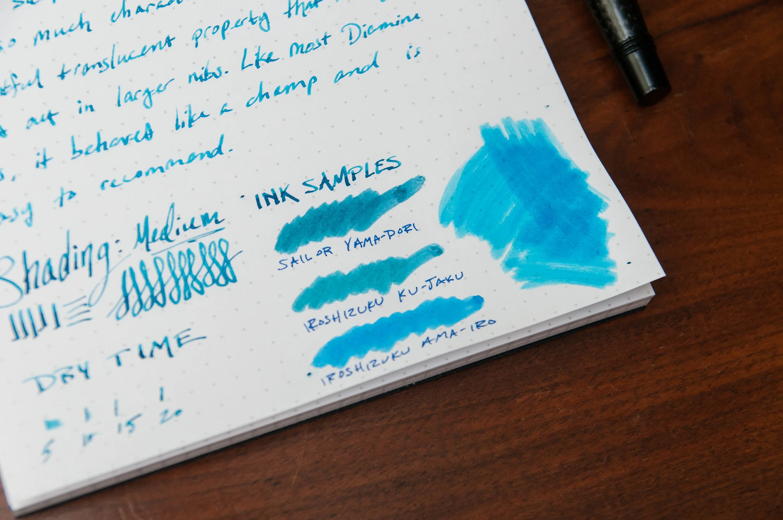
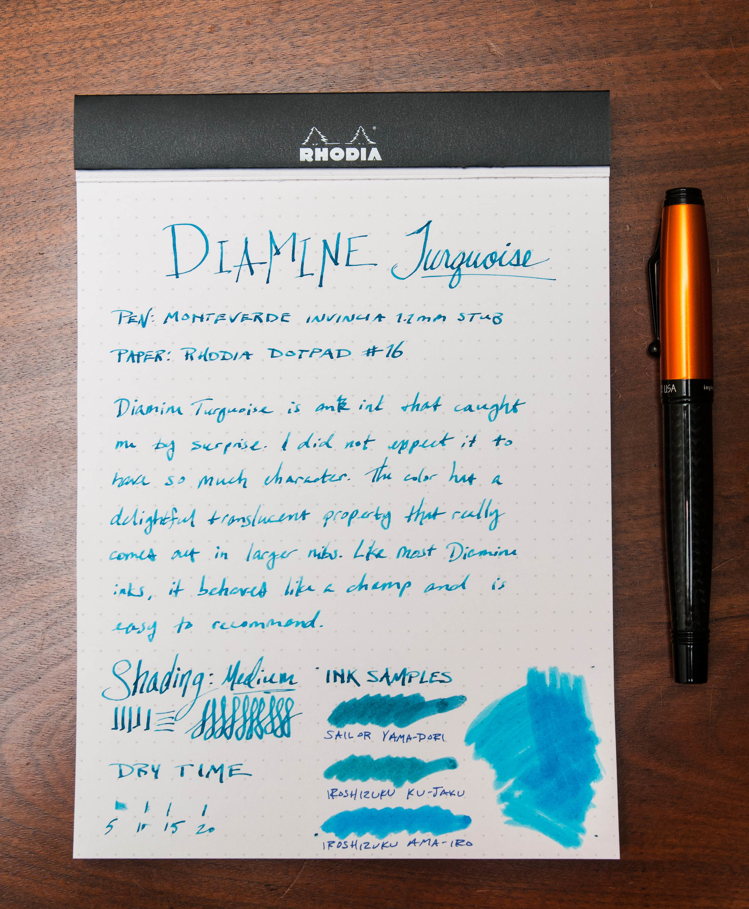
First off, the shade of this ink is much darker than I expected from looking at images online. It certainly photographs lighter than it appears on the paper. When writing, it shades beautifully and shows off navy, indigo, and green tones. It really is a beautiful color with loads of hidden characteristics. It's dark enough for office use, but has plenty of personality.

It's a well-lubricated ink that is very easy to clean. I haven't experienced any issues with it clogging, skipping, or failing to start immediately. It's a well-behaved ink, and acted exactly as I expected.

My favorite quality of this ink is the shading. It exposes different layers of the complex color hues and saturation, and I'm constantly enamored with what comes out on the page with this ink. It's dark, but it's moody.

Feathering is pretty much non-existent, and show-through is minimal on most papers even when using a wet 1.1 mm stub nib.

It's on the dark side of the blue spectrum, but not dark enough to call it a blue-black ink. And that's exactly how I like my dark blue inks — still blue.

JetPens offers this ink in several different formats. You can get a 50ml bottle, a package of 6 international short cartridges, or a package of 8 international long cartridges.

Overall, I'm really enjoying this ink and look forward to adding to the semi-regular rotation. I'm a huge sucker for lighter, brighter blues, but this is a nice contender for more subdued purposes.

(JetPens provided this product at no charge to The Pen Addict for review purposes.)

Posted on May 25, 2016 and filed under Waterman, Ink Reviews.

Diamine Turquoise Ink Review

(Jeff Abbott is a regular contributor at The Pen Addict. You can find more from Jeff online at Draft Evolution and Twitter.)

Sometimes, an ink name is simple and direct. Black, blue, green, etc. But, in most cases, these colors are bland compared to their exotic alternatives.

With Diamine Turquoise, the simple name does not indicate a simple, bland ink. It goes to show that you don't need an exotic name for an exotic, beautiful color.

Diamine Turquoise is a beautiful blue-green color with excellent properties. It dries quickly, it shades nicely, and it works like a champ in every pen I've tried. Really, it's a typical Diamine ink, and the only difference from the others is the color. That beautiful turquoise color.

Unlike many of my favorite blue-green inks, this ink has a lighter shade that shows off more of the variety of hues. With Sailor Yama-dori or Iroshizuku Ku-jaku, the shade is darker and harder to discern. It's subtle, which possesses its own beauty and delight. But Turquoise doesn't hold any punches, it's not meant for business use, and it delights with its bright, Caribbean hues. If you want to liven up a page, this ink is a great choice.

When you get down to it, Turquoise is a standard Diamine ink. It flows well, it dries relatively quickly, it exhibits some nice shading, and it's dependable. I really have nothing bad to say about the ink at all. The main draw is the color — the bright, turquoise that jumps from the paper when you write. If turquoise or bright blue-greens aren't your thing, you won't like this ink. But, if you happen to like the color, you can be assured that the ink behaves admirably.

One significant characteristic about this ink that's worth pointing out is the shading. It doesn't exhibit a crazy amount of shading, but it's definitely noticeable when writing normally. You can coax out more shading with a larger nib and slower strokes, but it isn't a slouch by any means. If there's one complaint about this ink, it's that the shading is a bit light for my taste. But, I'm not qualifying that as a complaint, because it has plenty of shading for most occasions. No ink is perfect, right?

In the land of standard Turquoise inks, I only have experience with Diamine's. I know that many people are fans of Lamy's offering, but I haven't yet tried it. With how pleased I am with Diamine's, I'm not sure I'll ever need to try another one.

It's turquoise, it's dependable, and it's affordable. As long as you like the color, it's a big win all around. As with other Diamine offerings, you can score this in a large 80ml bottle or a pack of 18 cartridges. It's a great ink, and I highly recommend it.

(JetPens provided this product at no charge to The Pen Addict for review purposes.)

Posted on May 11, 2016 and filed under Diamine, Ink Reviews.

Akkerman #1 Passage Blauw Ink Review

(Jeff Abbott is a regular contributor at The Pen Addict. You can find more from Jeff online at Draft Evolution and Twitter.)

After this last pen show at Atlanta, I've realized that I've established a pattern in regards to Akkerman inks. I buy a bottle at every pen show I attend. The latest show in Atlanta introduced me to one of the brilliant Akkerman blues -- Passage Blauw.

Passage Blauw was one of the samples available at the Vanness ink testing station, so that's a primary reason for why I picked up this particular ink. It's also the reason I picked up another ink, but that's another review.

After testing the ink and weighing the many, many options available at the show, I chose to go for the Passage Blauw. I'm really glad I did, because it's one of my new favorites.

First off, the bottle is killer. You get the same type of bottle with every Akkerman ink, but I still think they're extremely cool. It never gets old watching the top reservoir fill with ink from the bottom — all thanks to an ingenious marble system inside the bottle neck.

Perhaps the most important aspect of this ink is the color. After all, every Akkerman ink I've tried is very well-behaved and a joy to use. After that point, it's all about the color and specific properties of the ink. In this case, the color is a bright, happy blue that springs off the page with its translucent, Caribbean glory. It's very similar to Iroshizuku kon-peki, but a bit lighter. It's also very similar to Iroshizuku ama-iro, but a tad darker. It's somewhere in between these two inks, and that's just fine. The color is gorgeous and worth owning even if you have other similar colors.

The shading is the other killer aspect of this ink. It shades like a palm tree (I'll see myself out now). In pens with wide nibs, it shows off the shading characteristics like a champ. There's something tropical about watching a medium blue ink pool in the slower parts of letters while you're writing. It's my affinity for this effect that makes my blue ink collection continue to grow.

Dry time was actually a surprise here. It normally dries in less than 10 seconds in most cases. And, most of the tests were done with a medium cursive-italic nib. In a German fine nib, the results were similar. Either way, that's a spectacular dry time and it really impressed me.

Bleeding and show-through are minimal unless you are using a cheap paper. In that case, it feathers quite a bit. But, as long as you're using decent paper, it performs admirably.

In both pens I've tested so far, the flow and lubrication are top notch. This is an extremely well-behaved ink that I wouldn't hesitate to use in any pen I own.

Lastly, the price is a bit high at $28, but you have to remember that this ink is imported from the Netherlands and also has a super fancy bottle. For the joy I get from this ink, the price is completely fair.

I've gotten an Akkerman ink from the Vanness table at every pen show I've attended, but you can also order a bottle at any time from their website. If you're unsure about a bottle, go for a small sample first!

Posted on April 27, 2016 and filed under Akkerman, Ink Reviews.