Posts filed under Ink Reviews

Pilot Iroshizuku Syo-ro Ink Review

(Jeff Abbott is a regular contributor at The Pen Addict. You can find more from Jeff online at Draft Evolution and Twitter.)

Pilot Iroshizuku inks are well-known for being great fountain pen inks, and I'm sure we've all tried our fair share of different colors from the brand. For many of us, some of our favorite inks come from this line, and for good reason.

I've long been a fan of their Kon-peki ink, which is a bright blue that pops off any page. But, it can be a bit too much pop for some moods. Another favorite color of mine for fountain pen inks is turquoise mixed with other colors to tone down the gemstone feel. Sailor Yama-dori is a wonderful ink, and I've recently come to love Franklin Christoph's Midnight Emerald. Both of these inks are dark, subdued, and expose beautiful levels of depth when writing. So, it was only inevitable that I try the Iroshizuku color that somewhat matches the same spectrum. In short, it's an exceptional ink with a beautiful color.

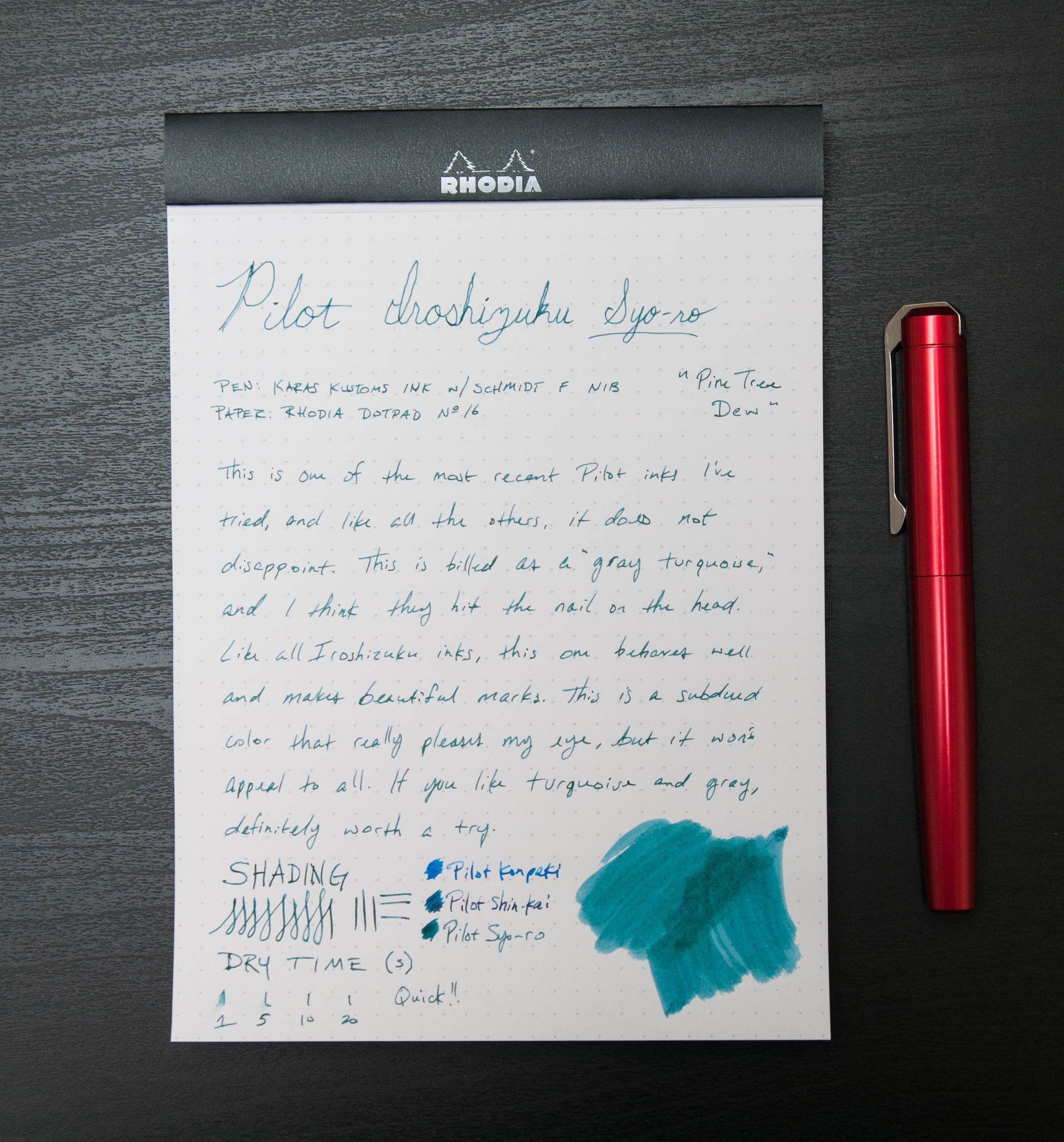
Pilot Iroshizuku Syo-ro is labeled as "Pine Tree Dew" on JetPens' site, which boils down to "Gray Turquoise." In this case, I think the word arrangement is perfect — it's definitely a turquoise ink with a bit of gray mixed in, not the other way around. There's plenty of color in the ink, but it's subdued enough to make it elegant and intriguing. I like inks that make you look twice or second-guess your first assumption.

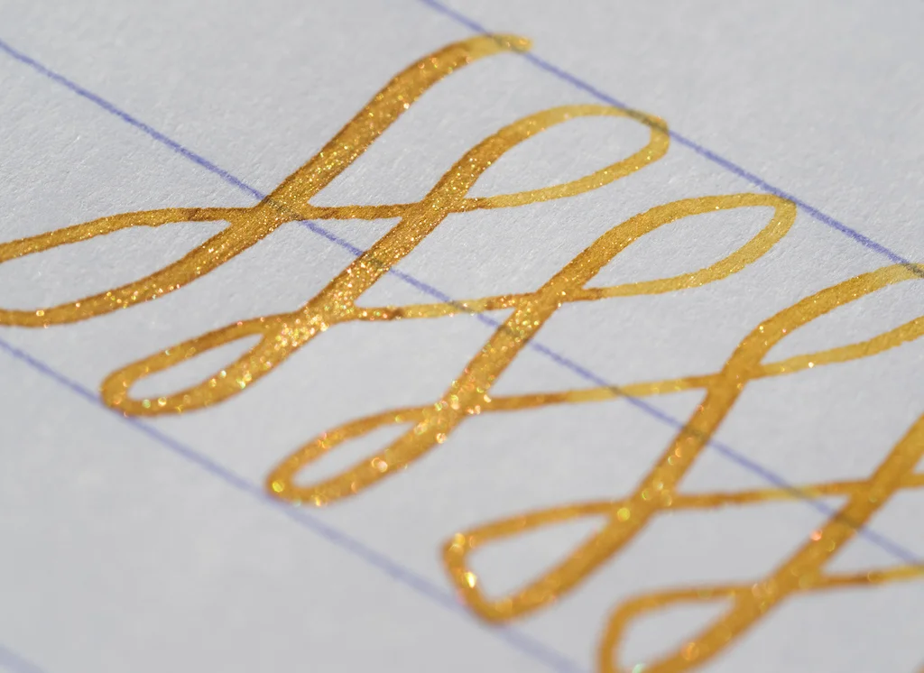
If you've ever tried an Iroshizuku ink, you know what to expect. If you never have tried them, you're in for a treat. Like all other in this brand, the Syo-ro ink is smooth, quick-drying, and resists feathering and bleeding on pretty much all papers (with the exception being cheap copy paper). There's a fair amount of shading to create the beautiful level of depth in the colors, and it works well with a pen that has some flex.

I've tried some other green inks in the past that I hoped would match the characteristics in this ink. Sadly, most of them looked dull on the page after the ink dried. With Syo-ro, the color is still bright and present after the ink has dried. The color looks like it has life, which exactly what I want from an ink that I use daily.

Show-through, bleeding, and feathering are minimal with this ink. It's remarkably well-behaved in many circumstances, and it's gentle on your pens as well. Cleaning is an easy exercise.

Dry time on this ink keeps surprising me. In most cases on my Rhodia pad, I could only create a tiny smudge on the 10-second mark. This is very quick for a fountain pen ink, and something to keep in mind if that attribute is important to you. Keep in mind, though, that this will vary based on the nib and feed unit for every pen you use.

I really have nothing bad to say about this ink. Sure, the Iroshizuku inks aren't the cheapest, but that's for good reason. When you buy an ink from this line, you know that it will perform well. The only thing you have to decide is what color, or how many.

Syo-ro is available from JetPens in two sizes: a 50ml bottle and a 15ml sample bottle. With the 15ml bottle being half the price of the 50ml bottle, it's hard to justify choosing it. It might make more sense if it was a 25ml bottle to match the price difference, or if the price was more in line with a bottle that is only 30% of the larger one. At any rate, if you like turquoise and fountain pens, this is one you don't want to miss.

(JetPens provided this product at no charge to The Pen Addict for review purposes.)

Posted on February 10, 2016 and filed under Ink Reviews, Iroshizuku, Pilot.

Diamine Shimmer Inks: A Review

(Susan M. Pigott is a fountain pen collector, pen and paperholic, photographer, and professor. You can find more from Susan on her blog Scribalishess.)

It was inevitable, of course, that Pen Addict should do a review on Diamine's line of shimmer inks. But what to say, now that everything's been said? Diamine Shimmer inks shimmer! That about covers it.

When Diamine announced the new line last fall, Instagram, Twitter, and Facebook went crazy. Everyone was talking about the new inks. J. Herbin offered some limited edition inks with glittery particles. But Diamine introduced ten glittery colors all at once.

As soon as the inks were released, reviews began popping up everywhere. The word "Shimmertastic!" inundated the pen community's ink vocabulary. Pictures of glittery ink appeared all over the web accompanied by whoops of excitement. Ink with all the magic of unicorns!

At first I resisted. I had purchased three of J. Herbin's shimmering inks (Rouge Hematite, Bleu Ocean, and Emerald of Chivor), and I wasn't all that impressed. The glitter fell so quickly to the bottom of the ink bottles after shaking, I had to rush to fill my pens. I never felt I could suck up enough glitter. Then I had to keep shaking my pen. And, unfortunately, the best examples of the inks' glitter and sheen were brought out in ink blobs, not writing samples. I also worried about what the ink might do to my nibs and feeds. Those bottles languish at the back of my ink drawer.

So, I waited until the initial buzz wore down before I ordered Diamine glitter ink. I purchased three bottles: Blue Lightning, Purple Pazzazz, and Golden Sands. I chose these three colors because I had seen photos of Blue Lightning and loved the color. The purple looked like it would be great for Christmas cards (though, admittedly, I only sent one Christmas card this year). And the gold looked spectacular for any special occasion. At $20.00 per 50 ml bottle, these aren't cheap inks, but they are a little less expensive than J. Herbin ($27.00).

Here are writing samples of each color:

Purple Pazzazz

Large Nibs

Small Nibs

Blue Lightning

Large Nibs

Small Nibs

Golden Sands

Large Nibs

Small Nibs

The only color I've used frequently is Purple Pazzazz. This is mainly because I put it in my TWSBI 580, which is my industrial strength pen. I wasn't worried about glitter particles ruining this pen. Although I have not heard people say that the Diamine Glitter ink is clogging their nibs, I'm not ready to leave it for long periods in my really expensive pens.

Right now I have Blue Lightning in my Sailor Pro Gear with a Cross Point nib. This nib really shows off the ink because it has such a broad stroke.

I put Golden Sands in my Conid Minimalistica, but after writing a few pages with it, I dumped it out. The ink leaked everywhere, and it didn't work well with the Conid's nib. I may try it in a different pen, but it seems like a paint brush might work better.

So far, I've been impressed with the shimmer capabilities of Diamine's inks, even in finer nibs. With the J. Herbin inks, it seemed that only wider, wetter nibs could really bring out the fantastic colors and shimmer. But, the Diamine inks glitter even with medium and fine nibs (though I doubt you'll see much glitter with extra-fine nibs). After writing in my journal with my TWSBI (medium nib), I could see the glitter when I held it in the sun.

What's interesting to me about the three bottles of Diamine I own is that each ink behaves differently. Blue Lightning seems a bit dry compared to the other two inks. Purple Pazzazz is wet, but not overly so. Whereas Golden Sands seems downright watery and difficult to control.

If you like glittery ink, then you'll like the Diamine Shimmer line. They seem to have gotten the formulation right in that the glitter particles are tiny and flow more easily through feeds and nibs than the J. Herbin inks (this is my very unscientific opinion). You'll still have to shake the bottles well before inking your pens, and shake or roll your pen before writing to get the glitter flowing.

Pros

  • Diamine Shimmer Inks come in ten colors and they aren't limited edition.
  • The glitter is quite visible in sunlight and bright indoor light.
  • The glitter particles do not seem to pose a problem for feeds and nibs, but it's always smart to exercise caution with specialty inks. I wouldn't advise leaving these inks in pens (especially vintage pens) for long periods of time.
  • Both wide and narrower nibs produce glitter.

Cons

  • The glitter shows only in bright light.
  • You have to remember to shake the bottle well before filling your pens and to shake or roll your pens before writing.
  • Glittery inks have their uses (invitations, seasonal cards), but they do evoke visions of unicorns and teenage girls (at least in my mind). I probably won't be grading papers with these, but, after a crazy semester like this one, purple glitter might be just the thing for writing 30% on someone's exam. Who knows?
  • These inks are definitely not water resistant.

(JetPens provided this product at no charge to The Pen Addict for review purposes.)

Posted on January 22, 2016 and filed under Diamine, Ink Reviews.

KWZ Iron Gall Gold Ink Review

(Jeff Abbott is a regular contributor at The Pen Addict. You can find more from Jeff online at Draft Evolution and Twitter.)

On my third KWZ iron gall ink, the KWZ IG Gold color has managed to shock me again. These KWZ inks really are special, and you owe it to yourself to try some out at some point. The hardest part of this will be choosing.

Previously, I reviewed KWZ IG Blue #1 and KWZ IG Blue #4 and was mesmerized by the way the ink changed color as it dried. The Gold is no exception. This behavior is a characteristic of iron gall inks, and you can read a bit more about the KWZ variety over at Vaness Pens.

The Gold ink is very similar to the other KWZ inks I've tried when it comes to the behavior and ink characteristics. It never has trouble starting or skipping, it doesn't feather, show-through is minimal, there's a nice medium level of shading that looks fantastic on the page, and it's a tad on the dry side when writing. After using several of these inks, this all feels normal now. Dry time isn't among the fastest — you're looking at around 20-25 seconds in most cases. Sure, this will be quicker the smaller the nib and thinner the paper, but it's still on the slow side.

Once it dries, though, it's nearly permanent. The drip and dunk tests were congruent with the other KWZ inks. The water damages the paper and blurs the ink, but it's 100% readable afterwards.

The color is what sets this ink apart. Gold isn't really a color you think of when looking at inks. Gold is a yellow metal that shines and sparkles. That's difficult to emulate in an ink without introducing some kind of sparkling particulates in the ink. J. Herbin and Diamine both have experience in this, but KWZ went another route. Instead of trying to produce a Goldschläger ink, the shading provides the depth of color that you need when trying to emulate gold. It doesn't look exactly like gold (nothing will, which is why gold is highly valued), but it definitely reminds you of gold.

When writing, the ink has a light-straw yellow color. As it dries, it turns partially to a light brown with yellow tones, while thinner ink strokes retain a more light-straw color. It's this straw and light brown color combo along with the beautiful shading characteristics of this ink that evoke the thought of gold in this ink. I'm not sure if I'd describe this ink as "gold colored" if I didn't know the name of the ink, but I definitely see the connection. If it's not called gold, then it's some sort of mix between dirty yellow, light brown, and some slight green tones to enhance the yellows. Overall, it's a strange, unique color that I can't stop inspecting. It's beautiful!

When looking at the ink in the bottle and samples online, I didn't think this ink would impress me much. This is definitely a color that will appeal to some people, while completely flopping with others. If you like light to medium brown inks, this is definitely worth trying. If you like inks that shade, it's also something you need to try. In any case, you need to try some KWZ iron gall inks! These inks are so much fun, and the colors are so unique compared to non-iron gall inks.

As with the other KWZ inks, you can pick up a 60 ml bottle of Gold, or a 4 ml sample vial to see if the color is something you appreciate.

(Vanness Pens provided this product at no charge to The Pen Addict for review purposes.)

Posted on January 6, 2016 and filed under Ink Reviews, KWZ.