Posts filed under Ink Reviews

KWZ Iron Gall Blue #4 Ink Review

(Jeff Abbott is a regular contributor at The Pen Addict. You can find more from Jeff online at Draft Evolution and Twitter.)

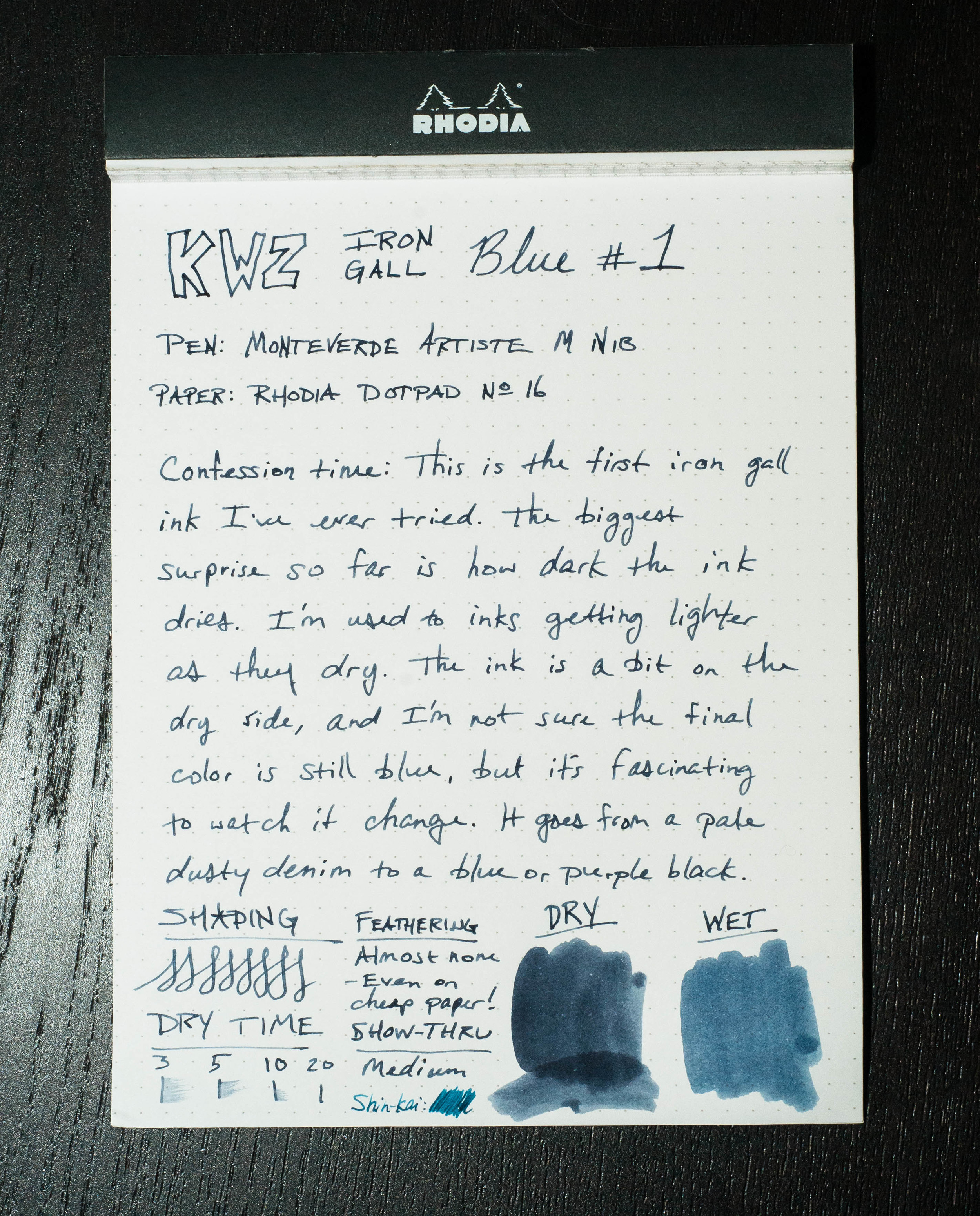
I recently reviewed another KWZ Iron Gall blue ink, and I was a little more than excited to try out another. This time, it's another member of the blue family — Blue #4.

Blue #4 is very similar to Blue #1, except that it dries a little slower, is slightly more lubricated, and doesn't have as much of a dramatic color-changing drying performance. Still, for all the similarities, it's the color that certainly sets this one apart from its sibling.

Let's cover the similarities first. Iron gall? Check. Dries darker than the original wet color? Oh yes. Water resistant? You bet. Easy to clean out of a pen? Definitely.

Now, let's talk a bit more in depth about the differences in Blue #4. For one, this ink is slower to dry than Blue #1. Average dry time for #4 is around 30 seconds, compared to 20 seconds for #1. 30 seconds is a bit on the long side for my tastes, so that's not something I can get over quickly.

Blue #4 can exhibit some nice shading behaviors — nothing extreme, but definitely pleasant. You'll notice it more after the ink dries since the wet ink is a pretty flat color. Like its #1 sibling, #4 also performs at an excellent level where show-through, feathering, and bleeding are concerned. Seriously, these KWZ IG inks are champs in this regard.

One thing that I definitely enjoy in this ink is the fact that it's less dry than Blue #1. It's certainly not a wet, easy-flowing ink, but it feels more normal when writing. Or, put another way, the pen/nib that I'm accustomed to still feel like the same pen/nib. With Blue #1, I hardly recognized my pen due to the significant drag on the nib from the dry ink.

Finally — possibly the most important attribute of the ink: the color. When writing, the color is a dusty purple with some distant blues shimmering through. As the ink dries, it transforms into a dark purple. It's a beautiful color once it dries, but I'd argue it's far from any blue I've seen. In certain spots, I can make out a dark, dark gray-blue, but my eyes still refuse to see anything but a purple foundation. Who knows, it may just be my unique eyes and a problem with how I see color (that's the funny thing about colors, anyway - we all see them differently to some extent), so take my opinion with a grain of salt.

That said, I like the color quite a bit. It's not what I recognize as blue, but that doesn't mean it isn't an intriguing, beautiful color.

There's a lot to like about these KWZ Iron Gall inks. What it really comes down to is your color preferences. Like the Blue #1 I tried before, Blue #4 offers some fantastic characteristics, and my favorite one by far is watching the color turn darker as the ink dries. If that sounds interesting to you, you really need to try out some KWZ IG Inks.

(Vanness Pens provided this ink sample at no charge to The Pen Addict for review purposes.)

Posted on December 16, 2015 and filed under KWZ, Ink Reviews.

KWZ Iron Gall Blue #1

(Jeff Abbott is a regular contributor at The Pen Addict. You can find more from Jeff online at Draft Evolution and Twitter.)

Iron gall inks aren't something I've experimented with much, as there are plenty of other inks to try that aren't difficult to clean out of your pen if you leave it idle for over a week. Not a big deal, still. And then, there's the archival quality of iron gall inks, but that didn't bring me in either. It wasn't until Brad sent me some samples of some KWZ iron gall inks that I gave them a try.

For those who aren't entirely acquainted with iron gall inks and their unique attributes, Vanness Pens has a page that describes the KWZ iron gall inks, as well as a few cautions against leaving it in pens unused for long periods. Basically, iron gall inks react with the paper when the water evaporates, making a (more or less) permanent mark on the page that grows darker as it dries.

To me, that's the main distinction, and one that I find fascinating to watch, regarding iron gall inks — they dry darker. This isn't normally the case for most fountain pen inks. They either dry a little lighter and less vibrant, or stay roughly the same, minus the sheen of wet ink.

Let's be honest, sometimes I just scribble with this ink to watch it dry over 20 - 30 seconds so I can watch it magically change color.

The particular KWZ iron gall ink I've tried first is called Blue #1. When wet, it looks like a pale, dusty denim color. After it dries, it's a dark midnight blue. It's so dark, I have a hard time discerning the exact color through all the black. But, in proper light, you can tell it's a deep, dark navy with purple and green hints. It's a very pretty ink, especially if you dig dark inks (blue-black fans?).

Like I said, watching this 20-second transition fascinates me.

When writing, the flow is a bit on the dry side. The Monteverde medium nib, which usually flows like glass with most inks, feels like it's dragging a tad. But, even though it feels a little slow, it's still smooth.

There's not a lot of shading in this ink, since it's so incredibly dark. You can see in the swab sample that there are some variations in color, but I never got that result from a nib. Show-through also isn't much a problem with this ink. It's on par in that respect in that you normally can't see it from the back of the page.

Dry time is also normal, coming in around 20 seconds or so in a medium nib. Not fast, but not slow either.

Since this is an iron gall ink, I also brought some water into the equation. If you've ever applied water to any colored inks, you'll probably find in most cases that the ink runs like a brand new red shirt in a load of white laundry. In the case of KWZ Blue #1, the results are impressive. I used cheap 20# copy paper for this test, and the aftermath is very usable. The text is legible, but it also barely bled and feathered. If you need an archival-quality ink in a dark midnight blue, look no further. This is permanent as long as the paper exists.

Cleaning the ink out of pens wasn't difficult. None of my pens laid around very long with the ink in them, so that's something to consider. I imagine it make take considerable more effort if the ink had been idle for a long period. Vanness pens make a special note of saying that stainless steel (which are used in a lot of nibs) is more susceptible to damage than gold nibs. It's nothing to panic about, but just be mindful!

In all, I have to admit I'm pretty impressed with iron gall inks, and KWZ, in general. The only complaint I have is in the name. I wouldn't say it's "misleading," but it's also not informative. Blue #1 doesn't indicate what kind of blue, and the screenshots online can be confusing. It would be great if they had signature names to tell them apart, because the blues all look fairly similar to me.

Apart from that one complaint, KWZ Iron Gall Blue #1 really impressed me. I hope the fascination with watching the ink change color as it dries never wears off. It's definitely worth your consideration.

(Vanness Pens provided this ink sample at no charge to The Pen Addict for review purposes.)

Posted on November 25, 2015 and filed under Ink Reviews, KWZ.

Diamine Oxblood Ink Review

(Jeff Abbott is a regular contributor at The Pen Addict. You can find more from Jeff online at Draft Evolution and Twitter.)

Oxblood is one of those words that took me a while to comprehend as a child. Why is the word "blood" in the name, and what does it have to do with an ox? My first memory of hearing this term was in relation to the color of a leather belt. I'm not confident I could tell you why this is still a standard color in some product lines, but it's probably fair that most people understand what the color looks like.

Diamine Oxblood is what I consider the standard oxblood color. It's not too dark, but it has plenty of dark red and brown mixing together to look like a shady blood color. I happen to be a fan of inks with this color scheme, but I understand it's also not for everyone. Either way, you'll know quickly after seeing a sample whether the color is for you. If it is, then Diamine is the one to start with.

I've written previously about a couple other red-brown inks that I really enjoyed: Diamine Ancient Copper and Organics Studio Edgar Allen Poe. These are both great inks in their own regard, but they're just a little off from the standard red-brown color I associate with a classic Oxblood. They're great inks and provide their own unique color and properties that make them great daily writers.

Diamine Oxblood is also a great daily writer. Let's get into the specifics of how this ink performs.

First off, the color is subtle, but deep and rich. It's a wonderful combination of reds and browns that I enjoy seeing on the page. Funny, I like the color of this ink, which is similar to blood, but I hate the sight of actual blood. Go figure.

Like every other Diamine ink I've used, it performs well. The ink has never dried up in my pens after a couple idle days, and it always starts straight away when I start writing. No hard starts, no skipping, or anything negative when it comes to ink flow and starting/stopping. The ink is right in the middle of the scale when it comes to lubrication and wetness. There's a pleasant amount of shading if you're using a pen with a larger nib, like a medium or larger German nib. In smaller nibs, you still get the great color, but the shading characteristics are diminished.

Dry time was average, coming in at just under 10 seconds for normal writing. You'll get smudges if you close a notebook too quickly after writing, and left-hand writers will have some issues with the long-ish dry time depending on the grip style.

When it comes to the color and how it compares to similar inks, I think it's the standard for Oxblood. Ancient Copper is also a red-brown ink, but it has more orange (copper) tones that make it more brown than red in certain light. Organics Studio Edgar Allen Poe is a much darker ink that also has some very light purple tones at times. E.A. Poe is one of my all-time favorite inks, but it's not a standard Oxblood in my opinion. Doesn't mean it's not gorgeous.

Overall, this is a fantastic ink that I think you should try if you are interested in dark reds and red-browns. As far as Oxblood goes, this is my standard in terms of color, shading, and behavior. On JetPens, you can order this ink in three different sizes/formats. It's available in a 30ml sample bottle, a full-sized 80ml bottle, and an 18-pack cartridge format.

(JetPens provided this product at no charge to The Pen Addict for review purposes.)

Posted on November 4, 2015 and filed under Diamine, Ink Reviews.