Posts filed under Ink Reviews

Callifolio Bosphore Ink Review

(Jeff Abbott is a regular contributor at The Pen Addict. You can find more from Jeff online at Draft Evolution and Twitter.)

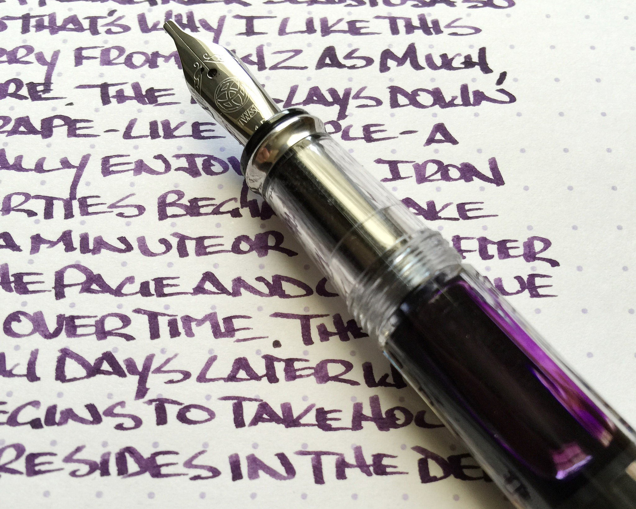
The more inks I try, the more I like the ones that don't necessarily commit to a single color. Blue inks with shades of green, purple, or gray. Purple inks with hints of gold, teal inks with red sheen, etc. These are the truly interesting inks because they exhibit depth. Sure, I do love some Kon-peki because the blue just pops off the page, but other times I want something that keeps me guessing.

Callifolio Bosphore is a perfect example of that description. I'm still not sure what color this ink really is, but it's a very interesting ink regardless. When I first look at the ink, I think it's purple. But as I keep looking, I change my mind to blue with some purple undertones. And then, wait — was that a patch of green I saw? I don't know anymore. Oh, now it's blue again! I don't mean this in a bad way at all — it's absolutely positive characteristic of the ink.

Let's back up a bit. L'Artisan Pastellier's Callifolio inks are all made by a single individual in Southern France. Brad wrote about one of them recently, and made the same remark: you won't find a lot of bright, poppy colors in the line-up.

These inks are apparently very easy to mix together, so keep that in mind if that's something you're interested in. The ink is also extremely well-behaved, but I'll get into that in a bit.

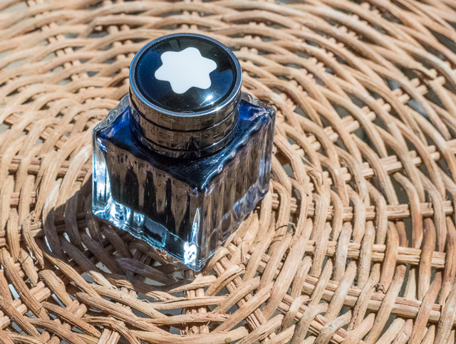
BYOG (bring your own glass)

Let's start with the container. This is unlike any ink container you've ever seen. It's a flexible pouch with a screw top. Really, it feels and acts like a sturdy Capri-Sun. This is very interesting because the opening on top isn't big enough to fit a pen into, and I'm pretty sure that's intentional. This ink container is meant to be emptied into a more proper container, like a spare glass bottle you may have. In my case, I didn't have a spare container, so I just used a syringe to get out a bit of ink for testing. I'm still amazed by how small the container looks next to a 50 ml glass bottle of ink.

The 50 ml pouch of ink runs around $8, while a 40 ml glass bottle is $11. You get a nice savings from opting out of the glass bottle, but that just keep in mind that you'll want something to transfer this ink to if you get the larger pouch option.

Ink characteristics

This is an extremely well-behaved ink. Even though it feels dry in the Monteverde, which usually feels a bit more wet with most inks, it never skips a beat or has flow issues. I wish the ink was a tad more lubricated, but it's not a major complaint. Once I'm writing, I don't notice it, but it is fair to note since this pen is typically a wet writer. Strangely enough, writing with a Japanese F nib didn't yield bad results either. Really, the ink is lubricated just enough to provide a nice level of feedback between the page and the nib tip.

Again, the color of this ink is interesting. I'm going to stick with calling it a dusty purple, but it's so much more. Purple, blue, gray, and even a hint of green sometimes are some of the colors you can expect to see regularly. It's these types of color mixes that keep me very interested in an ink.

The ink dries fairly quickly on thick paper — just under 10 seconds before most smudging isn't a problem. Probably not quick enough for some lefties, but not bad either.

This ink shades pretty easily, but it maintains the main color profile throughout. This isn't an ink that is blue through the main strikes and green through the light strokes. You just get darker and lighter shades of the mysterious dusty purple. Don't get me wrong, this is nice — just trying to accurately describe the behavior with words.

Wrap up

For the price, you should definitely check it out if this type of color is in your area of interest. This is a solid ink that will work well in any pen, and it's unlike anything you can buy from any of the large manufacturers.

((Vanness Pens provided this product at no charge to The Pen Addict for review purposes.)

Posted on August 12, 2015 and filed under Callifolio, Ink Reviews.

Montblanc Blue Hour Ink Review

Twilight at Caprock Canyons, Texas

Twilight at Caprock Canyons, Texas

(Susan M. Pigott is a fountain pen collector, pen and paperholic, photographer, and professor. You can find more from Susan on her blog Scribalishess.)

Montblanc "Blue Hour" or "Twilight" is "linked to the 'blue hour,' the time when the day turns to night," according to Montblanc's website. The ink comes in a 30ml square glass bottle adorned with the Montblanc emblem on the cap. It is a limited edition ink.

When I first saw a sample of this ink, I couldn't wait to purchase a bottle. It looked lovely with deep blue-green tones, sheen, and shading. I love blue inks, and I expected great things from Montblanc Blue Hour.

But when I inked my first pen with Blue Hour, I was disappointed. The ink didn't have the depth I was expecting. Where was the sheen? Where was the shading? And, worst of all, after I wrote a few pages and the ink dried, it faded to a sort of dusty bluish-green. You can see in the picture below how the ink is deep blue when it's fresh and dusty blue-green when it has dried.

I tried it in several different pens with various nib sizes and grew more disappointed. Broad nibs bring out the shading, but the ink was dry and unsaturated in my finer nibs.

The only way I was able to get sheen from the ink was in droplets. None of my writing samples, even with my super broad, flexible music nib, exhibited any sheen.

Chromatography demonstrates that the ink has blue, green, and yellow tones. I expected it to be more of a blue-black, but it leans more towards teal.

Blue Hour is not a wet, highly-saturated ink. When you do a smear test, it dries quickly. Obviously, the dry times will be longer with broader nibs, but not by much. The ink is not waterproof.

When I first used Blue Hour, I thought it resembled Iroshizuku Tsuki-Yo. The two inks look similar, but Tsuki-Yo has more green and the color definitely doesn't fade. Tsuki-Yo also flows better, especially in fine nibs.

I'm glad Blue Hour came in the smaller 30ml bottle, because this is not an ink I will use much. After falling in love with Montblanc Toffee, I genuinely thought this would be a terrific ink. But it is dry; it fades, and it simply fails to impress.

Posted on August 7, 2015 and filed under Ink Reviews, Montblanc.

KWZ Gummiberry Iron Gall Ink Review

I’m a fan of Iron gall inks, especially the more modern varieties like this KWZ Gummiberry from Vanness Pens. Iron gall inks can be intimidating if you are unfamiliar with them, but the way companies manufacture ink these days helps keep your pens safer as long as good fountain pen hygeine is used.

KWZ is a brand I have heard of in passing over the last few years. Made in Poland by Konrad Żurawski, the inks are made in small batches. This allows for experimentation with a wide range of colors that I personally haven’t seen before, especially in the iron gall realm.

Lisa Vanness asked me which color of the lineup I wanted to sample, and Gummiberry jumped off the page at me. I have enough blue and blue black inks to last a lifetime, and I’m a fan of Rohrer & Klingner Scabiosa, so I figured I’d see how another purple iron gall ink would compare.

Gummiberry is a grape-colored purple. It hits the page similar in color to the juice found in a grape jelly jar and dries into a color as deep as the deepest recesses of the jelly itself. From a distance, the aged color is nearly black, but a closer look shows that the deep purple color is retained. It has a wonderful look on the page.

Iron gall inks are generally quick drying, and this one is no exception. Even on slick Rhodia paper there was little smudging after 10 seconds, which puts it ahead of most standard inks. The ink is also waterproof, forming a bond with the paper after drying that is not able to be washed out. This is why iron gall inks were the historical standard for important documents and signatures.

As much of a fan of iron gall inks as I am, I am concious that without proper pen maintenance and cleaning I could be opening up myself to problems in my pens down the line. As I mentioned earlier, most iron gall inks these days are tamer than their predacessors and I have no problem keeping them inked in my modern pens for weeks, if not months, at a time. KWZ has an excellent page set up for fountain pens and iron gall ink maintenance that you should read prior to getting into these great inks.

I’m anxious to try more of what KWZ is offering, if nothing else for the colors offered (turquoise iron gall anyone?) My thanks to Vanness Pens for sending me this ink at no charge for review purposes. I’m hooked, and will definitely be purchasing more at the DC Pen Show next month.

Posted on July 13, 2015 and filed under Ink Reviews, Iron Gall, KWZ.