(Susan M. Pigott is a fountain pen collector, pen and paperholic, photographer, and professor. You can find more from Susan on her blog Scribalishess.)
I can't remember where I first saw a photograph of Bung Box Sapphire–Twitter or Instagram or a Web site–but I immediately fell in love with it, apparently a common experience with this ink. The minute I got the email from Vanness Pens that a box had arrived I ordered some. It's a good thing, too, since their entire stock of Sapphire sold out the same day.

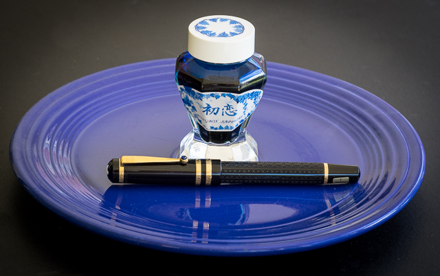
A little history about Bung Box Sapphire: apparently, the owner of the Bung Box store fell in love with Parker Penman Sapphire, so she tried to recreate the color. She called it Hatsukoi, which means "first love" (Bung Box Facebook Page), since that is the emotion the color evoked in her. I think most fountain pen lovers can relate to this experience, whether we fall in love with a particular ink color or a specific pen (or several).
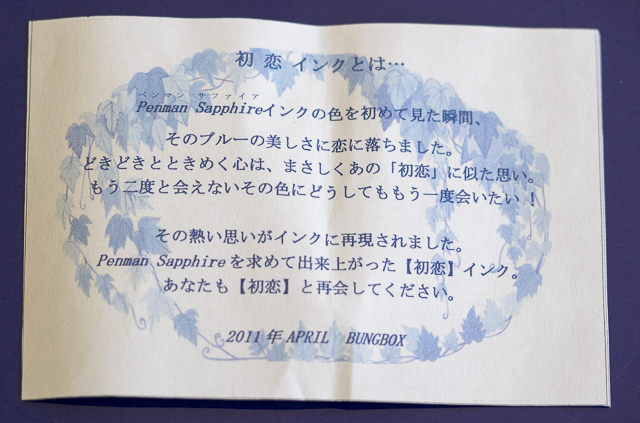
An insert included with the ink tells the story of its name
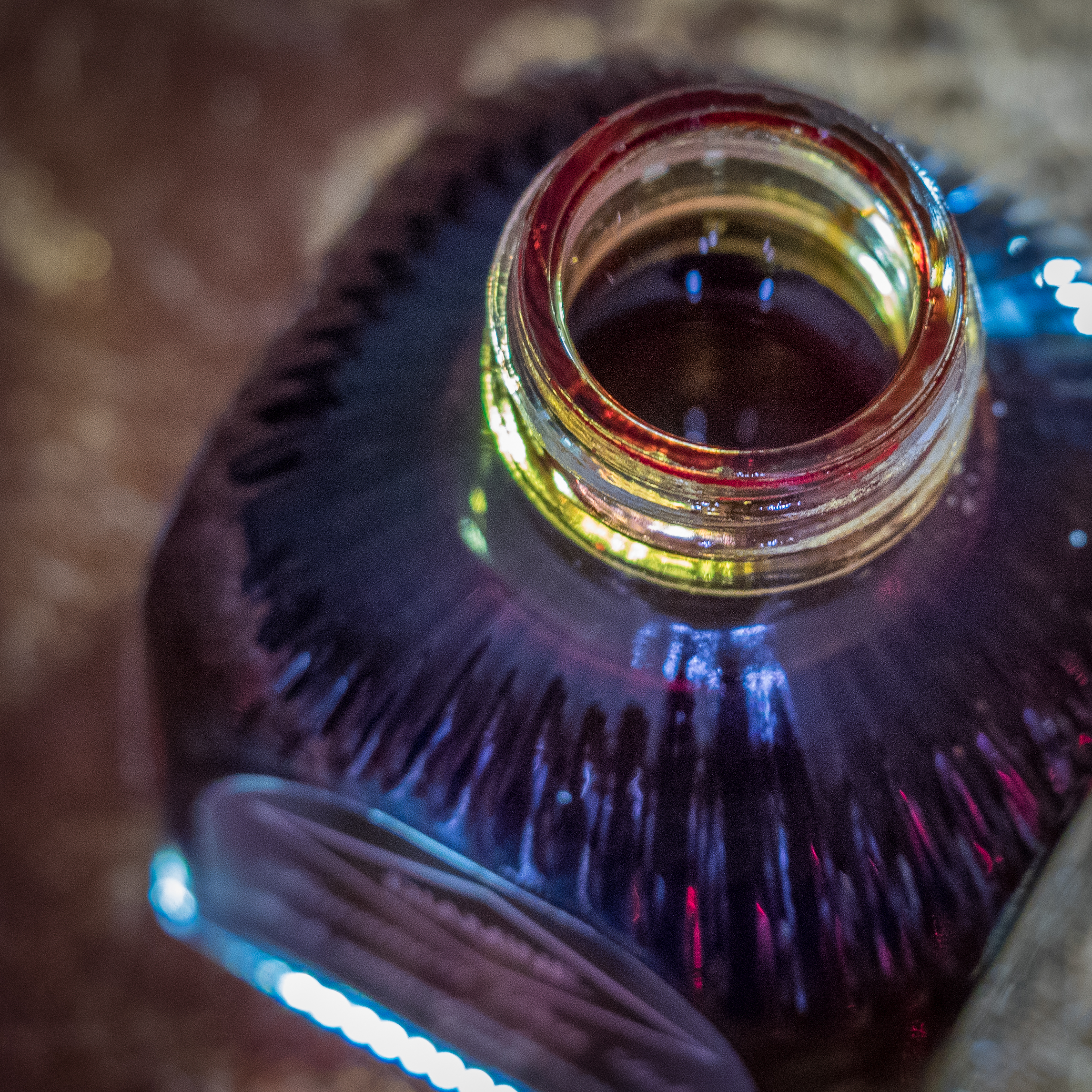
The Bung Box Sapphire ink bottle is a work of art. Compared to the usual Sailor Jentle ink bottles, these glass bottles are like miniature vases or containers for fancy perfume. I know I won't throw mine away when I've used up all the ink.

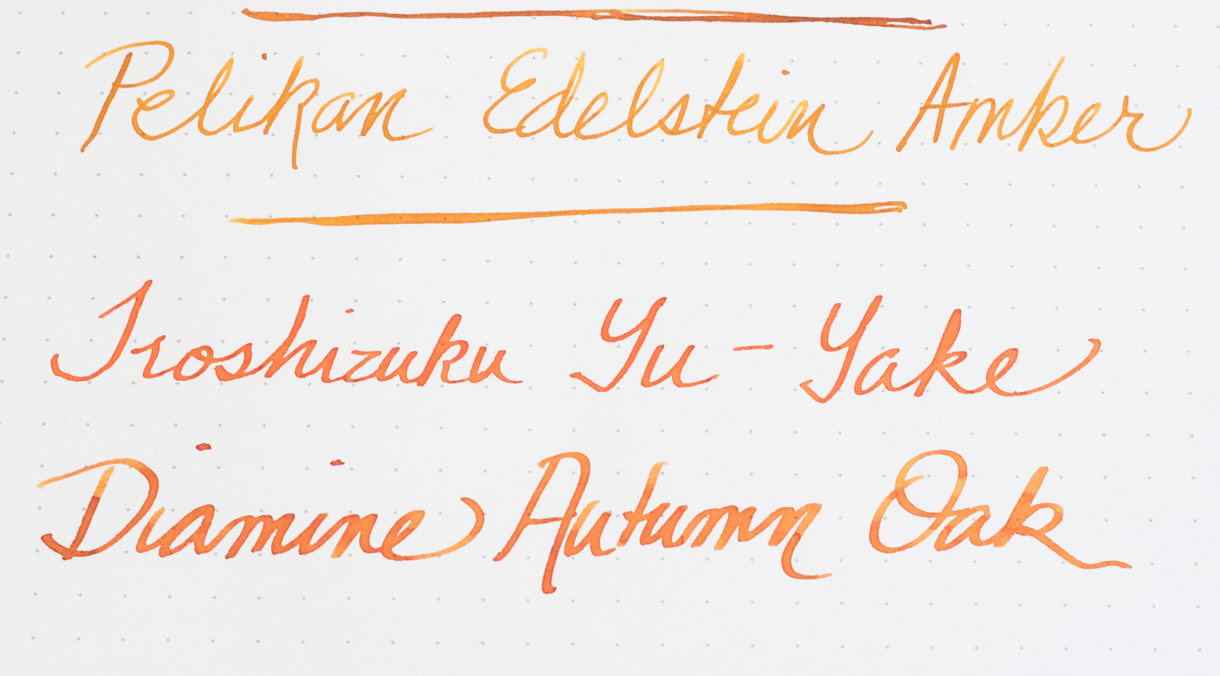
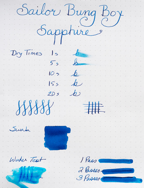
One of the best characteristics of Bung Box Sapphire is its excellent shading. As always with inks like this, the shading is most visible with wider nibs. I used my widest nibs (Pilot Parallel 2.4 and 1.5), my Nakaya music nib, an italic, a couple of flex nibs, and one fine nib to write samples.

The shading is fabulous, ranging from deep blue to a lighter, almost turquoise blue. If you look closely, you can even see shading with the fine nib.


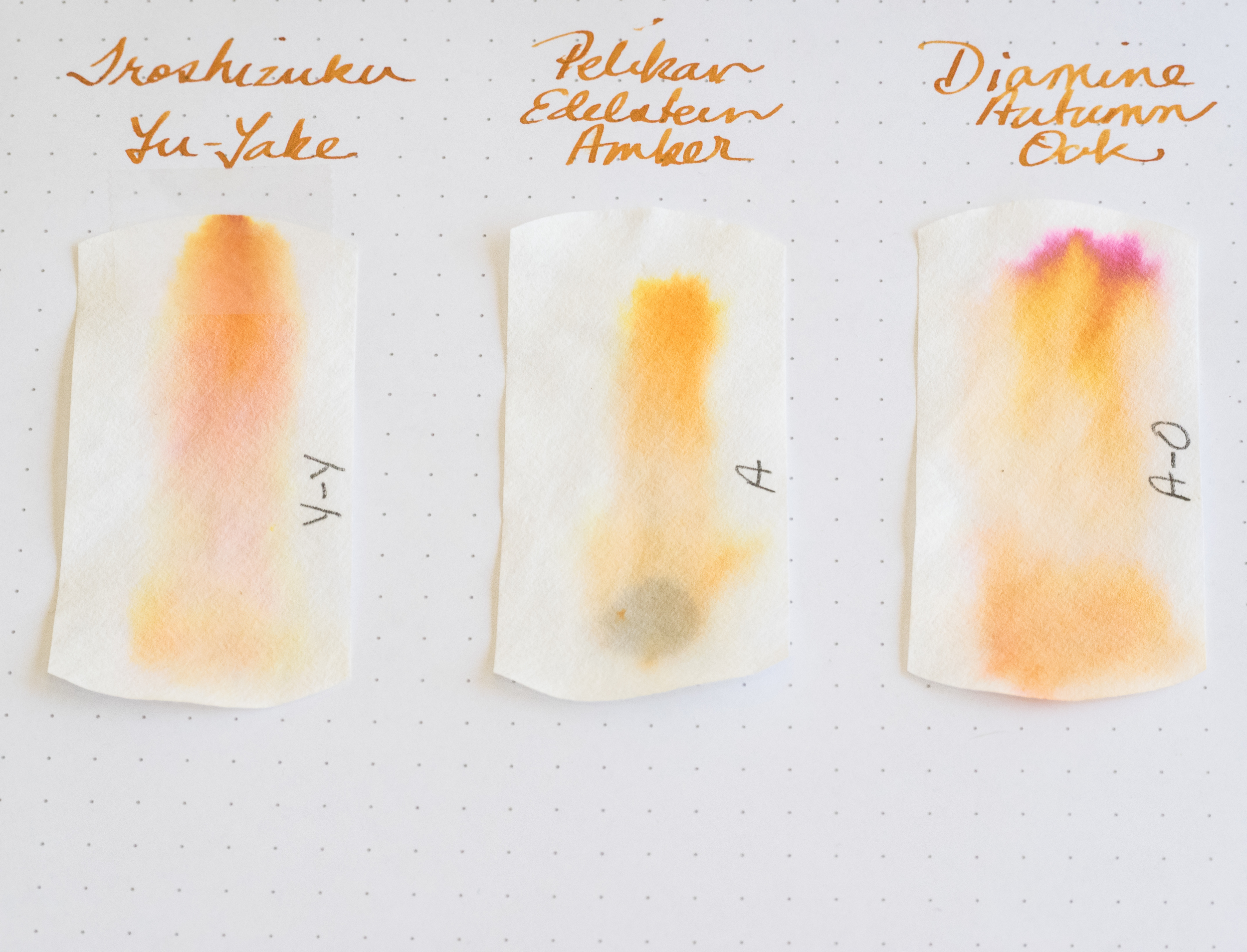
Although the ink sparkles, I only detected sheen in my splash samples not in my writing samples. You can see a bit of magenta along the edges.

I compared Bung Box Sapphire with some of my other blue inks. All of them have distinctive characteristics. I would say Sapphire and Asa-Gao are the closest in terms of chromatography. Both have a little bit of magenta in them. But I think Bung Box Sapphire stands out (along with Akkerman Shocking Blue) as the most vivid color.

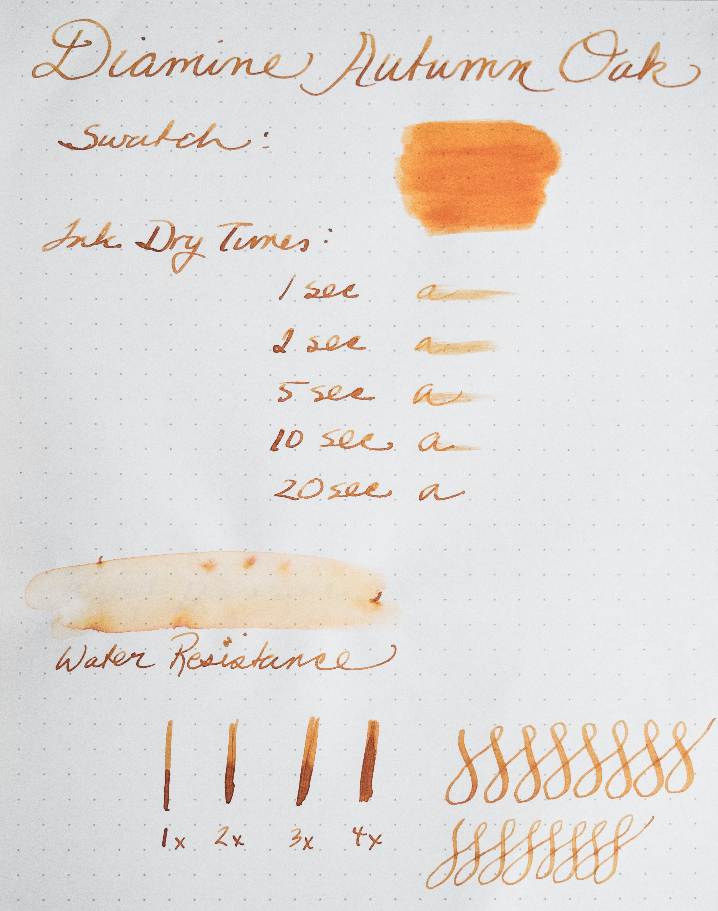
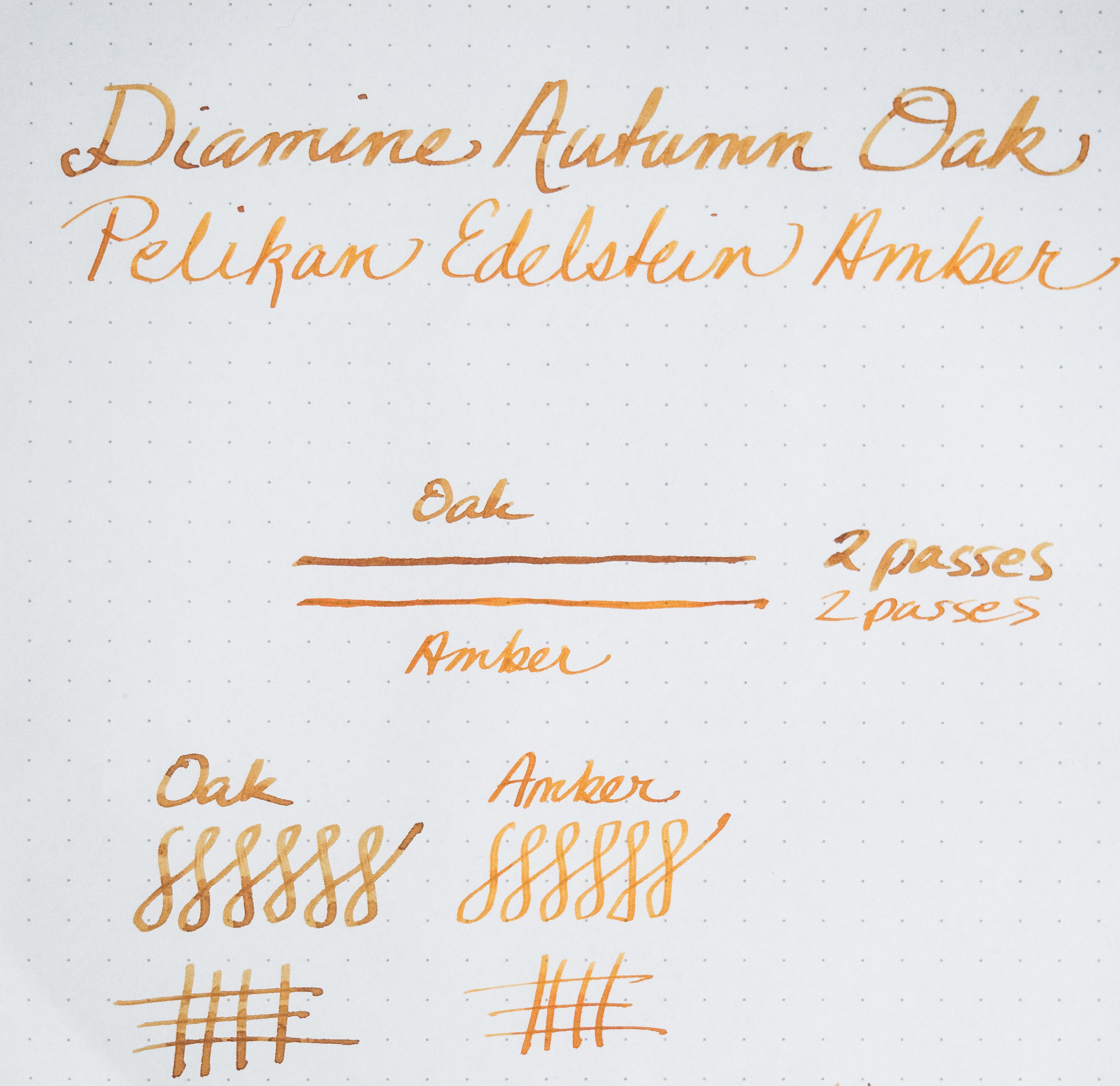
Bung Box Sapphire is an exquisite ink. It flows well and its dry times are in the normal range, at least with a fine nib on a Rhodia dot pad. With wider nibs, the dry time is longer. The ink is not waterproof.
One thing I've noticed about all my Sailor inks is that they have a distinctive odor. Apparently, they contain the chemical phenol to prevent mold or other contaminants from growing. In his glossary, Richard Binder says, "Phenol is an effective fungicide, acting as a protoplasmic poison, and was used for this purpose in ink until prohibited by law. (It is also toxic to forms of life other than fungi and is regulated as a Class B poison.) Phenol has a sweet, tar-like odor that is readily detected in inks containing it." I need to do more research on this ingredient as it can be rather caustic. I wonder if it can damage vintage pens, especially celluloid ones? Just in case, I'm not planning on using Sailor inks in any of my celluloid pens until I know more.

Sailor Bung Box Hatsukoi Sapphire is a unique, vibrant blue with excellent shading and some sheen. You can purchase this ink at Vanness Pens for $35.65 plus shipping, but only if you're really fast and lucky.