Posts filed under Ink Reviews

Franklin Christoph Midnight Emerald Ink Review

(Jeff Abbott is a regular contributor at The Pen Addict. You can find more from Jeff online at Draft Evolution and Twitter.)

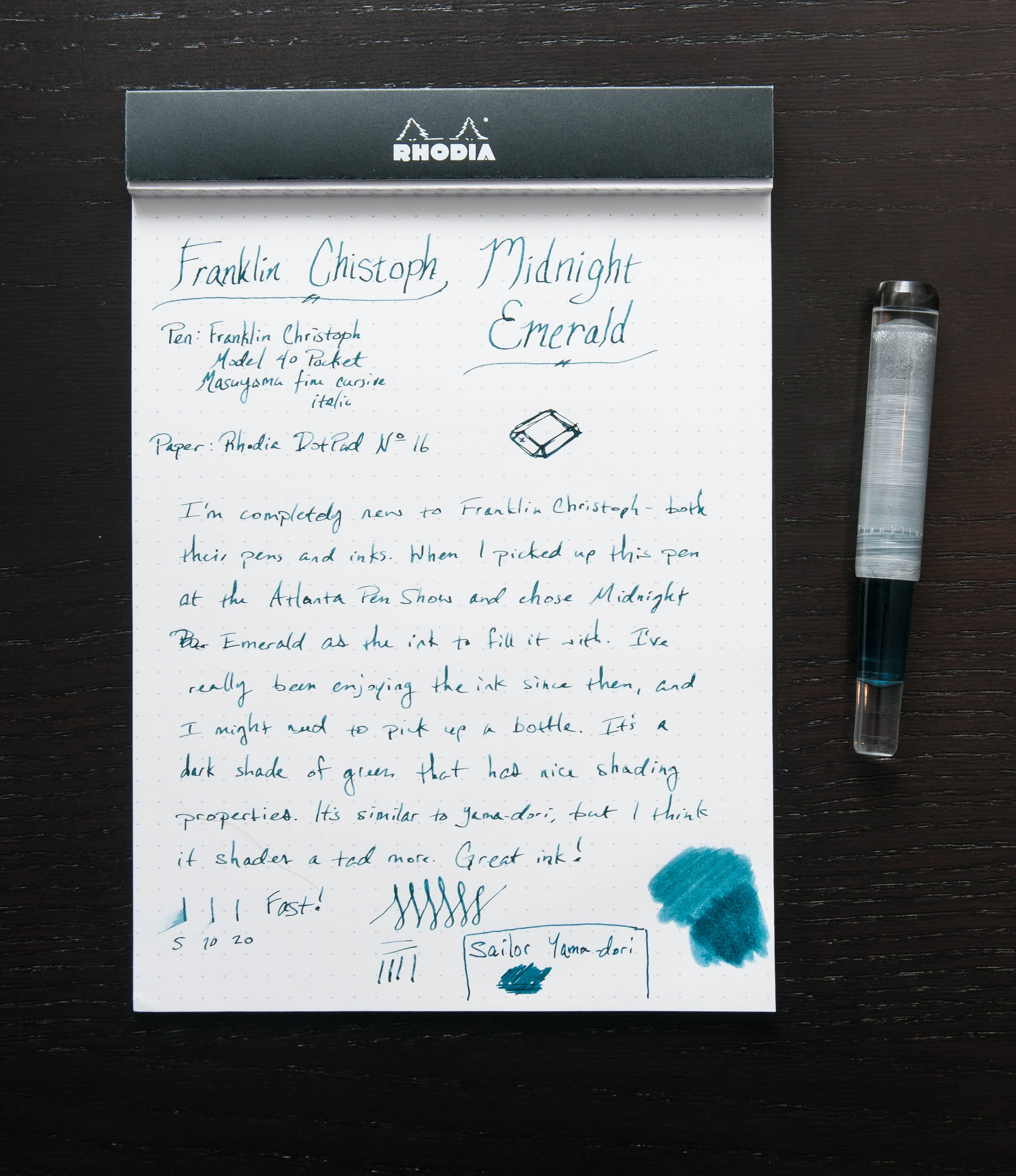
One of the purchases I made at the Atlanta Pen Show this year was a new Franklin Christoph fountain pen, but I'm saving that review for later. What I've been really impressed with so far (apart from the pen and nib) is the ink they supplied with the pen — Midnight Emerald. It's a beautiful shade of green that shades nicely and looks great inside the pen.

I've tried several green inks over the past couple of years. Like all colors, there are countless shades and properties to choose from. Luckily, my taste in colors is always changing each month. As part of the buying process, the nice folks at Franklin Christoph offer to fill your new pen with one of their inks. After a quick look at the ink sample sheet, I settled on the Midnight Emerald because it was non-standard and caught my eye compared to the others.

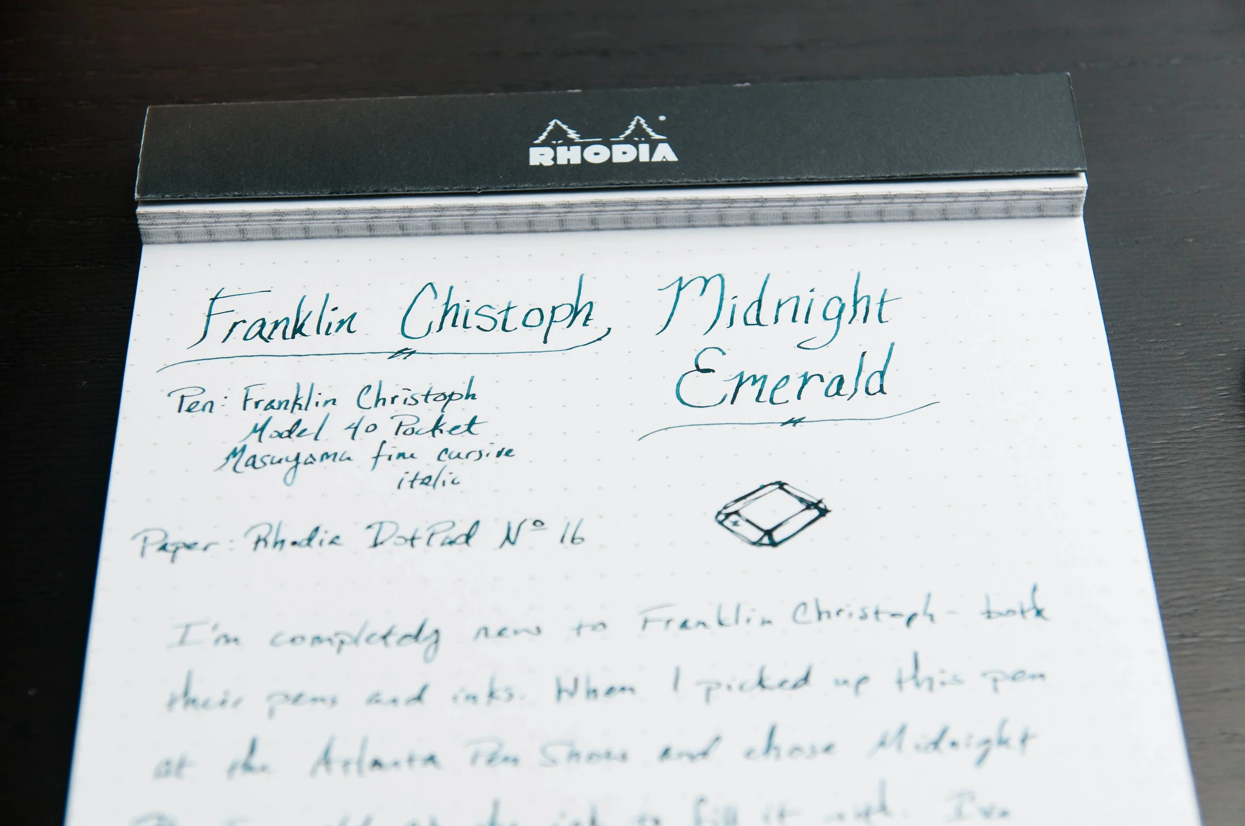
I was a little distracted when first trying the ink because I was mostly focused on the new pen, but after a few lines I started to notice the subtle shading and elegant color of the ink. Huge score with this complimentary ink.

Now, what makes this ink great? Well, like any ink, it comes down to several properties and personal taste. It's a nicely lubricated ink, doesn't feather easily, has nice shading properties, and has a great dark-green color that I love.

To be fair, I haven't tried cleaning it out of my pen yet as I haven't quite gone through it all. I was really hesitant to do an ink swab on the sample page since that's a good amount of ink that I'd rather use when writing, but the swab looks nice too. And, considering that the ink is really well-priced ($12.50 for 59ml), I don't think I'll continue worrying about running out because that means I'll just have the chance to buy a whole bottle.

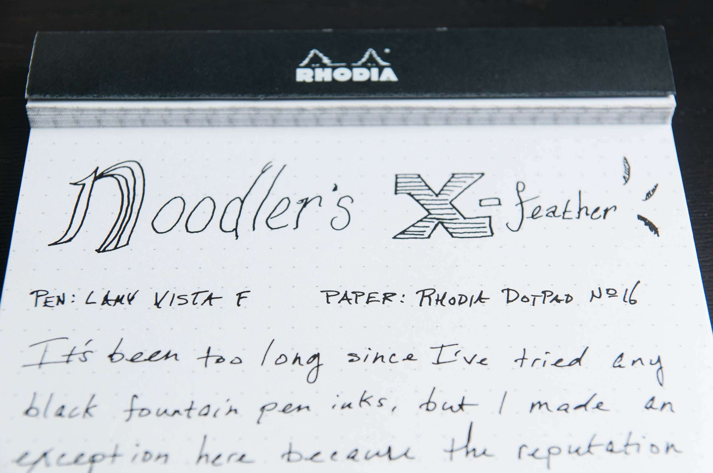
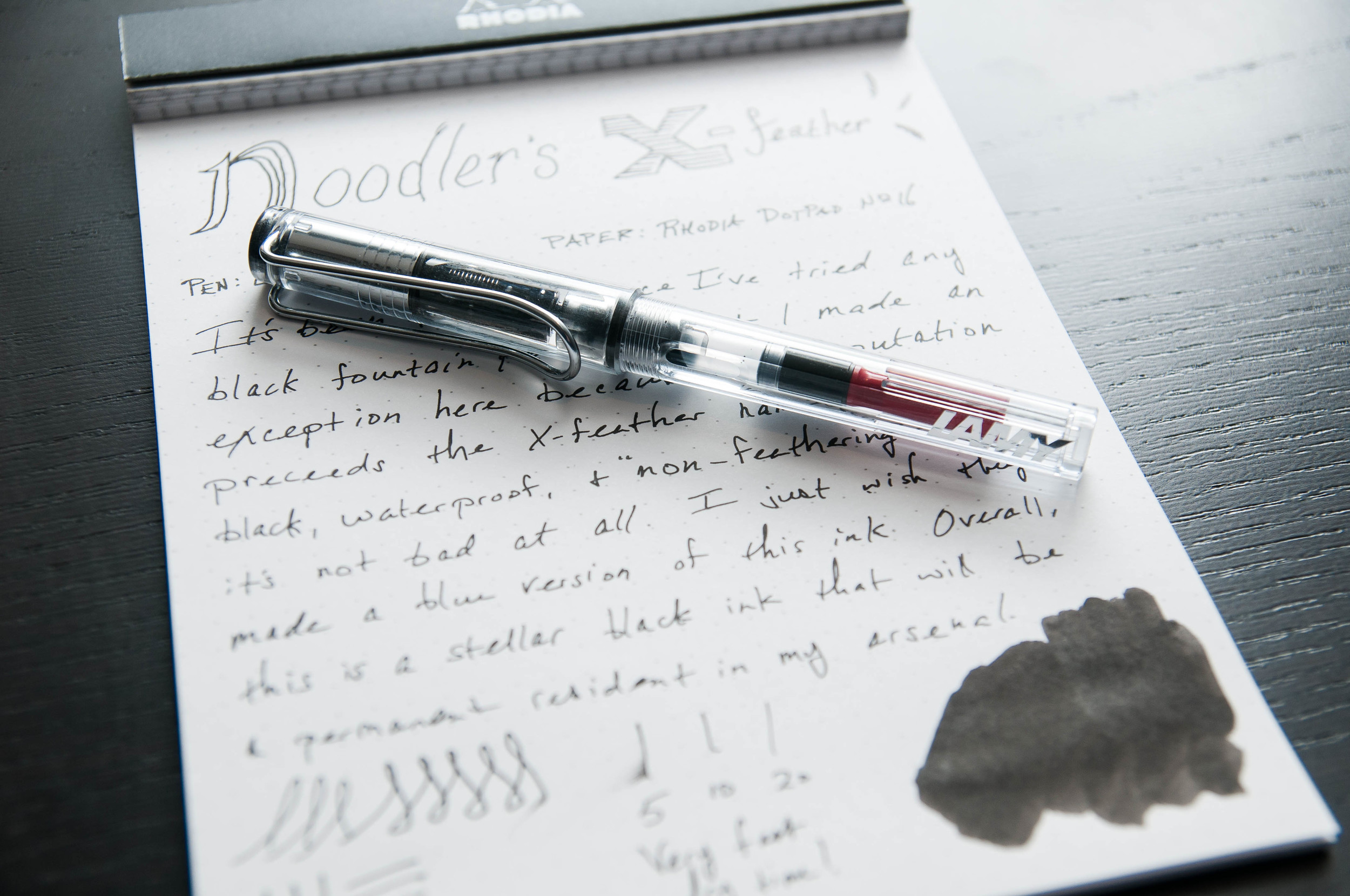
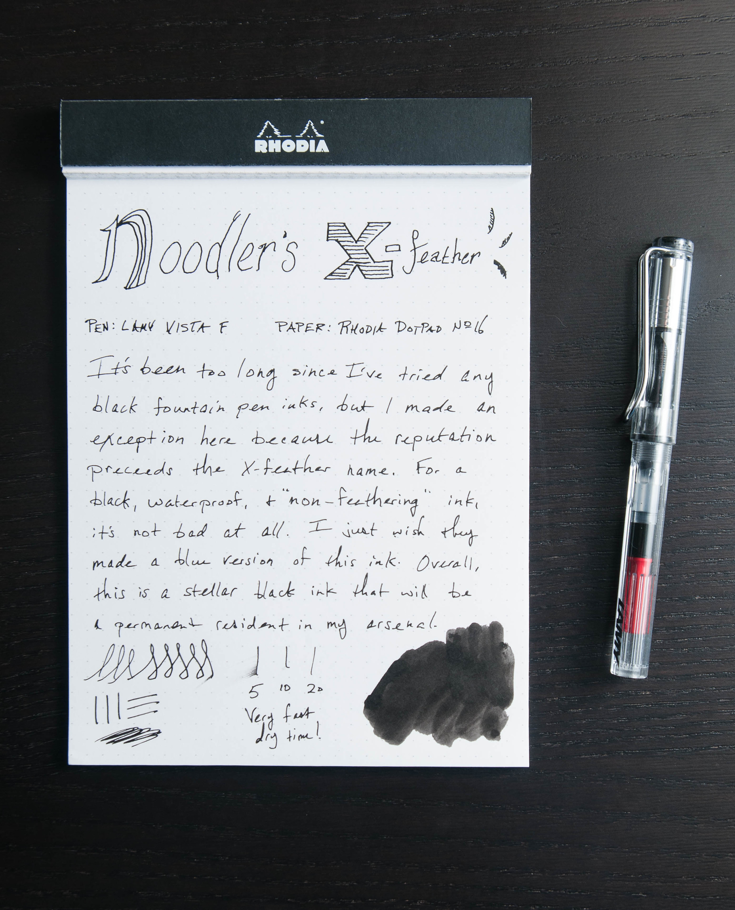
Compared to several other inks I'm using at the moment, Midnight Emerald is fairly resistant to feathering. Yes, it feathers on cheap paper, but it's minimal. Honestly, it's fairly similar to Noodler's X-Feather, which I happen to still have inked from an earlier review.

And then, there's the shading. I'm a huge fan of inks that have shading properties. Can't really explain why, but I know that shading makes me smile. I like the variation in color and depth. It's adds more character to the pen strokes and adds (subtle) visual interest to the letters. In this ink, it's not extravagant, but it stands out enough to be a delight.

The color/hue is similar to Sailor Yama-dori. When you compare them side-by-side, the differences are fairly obvious, but the basic color is close. Basically, it's a dark green. I wouldn't go so far as to call it a black-green, but it's dark. Only on thin, fast strokes does it turn to a medium green.

Overall, I'm extremely happy with this ink, and I look forward to buying a bottle of this once I run out. As I understand, this is a fairly new ink to Franklin Christoph. If there other new inks are similar to this one, that's a very good thing.

Posted on April 29, 2015 and filed under Franklin-Christoph, Ink Reviews.

Noodler's X-Feather Black Ink Review

(Jeff Abbott is a regular contributor at The Pen Addict. You can find more from Jeff online at Draft Evolution and Twitter.)

Admittedly, it's been a long time since I've tried out a new black ink. I've been really obsessed with all the different colors available that I forgot about the old standard. In all honesty, I haven't tried a new black ink since I wrote a review about Noodler's Heart of Darkness a year and a half ago. My philosophy on black inks is: you only need one.

Well, that might be true, but the choice isn't an easy one. Let me introduce Noodler's X-Feather — a brilliant, well-behaved black ink that is surprisingly resistant to feathering.

At first glance, this is just an ordinary black ink that you might have a hard time telling apart from other Noodler's black inks (or other black inks of any brand). It's a rich black, it's well-lubricated (maybe a tad dry), and dries pretty quickly. What's the selling point with this one? Well, for one, it supposedly feathers a lot less than other inks — especially on cheap paper. I tested this out on some 20# copy paper, and it actually did pretty well compared to a couple of Iroshizuki inks that I had nearby. Does it still feather? Yes, but you have to look closely to notice it.

Unlike some black inks, this one is a rich, dark black. There's a tiny bit of shading if the nib is wide enough, but it's difficult to detect. Honestly, I can't tell a difference between this and Heart of Darkness, so that's a big win.

When writing, the ink is smooth and flows very well. Again, on par for Noodler's. Cleaning the ink out of a pen is simple and doesn't cause any headaches. I'd say this ink is right in the middle of the wet/dry spectrum. It might be a tad wet for some tastes, especially in wider nibbed pens.

As the name implies, this ink does really well in the feathering department. Both feathering and show-through are minimal with this ink, which makes it ideal for use on cheap papers or papers that tend to cause ink tendrils due to the composition. No control over the paper quality you use? This is a good ink to try.

I'm not concerned with water resistance, but I tried it out with this ink since it's one of the bullet points on the description of the ink. Lo and behold, it does really well when water is introduced. A little cloudiness shows up, but the lines are true.

At the end of the day, this is a solid black ink. It's not exciting, but I don't think it was meant to be. If you need a reliable, water-resistant, non-feathering black ink, then this is a strong option for you to consider.

Of course, you can purchase a whole bottle if you want to dive in, or you can try out a sample to make sure it's everything you hope it to be.

Posted on April 15, 2015 and filed under Ink Reviews, Noodler's.

Diamine Sargasso Sea Ink Review

(Susan M. Pigott is a fountain pen collector, pen and paperholic, photographer, and professor. You can find more from Susan on her blog Scribalishess.)

Diamine Sargasso Sea is a rich, blue ink named after a region in the Atlantic Ocean. Known as the Northern Atlantic Subtropical Gyre, the region is defined by the ocean currents that surround it rather than by land boundaries. The sea is covered with patches of seaweed called Sargassum. The seaweed is bright orange, but the sea itself is a deep, tropical blue. (Source: National Oceanic and Atmospheric Administration)

This ink is well named. It is a highly saturated blue, evocative of the deep sea at dusk. It flows well, and, as with most Diamine inks, exhibits no negative characteristics. It works well in both wide and fine nibs, though, as always, you will get more shading with wider nibs. I didn't get any bleed through in spite of the ink's rich color.

I've been using this ink in a Pelikan M600 with an italic nib, a Platinum 3776 with a fine nib, and a Conway Stewart with a medium flex nib. I like it in all three pens. It is such a striking color that it's enjoyable to use for journaling, grading, and correspondence.

Because the ink is so saturated, it is difficult to see much shading unless you look closely. My macro lens also revealed some sheen to the ink.

The ink takes some time to dry fully on the Rhodia paper I used for my handwritten review. I've not had any problems with it smudging or being too wet in my Tomoe River journal.

I really love this ink's rich, blue color. I'm usually a fan of blue-black inks, but there's something about Sargasso Sea that delights me. A comparison with other blue inks is below.

You can purchase Diamine Sargasso Sea in two sizes at JetPens: 30ml ($7.00) or 80ml ($14.50).

Posted on April 10, 2015 and filed under Diamine, Ink Reviews.