Posts filed under Ink Reviews

Parker Penman Sapphire Ink Review

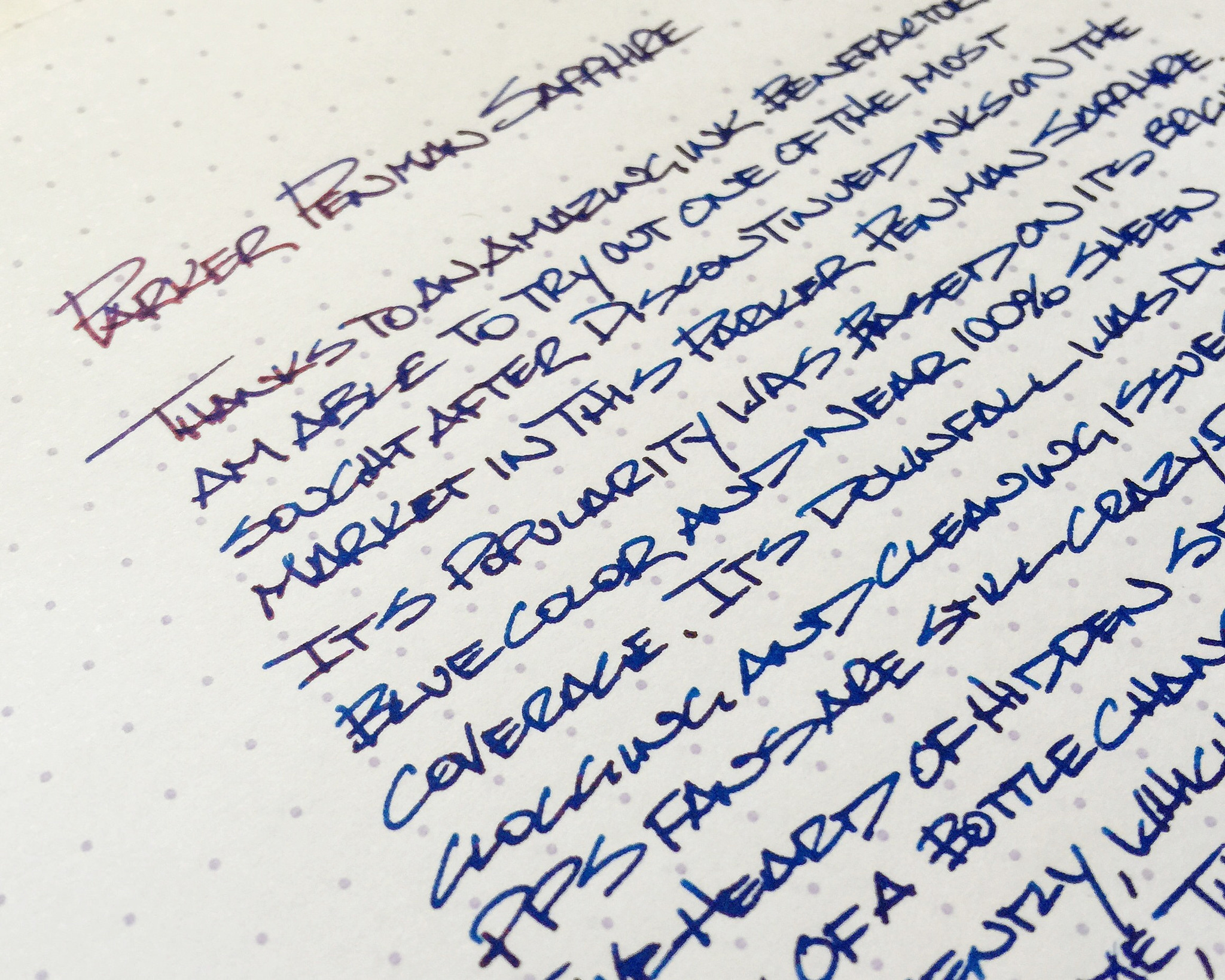
You have heard me talking about grail pens before, but is there such a thing as a grail ink? Lovers of Parker Penman Sapphire would undoubtedly say yes.

What makes this ink so special? For starters, it was only produced from 1993 to 2000. That brings on a rarity other readily available inks do not have. But there is a valid reason why Parker no longer makes it: It damages pens. Sounds wonderful, doesn't it?

Fans of Parker Penman Sapphire don't seem to care that it may stain and clog pens. To them, the vibrant blue color, deep saturation, and amazing sheen are worth the tradeoff. I see all of those things in my sample, which was sent to me by my wonderful ink benefactor in a vial simply marked "PPS". It is a very nice shade of blue, and the sheen is amazing - nearly 100% sheen on some of my letters - but overall I don't see what all the fuss is about. There are so many amazing blue inks currently on the market.

That is part of the chase right now for fans of PPS. When they aren't shelling out $75 or more for a bottle on the secondary market, the hunt is on for the closest match currently being produced. Private Reserve American Blue comes up in my searches as a close comp, as does Diamine Majestic Blue, Noodler's Baystate Blue (with staining and clogging built right in!), and Sailor Bung Box Sapphire. (Comparison shot of the last two and PPS found here.)

For me, I don't get it. It's a fine ink, and the sheen is undeniably cool, but it probably wouldn't crack my top 20 inks if I were to even effort a list like that. And that is only if it was currently available. I certainly don't see paying a premium for it. You won't find a stash of Parker Penman Sapphire hidden under my bed anytime soon.

Posted on March 13, 2015 and filed under Ink Reviews, Parker.

Rohrer & Klingner Verdigris Ink Review

(Jeff Abbott is a regular contributor at The Pen Addict. You can find more from Jeff online at Draft Evolution and Twitter.)

As another part of the Ink Drop subscription from January, I finally got around to inking up the Verdigris sample from Rohrer & Klingner. This, like most of the samples, was one that I was completely unfamiliar with, so I looked it up online to see what I could expect. From what I could tell, I was expecting a black-green or black-teal color, which seemed like an interesting color that could add some interesting pop to the page. So, I inked it up in a Lamy Vista with a fine nib.

First, let's talk about the properties of the ink. This is my first experience with this brand, so I was really interested to see how it behaved in the pen and on the page. I've heard many, many great things about several of the other inks from the brand.

This ink is exceptionally smooth on the page. It's a real joy to write with. Dry time leaves something to be desired, but it's not terrible. If you're a left-handed writer, you might not do well with this one. There's a very small degree of shading that's really only noticeable under bright light. Even with a wide nib, it was difficult to coax out any shading. I didn't notice until taking pictures with an off-camera flash that there's a bit of sheen visible in this ink. If only this were visible under normal light, that would be fantastic! As it is, though, shading and sheen are hardly noticeable in real situations.

Now, I don't intentionally sniff new inks, but I do notice any scents that come up while writing. This ink does have a slight scent, but it's not bad. It's very similar to other ink smells that I've noticed in the past.

Cleaning the ink out of the pen is incredibly easy. I don't believe that this ink has the same reputation as other inks, such as Scabiosa, which has warnings about leaving it in a pen for long without being used because it's an iron gall ink. Of course, it's not a great idea to leave ink in a pen unused for too long, but Verdigris is more in line with "normal" inks.

As far as a drip test, the ink did not do well. Not surprising, but worth mentioning since it does have some black in it.

Which brings me to the color. This is a green-black ink that sometimes has some blue showing through, so maybe a teal-black. Either way, the black side of the ink is predominant in a way that makes the other colors difficult to detect. I've always disliked (insert color name here)-black inks that lean really far into the black territory, and this one is no exception. Keep in mind, this is just my own personal preference, but when using this ink, I'm disappointed by the lack of color on the page. Again, only in bright light is it possible to see the green (and sometimes blue) peeking through. For me, I like just a bit less black in these types of mixed inks, and Verdigris is just too dark.

Is it a great ink? Absolutely. Is it one that I'll use again? Probably not. Why? The color (or lack thereof) just isn't for me. Keeping all that in mind, this might be just the ink you've been looking for, and, if so, I highly recommend it to you. Otherwise, I'd stay away unless you're looking for a black ink that sometimes lets a tad of green/blue peek through.

Posted on March 4, 2015 and filed under Rohrer & Klingner, Ink Reviews.

De Atramentis Black Edition Black-Brown Ink Review

(Jeff Abbott is a regular contributor at The Pen Addict. You can find more from Jeff online at Draft Evolution and Twitter.)

To be honest, I didn't know brown-black inks were a thing until one showed up in the January Ink Drop shipment. I wasn't excited about it because brown is usually associated with drab and boring. It ended up being the last one I tried in the group, and I have to say I was pleasantly surprised by the ink.

The ink in question is the De Atramentis Black Edition Black-Brown. Long name, right? Let's break it down. The maker is De Atramentis — German. This ink belongs in a special edition (Black Edition) that come in a black glass bottle to keep the light from affecting the ink. Finally, black-brown is the color.

How do you make a brown ink non-boring? You add shading properties to it. Now, there isn't a ton of shading going on here, but it's enough to add a lot of interest to the ink as you're writing. Also, the hue of the ink is a really pleasant color. It's a warm, calm brown. It's dark enough to be inconspicuous, but has just enough character to attract attention from the more detail-oriented eye.

Another lovely quality is the lubrication. This ink is smooth. My Monteverde Artista is a smooth pen to begin with, but this ink makes it feel like the nib's had a new polish. The feel of the ink is very pleasing.

Strangely, the ink does has a smell when writing. I can't quite place the smell because my sense of smell is atrocious, but it reminds me of crayons and watercolors. It's not a bad smell, but it makes me think of art supplies and art class.

The ink is easy to clean out of the pen, which is always a nice bonus and something I've been more aware of after trying J. Herbin's Rouge Hematite.

I don't normally do this, but I was curious as to the water resistant nature of this ink, so I did a drip test. It actually did really well for being a colored ink. I guess that is thanks to the black in the ink that makes it more permanent. I can't say anything about the archival properties of the ink, but I would assume it's better than average compared to other brown inks.

If you're interested in a dark brown ink that has some unique characteristics, definitely give this one a try. I know I was certainly surprised by how much I liked it.

Posted on February 18, 2015 and filed under Ink Reviews, De Atrementis.