Posts filed under Ink Reviews

Sailor Jentle Yama-dori Ink Review

image.jpg

(Jeff Abbott is a regular contributor at The Pen Addict. You can find more from Jeff online at Draft Evolution and Twitter.)

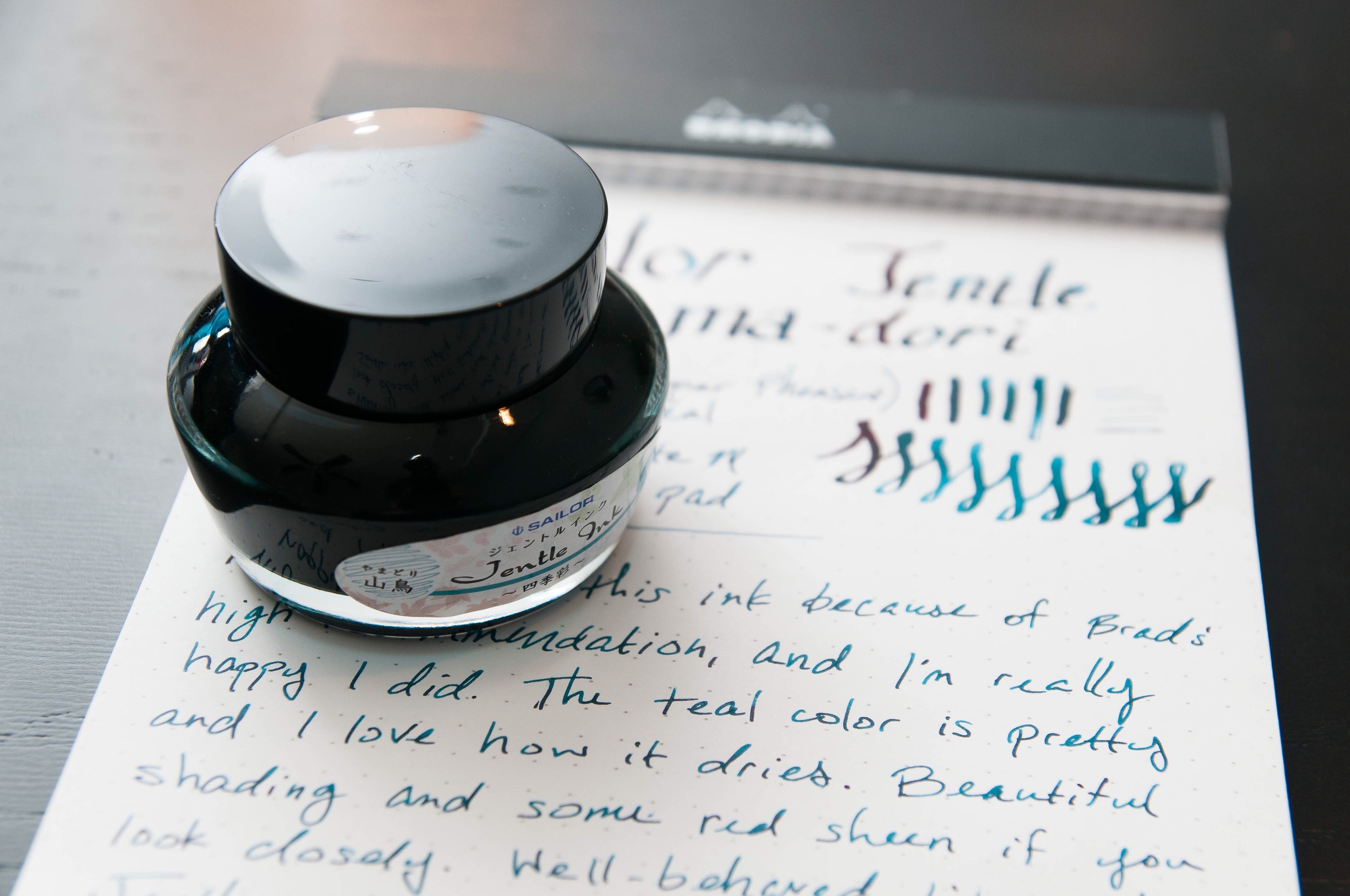
Back in July, I reviewed Noodler's Turquoise and came away with an urge to try more blue-green inks. So, here we are — I picked up a bottle of Sailor Jentle Yama-dori on Brad's recommendation. He seems to know a thing or two about good inks, so I figured I couldn't go wrong. Turns out, I really enjoy blue-green inks, and I especially enjoy Yama-dori.

If you listen to the podcast much at all, you'll pick up on a trend with Brad's ink tastes (or just look at the Top 5 lists) — he loves some blue-black inks. I like a good blue-black just fine, but some of them get so close to black that I don't end up using them very often. I like the flare and unique colors of some blue-blacks, but it seems like most are too dark for my tastes. That's where Yama-dori comes in. It's a fairly dark ink, but it's blue-green, shades beautifully, and has a red sheen. It's a delightful ink.

From a standard ink perspective, this is a very well-behaved ink. It dries relatively fast (just after 5 seconds for me in a medium nib), doesn't bleed through, doesn't feather much on cheap paper and not at all on premium paper, and cleans out easily. What really sets this ink apart for me is the color, shading, and confusing red sheen. Yep, red sheen in a blue-green ink. I can't begin to explain how that works, but it's fascinating to watch the pooled up ink give off a red color in certain lights. It looks as if someone wrote some lines with a medium blue-green ink and then came back with a red highlighter to fill in the darker parts later. It's unique, and I love it.

Now, I don't know about you, but I don't know much about pheasants. I don't think I've ever seen one in person. When Sailor calls this ink "copper pheasant," I'm not really sure what to think because I don't know whether pheasants are copper or not. After a quick search, I landed on the green pheasant that's native to Japan. Take a look at the male plumage and take a guess at why Sailor named this ink after it. Pretty obvious, right? Dark green, brilliant blue, and shiny red feathers.

If you want an ink that looks professional but has a unique color, Yama-dori is a great color and behaves well. Personally, ever since I've gotten this ink it's always been in at least one pen. I love the blue-green colors because they're brilliant when you look closely under the light. Yet, it's mild and dark enough to be perfectly legible and professional. It has a royal, mysterious feel to it, and I can't get enough of it.

50 mL of the ink will run $20, which is the normal price for the Sailor Jentle line. The bottle (like the other Sailor bottles) has a nifty cone inset that allows you to easily draw up ink even when the ink level gets a bit low. Also, Sailor gets major points in this bottle design because the mouth of the bottle is extra wide. It's frustrating to get a new ink only to find that your favorite pen is too fat to get into the bottle. Well done, Sailor.

(JetPens provided this product at no charge to The Pen Addict for review purposes.)

image.jpg
image.jpg
image.jpg
Posted on January 21, 2015 and filed under Sailor, Ink Reviews.

Caran d'Ache Chromatics Magnetic Blue Ink Review

Being a fan of blue black inks, there is a lot to like about Caran d'Ache Chromatics Magnetic Blue. But regardless of if I like the color or not, there is one big, BIG hangup with this ink.

The Chromatics line was created to mimic the color spectrum found in a prism, and the 12 colors represent a very nice range. The Magnetic Blue I chose is a nice cloudy blue with hints of grey and a hint of purple. The shading is average, with a narrow range of color found in my lines. You can see it, but the shading is not necessarily a standout. The smoothness and lubrication of the ink is a highlight, flowing true and easily form the nib. It is a long-drying ink though, one of the longest I recall testing. When using it in my Midori Travelers notebook I actually had it transfer to the previous page when shutting the book.

Ranking it against only the other blue black inks I use frequently, it's not top 5 material on color alone. It's just not special enough to stand out from the crowd, and therein lies the major problem. It will cost you $38 dollars to try out an average ink.

This is easily the most expensive bottle of ink on my shelf and it will be rarely used. Looking at the swatches on JetPens I think I would have been happier with one of the brighter colors like Electric Orange or Hypnotic Turquoise. I use so many blue black inks I am very sure of where this ranks, so picking a different color may have left me more impressed. Still, for a premium ink it doesn't do enough for me to justify the price. Pilot Iroshizuku has nothing to worry about.

Have you used any of the Caran d'Ache Chromatics inks? I've love to get some feedback and comments if you have. Let me know what I am missing!

(JetPens provided this product at no charge to The Pen Addict for review purposes.)

Posted on January 9, 2015 and filed under Caran d'Ache, Ink Reviews.

J. Herbin Stormy Grey Fountain Pen Ink Review

I've only been deep into fountain pens and inks for a few years and I don't recall a product - especially an ink - causing this much noise in our little world. J. Herbin Stormy Grey has taken the internet by storm, proving that we all like shiny and new. Especially shiny.

Gold flecks contained within the deep grey ink are the big selling point in J. Herbin's latest anniversary ink release. Rouge Hematite, the first release in the 1670 series, also had a gold feature, but in the form of a sheen, not actual flecks in the ink. That one slight change really sets Stormy Grey apart.

The grey is a beautiful, saturated coal grey, bordering on light black. I had zero flow issues in either my TWSBI 1.5 mm stub nib that this writing sample was done with, or a medium dip pen nib which I used for a few notes. I found the gold flecks to be inconsistent, with a heavy presence on some letters, and a light to no presence on others. This happens when there are actual physical materials that need to be dispersed within the ink.

My biggest issue with Stormy Grey is the additional maintenance required to keep the ink flowing consistently. J. Herbin even has a label warning:

Having these additional things to worry about doesn't fit my usage pattern. I would be very worried to leave this ink loaded for more than a week or two. Plus, the bottle and reservoir shaking that is needed to get even fleck dispersion before use is annoying. Using a dip nib is an option, but that limits portability.

I must be the only one with this issue though, as JetPens can't seem to keep it in stock. There was a short reload right before Christmas that vanished within hours, so if you want to get your hands on this ink be sure to sign up to be notified when inventory becomes available again.

(JetPens provided this product at no charge to The Pen Addict for review purposes.)

Posted on December 26, 2014 and filed under Ink Reviews, J. Herbin.