Posts filed under Franklin-Christoph

Franklin-Christoph Model 65 Stabilis Review

(Susan M. Pigott is a fountain pen collector, pen and paperholic, photographer, and professor. You can find more from Susan on her blog Scribalishess.)

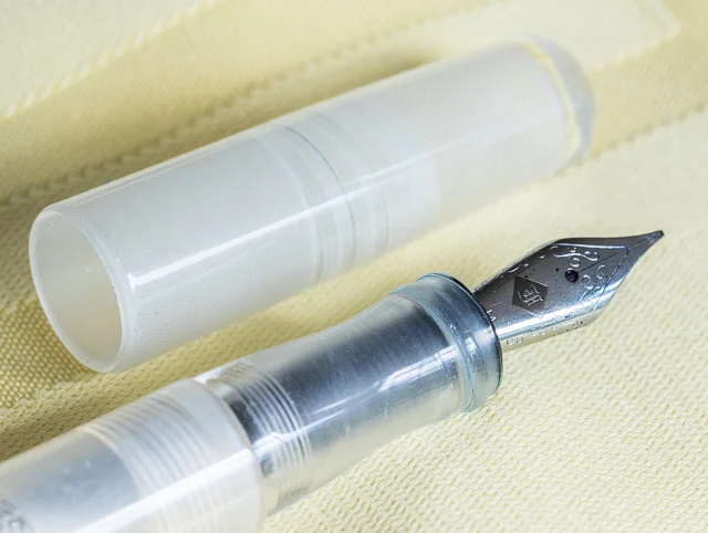
Well, I'm eating crow, that's for sure. In my review of the Franklin-Christoph Model 19, I claimed that I was not interested in the ice models that the company makes. I now own an ice model, and it is one of the coolest pens I own (pun intended).

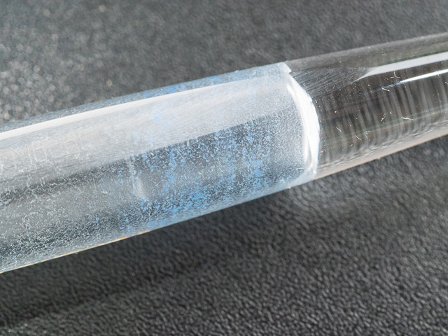
I sent back the Model 19 after I decided it was too big for my hand. Following many emails back-and-forth with Lori in customer service (she gets new angel's wings every time I email her), I finally decided on the Model 65 Stabilis in ice. What made me change my tune? I saw a video review of a different ice model which the reviewer had eyedroppered. When the ice is filled to the brim with ink, the result is simply magical.

The pen transforms into whatever color the ink is, but, because the acrylic looks like ice, the ink sparkles inside. The effect is unlike any demonstrator pen I've owned.

The Model 65 Stabilis is the smaller version of Franklin-Christoph's desk pens with a #5 nib (the model 65 is longer and takes the larger #6 nib). The name Stabilis comes from the pen's unique design. The barrel is round except for one small portion that is flat. This allows the user to place the pen on a desk without worrying that it will roll off. It's genius, really.

The flat side is etched with the words "Franklin-Christoph Model 65." This branding is unobtrusive but classy, especially when you see it reflected in sunlight.

Another design element that makes this pen stand out is the cap threads. Instead of the threads being on the barrel, they are at the top of the grip section. Not only does that mean your fingers never feel the threads while writing, but the threads act as the barrier between your fingers and the nib. Why didn't someone think of this sooner?

Like most Franklin-Christoph pens, the Model 65 can be used with cartridges or a converter (both are included with the pen). The fact that you can also transform the pen into an eyedropper makes it even better.

The Model 65 is light, weighing only .06 oz/17grams without ink. It measures 5.35 inches in length capped, 5.6 inches uncapped, and 6.2 inches posted. The barrel diameter ranges from .51 inches to .39 inches near the grip. The Stabilis is a full-length pen with a comfortable barrel size. The acrylic makes it extremely light and easy to write with.

I don't normally post my pens, but I tried writing with the Stabilis posted just to see how it felt. I thought posting threw the balance off slightly, but it's a subjective thing. The cap is rather small, and it's completely round (no flat side), so it can roll off the desk pretty easily. I stand it up vertically so it won't roll.

For this pen, I decided to get the Mike Masuyama stainless-steel medium italic nib.

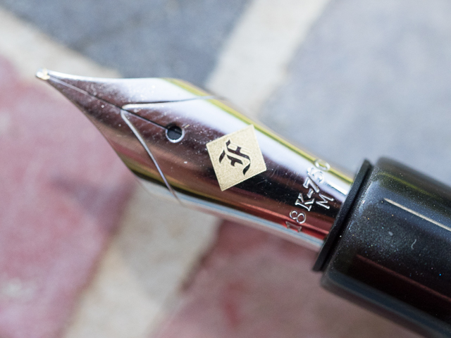
It is fantastic. In all honesty, I cannot tell the difference between this stainless steel nib and the 18k nib I had on the Model 19. In fact, I like this nib's design better–an understated "F" in an etched diamond and scroll work.

I thought the italic might be more finicky than the medium stub I had on the Model 19, but it is smooth and has a wide sweet spot. It produces a nice, crisp line and doesn't catch on the paper.

I emptied the pen after making it into an eyedropper to see how hard it is to get the ink out. I rinsed the barrel with water first, but I noticed ink residue near the bottom. I used some pen wash, shook it up pretty well, and rinsed again. Even using a Q-tip didn't get that little bit of residue out. If it makes me crazy, I'll try soaking it all night.

I disassembled the nib unit and all the ink accumulated there cleaned out nicely. Lori warned me that if ink gets in the threads it's more difficult to clean out. She suggested avoiding troublesome, highly saturated inks (which is fountain-pen-community-speak for avoiding a certain blue ink that causes major existential crises whenever it is mentioned in forums). The key is, use your common sense when deciding which inks to use if you transform the pen into an eyedropper.

The Model 65 Stabilis is a terrific pen. It suits me in every way that the Model 19 did not. The pen is currently available in classic black, solid ice, or a stunning blue-violet with numerous nib choices. Prices range from $149.50 to $244.50 depending on the nib.

I love, love, love this pen!

Pros

  • Beautiful pen at a reasonable price.
  • Versatile, since you can use cartridges, a converter, or transform the pen into an eyedropper
  • The Solid Ice model is magical when filled with ink in eyedropper mode.
  • The Masuyama stainless steel nib is fantastic.
  • This pen is absolutely comfortable in the hand.
  • Genius design elements, such as the flat side so the pen doesn't roll, and the placement of the cap threads, make this pen stand out.

Cons

  • People who prefer pens with some heft may find this pen too light.
  • Good luck trying to decide between the Solid Ice and the Violet-Blue. Even better, just get one of each!
  • Because this pen uses the #5 nib, you can't use it with the Franklin-Christoph 1.9 Music Nib which comes only in #6 size. You can get cursive italic calligraphy nibs in either 1.1 or 1.4mm sizes.
Posted on May 29, 2015 and filed under Fountain Pens, Franklin-Christoph, Pen Reviews.

Franklin-Christoph Model 19 "1901" in Smoke and Cinnamaroon: A Review

(Susan M. Pigott is a fountain pen collector, pen and paperholic, photographer, and professor. You can find more from Susan on her blog Scribalishess.)

I don't know why I never considered purchasing a Franklin-Christoph fountain pen. I've seen a few photos of their pens in ice acrylic, and those didn't interest me. But after Franklin-Christoph came out with their monster 1.9 music nib, I found myself on their Web site looking at their pen offerings. One caught my eye: the Model 19. I liked the shape of the pen, and I saw they were working on a new color combination that I thought was unique and gorgeous–smoke with cinnamaroon bands.

I haunted the site daily, wondering when the new color would come out. Finally, I emailed them to get the date and received a response almost immediately: "They're done and should be on the Web site tomorrow!" The next day I ordered one.

The pen arrived a few days later, but I made myself wait until Friday, my writing day, to open it. It was well-packaged, and by that I mean an outer postal box, an inner postal box, bubble wrap, and packing paper around a plain white cardboard box with the Franklin-Christoph logo.

Inside was a maroon leather zip pouch with the pen, two blue ink cartridges, a couple of Franklin-Christoph business cards, and a Mike Masuyama card verifying that my medium 18K nib was ground by him into stub.

The pen is large. The barrel is .61 inches in diameter, and it's certainly the fattest pen I've used. It's a good thing they included the pen pouch, because Model 19 absolutely won't fit in my Franklin-Christoph Penvelope.

Penvelope.jpg

Although the barrel is wide, the grip gradually narrows from .50 inches to .425 closest to the nib. So, while the pen itself is much wider than my other fountain pens, when you compare the grips, they aren't drastically different.

Its length is more typical of fountain pens: 5.50 inches capped, 5.1 inches uncapped, and 6.62 inches posted (though I would never post this pen). At only 28.35 grams without ink, the pen isn't heavy for its size.

Made of thick acrylic, this version has swirls of dark and light gray with beautiful sheen. The cinnamaroon bands sparkle and offer a truly unusual contrast to the smoke colors.

The clip is rhodium plated and etched with four diamonds. I never use the clip on my pens, but this one seems sturdy.

The cap top is inscribed with the Franklin-Christoph logo, and "Franklin-Christoph" is etched into the cap where ordinarily you might find a cap ring.

The nib is a single-tone, rhodium-plated 18K gold nib with minimal styling. A yellow diamond with the logo adorns the nib. I'll admit I don't like this nib's design (the stainless steel nibs are actually prettier). The etched yellow diamond clashes with the rhodium plating of the nib. I wish they had simply etched the logo into the nib itself (like they do on the stainless steel nibs) and added scroll work.

I like the size of the nib and the stub doesn't catch on the paper like some of my italic nibs do. Although the nib has no flex, it's springy, and you can get a little line variation if you press down.

I've noticed a few hard starts and a tiny bit of skipping with this nib. Normally I wash a new nib thoroughly before inking it, but I failed to do that this time. When I change ink, I'll do a good cleaning and see if the skipping stops. The problem may be related to the converter. I noticed that the ink pooled in the middle of the converter after the pen had been lying on its side for the evening. I had to force the ink down using the knob to get it flowing again.

The pen uses cartridges or an included converter. The cartridges look minuscule next to this big pen. The converter seems adequately sized, but I'm not impressed with its performance so far. It lacks a metal ball to keep the ink flowing. And, unlike other models in the Franklin-Christoph line, apparently you can't turn the Model 19 into an eyedropper.

Unfortunately, this pen is simply too wide for my small hands. I noticed that, after just a few pages of writing, my wrist felt fatigued, a problem I've not encountered with my other fountain pens. It's not the weight of the pen; the large barrel seems to be the main issue.

Franklin-Christoph offers a lifetime warranty on the pen, which tells me these pens are built to last. There's also a generous 30-day return policy, no questions asked.

You can order the Model 19 from Franklin-Christoph with a stainless steel nib in a variety of sizes for $195. If you want it with the impressively-sized music nib either in shiny stainless steel or the new stealth shadow, you'll pay $205. With 18K nibs from EF to B the cost is $285. For a Masuyama specialty nib in stainless steel you'll pay $210 and $300 for an 18K.

Pros

  • Stunning pen at a reasonable price. The smoke design with the cinnamaroon bands is unique and beautiful.
  • An amazing variety of nib choices in both steel and 18K gold.
  • Very light pen considering its size.
  • The Masuyama medium stub writes beautifully (but see below under cons).
  • Comes with a handy zippered pen pouch. You'll need this, as the pen won't fit in normal-sized pen loops or pen cases.
  • Prompt and courteous customer service.
  • Comes with a lifetime warranty.

Cons

  • This pen is large. If you have small hands it might not be comfortable for you.
  • I prefer piston-fillers over cartridge/converter pens. But converters are often easier to clean.
  • The converter does not move the ink to the feed without some user intervention, which is bothersome. This could be due to the ink I was using (Diamine Red Dragon). Some inks flow better than others.
  • My nib had some hard starts and a little bit of skipping, perhaps due to the converter/feed flow problem.
  • I don't particularly like the 18K nib design, but this is purely personal taste.
Posted on May 8, 2015 and filed under Pen Reviews, Franklin-Christoph, Fountain Pens.

Franklin Christoph Midnight Emerald Ink Review

(Jeff Abbott is a regular contributor at The Pen Addict. You can find more from Jeff online at Draft Evolution and Twitter.)

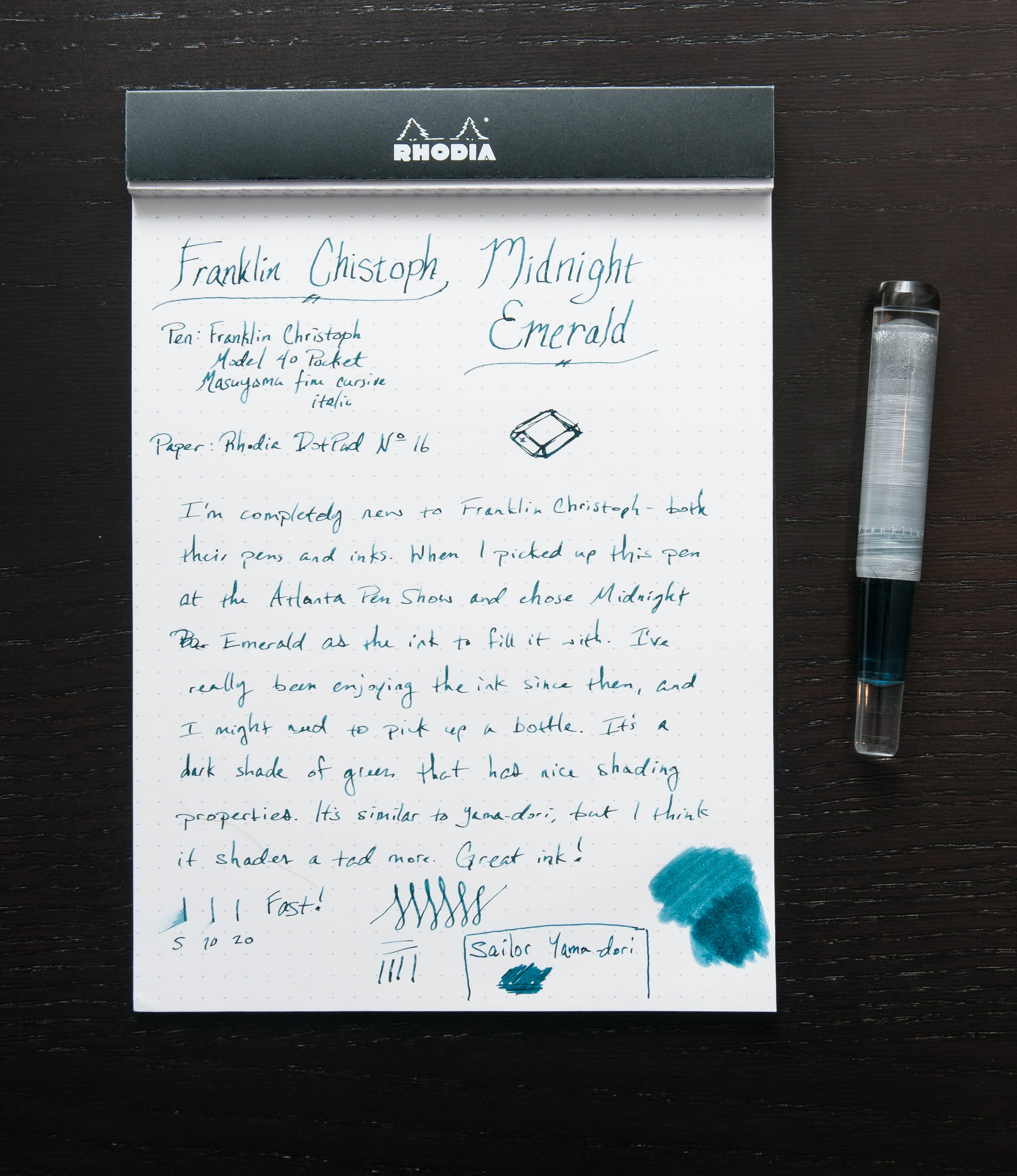
One of the purchases I made at the Atlanta Pen Show this year was a new Franklin Christoph fountain pen, but I'm saving that review for later. What I've been really impressed with so far (apart from the pen and nib) is the ink they supplied with the pen — Midnight Emerald. It's a beautiful shade of green that shades nicely and looks great inside the pen.

I've tried several green inks over the past couple of years. Like all colors, there are countless shades and properties to choose from. Luckily, my taste in colors is always changing each month. As part of the buying process, the nice folks at Franklin Christoph offer to fill your new pen with one of their inks. After a quick look at the ink sample sheet, I settled on the Midnight Emerald because it was non-standard and caught my eye compared to the others.

I was a little distracted when first trying the ink because I was mostly focused on the new pen, but after a few lines I started to notice the subtle shading and elegant color of the ink. Huge score with this complimentary ink.

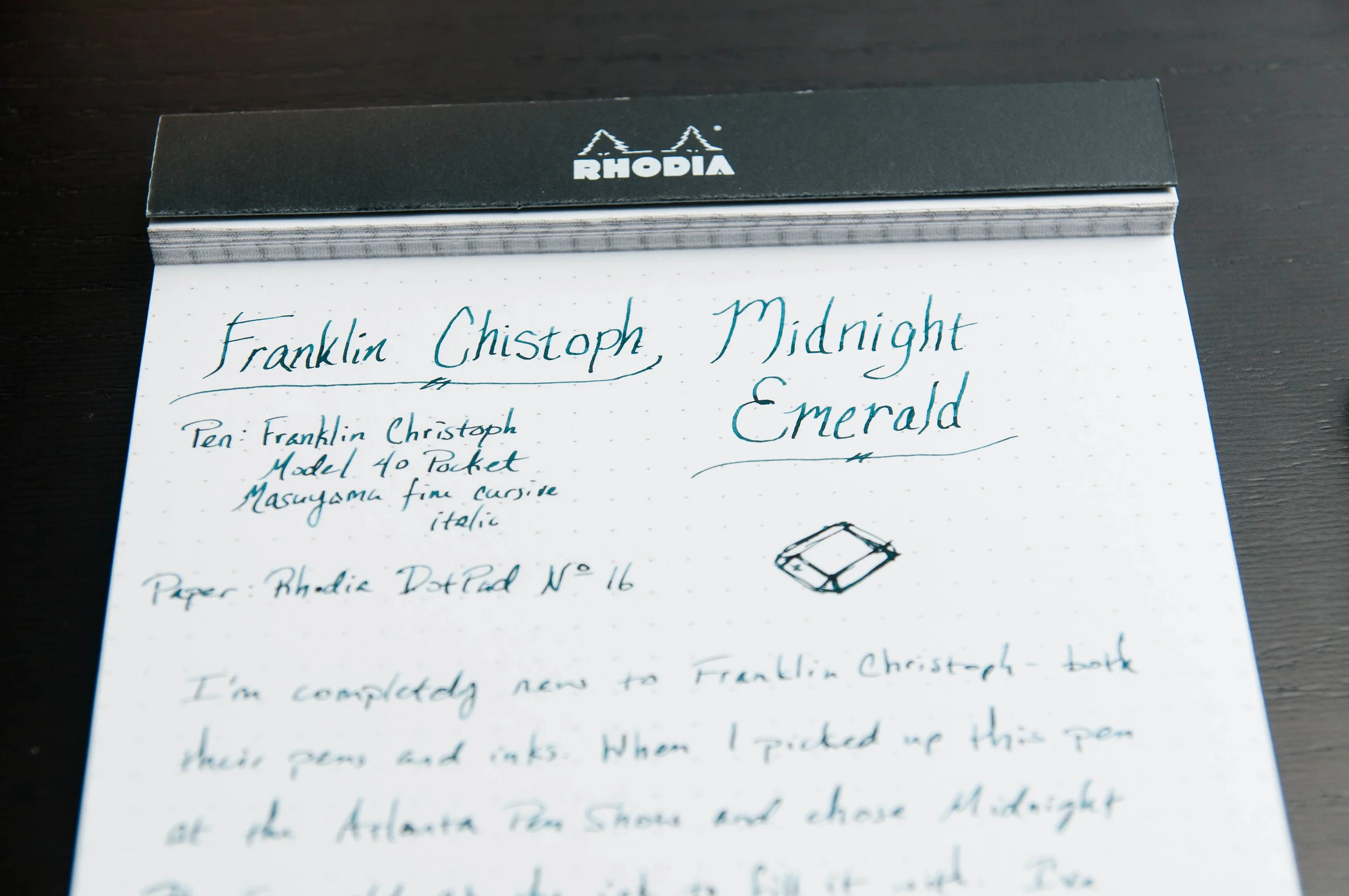
Now, what makes this ink great? Well, like any ink, it comes down to several properties and personal taste. It's a nicely lubricated ink, doesn't feather easily, has nice shading properties, and has a great dark-green color that I love.

To be fair, I haven't tried cleaning it out of my pen yet as I haven't quite gone through it all. I was really hesitant to do an ink swab on the sample page since that's a good amount of ink that I'd rather use when writing, but the swab looks nice too. And, considering that the ink is really well-priced ($12.50 for 59ml), I don't think I'll continue worrying about running out because that means I'll just have the chance to buy a whole bottle.

Compared to several other inks I'm using at the moment, Midnight Emerald is fairly resistant to feathering. Yes, it feathers on cheap paper, but it's minimal. Honestly, it's fairly similar to Noodler's X-Feather, which I happen to still have inked from an earlier review.

And then, there's the shading. I'm a huge fan of inks that have shading properties. Can't really explain why, but I know that shading makes me smile. I like the variation in color and depth. It's adds more character to the pen strokes and adds (subtle) visual interest to the letters. In this ink, it's not extravagant, but it stands out enough to be a delight.

The color/hue is similar to Sailor Yama-dori. When you compare them side-by-side, the differences are fairly obvious, but the basic color is close. Basically, it's a dark green. I wouldn't go so far as to call it a black-green, but it's dark. Only on thin, fast strokes does it turn to a medium green.

Overall, I'm extremely happy with this ink, and I look forward to buying a bottle of this once I run out. As I understand, this is a fairly new ink to Franklin Christoph. If there other new inks are similar to this one, that's a very good thing.

Posted on April 29, 2015 and filed under Franklin-Christoph, Ink Reviews.