Posts filed under Fountain Pens

Faber-Castell Hexo Rose Fountain Pen Review

(Jeff Abbott is a regular contributor at The Pen Addict. You can find more from Jeff online at Draft Evolution and Twitter.)

I'm a big fan of fountain pens that can deliver a solid fundamental writing instrument along with unique or delightful design elements for under $50. This has to be a difficult price range to deliver on, and not everyone succeeds. In my experience, the biggest letdowns in this price range usually come in the form of a unique looking pen that just doesn't write well. At $50, you want something that looks nicer than a disposable or $20 entry level pen, but you also want it to write as well as any of the fantastic pens in the lower price bracket (if not better).

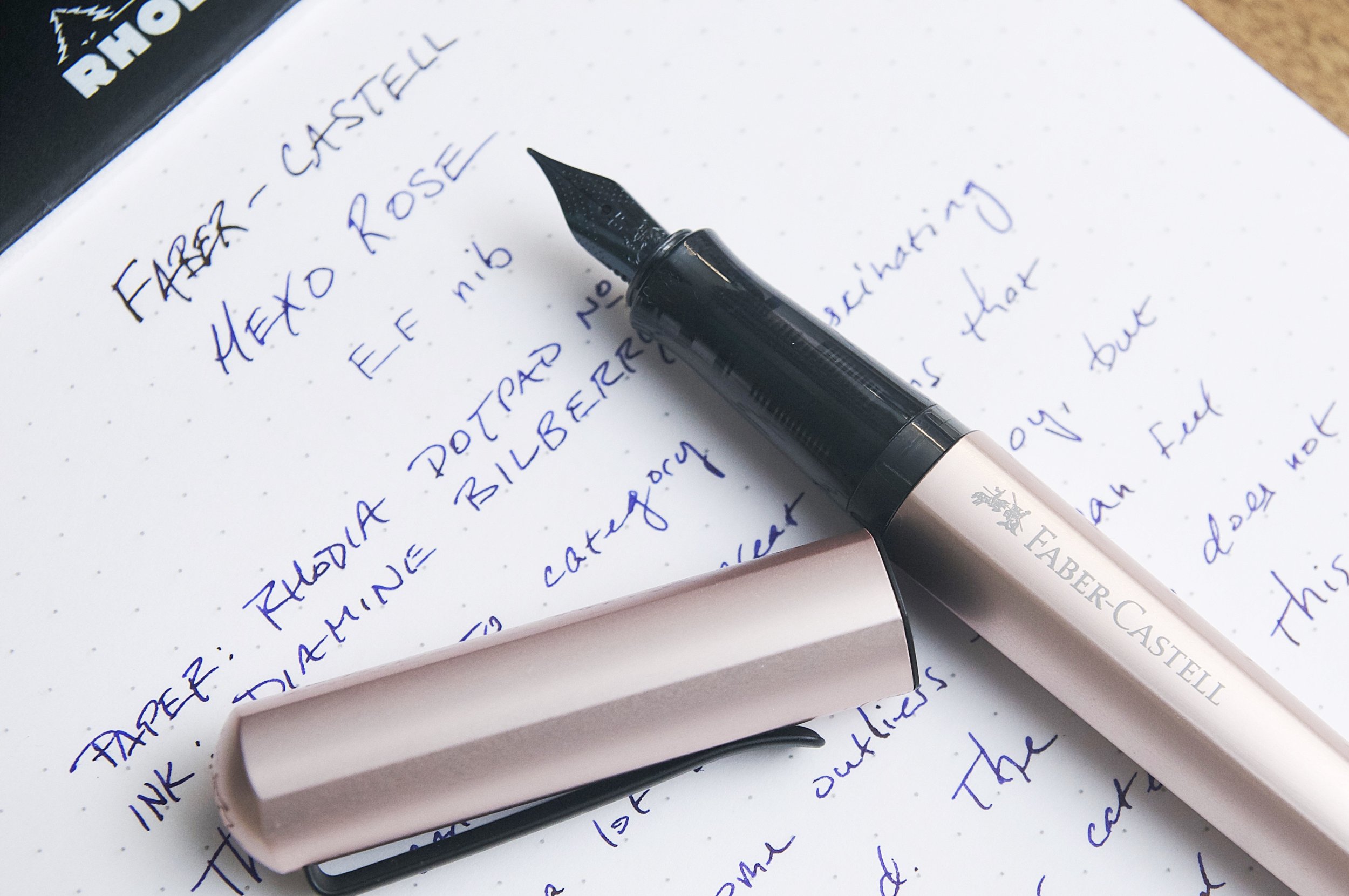
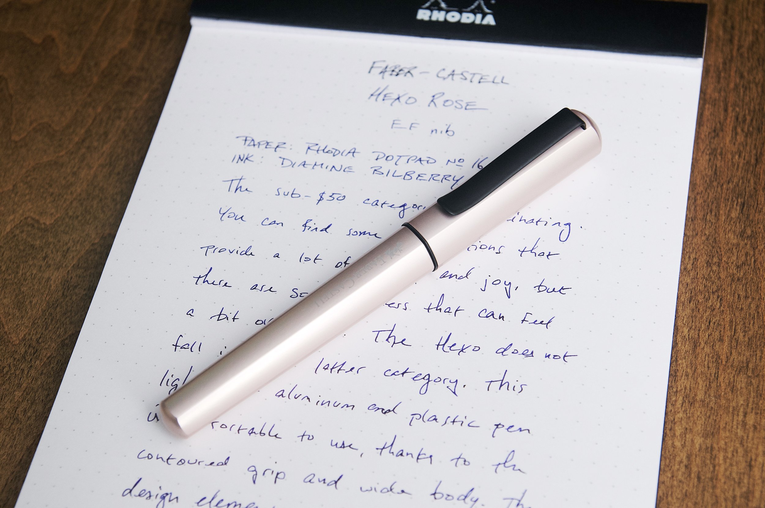
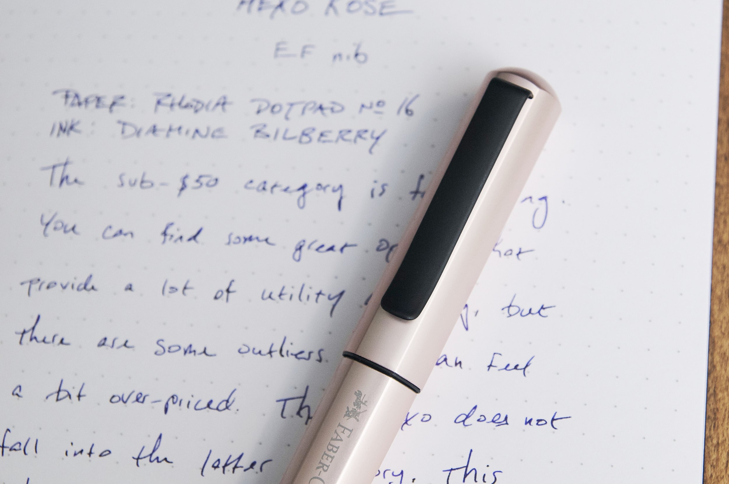
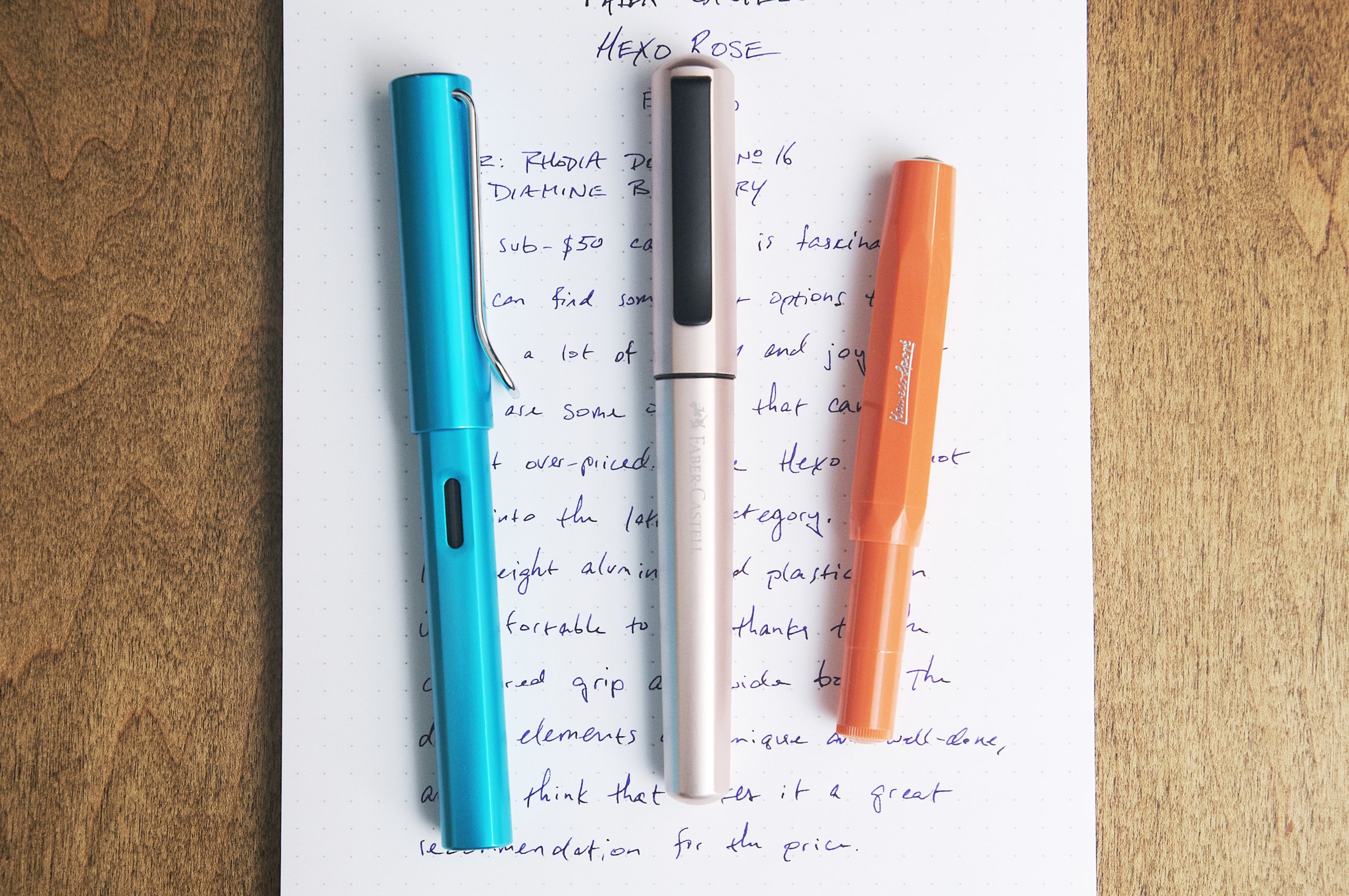
The Hexo from Faber-Castell is an entry-level fountain pen with a modern design and fantastic build. The name "Hexo" aligns with the hexagonal shape of the pen body and cap, but the corners are rounded off and smooth to make it comfortable to handle. The Rose color that I have now is a light pink — almost difficult to detect unless there's plenty of light. Otherwise it looks silver or champagne.

The broad matte black clip contrasts the aluminum body well, and also does a great job of keeping the pen attached to things. It's really strong, but easy to use.

One of my favorite features of the Hexo is the mechanism that auto-aligns the cap to the barrel so that the hexagonal lines match. When you design a pen with lines that go from top to bottom, you have to assume that a large portion of buyers will be compelled to make sure those lines always line up, and I really appreciate them thinking ahead and making that process automatic for me. This is accomplished with some small guides on the grip that ensure the cap lines up. The click fitting for the cap also makes this pen easy to uncap/cap, and features a satisfying click to let you know it's capped securely.

On top of the aligning cap, the grip section also has a similar alignment guide for screwing it into the body. Once you reach the end of the threads when screwing the grip onto the body, the final quarter turn positions the grip so that it aligns perfectly with the body. It's hard to explain how satisfying it is to achieve perfect alignment on this pen with zero effort. It's so good that I think it's the biggest selling point of this pen. Faber-Castell has seen the OCD crowd, and they have delivered a fantastic pen for us.

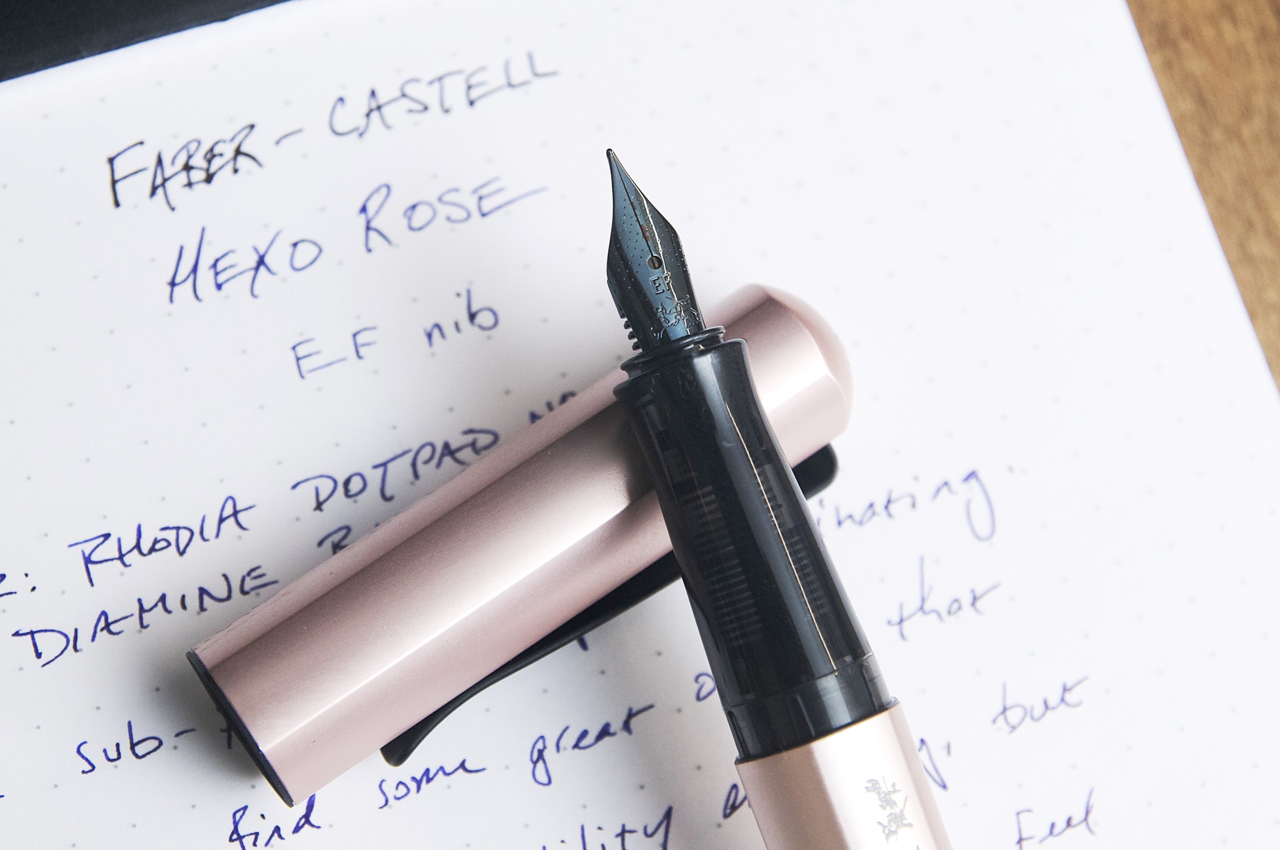
Aside from the design and nifty alignment features, this pen is actually really good at being a writing instrument as well. The steel nib is firm, but provides a crisp line with plenty of feedback. The EF size in my pen is right on target for a European-style nib size. Mine is smooth and required no tuning or tweaking — it wrote well out of the box. The nib and feed provide great flow when writing, and the good seal from the cap means you can uncap and start writing immediately without waiting or scribbling a few lines to get the ink flowing. It's a workhorse in the writing department.

The grip section features a flared shape that provides a nice butt for your fingers to rest into when writing. Something else I appreciate is that the shape is uniform in diameter, meaning this will work well for right- or left-handed writers who use some form of standard-ish grip. The grip provides just enough shape to be useful for many grip styles. Pens that lean into the three-finger tripod grip alienate a lot of people who don't grip pens that way, and the pen is either uncomfortable or unusable. With the Hexo, it's really comfortable, functional, and inclusive.

The light weight body and contoured grip are further complimented by the larger-than-average diameter of the pen, which I find to be more comfortable. Not everyone will agree with me, but I like pens that are a little wider for writing in cursive or for writing for extended periods. All three of these design choices result in a really comfortable writing experience.

The Faber-Castell Hexo is a fantastic entry-level pen from a company that knows a thing or two about stationery. At $42, it’s easy to recommend as a stylish, modern alternative to other sub-$50 pens. The $50 price point has a few "luxury" brand pens that don't deliver on the writing instrument fundamentals, but this is not one of those. This is pen that nails the fundamentals, but also provides some nice extras like the unique design, auto-aligning cap, and wider body. If the Rose color isn't your thing, you can also find this pen in black, silver, bronze, and blue. And, you have a choice of EF, F, M, and B nibs. This is a great pen for gifts, introducing people to fountain pens, or as a nice treat for yourself!

(Vanness Pens provided this product at a discount to The Pen Addict for review purposes.)


Enjoy reading The Pen Addict? Then consider becoming a member to receive additional weekly content, giveaways, and discounts in The Pen Addict shop. Plus, you support me and the site directly, for which I am very grateful.

Membership starts at just $5/month, with a discounted annual option available. To find out more about membership click here and join us!

Posted on November 8, 2023 and filed under Faber-Castell, Fountain Pens, Pen Reviews.

Gravitas Pocket Fountain Pen Full White Delrin Review

(Sarah Read is an author, editor, yarn artist, and pen/paper/ink addict. You can find more about her at her website and on Twitter. And her latest book, Root Rot, is now available for pre-order!)

When I received my Gravitas Quark, there was a stowaway in the package. There, nestled in with the expected items, was a leatherette pen sleeve, and inside that was the best hitchhiker ever--a white Delrin pocket fountain pen. I hadn't yet tried any of Gravitas's standard pocket pens, so this was a very welcome addition to the collection.

The most striking thing about the Delrin material is how light it is. The pen hardly weighs anything at only 13g capped or posted. The light weight makes it easy and comfortable to write with, and the Delrin warms in the hand, so there's no fatigue even with very long writing sessions.

The pen is shaped similarly to a Kaweco pocket pen, where the cap covers most of the body. That keeps it compact when closed, and then when posted, the long cap transforms it into a full-sized pen. The end finials are both shaped to a sharp point, and one side of the cap is machined flat to serve as a roll-stop. The grip section is finely textured to prevent slipping, and it has a nice tapered shape that is easy to hold.

The nib it comes with is one of Gravitas's own nibs, which fits Jowo nib units. It also comes with a wee plunger converter, though it also takes short international cartridges. It also comes with two O-rings, one on the grip section threads and one on the cap threads, that add extra security if you want to eyedropper the pen. I haven't tried eyedroppering it yet, but I plan to next fill.

The nib writes very smoothly with good ink flow. The only issue that might annoy some users is that the texture of the grip traps ink when filling from a bottle, so there may be some discoloration between cleanings. Some inks might even cause some staining to the white material there. This doesn't bother me, personally--I like inky grips as much as I like inky fingers--but I know some folks who hate it. Maybe go for the black Delrin, if that's you!

This pen sells for 90 Euros, or around $95. While that's a lot compared to the similar-appearing Kaweco, this Delrin material makes a huge difference in quality that's reflected in that price. This is a tough, workhorse pen. Which is good, because it's inked up for NaNoWriMo, and it's time to put it to work.

(Gravitas Pens provided this product at no charge to The Pen Addict for review purposes.)


Enjoy reading The Pen Addict? Then consider becoming a member to receive additional weekly content, giveaways, and discounts in The Pen Addict shop. Plus, you support me and the site directly, for which I am very grateful.

Membership starts at just $5/month, with a discounted annual option available. To find out more about membership click here and join us!

Posted on November 2, 2023 and filed under Gravitas, Fountain Pens, Pen Reviews.

Pilot Explorer Fountain Pen Review

(Jeff Abbott is a regular contributor at The Pen Addict. You can find more from Jeff online at Draft Evolution and Twitter.)

The Pilot Explorer fountain pen may have been around for close to five years now, but it still feels like a new release from Pilot. And even though it's been on the market for years now, I still automatically think of the OG Explorer when someone mentions "Pilot Explorer." In my mind, there's still only one Pilot Explorer, and it's a quirky, discontinued rollerball pen that is really hard to find nowadays. Because of this block in my brain, I compulsively refer to the fountain pen version as the "Pilot Explorer fountain pen" because my brain won't let me use the old name. If this is the kind of thing I have to look forward to as I continue becoming Old™, I guess bring it on? Or maybe be a little more creative with naming things? Either way, we're here to look at a fountain pen, and I'll leave my name judgments behind with this paragraph.

Kimberly actually looked at a similar variant of this pen back in March, so be sure to check that out for the demonstrator barrel and fine nib! The one I have the pleasure of using is from Vanness and it's the Turquoise colorway with a medium steel nib. I try to branch out from my preferences for turquoise and purple, but I also have a hard time saying no when turquoise or purple happen to be the only "interesting" color option for a product. That's what happened with the Explorer fountain pen, and I couldn't be happier with this finish color. The turquoise is delightful and has a little bit of metallic sparkle mixed in with the paint to give it a bit more visual interest. Pairing this up with a turquoise ink is a must (at least in my opinion). I chose Infinity Turquoise from Private Reserve because it was the easiest Turquoise for me to reach in my embarrassingly disorganized ink shelf, but I would have preferred using Pilot Iroshizuku ama-iro to satisfy the brand-on-brand OCD.

Moving on from the exterior color, there are few other details on the outside of the pen that make this a unique entry among Pilot's fountain pens. The matte black clip and finials provide a great contrast to the bright body color. There are a couple of black circle cutouts at the top of the cap, and I wish Pilot had skipped this part because it detracts from the overall look of the pen. There's also a large "Pilot" logo debossed along one side of the cap that also diminishes the overall feel of the pen. The Kakuno is the closest comparison for the Explorer fountain pen, and there aren't any large logos there, so I'm confused why Pilot chose to go all-in on the logo with this pen. The Metropolitan is also comparable in terms of price, and the only logo present on that pen is minuscule — there's a small Pilot stamped into the shoulder of the clip. Big differences!

Uncapping the pen is a smooth process. The cap snaps on/off from the grip section, which makes it easy to operate with one hand. The cap also posts securely on the back of the pen. There's a nice audible snap when putting the cap back on the pen so you know it's closed and ready to go.

The grip on this pen is similar to the Kakuno, but it's just a bit smaller in diameter. The translucent plastic is smooth, but still provides plenty of grip when using the pen.

Like the Kakuno, the Explorer fountain pen is entirely made of plastic, which makes it really lightweight. Contrast this to the Metropolitan, which is brass and aluminum, the writing experience is much different. I like using the Explorer fountain pen for longer writing sessions because it just disappears in my hand. I feel the same way about the Kakuno. I have no problem using the Metropolitan for extended periods, but I can definitely feel a difference in overall hand fatigue.

The steel nib on this pen is very similar to the Kakuno and Metropolitan. The medium size of this nib is a Japanese medium, which is close to a typical European fine. The nib is smooth and performs well out of the box — exactly what I've come to expect from Pilot, even on their lower-end pens.

The pen came with a squeeze cartridge converter (same one that is included with the Metropolitan), and also a black cartridge. At the price point, this is a nice inclusion. If it didn't come with a converter, I'd definitely add one to the order.

The Pilot Explorer fountain pen is a great entry-level option for new-comers, but also an excellent workhorse that can justify a place in any collection. The lightweight but durable material make it easy to use, and the price point is easy to accept at just $25. If the turquoise color isn't your thing, there are several other options as well. This makes a great first fountain pen for yourself or as a gift, but it's also a solid fountain pen to add to your collection. Just be aware that this isn't the first Pilot Explorer!

(Vanness Pens provided this product at no charge to The Pen Addict for review purposes.)


Enjoy reading The Pen Addict? Then consider becoming a member to receive additional weekly content, giveaways, and discounts in The Pen Addict shop. Plus, you support me and the site directly, for which I am very grateful.

Membership starts at just $5/month, with a discounted annual option available. To find out more about membership click here and join us!

Posted on October 25, 2023 and filed under Pilot, Explorer, Fountain Pens, Pen Reviews.