Posts filed under Fountain Pens

Pilot Grance Fountain Pen Review

(Jeff Abbott is a regular contributor at The Pen Addict. You can find more from Jeff online at Draft Evolution and Twitter.)

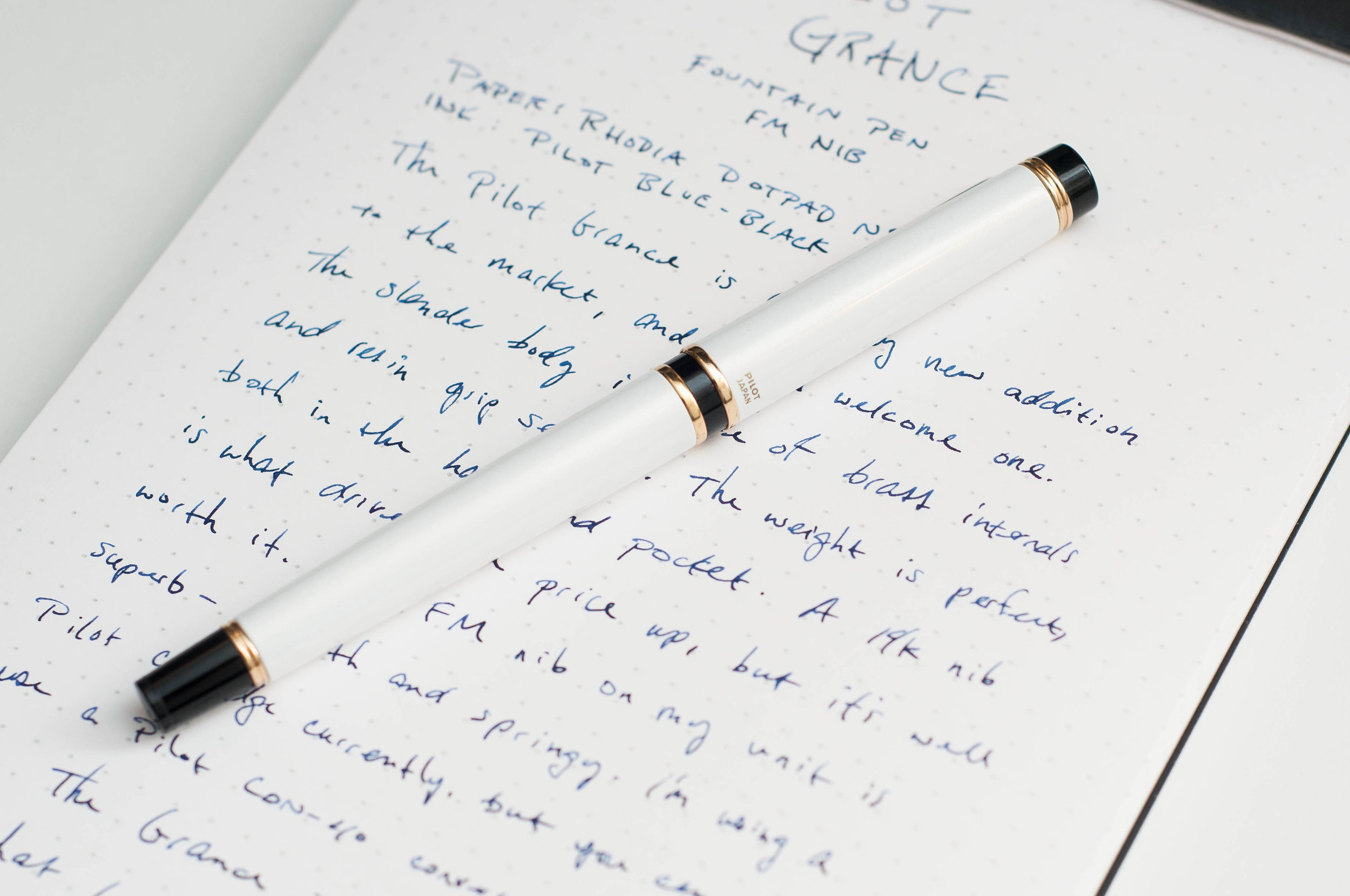
The Pilot Grance is a relatively new addition to Pilot's North American lineup (in 2024!), and I'm really glad they decided to bring it here. When you look at fountain pens as a whole, there's an overwhelming majority of pens that use a screw on cap versus a friction fit slip or snap cap. While that's not a bad thing, I've always wondered why that's the case. The Grance is an elegant, slim-bodied pen that packs in a fantastic nib and comfortable feel that looks great in any setting.

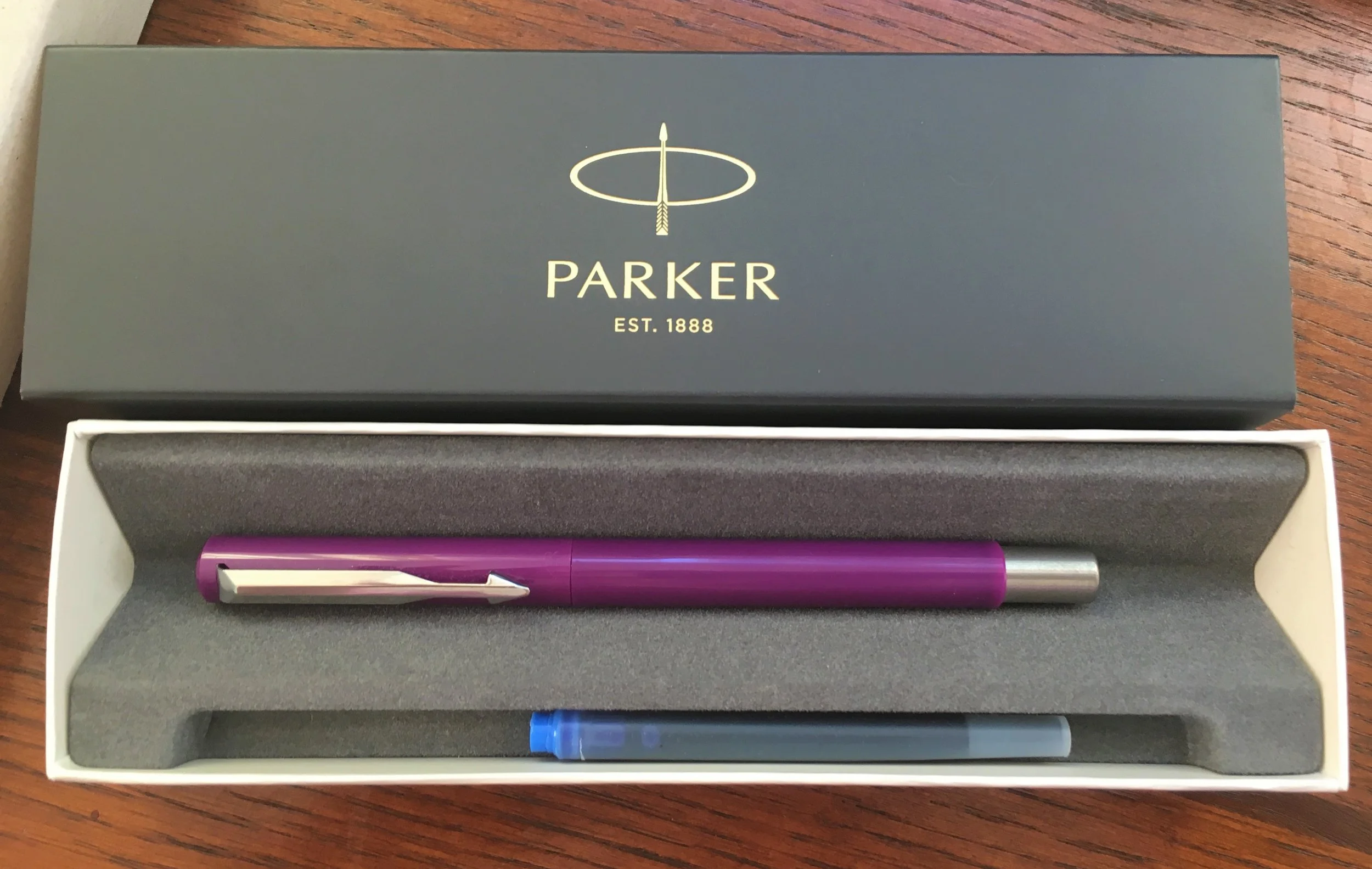
In my mind, the Grance is the more refined and elegant version of the Metropolitan. The Metropolitan is affordable, accessible, and a great deal. The Grance builds on top of that with more premium materials, but also nails the writing experience. From what I can tell, the interior of the Grance is made of brass, with a thick metal covering that features a metallic, pearlescent finish that glimmers in the light. There are also black resin accents that are offset with yellow gold pieces. When I first saw this pen, the gold hardware put me off until I picked the pen up and started writing with it. While I wish there were other options (they're all gold, baby!), I quickly got over my aesthetic issues with the yellow gold. It might not be my number one preference, but this pen is a champ that has become my daily writer despite our color differences.

The Grance is also a fairly small lineup, sporting only three color options: Pearl White, Pearl Pink, and Pearl Blue. Again, the options aren't plentiful, but I can only imagine that Pilot have plans to expand this line if it does well.

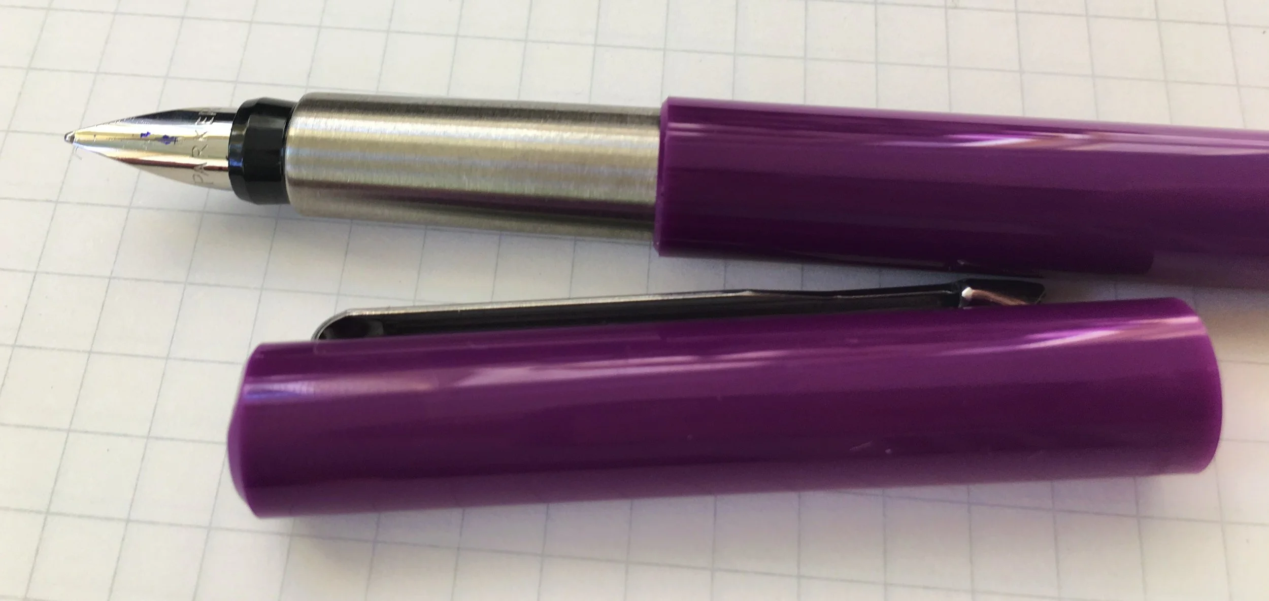
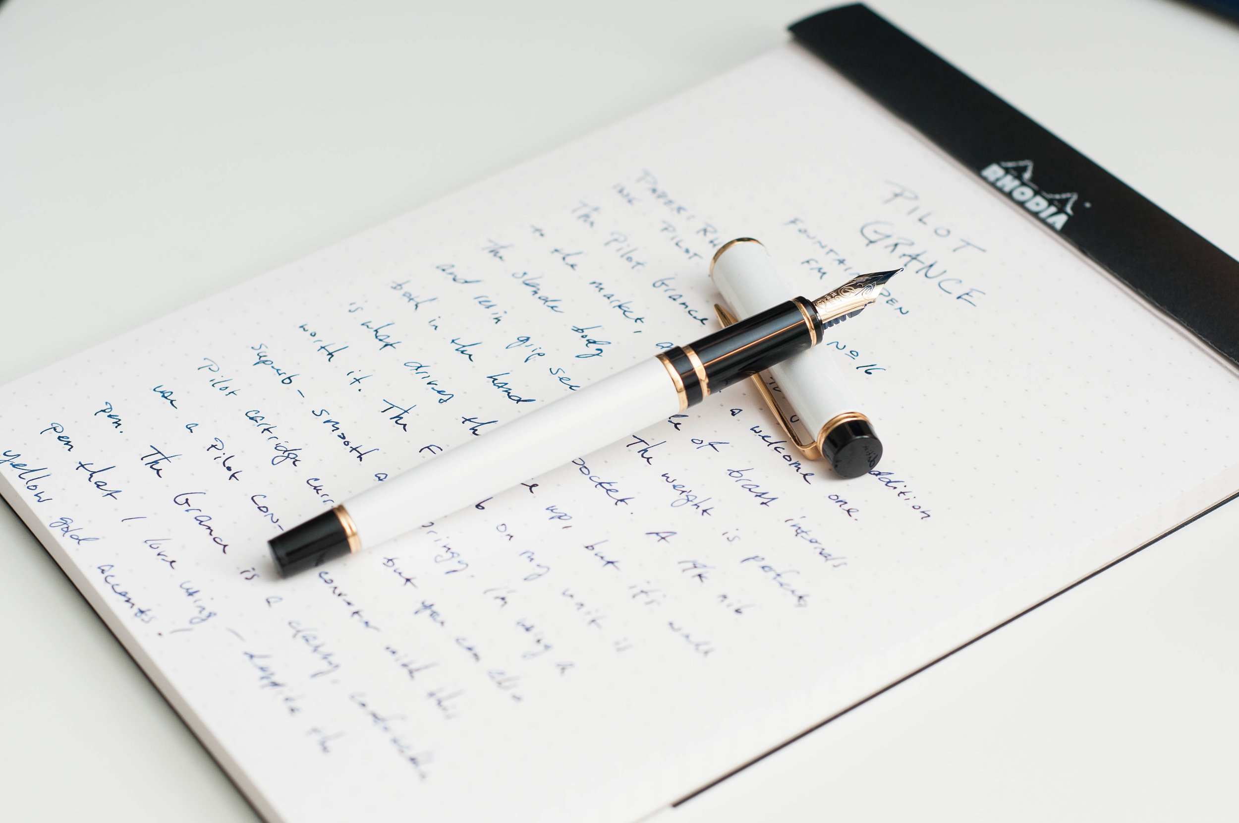
The grip section is a black resin that picks up fingerprints easily, but feels great when in use. There's a small taper toward the tip of the pen, but there's also a small ring of gold around the end of the grip that provides a nice place to rest your fingers when writing. In my experience, the grip does not get slippery when writing despite the lack of texture. And the slim body makes longer writing sessions comfortable as well.

The cap design for the Grance is a snap cap that works very well in practice. In some instances, the snap cap can be too tight, requiring too much effort to open and close. In these cases, it can be an annoyance, but it can also cause you to sling ink if you're not careful. Luckily, the Grance does not suffer from these issues. It's just the right amount of snug to keep the cap on securely. It also posts nicely using the same snap mechanism.

The clip on the Grance is much stronger than I expected it to be. It easily keeps the pen secure on almost any material it can fit over. Even when my bag has been thrown around a bit, the Grance stays put where I clipped it.

In terms of ink options, you have plenty. The Grance fits standard Pilot cartridges, but you can also use a Pilot CON-40 converter to use any ink you like.

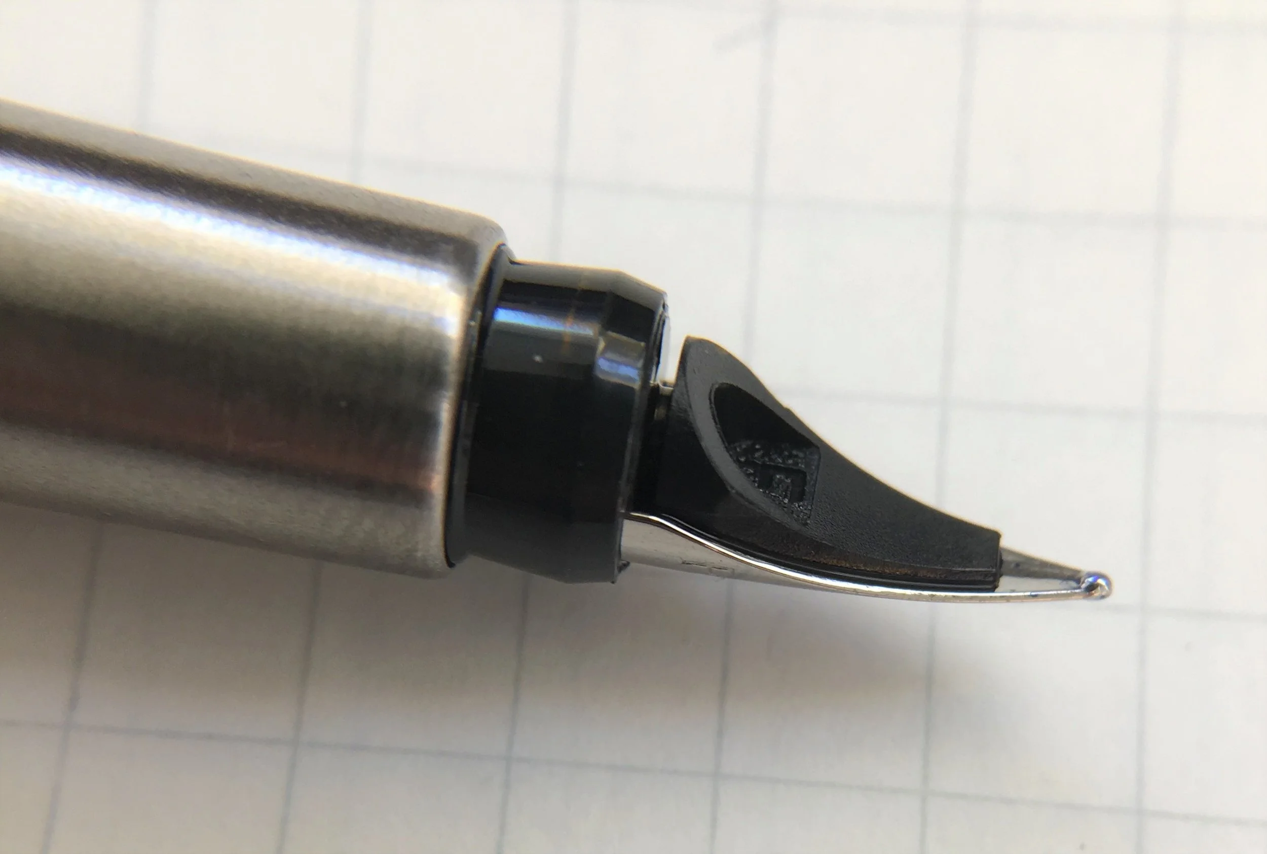
Now, let's move on to what really makes this pen sparkle for me: the writing experience. The best part about this pen, and the part that also brings the price point into the low-premium arena is the nib. It's a 14k gold nib that feels smooth, bounces a bit while writing, and flows well. I've always really enjoyed Pilot gold nibs, and this one is no exception. In the unit I have, I'm using the FM nib, which is somewhere between fine and medium. It's also one of my favorite nibs due to the size.

When writing with this pen, there's a slight (but noticeable) spring in the nib due to the soft gold material. It doesn't provide much in the way of line variation, but it does give the pen a soft feel when writing, added to the premium experience.

I've been using this pen as my daily driver for several weeks, and I've never once had any issues with skipping, hard starts, or excessive ink flow. It's a work horse - it's simply ready to write the instant you pick it up and uncap it. Even leaving it uncapped for a couple of minutes doesn't faze it. It's incredibly reliable, and I love it for that.

This is true of most Pilot pens I've used, and the Grance is no exception: this nib is incredibly smooth on paper. Writing is pure joy and this pen can keep up with most everything you decide to use it for. It's reliable, pleasing, and delightful.

Overall, I was reluctant to use this pen when I first saw it. It's slim, it uses gold accents, and the color options are few. Despite all this, I've fallen in love with it over the past few weeks. I didn't expect this, but the nib is what caused this. It's an excellent nib, the pen is comfortable to use, and it's incredibly reliable. When that's the case, the exterior aesthetics can sometimes take a backseat.

The Pilot Grance is available in three colors and four nib sizes (EF, F, FM, M). It's in the lower premium price range at $140, but that price is about as low as you can go with a gold nib. If this pen fits your style, then you'll love using it.

(JetPens provided this product at no charge to The Pen Addict for review purposes.)


Enjoy reading The Pen Addict? Then consider becoming a member to receive additional weekly content, giveaways, and discounts in The Pen Addict shop. Plus, you support me and the site directly, for which I am very grateful.

Membership starts at just $5/month, with a discounted annual option available. To find out more about membership click here and join us!

Posted on August 22, 2018 and filed under Pilot, Pen Reviews, Grance, Fountain Pens.

Leonardo Officina Italiana Momento Zero Positano Resin Fountain Pen: A Review

(Susan M. Pigott is a fountain pen collector, pen and paperholic, photographer, and professor. You can find more from Susan on her blog Scribalishess.)

(Note: First two paragraphs updated with corrected information.)

Leonardo Officina Italiana is a new brand of fountain pen, but it has a grand heritage. The Leonardo is the brainchild of Salvatore Matrone, the son of Ciro Matrone who was one of the founders of Delta Pens. Leonardo pens are hand turned by solid bar in either resin or celluloid. The name “Momento Zero” means “a new beginning.”

I purchased my Leonardo from the Casa della Stilografica shop, which was founded in 1944 by Antonio Sacchetti. Today, Marco Moricci, Antonio’s grandson, along with his father, Vittorio, and mother, Patrizia, run the shop.

When I saw photographs of the new Leonardo Officina Italiana fountain pens, I was impressed. I read a review in which the writer had purchased one of the celluloid models and one of the resin models. The celluloid models come with 14k gold nibs whereas the resin ones have steel nibs. The reviewer said he couldn’t tell the difference between the 14k nib and the steel one—that’s how good the steel nibs are.

The Leonardo Momento Zero comes in a classic black box with the company’s logo on the top. Inside, you’ll find the pen, a pamphlet, and a card certifying that the pen was made in Italy.

Although initially I was tempted to buy one of the Abyss Celluloid pens, I decided to try a resin model first. I chose the Momento Zero Positano turquoise. Positano is a town on the Amalfi Coast in Italy, and I assume the color is meant to mimic the beautiful sea coast near the town. Although the color is called “Turquoise,” in person it’s more of a cerulean blue. I matched it with Iroshizuku Ku-Jaku ink and they complement one another perfectly. The resin is absolutely beautiful with swirls of white and blue variations that really do look like ocean water.

The pen honestly doesn’t feel like resin—it has more heft to it since the resin is impressively thick. This is no cheap plastic pen; it exudes quality. It’s a large pen: 5.6 inches/142mm closed, 5.08 inches/129mm uncapped, and 6.7 inches/170mm posted, but it is not as thick in diameter as, say, a Montblanc 149.

Beautiful details set this pen apart. Both the cap finial and the barrel bottom are conically shaped rather than flat.

The clip looks very Omas-like, with a roller ball that aids in slipping the clip onto a pocket or a stack of papers.

The cap is adorned with two thin gold bands. The barrel also sports a gold band where the barrel meets the cap and near the bottom of the barrel. These details make the pen look super classy.

The company’s name is inscribed subtly on the pen’s barrel along with the number of the pen. Mine is number 217.

The pen comes with a custom Leonardo converter that is especially nice. It screws in to the grip unit and is very well made.

The nib is gold-colored steel. I chose a stub nib and had to wait a little longer for it, but it was worth it. The nib is engraved with “Leonardo Officina Italiana” the Leonardo logo (outspread wings), and the nib size.

The stub nib offers really nice line variation and is smooth and trouble free. It writes better than some of my solid gold nibs, although occasionally I’ll hear a little scratchy sound as though there’s an errant piece of metal hitting the paper. I’ve checked the nib thoroughly and can’t find any abnormalities in the nib, so it may just be the angle I’m holding the pen. Regardless, I love how this pen writes.

I am thoroughly in love with my Leonardo Momento Zero pen. It is extremely well made and it feels like it will last forever. You can purchase the resin models in a variety of colors: turquoise, red, blue, brown-gold, red-gold, matte black, blue-gold, deep blue-gold, and brown vintage. The base price if you purchase directly from the Stilografica shop is €121.31 excluding VAT.

Pros

  • The Leonardo Momento Zero pen is immaculate. The resin is beautiful and the trim makes for a classic look.
  • I really like the quality of the custom convertor that comes with the pen.
  • The steel stub nib on this pen is simply fantastic. It offers excellent line variation and smooth writing.
  • Depending on the exchange rate, €121.31 translates to about $140.00 (plus shipping). I think this is an excellent price for such a well made pen.

Cons

  • I usually find some factor that detracts from fountain pens I review, but in all honesty, I am completely satisfied with my Leonardo. I highly recommend this company and the pens they make in house.

(I purchased this pen with my own funds and received no compensation from Casa della Stilografica for this review.)


Enjoy reading The Pen Addict? Then consider becoming a member to receive additional weekly content, giveaways, and discounts in The Pen Addict shop. Plus, you support me and the site directly, for which I am very grateful.

Membership starts at just $5/month, with a discounted annual option available. To find out more about membership click here and join us!

Posted on August 10, 2018 and filed under Leonardo, Fountain Pens, Pen Reviews.

Parker Vector Fountain Pen Review

(Sarah Read is an author, editor, yarn artist, and pen/paper/ink addict. You can find more about her at her website and on Twitter.)

Parker is undoubtedly one of the great legacy penmakers, so it makes sense that they should have their own entry-level fountain pen. The Vector has been around for a long time, and some fresh new colors have brought it back into the spotlight. It's fun and inexpensive and functional--but I don't think it stands up very well against its competitors. There are a lot of good quality affordable fountain pens, now. We're in a golden age of pens and it's easy to be spoiled for choice.

The Vector is a slim, lightweight fountain pen with a plastic body and metal accents. The grip section and bottom cap where the pen posts are a brushed gunmetal color, and the clip is chrome in the shape of the classic Parker arrow. The grip section is long and slim. The nib is plain stainless steel over a smooth feed.

My first thought, when I lifted the pen from its box, was, "Is this a disposable fountain pen?" That's not a good sign, probably, because, no--it's not. But the plastic it's made of feels like it is. Maybe it's the snap cap with a lack of cap band, but it reminds me a bit of a Crayola marker. It feels like it's not meant to last. For a $12 pen I'm not expecting an heirloom, of course, but it wasn't a good first impression.

The $12 price tag is a little misleading, as well, because the pen doesn't come with a converter. That's a separate $9.25. So, $21.25 is closer to the real cost. When compared with other beginner pens that come with converters, this feels like it's priced a bit high for this quality.

The writing experience hasn't been very impressive, either. It does write, and the Parker blue ink it comes with is beautiful and well behaved, but I'd want to buy a bottle and put it in a different pen. The nib isn't too scratchy, but I had some drying issues and the feed seemed to struggle to keep the flow going when writing for longer periods. The grip section is also uncomfortable. It isn't shaped at all and it's slick, so I was constantly having to readjust my grip. The plastic edge where the body meets the section is also quite sharp. There's no smoothing or band there, so it's just raw plastic.

All told, there isn't much about this pen that would move me to recommend it, even for a beginner. The Pilot Metropolitan is ultimately less expensive and much better quality. Parker makes some really fantastic fountain pens, but this one doesn't seem to fit the brand. Perhaps my expectations are playing a role in my disappointment here, but I don't see myself reaching for this pen.


Enjoy reading The Pen Addict? Then consider becoming a member to receive additional weekly content, giveaways, and discounts in The Pen Addict shop. Plus, you support me and the site directly, for which I am very grateful.

Membership starts at just $5/month, with a discounted annual option available. To find out more about membership click here and join us!

Posted on August 2, 2018 and filed under Parker, Fountain Pens, Pen Reviews.