Posts filed under Diamine

Diamine Oxblood Ink Review

(Jeff Abbott is a regular contributor at The Pen Addict. You can find more from Jeff online at Draft Evolution and Twitter.)

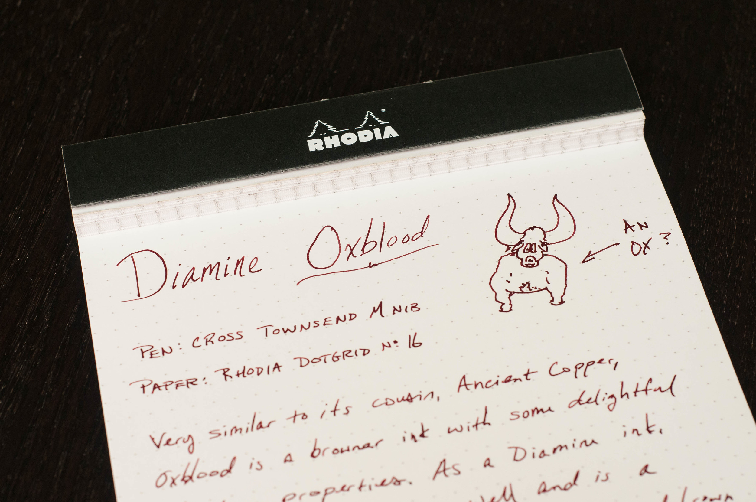
Oxblood is one of those words that took me a while to comprehend as a child. Why is the word "blood" in the name, and what does it have to do with an ox? My first memory of hearing this term was in relation to the color of a leather belt. I'm not confident I could tell you why this is still a standard color in some product lines, but it's probably fair that most people understand what the color looks like.

Diamine Oxblood is what I consider the standard oxblood color. It's not too dark, but it has plenty of dark red and brown mixing together to look like a shady blood color. I happen to be a fan of inks with this color scheme, but I understand it's also not for everyone. Either way, you'll know quickly after seeing a sample whether the color is for you. If it is, then Diamine is the one to start with.

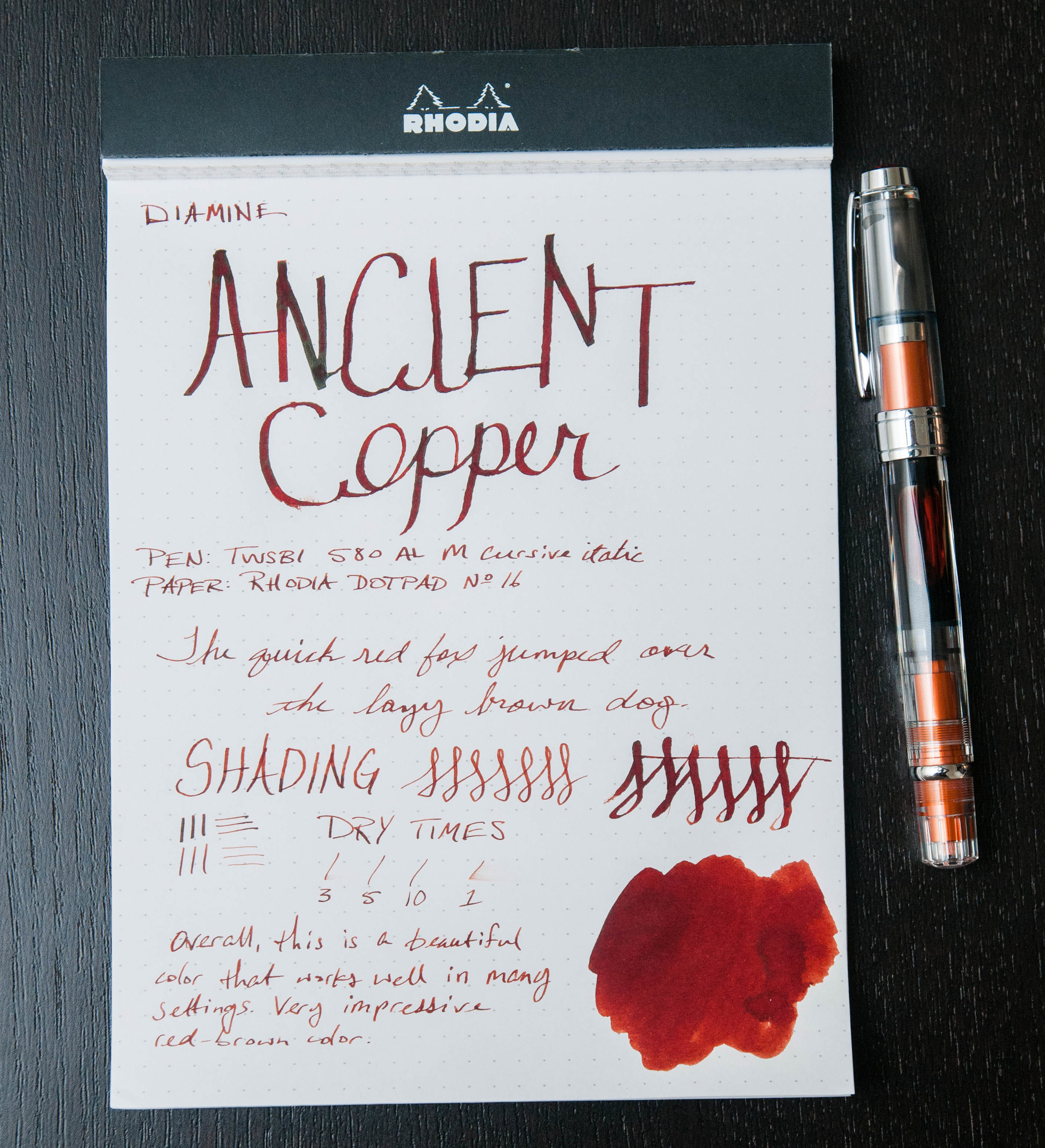
I've written previously about a couple other red-brown inks that I really enjoyed: Diamine Ancient Copper and Organics Studio Edgar Allen Poe. These are both great inks in their own regard, but they're just a little off from the standard red-brown color I associate with a classic Oxblood. They're great inks and provide their own unique color and properties that make them great daily writers.

Diamine Oxblood is also a great daily writer. Let's get into the specifics of how this ink performs.

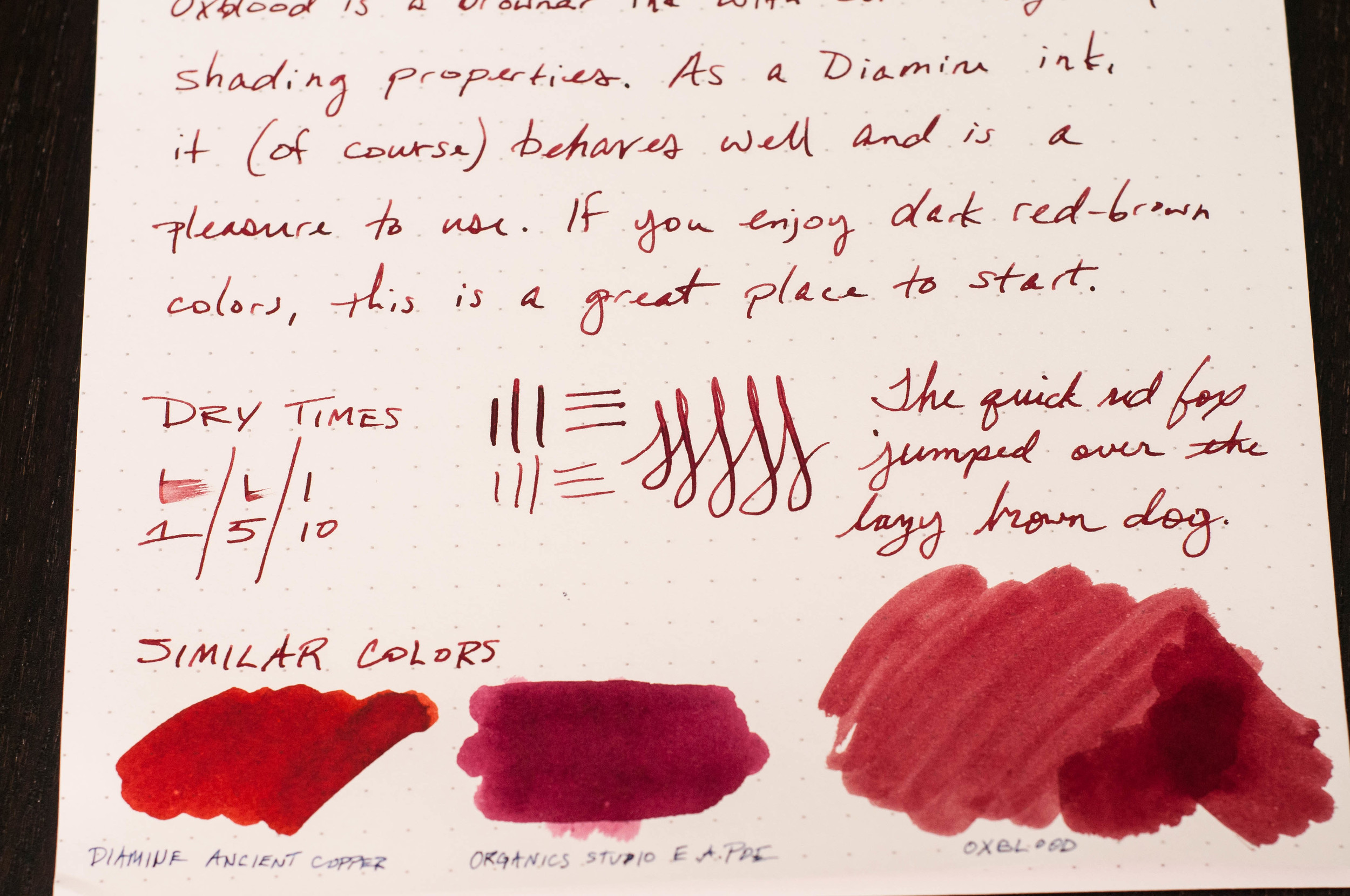
First off, the color is subtle, but deep and rich. It's a wonderful combination of reds and browns that I enjoy seeing on the page. Funny, I like the color of this ink, which is similar to blood, but I hate the sight of actual blood. Go figure.

Like every other Diamine ink I've used, it performs well. The ink has never dried up in my pens after a couple idle days, and it always starts straight away when I start writing. No hard starts, no skipping, or anything negative when it comes to ink flow and starting/stopping. The ink is right in the middle of the scale when it comes to lubrication and wetness. There's a pleasant amount of shading if you're using a pen with a larger nib, like a medium or larger German nib. In smaller nibs, you still get the great color, but the shading characteristics are diminished.

Dry time was average, coming in at just under 10 seconds for normal writing. You'll get smudges if you close a notebook too quickly after writing, and left-hand writers will have some issues with the long-ish dry time depending on the grip style.

When it comes to the color and how it compares to similar inks, I think it's the standard for Oxblood. Ancient Copper is also a red-brown ink, but it has more orange (copper) tones that make it more brown than red in certain light. Organics Studio Edgar Allen Poe is a much darker ink that also has some very light purple tones at times. E.A. Poe is one of my all-time favorite inks, but it's not a standard Oxblood in my opinion. Doesn't mean it's not gorgeous.

Overall, this is a fantastic ink that I think you should try if you are interested in dark reds and red-browns. As far as Oxblood goes, this is my standard in terms of color, shading, and behavior. On JetPens, you can order this ink in three different sizes/formats. It's available in a 30ml sample bottle, a full-sized 80ml bottle, and an 18-pack cartridge format.

(JetPens provided this product at no charge to The Pen Addict for review purposes.)

Posted on November 4, 2015 and filed under Diamine, Ink Reviews.

Diamine Asa Blue Ink Review

(Jeff Abbott is a regular contributor at The Pen Addict. You can find more from Jeff online at Draft Evolution and Twitter.)

Blue inks are a weakness of mine. I'm always searching for something that's a little different and interesting compared to the ones I've already tried.

JetPens recently started carrying small trial size bottles of many Diamine inks, and I've been trying those out pretty frequently.

Asa Blue is one of those inks, and it's probably one you've heard of before. This is one of those standard blues that gets recommended quite a bit. Even though I've known about it since I first started using fountain pens, I'm only now just getting around to trying it.

In this case, better late than never.

Color

Asa Blue is a deep, rich blue. I'd call it a royal blue, and it lives up to the name much better than Kaweco's version of the color. Calling it navy might be too much, since navy is closer to blue-black in most cases. Either way, this is a standard blue that looks fantastic and fits in professional environments with no problem. This ink won't turn heads because of its stand-out color, but it might for the small amount of shading it exhibits.

I think the best way to describe this color is to compare it to most blue gel ink pens that you can buy. It's a standard blue, and it looks fantastic. And, like I said earlier, this is a deep, dark blue, but I wouldn't classify it as a blue-black.

Properties

Like other Diamine inks I've tried recently, it behaves admirably in my pens. Feathering is non-existant, show-through is minimal, and there's a pleasant level of shading evident in some strokes. It's a smooth, well-lubicrated ink that works well in dry, small-nibbed pens, but also doesn't over-saturate the page in a broader nib. It behaves just as you'd expect a Diamine ink to behave, and that's a compliment.

The shading in this ink is subtle. It's not flamboyant like Kon-peki, Ancient Copper, or Rouge Hematite, but you notice it in the strokes after the ink has settled on the page. There's just enough variation in the color that you can tell a fountain pen created the line. For an office setting, you can't go wrong with properties like that. It looks professional, but it's also gorgeous instead of bland.

Conclusion

I've been really happy so far with the Diamine inks I've tried. They behave well, clean out of the pen easily, never have issues starting or skipping, and have great color and saturation. With a deep blue, I'm not expecting a lot of shading, but the small hints evident in Asa are a real pleasure to notice when writing.

There are a couple of different options for buying this ink. You can get a full-sized 80ml bottle, or a smaller 30ml bottle for about $17.50 or $7.50, respectively.

If you're interested in dark blues that behave well, this is a swell place to start.

(JetPens provided this product at no charge to The Pen Addict for review purposes.)

Posted on September 30, 2015 and filed under Diamine, Ink Reviews.

Diamine Ancient Copper, A Champion Of Red-Browns

(Jeff Abbott is a regular contributor at The Pen Addict. You can find more from Jeff online at Draft Evolution and Twitter.)

Diamine Ancient Copper is one of the inks that I heard of or discovered fairly quickly after joining the fountain pen community. This is for good reason. Like Iroshizuku Kon-peki, it has a loyal, vocal following. After trying the ink out for a while, I'm one of them.

This isn't my first Diamine ink, but it is the first that I've reviewed. For me, reviewing the ink was a piece of cake because it behaves so well. When looking at inks, you're looking for any characteristics that might make it undesirable in certain pen or paper combinations. With Ancient Copper, if you like the color, the rest is history.

First off, like most Diamine inks, you can buy it in three sizes. There's a large 80ml bottle that will last you a long time, a smaller 30ml bottle if you want to try it out, and standard international short cartridges.

I like that Diamine offers a nice range of sizes with their inks. Sometimes you don't want to dive in with a full-sized bottle of something you may not like.

Now, how does this ink perform? Remarkably well, but let's get more detailed than that.

The ink shades fairly easily and looks beautiful on the page. Anything from a German fine nib and up will allow the ink to show its true shading capabilities, and that's something you don't want to miss out on. In my opinion, it's one of the best attributes of the ink.

It's well-lubricated and easy flowing — I'd say it's right in the middle of the scale. Even in my "dry" pens, it never has any issues with flow.

It's extremely easy to clean out of the pen. It washes out in just a few quick flushes. This is on par with other Diamine inks I've tried, so that's no surprise here.

Dry time actually surprised me. Within 2 or 3 seconds, smudging was almost undetectable. Sure, your mileage will vary based on what pen and paper you're using, but that's still really impressive.

There isn't a noticeable sheen once the ink dries, and it dries to a matte color. If sheen is your thing, this ink won't impress you.

But, I'd wager that most of us are here because of the color of this ink. Ancient Copper is such an apt name — I don't think they could've done any better with this one.

It's a reddish-brown that resembles a lighter oxblood color. It's dark enough to still be quasi-professional, yet extremely interesting on the page. When I swatched the ink with a swab, you can see that red is a dominant color, but the brown that pools in the darker areas is what gives it life. Overall, I'm completely in love with the color, and I can't see myself taking this ink out of my regular rotation for a very long time.

If you're remotely interested in red-brown inks, Ancient Copper should be your first stop. It's a fantastic ink, and definitely worth checking out. And, you can even choose between an 80ml or 30ml bottle, or cartridges depending on what pen you want to use it in. Very impressive ink, and I highly recommend it.

(JetPens provided this product at no charge to The Pen Addict for review purposes.)

Posted on September 9, 2015 and filed under Diamine, Ink Reviews.