Posts filed under Diamine

Diamine Autumn Oak Ink Review

(Susan M. Pigott is a fountain pen collector, pen and paperholic, photographer, and professor. You can find more from Susan on her blog Scribalishess.)

It's June in Texas, so I feel rather strange writing about an autumn-colored ink. But, today it's also overcast and rainy thanks to a tropical storm, so it seems fallish out there, despite the temperatures. Let's all pretend it's October!

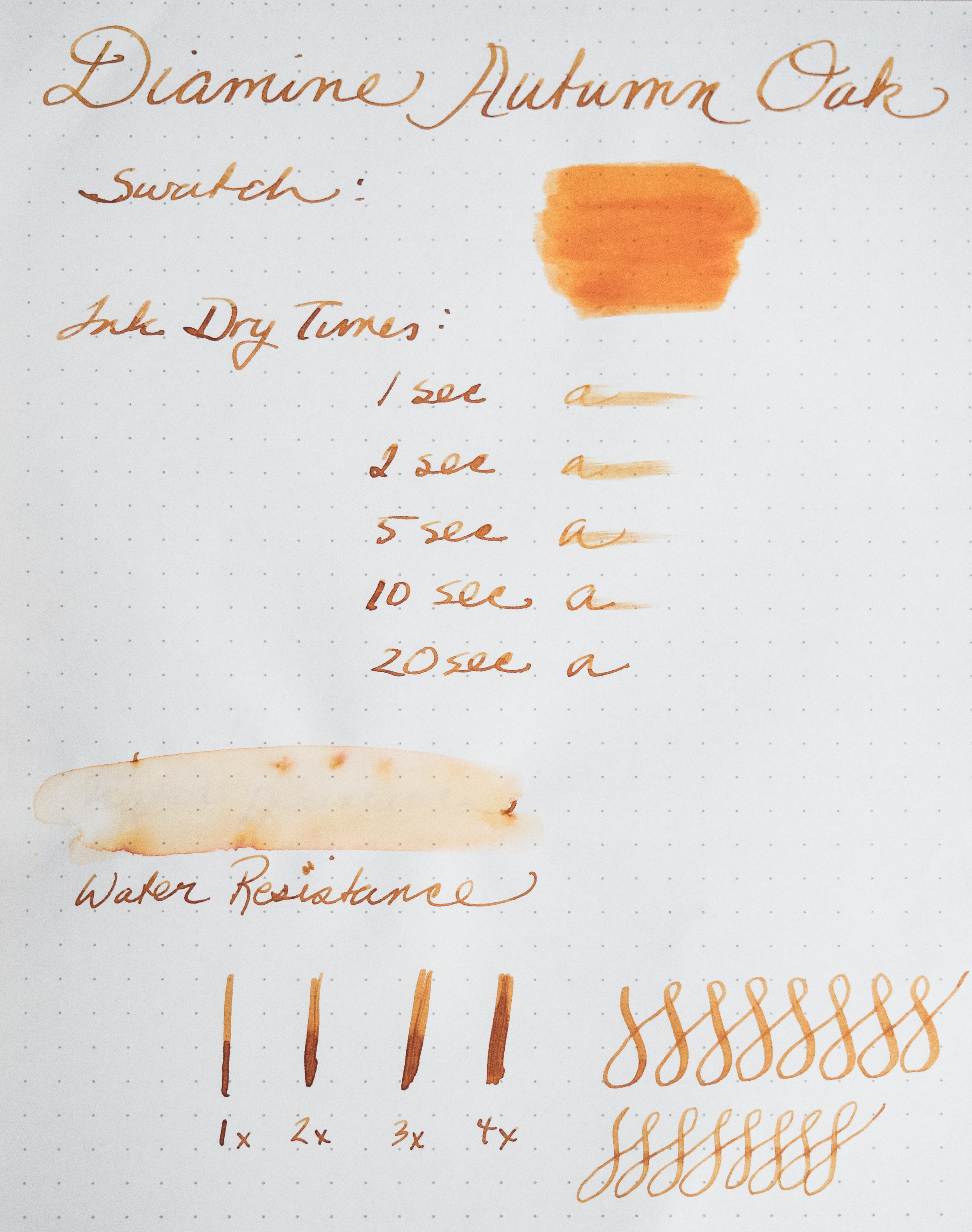
Diamine Autumn Oak is aptly named. The color looks like the leaves at Lost Maples State Park, a place we visit every November.

The ink is a beautiful orange with stunning shading properties, ranging from a dark orange with hints of brown to a light orange, just like leaves.

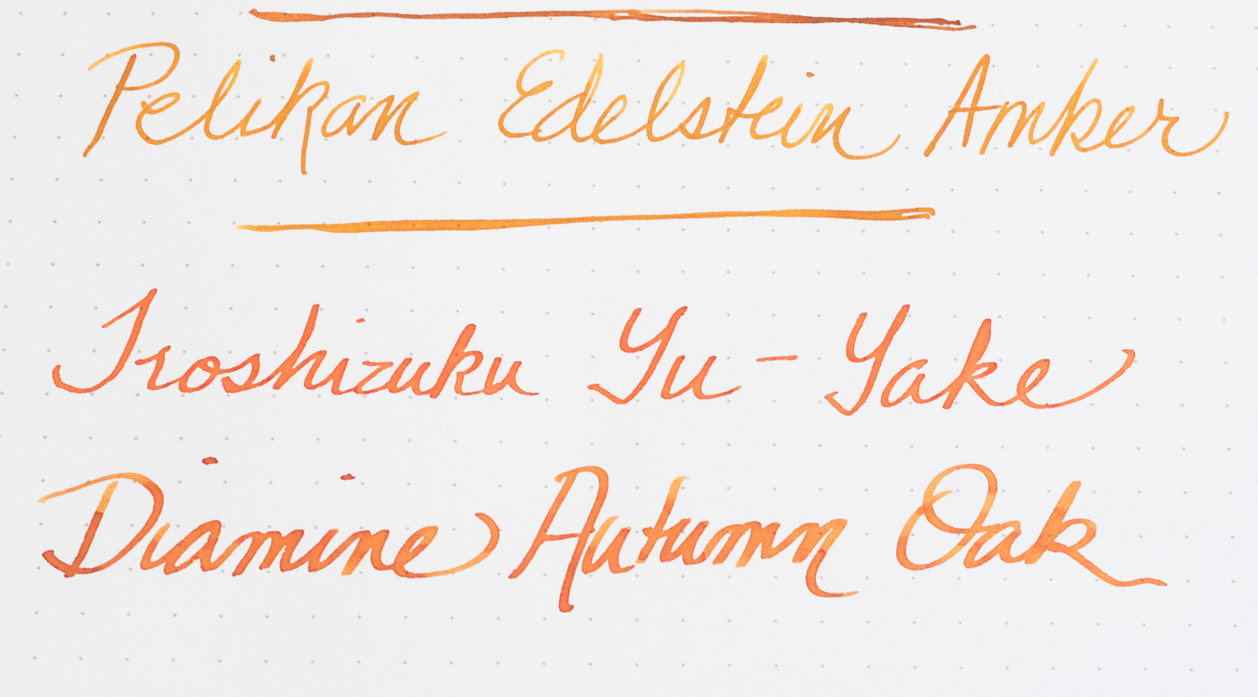
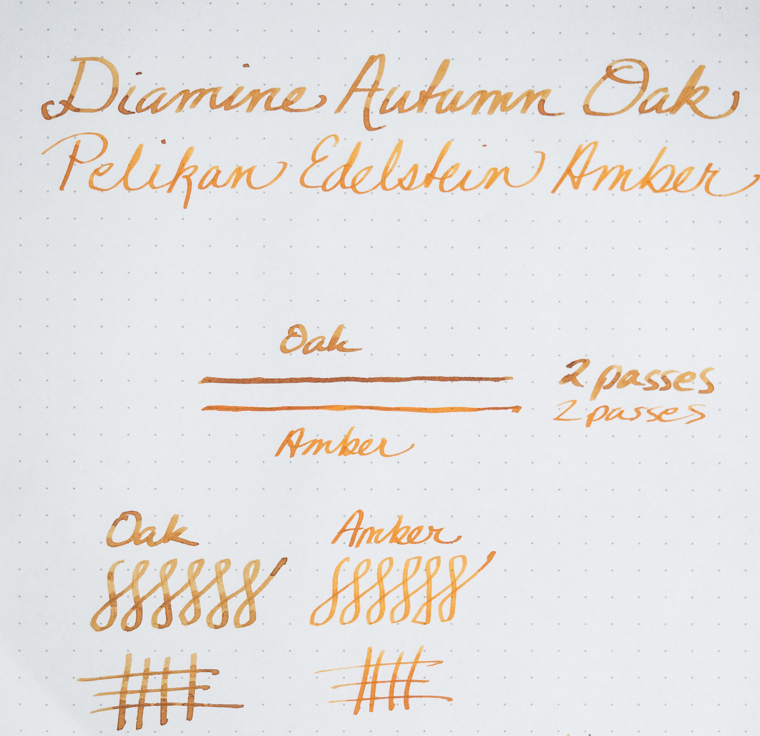
I compared Autumn Oak with my other two orange inks, Pelikan Edelstein Amber and Iroshizuku Yu-Yake.

Amber also exhibits good shading, but it is more yellow in tone than Autumn Oak and doesn't have the range of colors. Yu-Yake is a flat orange and exhibits hardly any shading (I always crave an orange lollipop when I use Yu-Yake).

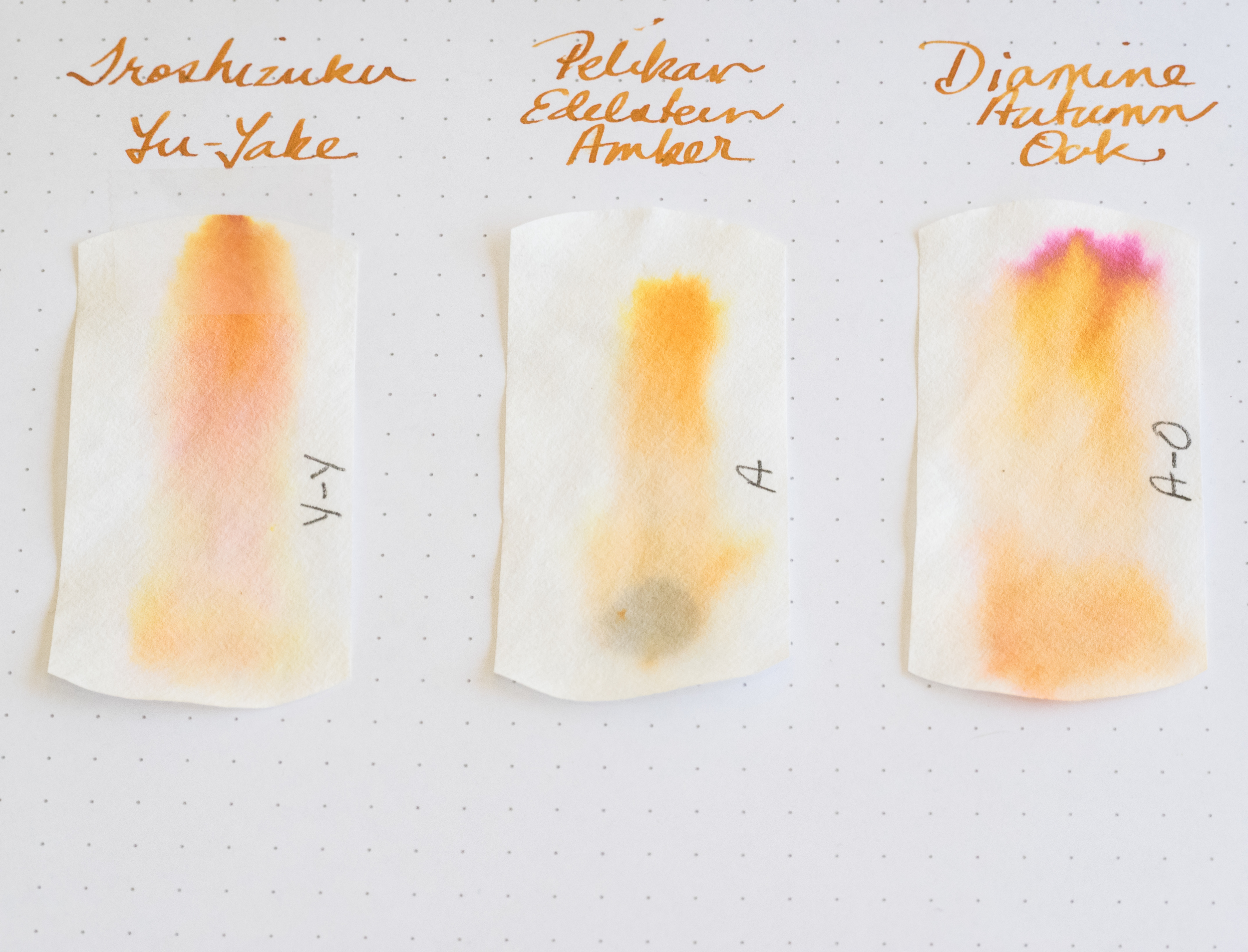
Chromatography indicates that Yu-Yake contains yellow, orange, and a slight amount of pink. Amber contains primarily yellow. Autumn Oak contains orange, yellow, and a good amount of pink (which is probably what gives it the gorgeous brown tones).

Autumn Oak, like other Diamine inks, has no odor. It flows well in all the pens I used. It shows little water resistance, and dry times depend on the size and wetness of your nib.

One concern I have about Autumn Oak is that it seems to darken after a day or two in a pen. Perhaps this is due to cross contamination between inks (i.e. my pen had some old ink in the feed and it mixed with the Autumn Oak) or maybe the ink darkens when it sits in a pen for a while.

In this photo, Autumn Oak looks much more brown than orange after a day or two in my pen

In this photo, Autumn Oak looks much more brown than orange after a day or two in my pen

After I experienced the color shift the first time, I thoroughly cleaned out my pens (water, pen flush, more water) and refilled with Autumn Oak. Even after the cleaning, I noted a slight amount of darkening. I wonder if anyone else has experienced this with Diamine Autumn Oak?

But in this photo the darkening is less noticeable

But in this photo the darkening is less noticeable

Regardless, this ink is a keeper. The shading alone makes it one of my favorite inks. Now I must have a Pilot Vanishing Point in orange just for this ink. I love it when an ink color requires a pen purchase, don't you?

I'm not the only one impressed by this ink (many reviews are available). I shipped a pen to Canada and used Autumn Oak to address the package. The recipient was happy to receive her new pen, but she wrote to me just to ask, "What was that ink you used?" If ink on an address label impresses someone, you know you have a winner!

Posted on June 19, 2015 and filed under Diamine, Ink Reviews.

Diamine Tyrian Purple Ink Review

(Susan M. Pigott is a fountain pen collector, pen and paperholic, photographer, and professor. You can find more from Susan on her blog Scribalishess.)

Tyrian Purple is named after a reddish-purple dye made in Tyre, Phoenicia, from sea snails. Huge numbers of snails were collected and boiled in lead vats. The smell, apparently, was quite memorable. The dye was meant to mimic clotted blood, and it was restricted to the rich, because of its limited availability. (Source: The New York Times; see also Wikipedia).

Diamine's version certainly evokes the ancient color with both red and purple tones. It reminds me a little of Noodler's Black Swan in Australian Roses (original formulation), though that ink has more shading. Nevertheless, Diamine's color exhibits good shading with a flex or broad nib. With a finer nib, you won't notice the shading at all.

The ink flows well, has no distinctive odor, and dries relatively quickly depending on the paper. On the Rhodia dot pad, it takes a bit more time to dry than on more absorbent paper.

This is not a highly saturated, deep purple. It leans more toward magenta. But it is beautiful, and if you want a purple that looks more like wine than grape juice, Tyrian Purple is a good choice. If you prefer a purer purple color, Diamine Imperial Purple might suit you better.

A comparison of several purple inks is below. Unfortunately, I sold my bottle of Black Swan in Australian Roses, so I couldn't include it in the comparison.

Tyrian Purple will work well for journaling and personal correspondence. I wouldn't use it in a business setting, though for grading papers it would be a happy medium between red and purple.

You can purchase Diamine Tyrian Purple at JetPens for $14.50 (80ml).

Posted on May 15, 2015 and filed under Diamine, Ink Reviews.

Diamine Sargasso Sea Ink Review

(Susan M. Pigott is a fountain pen collector, pen and paperholic, photographer, and professor. You can find more from Susan on her blog Scribalishess.)

Diamine Sargasso Sea is a rich, blue ink named after a region in the Atlantic Ocean. Known as the Northern Atlantic Subtropical Gyre, the region is defined by the ocean currents that surround it rather than by land boundaries. The sea is covered with patches of seaweed called Sargassum. The seaweed is bright orange, but the sea itself is a deep, tropical blue. (Source: National Oceanic and Atmospheric Administration)

This ink is well named. It is a highly saturated blue, evocative of the deep sea at dusk. It flows well, and, as with most Diamine inks, exhibits no negative characteristics. It works well in both wide and fine nibs, though, as always, you will get more shading with wider nibs. I didn't get any bleed through in spite of the ink's rich color.

I've been using this ink in a Pelikan M600 with an italic nib, a Platinum 3776 with a fine nib, and a Conway Stewart with a medium flex nib. I like it in all three pens. It is such a striking color that it's enjoyable to use for journaling, grading, and correspondence.

Because the ink is so saturated, it is difficult to see much shading unless you look closely. My macro lens also revealed some sheen to the ink.

The ink takes some time to dry fully on the Rhodia paper I used for my handwritten review. I've not had any problems with it smudging or being too wet in my Tomoe River journal.

I really love this ink's rich, blue color. I'm usually a fan of blue-black inks, but there's something about Sargasso Sea that delights me. A comparison with other blue inks is below.

You can purchase Diamine Sargasso Sea in two sizes at JetPens: 30ml ($7.00) or 80ml ($14.50).

Posted on April 10, 2015 and filed under Diamine, Ink Reviews.