Posts filed under Akkerman

Six Shades of Grey: An Ink Comparison

(Susan M. Pigott is a fountain pen collector, pen and paperholic, photographer, and professor. You can find more from Susan on her blog Scribalishess.)

A few weeks ago I reviewed Kaweco Smokey Grey ink. Unfortunately, I was unimpressed with that ink, but I needed a matchy ink to go with my lovely Montblance Alexandre Dumas fountain pen. So, I bought some grey ink samples from Vanness Pens and decided to compare them.

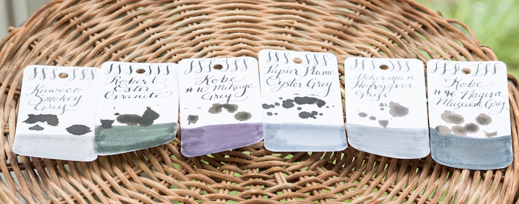
The six inks I compared are Kaweco Smokey Grey, Robert Oster Graphite, Kobe #10 Mikage Grey, Papier Plume Oyster Grey, Akkerman #29 Hofvijver Grijs, and Kobe #46 Nagisa Museum Grey.

In the comparison above, you can see that I wound up with quite a variety of greys, ranging from the very light Kaweco to the almost black Nagisa Museum Grey.

The chromatography on each ink reveals some interesting characteristics.

L to R: Kaweco Smokey Grey, Robert Oster Graphite, Kobe Mikage Grey, Papier Plume Oyster Grey, Akkerman Hofvijver Grijs, and Kobe Nagisa Museum Grey

Kaweco Smokey Grey has virtually no color range, varying slightly from grey to light lavender. Robert Oster Graphite is the most spectacular of the bunch at least in terms of chromatography, with lots of magenta and blue. Kobe Mikage contains mostly lavender and a little bit of blue. Papier Plume Oyster Grey contains blue and magenta tones. Akkerman Grijs is, perhaps, the truest grey, revealing no other colors. Kobe Nagisa Museum Grey is the darkest of all, and like the Akkerman, it demonstrates virtually no color variation.

Close ups of the ink swatches show what each ink looks like using a Brause 361 Steno Blue Pumpkin Calligraphy Pen Nib along with splotches and swabs.

Kaweco Smokey Grey is quite light in the swab, but with the wet dip nib, it writes more like a dark grey.

Robert Oster Graphite, despite its colorful chromatography, is a dark grey both in the swab and with the pen. The ink splats show a tiny bit of sheen, but unfortunately it’s been raining in Abilene all week, and I couldn’t get pictures with sunlight displaying the sheen in all its glory.

Kobe Mikage Grey, in my opinion, is the most intriguing shade of grey. In the swab, the writing, and the splats its purple hue is quite striking.

Papier Plume is a really nice blue-grey as revealed in the swab. With the pen, it appears as a dark grey with some blue sheen.

Akkerman Grijs is definitely the truest grey. The swab shows that it’s a flat color with little variation.

Kobe Nagisa Museum Grey is very close to black with some nice sheen.

I was really pleased with the wide variety of grey shades in these samples. I’ve pretty much written off Kaweco Smokey Grey as being too light and uninteresting for my use. If I wanted a true grey, I would choose the Akkerman. I found Kobe Nagisa to be too close to Iroshizuku Take-Sumi which I already own. Although Robert Oster inks are usually among my top picks, I didn’t much like Graphite, even though the chromatography made the ink look really interesting. So, of the six shades of grey, my two favorites are Papier Plume Oyster with its beautiful blue-grey tones and nice shading and Kobe #10 Mikage Grey with its deep purple-grey hue. It also shades quite well and has some sheen.

Currently my Montblanc Alexandre Dumas is inked with Kobe Mikage. When I run out of that, I’ll put the Papier Plume in the pen and make my final decision about which ink I’ll buy.

You can purchase a 30ml bottle of Kaweco Smokey Grey from JetPens for $13.50. All the other inks are available from Vanness Pens. Robert Oster Graphite is $17.00 for 50ml. Kobe #10 Mikage Grey and Kobe #46 Nagisa Museum Grey are $30.00 for 50ml. Papier Plume Oyster Grey is $7.00 for 30ml. And Akkerman Hofjijver Grijs is $28.00 for 60ml.

(I purchased the ink samples above with my own funds from Vanness Pens.)


Enjoy reading The Pen Addict? Then consider becoming a member to receive additional weekly content, giveaways, and discounts in The Pen Addict shop. Plus, you support me and the site directly, which I am very grateful.

Membership starts at just $5/month, with a discounted annual option available. To find out more about membership click here and join us!

Posted on September 29, 2017 and filed under Ink Reviews, Akkerman, Kaweco, Kobe, Papier Plume.

Akkerman #1 Passage Blauw Ink Review

(Jeff Abbott is a regular contributor at The Pen Addict. You can find more from Jeff online at Draft Evolution and Twitter.)

After this last pen show at Atlanta, I've realized that I've established a pattern in regards to Akkerman inks. I buy a bottle at every pen show I attend. The latest show in Atlanta introduced me to one of the brilliant Akkerman blues -- Passage Blauw.

Passage Blauw was one of the samples available at the Vanness ink testing station, so that's a primary reason for why I picked up this particular ink. It's also the reason I picked up another ink, but that's another review.

After testing the ink and weighing the many, many options available at the show, I chose to go for the Passage Blauw. I'm really glad I did, because it's one of my new favorites.

First off, the bottle is killer. You get the same type of bottle with every Akkerman ink, but I still think they're extremely cool. It never gets old watching the top reservoir fill with ink from the bottom — all thanks to an ingenious marble system inside the bottle neck.

Perhaps the most important aspect of this ink is the color. After all, every Akkerman ink I've tried is very well-behaved and a joy to use. After that point, it's all about the color and specific properties of the ink. In this case, the color is a bright, happy blue that springs off the page with its translucent, Caribbean glory. It's very similar to Iroshizuku kon-peki, but a bit lighter. It's also very similar to Iroshizuku ama-iro, but a tad darker. It's somewhere in between these two inks, and that's just fine. The color is gorgeous and worth owning even if you have other similar colors.

The shading is the other killer aspect of this ink. It shades like a palm tree (I'll see myself out now). In pens with wide nibs, it shows off the shading characteristics like a champ. There's something tropical about watching a medium blue ink pool in the slower parts of letters while you're writing. It's my affinity for this effect that makes my blue ink collection continue to grow.

Dry time was actually a surprise here. It normally dries in less than 10 seconds in most cases. And, most of the tests were done with a medium cursive-italic nib. In a German fine nib, the results were similar. Either way, that's a spectacular dry time and it really impressed me.

Bleeding and show-through are minimal unless you are using a cheap paper. In that case, it feathers quite a bit. But, as long as you're using decent paper, it performs admirably.

In both pens I've tested so far, the flow and lubrication are top notch. This is an extremely well-behaved ink that I wouldn't hesitate to use in any pen I own.

Lastly, the price is a bit high at $28, but you have to remember that this ink is imported from the Netherlands and also has a super fancy bottle. For the joy I get from this ink, the price is completely fair.

I've gotten an Akkerman ink from the Vanness table at every pen show I've attended, but you can also order a bottle at any time from their website. If you're unsure about a bottle, go for a small sample first!

Posted on April 27, 2016 and filed under Akkerman, Ink Reviews.

Akkerman Shocking Blue Ink Review

(Susan M. Pigott is a fountain pen collector, pen and paperholic, photographer, and professor. You can find more from Susan on her blog Scribalishess.)

I sought out a bottle of Akkerman Shocking Blue after seeing a close up of the ink on Instagram. Akkerman isn't the easiest ink to find in the USA, but I was directed to Vanness Pens. I had to wait a week or two until they got some in stock, then I clicked on the pay button. At $30.00 a bottle (60ml), this is expensive ink. But, when I saw the beautiful bottle, I understood why. Plus, most U.S. retailers don't carry Akkerman, so it comes at a premium.

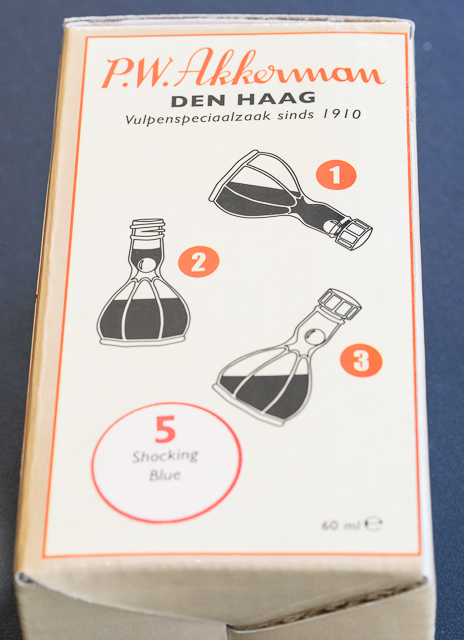
The bottle itself is a work of art. It looks like a piece of antique glasswork with facets and a genie bottle shape.

The unique shape of the bottle is also functional. There's a ball in the upper chamber that moves away when you tip the bottle, allowing ink in. You fill your pen, and tip the bottle again so the ink can flow back into the bottom chamber.

The ink flows well in my Montblanc 146 with a stub nib, but it really shines in flex nibs.

I suspect it would be stunning with the Franklin-Christoph 1.9 music nib (hint, hint, Brad). The ink has a slight odor, but it's not overpowering.

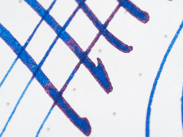
The color is simply amazing. It's a vivid blue with incredible shading and a cool purple-red glimmer outline you can see in close up shots. I just wish you could see this with the naked eye, and maybe you can with super-wide nibs.

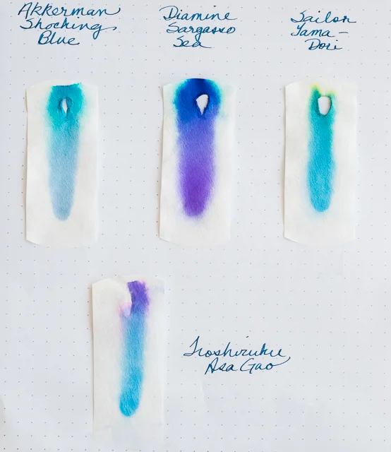
I did a chromatography comparison of Shocking Blue with a few of my other blue inks. The closest parallel was Iroshizuku's Asa-Gao, but the Asa-Gao has purple in it, whereas Shocking Blue does not. I don't know why the purple-red outline I see in the close ups doesn't show up in the chromatography. I made several attempts, and in every case Shocking Blue exhibited only varied shades of blue–no purple, no red.

Compared with some other blues, Shocking Blue is a true blue whereas Diamine Sargasso Sea contains lots of purple. Sailor's Yama-Dori is more of a dark turquoise, Iroshizuku's Asa-Gao is close in tone to Shocking Blue, but also contains purple, and Diamine Denim is a blue-black.

Shocking Blue takes some time to dry on the Rhodia DotPad paper. Of course, the wider your nib, the longer it will take the ink to dry. And the paper you use makes a difference. On my Tomoe River paper, the ink dries almost immediately. It's definitely not waterproof, so if that's important to you, you'll want to look elsewhere.

I purchased my bottle from Vanness Pens for $30.00 plus $7.00 shipping. They have great customer service and my bottle was shipped almost immediately.

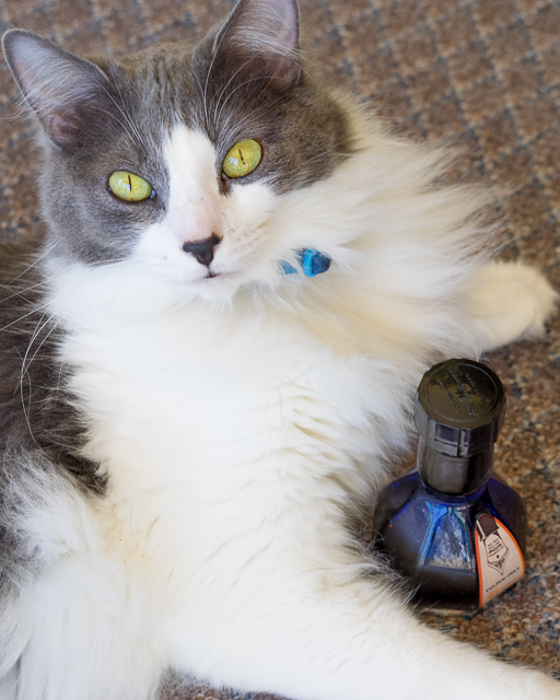
Please note: the adorable cat is not included with the bottle of ink.

Posted on May 1, 2015 and filed under Akkerman, Ink Reviews.