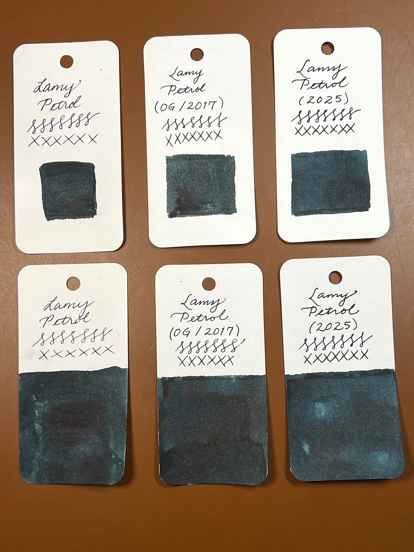
(Kimberly (she/her) took the express train down the fountain pen/stationery rabbit hole and doesn't want to be rescued. She can be found on Instagram @allthehobbies because there really are many, many hobbies!.)
I visited a few stationery shops when I was in the SoCal area after the CA Pen Show in February. In addition to Paper Plant Co, I also went to the Shorthand shop in the Larchmont Village neighborhood (the other location is in Highland Park). Larchmont Village has several blocks of cute shops and restaurants, so this was a great location to walk around. Let’s take a look!

Shorthand, Larchmont Village location.

Can’t wait to go inside!
I gasped out loud (in a good way) when I stepped inside because it is such a visually pleasing aethestic!

I love the airy, open feeling inside the shop. There is a lot of room to browse and you never feel rushed.

After gasping upon entry, I looked to my right and saw this color-coordinated window display from the inside.

There is a wall full of greeting cards to choose from. In fact, this is only half of what’s on this wall. You can also buy the posters displayed above the cards.

More cards!

In the corner is this awesome wooden card catalog which holds all sorts of refills - from fountain pen ink cartridges, to ballpoint and rollerball refills, to pencil leads!

Look at all this colorful eye candy on the walls! My inner matchy-matchy heart was bursting!

Any green fans out there?

I bet no one likes orange either, right? Maybe one guy, but he’s a lil sus. 🙂
Shorthand isn’t a pen store, per se, but they did have assorted pens, including fountain pens, available.

Here are some of their fountain pens.

A few more pens, as well as custom stationery and other assorted items, in the glass case at the counter.
Since I was just at the CA Pen Show a couple days prior, I wasn’t on the hunt for anything in particular. I still enjoyed looking at the products in my favorite colors and being able to talk to the staff in a relaxed environment.

I couldn’t resist this awesomely colorful clutch pencil from Koh-i-noor, as well as their shop postcard.
As I mentioned above, there are two Shorthand locations: this one in Larchmont Village at 126 N Larchmont Blvd, Los Angeles, CA 90004 and the other in Highland Park at 5030 York Blvd, Los Angeles, CA 90042. Both shops are open daily from 10am - 7pm. You can reach them via their online contact form. You can call the Larchmont location at 323-640-1793 or Highland Park location at 323-642-9039. Shorthand is also on Instagram as Shop Shorthand.
Enjoy reading The Pen Addict? Then consider becoming a member to receive additional weekly content, giveaways, and discounts in The Pen Addict shop. Plus, you support me and the site directly, for which I am very grateful.
Membership starts at just $5/month, with a discounted annual option available. To find out more about membership click here and join us!