Filtering by Author: Kimberly Lau

Happy Pen/Ink Pairings

(Kimberly (she/her) took the express train down the fountain pen/stationery rabbit hole and doesn't want to be rescued. She can be found on Instagram @allthehobbies because there really are many, many hobbies!.)

While trying to figure out what I wanted to write about this week, I was struck by a few pen/ink pairings that were bringing me a little more happiness than I expected, and for very different reasons, so I thought I’d share why I’m enjoying them so much.

Kaweco Perkeo (Indian Summer) and Ferris Wheel Press Goose Poupon Despite being a long time Kaweco Sport fan, it wasn’t until 3 years ago that I first used the Kaweco Perkeo for this showdown article. I really liked the pen, but that particular color wasn’t my jam, so back it went to the Bossman for a giveaway. I eventually bought myself the Infrared one and more recently, this Indian Summer colorway. I’m not going to go into the merits of the Perkeo (you can read the review for why I like it), but this pen is “sparking joy” because I am loving the combo of this pen with Ferris Wheel Press Goose Poupon.

Kaweco Perkeo Indian Summer (Medium nib) with Ferris Wheel Press Goose Poupon.

For starters, I used to think that this color was gross, and years later I’m finding myself drawn to “weirder” colors like this yellow-green, which is kind of reminiscent of poopy diapers. It just reminds me that tastes can and do change, which is one way that I find myself “maturing” in this rabbit hole. This pen, at $20 (or less), is a reminder that pens don’t have to be expensive to be enjoyable. Also, this ink not only is a great, well-behaved match, but is also named Goose Poupon - a play on the Dijon-style mustard Grey Poupon - and the kid in me keeps giggling and calling it “Goose Poopoo”.

I love how this ink shades!

It is a nice shader, whether I’m printing or writing in cursive. The only time I had any issues was when the ink didn’t flow from the cartridge and I had to tap it a few times to get the ink to “unstick” itself from the walls (that happens with some inks if syringe-filling a cartridge). This combo is such a divergence from my usual pens/inks that it’s a welcome change to my lineup and a reminder to occasionally think (or ink) outside the box!

Kaweco Special (Red) and Diamine Noel This pen has no right being one of my favorite pens. For one, it’s red. This blue-and-gold girl (Go Bears!) is not a red girl, but over the years, fountain pens and inks have changed my tune. Still, the number of blue pens and inks far outnumber the red ones, so this really shouldn’t even be a contender! Also, it has brass accents, which goes well with the red, but is subject to patina-ing, which usually drives me crazy. And yet, for unknown reasons, it doesn’t really bother me.

This Kaweco is also a much slimmer pen than I typically prefer, but it’s still comfortable in hand. I think that its slightly heavier weight (due to it being metal, instead of the Perkeo’s plastic) balances out the slimness. What shouldn’t be a surprise is that it is faceted, which means automatic brownie points.

Yay for facets, but look at that patina! (shudder)

I have had this pen inked up with this ink since March 16, 2024. I filled a converter with it (once) and have used it 34 times since then (including today). I don’t always use it for lots of writing (maybe the day’s todo list or a page in a penpal letter), but it has never failed to write as soon as I uncap it. The pen’s o-ring means that it seals very well and your pen does not dry, despite traveling on many airplanes and even writing at 9000 feet in Colorado.

Lastly, I’ve inked up the pen with Diamine Noel multiple times since owning this pen. While it didn’t wow me when I first swatched it in 2019 as part of Diamine’s first Inkvent (it is a red ink, after all), I absolutely loved it once I wrote with it! Noel is a nice deep red ink with subtle green sheen and average to slightly wetter flow. I have a hard time picking a different ink for this pen, and vice versa.

The subtle greenish gold sheen is chef’s kiss!

Platinum 3776 (Shape of Heart, Chai Latte) with Lennon Tool Bar Sesame Oil No surprise that a Platinum 3776 with a Medium nib is something that I enjoy writing with, and I love this special edition with the light brown cap with crystals in the finial (just don’t make me find the 3 punched out nib-hearts!), but I am REALLY digging the pen with the Lennon Tool Bar Sesame Oil ink. The ink is a light brown ink that has great shading, especially when printing. Copying out Meditations with this pen/ink combo is so calming because the soft brown ink, despite not being a wet ink, just flows so perfectly out of this pen. Bonus was that a friend helped me get a bottle of this ink when it was sold out everywhere. No crazy revelations here, just a combination that I’m really loving.

Love this combo, not much more to it than that!

TWSBI Vac 700R (Kyanite) with Robert Oster Blue Denim I was hoping that the Jacques Herbin’s Kyanite du Nepal would be a good match for the TWSBI Vac 700R, Kyanite, but alas, the colors were off enough that it would drive me crazy, so I picked a better match that I hadn’t used in several years, Robert Oster Blue Denim.

Jacques Herbin Kyanite du Nepal is too blue for the TWSBI Kyanite which is more of a teal.

Cursive or print, both were equally enjoyable with this pen/ink combo.

I’ve really been enjoying writing with this larger TWSBI (with the size 6 nib) for transcribing another Italian kids book. The Medium nib feels great and I love seeing the ink matching the nib as it flows onto the page.

The ink/nib match really kicked it up several notches for me!

The ink is also a subtle sheener, with a touch of red sheen in some spots (more noticeable with print than cursive). I don’t usually love high capacity pens because I have so many pens inked up at a time, but it’s kind of cool watching the ink level slowly going down (9 pages down, maybe another 20 to go). The ink flow isn’t too wet nor dry and matches the wetness of the size 6 nib. Another happy combo.

Look at that subtle red sheen! Have I mentioned how much I love subtle sheen like that?

I’m sure I could come up with more happy combinations, but these really just struck me as some current favorites, and not just because of ink/pen matchy match, though let’s be real, a good color match also makes me happy. With everything happening in the world around us, we could all use anything that brings a little bit of joy and sunshine in our lives. After all, isn’t that why we use fountain pens? ☺️

PS - Bonus happiness is me finally getting around to starting a book journal for the books I read last year.

(Disclaimer: All products, pens, inks, papers, stamps, and washi tape are my own.)

Posted on February 7, 2025 and filed under Fountain Pens.

Diggin’ These Amarillo Vibes

(Kimberly (she/her) took the express train down the fountain pen/stationery rabbit hole and doesn't want to be rescued. She can be found on Instagram @allthehobbies because there really are many, many hobbies!.)
I know, I know, I just did an ink review a couple weeks ago - Sugar Turtle Studio’s Slowpoke inks - but I just got these from the Bossman at the Philly Pen Show and I just HAD to check them out asap! These aren’t the first inks with Amarillo Stationery’s name on it (they’ve collaborated with Pennonia for three inks) but this is their first private label release, which is exciting.

The Amarillo Vibes set of inks launched a few weeks ago on January 13, 2025 and come in 30ml glass bottles. Despite the bottles looking like those of Birmingham Pen Company, Erick Gama (the guy behind Amarillo Stationery) confirmed that the inks are NOT made by them. Good luck getting him to spill the beans!

Rotating the boxes gives you a fun look at the inspiration behind these inks!

The boxes don’t have the ink names on them, but there are colored swatch stickers to identify them.

I love the doodle art on the bottles!

Here are the bottles with their Col-O-Ring swatch cards.

As in the past, all swatches were done on Col-O-Ring cards using a Kakimori steel dip nib, while writing samples were done with a TWSBI Go with a Medium nib and a Lamy Vista with a steel Medium nib. The TWSBI Go is a wetter writer and the Lamy is a drier writer, so these two give me a good idea of how an ink will look from different pens. The notebook used for writing samples is the Endless Recorder with 68 gsm Tomoe River paper. Dry times for the Vista are shown with “(V)” and the Go will be below that and might also be shown with “(T)”. Dry times may be a bit slower on 52gsm TR or faster on paper like Cosmo Air Light, Rhodia, copy paper, or with drier or finer nibs, etc.

The Amarillo Vibes series includes Blue Suntan, Teal Waistband, Toasty Joggers, and Urng Kicks (pronounced like a mix “urn” and “orange”). I will admit that it took me way too long to figure out where these names came from (this is what I get for not reading the posts and listings until I started swatching, lol).

Amarillo Blue Suntan Amarillo Blue Suntan is inspired by Amarillio’s “skin”, which is a light-to-medium dusty blue. It has nice shading, especially in drier pens.

Writing sample of Blue Suntan on 68 gsm Tomoe River Endless Notebook.

You get a bit more shading from the drier-writing Vista compared to the wetter Go. As expected, the ink is a bit darker and a touch more saturated in the Go, but the main color is still the same. (Some inks can look very different in drier/wetter pens.)

Blue Suntan’s chromatography has both light blue and grey tones. There is just a wee hint of pink just above the ink line.

Inks similar to Amarillo Blue Suntan: Kyo-no-oto 07 Hisoku (closest in color but is a drier ink), Graf von Faber-Castell Deep Sea Green (which is less green than the name implies), Kobe 68 Nishimaiko Pearl Blue and Colorverse Tar Heel (a bit too light), Sailor Mayo Koke (too green and too dark.)

Amarillo Teal Waistband.

Teal Waistband takes its inspiration from Amarillo’s teal equator belt. It is slightly darker and greener compared to Blue Suntan.

Writing sample of Amarillo Teal Waistband on 68 gsm Tomoe River Endless Notebook. The writing is a bit more teal, while the swatches are more green.

Like Blue Suntan, Teal Waistband is a bit darker and slightly more saturated with the Go, but the underlying teal color is the same.

Hard to believe how bright the turquoise is on the strip. The hint of yellow gives the ink its slight greenness, but the amount of pink was definitely a surprise. I wasn’t able to see any of the pink in the writing samples or swatches.

Inks similar to Amarillo Teal Waistband: Waterman Harmonious Green (too green), Jacques Herbin Vert Metropolitain (touch too green and dark), Wearingeul Tick Tock Croc and Diamine Velvet Emerald were the closest, and Iroshizuku Sui-goku (a bit too bright.)

Amarillo Toasty Joggers on 68 gsm TR. Toasty Joggers is described as “yellow/brown color with a hint of pink”, but depending on the light, can look a bit orangey too.

Writing sample of Toasty Joggers on 68 gsm Tomoe River Endless Notebook. It is a very readable yellow/brown, even in a drier pen like the Vista, but might be a touch on the light side for a Japanese Fine or Extra Fine.

The Vista shows a bit more yellow than the Go, which shows it a bit more brown leaning. The pink isn’t obvious like a sheen or chromashader, but more as an undertone.

A mix of yellow and brown, but the chromatography is also showing that “hint of pink”, which can give it a bit of a dusty orange feel.

Inks similar to Amarillo Toasty Joggers: Jacques Herbin Tour Eiffel and Franklin-Christoph Honeycomb were the two closest, Diamine Three Kings (too yellow) and Tono & Lims Toyoma (too light and not quite brown enough.)

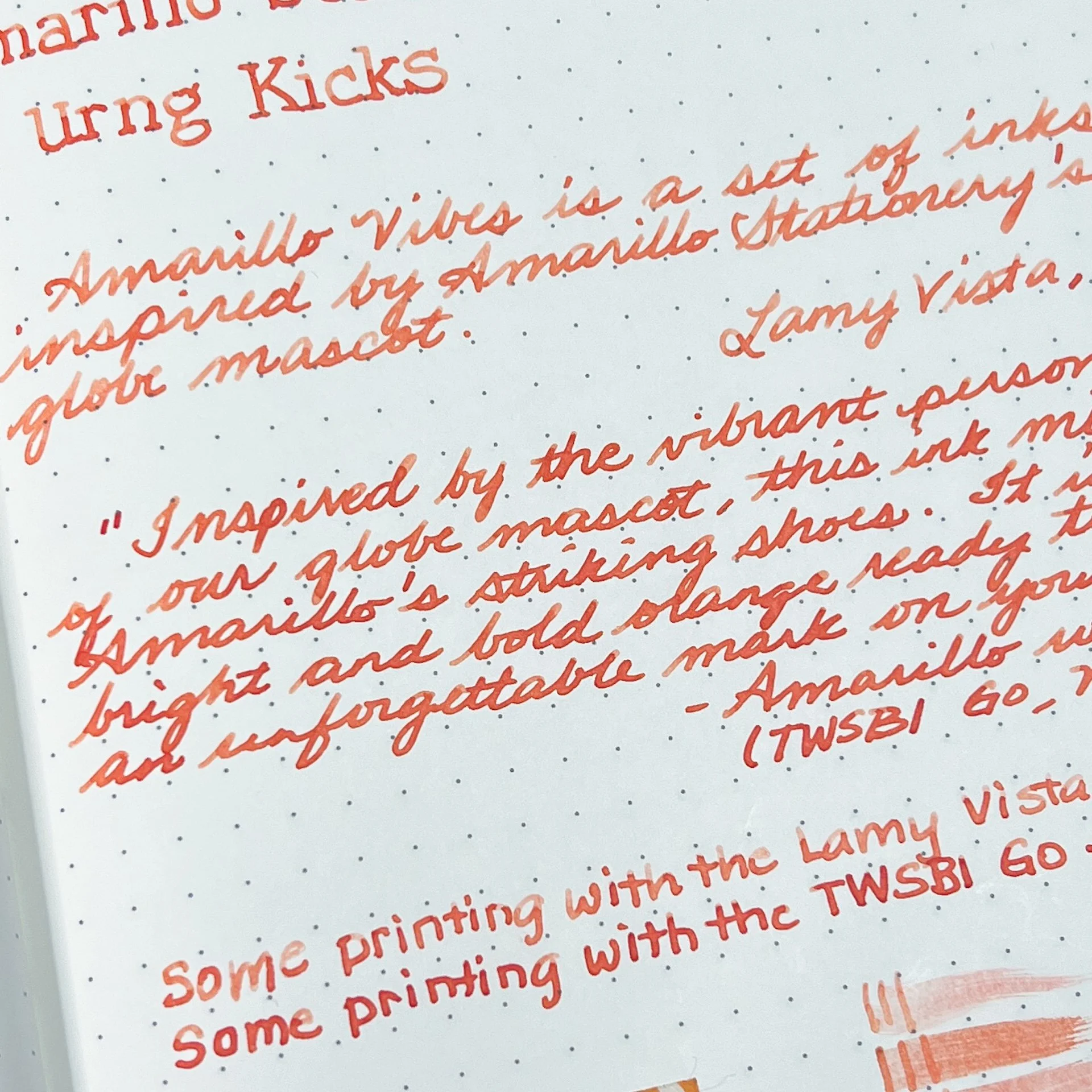
Amarillo Urng Kicks on 68 gsm TR.

Urng Kicks is inspired by Amarillo’s shoes and is described as “a bright and bold orange”.

Writing sample of Amarillo Urng Kicks on 68 gsm Tomoe River Endless Notebook.

Unlike the other inks, Urng Kicks is a fair bit lighter with the Vista than the Go, with shading prominent in both print and cursive. It looks a bit more coral in the Vista’s drier nib, and more of a red-orange with the Go.

A fair amount of pinkish red and a bright streak of yellow at the top.

Inks similar to Amarillo Urng Kicks: Van Dieman’s Golden Nugget Pumpkin (a bit too red and saturated), Bungubox Omaezaki Sunset (the closest), Diamine Celebration (good match colorwise but too light). It was hard to find matching inks as others were either too orange, too red, or too pink.

Swatches of Blue Suntan, Teal Waistband, Toasty Joggers, and Urng Kicks on 52 gsm TR in a 2021 Hobonichi Weeks.

Swatches on 68 gsm TR in the Endless Recorder.

All 4 inks behaved well and wrote nicely. Dry times weren’t bad at all, but I did expect Blue Suntan and Urng Kicks to dry faster than they did, given how much shading it had from the Vista. Toasty Joggers was the fastest to dry around 30 seconds, while the other two were 45-60 with a wet writer.

The Amarillo Vibes ink series is currently available on the Amarillo Stationery website for $18/bottle (shipping is not included.)

(Disclaimer: Thank you to Erick Gama of Amarillo Stationery for providing these inks for review. All other inks and notebooks are my own, including the Amarillo patch and sticker which I bought from their website last year.)

Posted on January 31, 2025 and filed under Amarillo Stationery, Ink Reviews.

2025 Philadelphia Pen Show Recap

(Kimberly (she/her) took the express train down the fountain pen/stationery rabbit hole and doesn't want to be rescued. She can be found on Instagram @allthehobbies because there really are many, many hobbies!.)

The past few weeks have been pretty stressful (family/medical stuff - I’m fine, just a lot going on), so I was looking forward to the first pen show of the year, even more than I usually do. Like past years and other shows, I was working at the Franklin-Christoph table and since I was not in my usual “buy everything in sight” mindset, I didn’t take as many pictures as I would have liked to, but thankfully, I was able to snag some pictures from others.

Welcome to the city of brotherly love, Philadelphia!

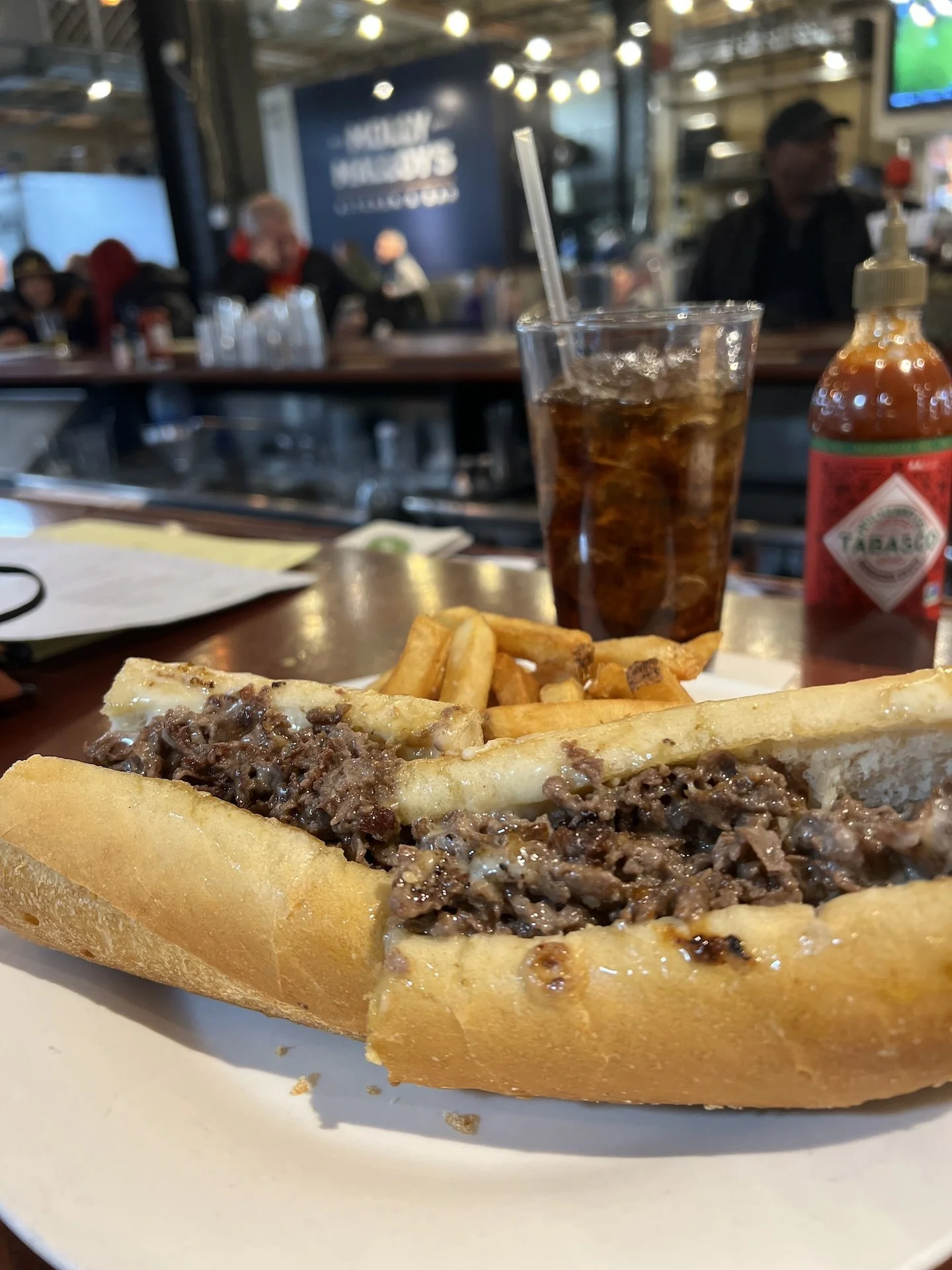
But first, Philly cheesesteak from Molly Malloy’s - yes to Cooper Sharp, onions, and bell peppers!

One of the things I like about the Philly show is that it is fairly predictable (in a good way). Same show owners/organizers (Scott Franklin of Franklin-Christoph and Eric Orozco are co-owners of the show), same hotel as the past several years, same chilly mid-January weather. Many of the vendors from past years were here again this year. Like last year, the show was held on the Mezzanine level. It’s a great first pen show because it’s not too large and not too small, but its mix of vintage and modern vendors means there’s something for just about everyone.

Weekend pass holders got a copy of Nibbage which had a map, vendor list, as well as a couple pages for folks to sign. New this year was the show stamp which you can use in your copy of Nibbage (wanna guess who forgot to do that?). If you got 10 signatures, you could also get a show sticker. It was a lot of fun asking folks to sign my copy of Nibbage - reminded me of signing yearbooks! “Have a great summer! TTFN!” 😃

This year’s Nibbage and an awesome stamp!

View from the F-C table in the first ballroom. This was taken early in the day on Friday before it got super crowded.

Looking into the second ballroom on Friday morning. Both ballrooms have a good amount of aisle space to look at the different tables and to move around.

As co-owner of the Philly Pen Show, Franklin-Christoph always makes an ink to kick off the year as well as matching exclusive pens. This year’s color is a brick orange color, like a terracotta or burnt orange. They also released an engraved and painted 03M (M for Modified to not have a clip or finial like the regular 03).

Ink ‘25 and Philly Pen Show Pen (top), along with other engraved and painted 03M pens.

Last year, the F-C table was in the back of the first ballroom. This year, we were in the front of that ballroom, so I enjoyed seeing the people coming and going. The show was pretty well-attended on both Friday and Saturday, with a busier crowd on Saturday, which is pretty common for most shows. Despite the impending snow storm as well as the Philadelphia Eagles game on Sunday, there was a surprising number of people who came to the show on Sunday morning. It definitely tapered pretty quickly after 1pm or so.

Various buildings were lit up in green in preparation for Sunday’s Eagles’ game. Go Birds!

==nib grinders== The first ballroom was where most of the nib workers were. Gena Salorino of Custom Nib Studio at the far end, Matthew Chen for his first Philly show. Not pictured were Josh Lax of JJ Lax Pen Company who I accidentally cropped, Damien Alomar of All in the Nib who was in another aisle, and Kirk Speer of Pen Realm who was in the other ballroom.

Philadelphia’s own Ian Schon of Schon Dsgn along with his crew, Scott and Bea.

It was great to see Cary Yeager and Chris Henline of Truphae at the show!

You can always count on finding the most colorful and fun stationery items from Tom Forsythe of Sugar Turtle Studio.

Bill and Jaclynn of Pilot USA trying to pick a favorite Pilot pen to show off.

Jaclynn and Aiki (right) picking names to find a lucky winner.

The Kenro crew had an impressive display of pens and accessories including…

...this amazing carousel for the Ferris Wheel Press inks! Kenro announced on Friday, January 17th, that they are now the North American distributor for Ferris Wheel Press! How exciting!

Not pictured (because I forgot) were the kind folks from the Philadelphia Calligraphers’ Society that were set up in the hallway and wrote people’s names in calligraphy.

Remember when I said the show was predictable? That doesn’t mean they don’t try to improve the show and make it better. I already mentioned Nibbage (which they created last year), the show stamp (for this year), and a sticker for getting a bunch of signatures. They also had pen show bags for sale (see haul picture) and had a new backdrop for folks to strike a pose with their pen friends!

*I love this photo of me with one of my favorite people, Azizah, in front of this fun, colorful, inky backdrop! *

After years of only knowing each other online on IG and Discord, I FINALLY got to meet the one and only Tom Oddo!

They also added more classes and seminars this year than in the past, which is a great way for folks to learn how to use their pens and things, and take a break from retail therapy. If I wasn’t working at the show, I would have taken Sugar Turtle Studio’s seminars on Creative Journaling, Michael Ward’s Spencerian class (though I’d also LOVE to take a dance lesson from him too - Philly organizers, can we make that happen?), and one of Azizah Asgarali’s classes (too many good ones to pick from). In addition to the paid classes, there were also free events like a newly added pen show tour, Josh Lax’s Vintage Pen Panel, and the Two Ring Circus podcast with Azizah, Eric Orozco, and Drew Brown (if it wasn’t so early on a Sunday, this night owl would’ve been there).

Gotta love the ink slinging that happens in Azizah’s workshops!

Even yours truly taught a handwriting improvement class! (PC: Brad’s view from the back.)

The Bossman practicing his block print - yes, the class is for ANY kind of writing, even print! (PC: Brad)

Proof that they finished the class and no one threw anything at me!

The show was great, but my favorite part of pen shows is hanging out with pen friends afterwards!

So good to spend time with pen friends - many of whom I haven’t seen since the last Philly show! (This is in one of the lobby seating areas.)

Fun times with Drew, Simar, and Eric!

Hydration is extra important on Saturday night (yes, actual water in those water bottles, lol)!

Watching the Sunday night football games with pen friends, Kimberly Henderson (left), Carol, John, and Bryce Gillett of Luxury Brands of America, and Marty Henderson.

As always, I had a great time at this show, and I loved spending time with friends I hadn’t seen in what felt like ages, which my heart and soul desperately needed. The Philly Pen Show is a great way to kick off pen show season and 2025 was no exception.

My Philly haul included a surprise find of the Colorverse Colorvent calendar, Pennonia x Inkdependence Hens & Chicks ink, Franklin-Christoph Pocket 20 (with an EF SIG “flex” nib and ebonite feed that I can’t wait to ink up), Franklin-Christoph Ink ‘25 and an ink sample from Ferris Wheel Press.

Not gonna lie, this might be one of my most treasured pen show items ever. And this might also be my most brilliant idea ever. (Pro tip: I used a Hobonichi with a plastic cover underneath the front layer so it wouldn’t bleed through and so it was easier for people to write on. You’re welcome 🙂)

*The real haul, though, are the memories that are reflected on my pen show bag and in my copy of Nibbage. *

A huge Thank You to the Philly Pen Show crew for a wonderful show! Now that pen show season has officially kicked off, I’m even more excited for the next shows, which will be the upcoming California Pen Show in a few weeks and the Baltimore Pen Show shortly after that. I hope to see you there! Until then, stay warm, stay safe, and stay inky!


Enjoy reading The Pen Addict? Then consider becoming a member to receive additional weekly content, giveaways, and discounts in The Pen Addict shop. Plus, you support me and the site directly, for which I am very grateful.

Membership starts at just $5/month, with a discounted annual option available. To find out more about membership click here and join us!

Posted on January 24, 2025 and filed under Pen Shows.